


Flex布局
之前还没学习过flex布局的,建议先去看看 阮一峰老师的Flex布局教程

Flex 例子
<div class="box">
  <span class="item"></span>
</div>
上面代码中,div元素(代表骰子的一个面)是Flex容器,span元素(代表一个点)是Flex项目。如果有多个项目,就要添加多个span元素,以此类推
1. 单项目

Flex布局默认就是首行左对齐
.box {
  display: flex;
}

.box {
  display: flex;
  justify-content: center;
}

.box {
  display: flex;
  justify-content: flex-end;
}

.box {
  display: flex;
  align-items: center;
}

.box {
  display: flex;
  justify-content: center;
  align-items: center;
}

.box {
  display: flex;
  justify-content: center;
  align-items: flex-end;
}

.box {
  display: flex;
  justify-content: flex-end;
  align-items: flex-end;
}
2. 双项目

.box {
  display: flex;
  justify-content: space-between;
}

.box {
  display: flex;
  flex-direction: column;
  justify-content: space-between;
}

.box {
  display: flex;
  flex-direction: column;
  justify-content: space-between;
  align-items: center;
}

.box {
  display: flex;
  flex-direction: column;
  justify-content: space-between;
  align-items: flex-end;
}

.box {
  display: flex;
}

.item:nth-child(2) {
  align-self: center;
}

.box {
  display: flex;
  justify-content: space-between;
}

.item:nth-child(2) {
  align-self: flex-end;
}
3 三项目

.box {
  display: flex;
}

.item:nth-child(2) {
  align-self: center;
}

.item:nth-child(3) {
  align-self: flex-end;
}
4 四项目

<div class="box">
  <div class="column">
    <span class="item"></span>
    <span class="item"></span>
  </div>
  <div class="column">
    <span class="item"></span>
    <span class="item"></span>
  </div>
</div>
.box {
  display: flex;
  flex-wrap: wrap;
  align-content: space-between;
}

.column {
  flex-basis: 100%;
  display: flex;
  justify-content: space-between;
}
5 六项目

.box {
  display: flex;
  flex-wrap: wrap;
  align-content: space-between;
}

.box {
  display: flex;
  flex-direction: column;
  flex-wrap: wrap;
  align-content: space-between;
}
6 九项目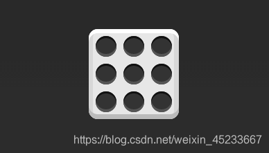
.box {
  display: flex;
  flex-wrap: wrap;
}
2 网格布局
2.1 基本网格布局

<div class="Grid">
  <div class="Grid-cell">...</div>
  <div class="Grid-cell">...</div>
  <div class="Grid-cell">...</div>
</div>
.Grid {
  display: flex;
}

.Grid-cell {
  flex: 1;
}
2.2 百分比布局
某个网格的宽度为固定的百分比,其余网格平均分配剩余的空间

<div class="Grid">
  <div class="Grid-cell u-1of4">...</div>
  <div class="Grid-cell">...</div>
  <div class="Grid-cell u-1of3">...</div>
</div>
.Grid {
  display: flex;
}

.Grid-cell {
  flex: 1;
}

.Grid-cell.u-full {
  flex: 0 0 100%;
}

.Grid-cell.u-1of2 {
  flex: 0 0 50%;
}

.Grid-cell.u-1of3 {
  flex: 0 0 33.3333%;
}

.Grid-cell.u-1of4 {
  flex: 0 0 25%;
}
圣杯布局
圣杯布局(Holy Grail Layout)指的是一种最常见的网站布局。页面从上到下,分成三个部分:头部(header),躯干(body),尾部(footer)。其中躯干又水平分成三栏,从左到右为:导航、主栏、副栏

<body class="HolyGrail">
  <header>...</header>
  <div class="HolyGrail-body">
    <main class="HolyGrail-content">...</main>
    <nav class="HolyGrail-nav">...</nav>
    <aside class="HolyGrail-ads">...</aside>
  </div>
  <footer>...</footer>
</body>
.HolyGrail {
  display: flex;
  min-height: 100vh;
  flex-direction: column;
}

header,
footer {
  flex: 1;
}

.HolyGrail-body {
  display: flex;
  flex: 1;
}

.HolyGrail-content {
  flex: 1;
}

.HolyGrail-nav, .HolyGrail-ads {
  /* 两个边栏的宽度设为12em */
  flex: 0 0 12em;
}

.HolyGrail-nav {
  /* 导航放到最左边 */
  order: -1;
}


 3239
3239


 被折叠的 条评论
为什么被折叠?
被折叠的 条评论
为什么被折叠?
 到【灌水乐园】发言


