


所用工具皆为系统自带,方便实现功能。
效果展示

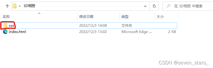
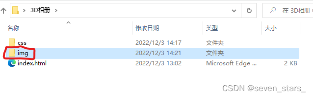
一、创建整个文件的根目录
再桌面上新建一个文件夹,并且命名为:3D相册
二、创建3D相册内部文件
1.创建index.html
1.双击进入 3D相册 文件夹,并创建一个新的txt文本文件。
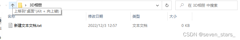
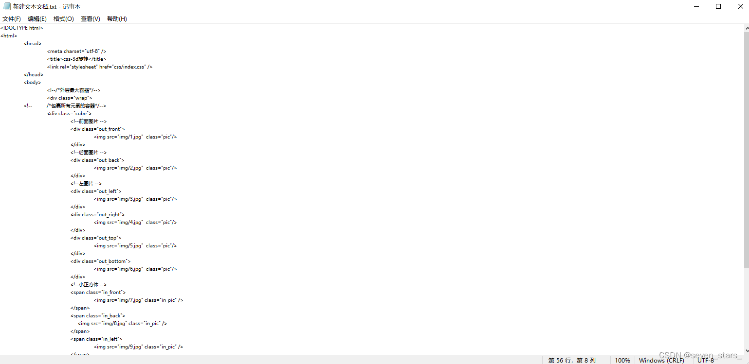
2.把下面代码复制到新建文本,并且保存后退出。
<!DOCTYPE html>
<html>
	<head>
		<meta charset="utf-8" />
		<title>css-3d旋转</title>
		<link rel="stylesheet" href="css/index.css" />
	</head>
	<body>
		<!--/*外层最大容器*/-->
		<div class="wrap">
	<!--	/*包裹所有元素的容器*/-->
		<div class="cube">
			<!--前面图片 -->
			<div class="out_front">
				<img src="img/1.jpg"  class="pic"/>
			</div>
			<!--后面图片 -->
			<div class="out_back">
				<img src="img/2.jpg"  class="pic"/>
			</div>
			<!--左图片 -->
			<div class="out_left">
				<img src="img/3.jpg"  class="pic"/>
			</div>
			<div class="out_right">
				<img src="img/4.jpg"  class="pic"/>
			</div>
			<div class="out_top">
				<img src="img/5.jpg"  class="pic"/>
			</div>
			<div class="out_bottom">
				<img src="img/6.jpg"  class="pic"/>
			</div>
			<!--小正方体 -->
			<span class="in_front">
				<img src="img/7.jpg" class="in_pic" />
			</span>
			<span class="in_back">
			     <img src="img/8.jpg" class="in_pic" />
			</span>
			<span class="in_left">
				<img src="img/9.jpg" class="in_pic" />
			</span>
			<span class="in_right">
				<img src="img/10.jpg" class="in_pic" />
			</span>
			<span class="in_top">
				<img src="img/11.jpg" class="in_pic" />
			</span>
			<span class="in_bottom">
				<img src="img/12.jpg" class="in_pic" />
			</span>
		</div>
		</div>
	</body>
</html>
如图所示
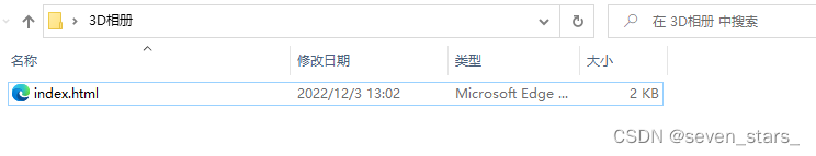
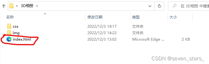
3.将文件名改为index.html
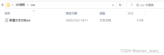
2.创建css文件夹及其内容
1.在3D相册文件夹下新建一个文件夹,并命名为:css
2.进入css文件夹,并且新建一个txt文本文件
3.在新建的文本中插入下面代码
html{
	background: #000;
    height: 100%;
}
/*最外层容器样式*/
.wrap{
	position: relative;
	position: absolute;
	top: 0;
	right: 0;
	bottom: 0;
	left: 0;
	width: 200px;
	height: 200px;
	margin: auto;
	/*改变左右上下,图片方块移动*/

}
/*包裹所有容器样式*/
.cube{
	width: 200px;
	height: 200px;
	margin: 0 auto;
	transform-style: preserve-3d;
	transform: rotateX(-30deg) rotateY(-80deg);
	-webkit-animation: rotate 20s infinite;
	/*匀速*/
	animation-timing-function: linear;
}
@-webkit-keyframes rotate{
	from{transform: rotateX(0deg) rotateY(0deg);}
	to{transform: rotateX(360deg) rotateY(360deg);}
}
.cube div{
	position: absolute;
	width: 200px;
	height: 200px;
	opacity: 0.8;
	transition: all .4s;
}
/*定义所有图片样式*/
.pic{
	width: 200px;
	height: 200px;
}
.cube .out_front{
	transform: rotateY(0deg) translateZ(100px);
}
.cube .out_back{
	transform: translateZ(-100px) rotateY(180deg);
}
.cube .out_left{
	transform: rotateY(90deg) translateZ(100px);
}
.cube .out_right{
	transform: rotateY(-90deg) translateZ(100px);
}
.cube .out_top{
	transform: rotateX(90deg) translateZ(100px);
}
.cube .out_bottom{
	transform: rotateX(-90deg) translateZ(100px);
}
/*定义小正方体样式*/
.cube span{
	display: bloack;
	width: 100px;
	height: 100px;
	position: absolute;
	top: 50px;
	left: 50px;
}
.cube .in_pic{
	width: 100px;
	height: 100px;
}
.cube .in_front{
	transform: rotateY(0deg) translateZ(50px);
}
.cube .in_back{
	transform: translateZ(-50px) rotateY(180deg);
}
.cube .in_left{
	transform: rotateY(90deg) translateZ(50px);
}
.cube .in_right{
	transform: rotateY(-90deg) translateZ(50px);
}
.cube .in_top{
	transform: rotateX(90deg) translateZ(50px);
}
.cube .in_bottom{
	transform: rotateX(-90deg) translateZ(50px);
}
/*鼠标移入后样式*/
.cube:hover .out_front{
	transform: rotateY(0deg) translateZ(200px);
}
.cube:hover .out_back{
	transform: translateZ(-200px) rotateY(180deg);
}
.cube:hover .out_left{
	transform: rotateY(90deg) translateZ(200px);
}
.cube:hover .out_right{
	transform: rotateY(-90deg) translateZ(200px);
}
.cube:hover .out_top{
	transform: rotateX(90deg) translateZ(200px);
}
.cube:hover .out_bottom{
	transform: rotateX(-90deg) translateZ(200px);
}
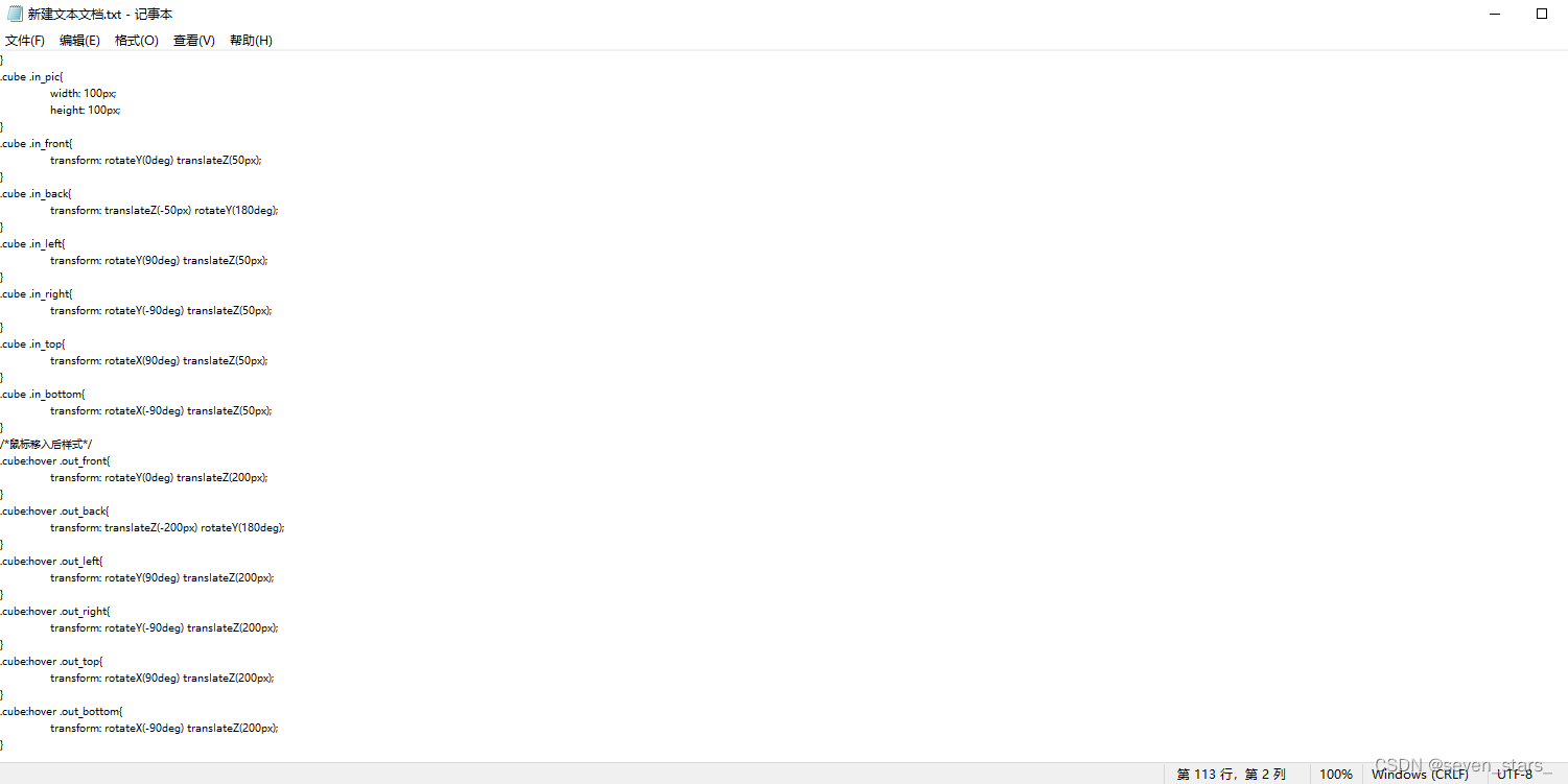
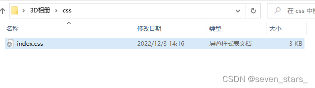
4.保存文本,并退出。
5.给txt文件重新命名:index.css
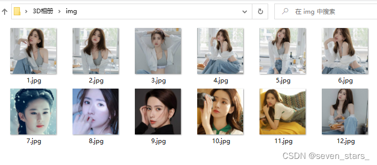
3.在创建img文件夹及其内容
1.在 3D相册 文件夹下新建一个文件夹,并命名为:img
2.然后把12张照片复制到img文件夹中
命名就按下图的方式命名,照片名一定要是1.jpg 2.jpg 3.jpg 4.jpg 到 12.jpg ,不能起别的名字。1.jgp 2.jgp 3.jpg 4.jpg 等等往下类推,最多到 12.jpg 也就是最多放12张照片。
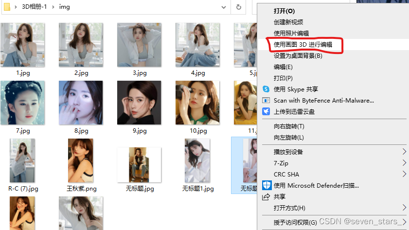
4.关于图片大小以及修改方法
1.用win10系统自带的 画图3D打开照片

2.右击图片,选择照片中框出来的工具打开照片,工具是win10系统自带的。
3.打开照片以后点击左上角的剪裁,得到下图所示界面。
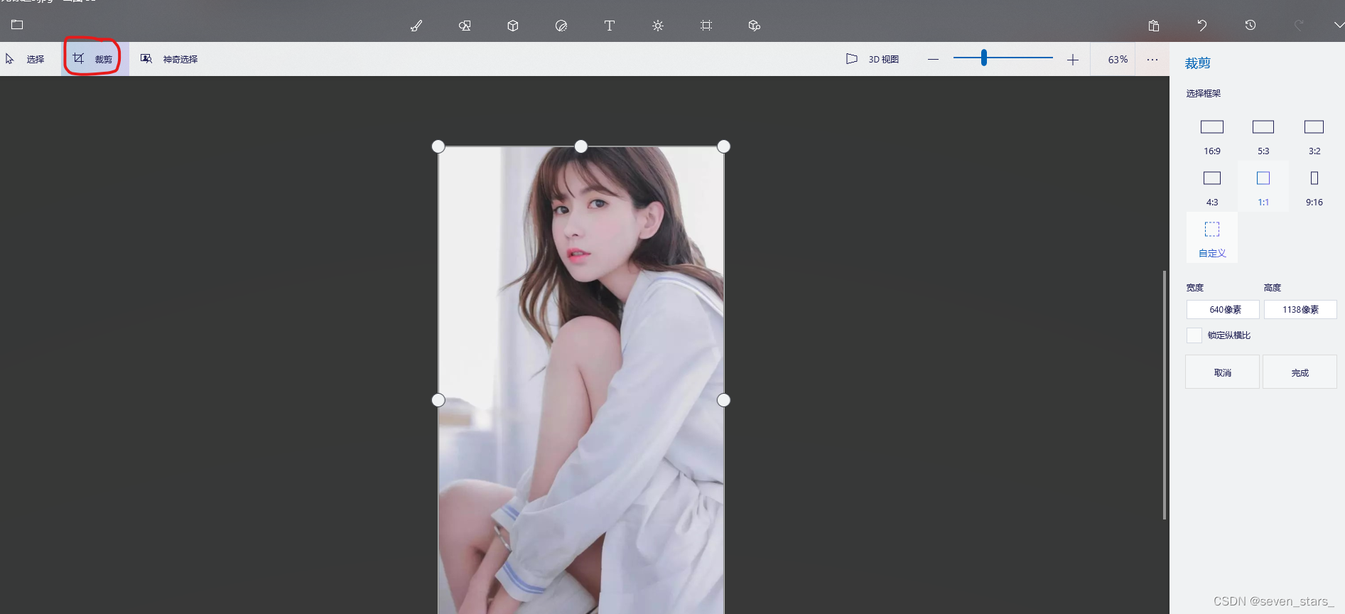
4.紧接着选择右侧1:1的选项,图片中会出现一个正方形的选框,同时右侧的高度和宽度的像素点已经一样了。
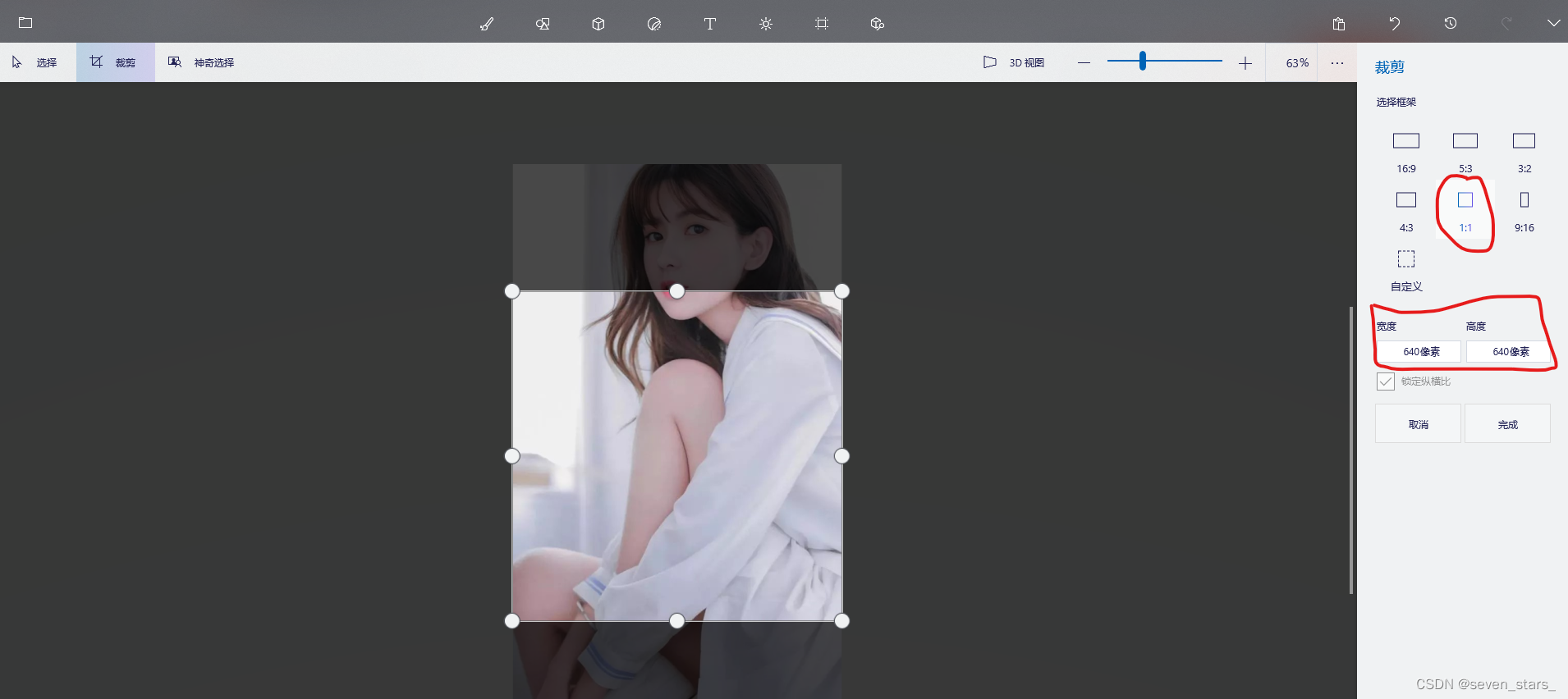
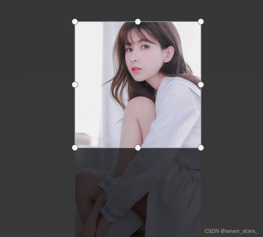
5.燃油用鼠标拖动选框向上或者向下移动,得到想要的部分。
6.照片的像素点没有具体要求,高度和宽度相等就好。
7.最后点击完成、保存,就可以得到想要的尺寸了。
总结
双击运行index.html文件,在浏览器中就会打开,得到3D旋转的相册。

如果觉得好,欢迎点赞+评论+收藏。
下载方法
链接:https://pan.baidu.com/s/1Nl4iqn5EwRRDwYYel6SzWA
提取码:sx97


 1878
1878


 被折叠的 条评论
为什么被折叠?
被折叠的 条评论
为什么被折叠?
 到【灌水乐园】发言


