Tips
- Safari 浏览器需设置 -webkit- 前缀,Chrome 倒是都可以;
- -webkit- 的渐变角度进行需要换算: 90 - 原角度 = 需设角度:
background-image: linear-gradient(135deg, red, yellow);
background-image: -webkit-linear-gradient(-45deg, red, yellow); - -webkit- 径向渐变属性为百分号,
"shape size at position 不适用:
background-image: radial-gradient(ellipse farthest-corner at 90% 90%, red, yellow);
background-image: -webkit-radial-gradient(90% 90%, red, yellow); animation-play-state 可被 animation 属性合并简写,但在 -webkit-animation 中需单独定义:
animation: rotate 1s infinite linear paused;
-webkit-animation: rotate 500s infinite linear; -webkit-animation-play-state: paused;
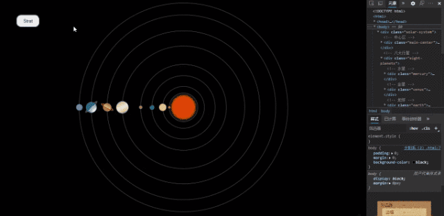
第一种实现:【改变元素中心(公转)】
Tips:
-
1. "行星" 与 "轨道" 分离,不共用元素标签;
-
2. 利用
transform-origin 改变元素中心位置,达到 "星体" 位于最左端,最右端连接圆心,来实现 "公转";
-
3.
transform-origin: x y; 中("z" 此处不需要),x 的值为 "星体" 外边距的值即
margin-left,y 的值为 "星体" 的高的一半,即
height / 2;
【即 transform-origin: mragin-left height/2】

<!DOCTYPE html>
<html>
<head>
<meta charset="utf-8" />
<title></title>
<style type="text/css">
body {
padding: 0;
margin: 0;
background-color: black;
}
.solar-system {
position: absolute;
min-width: 100%;
min-height: 100%;
transform: scale(0.75);
-webkit-transform: scale(0.75);
}
.circle-center {
position: absolute;
width: 2px;
height: 2px;
border-radius: 50%;
background-color: black;
top: 50%;
left: 50%;
margin-top: -1px;
margin-left: -1px;
z-index: 1;
}
.sun {
position: absolute;
width: 80px;
height: 80px;
border-radius: 50%;
background-color: rgba(223, 66, 5, 1);
box-shadow: 0 0 10px 10px rgba(255, 104, 0, 0.9);
top: 50%;
left: 50%;
margin-top: -40px;
margin-left: -40px;
}
.mercury {
position: absolute;
width: 10px;
height: 10px;
border-radius: 50%;
background-color: rgba(173, 120, 54, 1);
top: 50%;
left: 50%;
margin-top: -5px;
margin-left: -63px;
z-index: 1;
transform-origin: 63px 5px;
animation: rotate 1.5s infinite linear paused;
-webkit-transform-origin: 63px 5px;
-webkit-animation: rotate 1.5s infinite linear;
-webkit-animation-play-state: paused;
}
.venus {
position: absolute;
width: 30px;
height: 30px;
border-radius: 50%;
background-color: rgba(216, 189, 154, 1);
top: 50%;
left: 50%;
margin-top: -15px;
margin-left: -100px;
z-index: 1;
transform-origin: 100px 15px;
animation: rotate 3s infinite linear paused;
-webkit-transform-origin: 100px 15px;
-webkit-animation: rotate 3s infinite linear;
-webkit-animation-play-state: paused;
}
.earth {
position: absolute;
width: 20px;
height: 20px;
border-radius: 50%;
background-image: linear-gradient(135deg, rgb(12, 133, 0) 10%, rgb(0, 53, 255) 100%);
background-image: -webkit-linear-gradient(-45deg, rgb(12, 133, 0) 10%, rgb(0, 53, 255) 100%);
top: 50%;
left: 50%;
margin-top: -10px;
margin-left: -139px;
z-index: 1;
transform-origin: 139px 10px;
animation: rotate 6s infinite linear paused;
-webkit-transform-origin: 139px 10px;
-webkit-animation: rotate 6s infinite linear;
-webkit-animation-play-state: paused;
}
.mars {
position: absolute;
width: 14px;
height: 14px;
border-radius: 50%;
background-color: rgba(152, 120, 94, 1);
top: 50%;
left: 50%;
margin-top: -7px;
margin-left: -182px;
z-index: 1;
transform-origin: 182px 7px;
animation: rotate 11s infinite linear paused;
-webkit-transform-origin: 182px 7px;
-webkit-animation: rotate 11s infinite linear;
-webkit-animation-play-state: paused;
}
.jupiter {
position: absolute;
width: 50px;
height: 50px;
border-radius: 50%;
background-image: repeating-linear-gradient(-25deg, rgb(162, 141, 117) 5%, rgb(247, 239, 210) 50%, rgb(162, 141, 117) 100%);
background-image: -webkit-repeating-linear-gradient(115deg, rgb(162, 141, 117) 5%, rgb(247, 239, 210) 50%, rgb(162, 141, 117) 100%);
top: 50%;
left: 50%;
margin-top: -25px;
margin-left: -275px;
z-index: 1;
transform-origin: 275px 25px;
animation: rotate 50s infinite linear paused;
-webkit-transform-origin: 275px 25px;
-webkit-animation: rotate 50s infinite linear;
-webkit-animation-play-state: paused;
}
.saturn {
position: absolute;
width: 34px;
height: 34px;
border-radius: 50%;
background-image: repeating-linear-gradient(30deg, rgb(113, 72, 46) 5%, rgb(220, 180, 109) 50%, rgb(113, 72, 46) 100%);
background-image: -webkit-repeating-linear-gradient(60deg, rgb(113, 72, 46) 5%, rgb(220, 180, 109) 50%, rgb(113, 72, 46) 100%);
top: 50%;
left: 50%;
margin-top: -17px;
margin-left: -329px;
z-index: 1;
transform-style: preserve-3d;
transform-origin: 329px 18px;
animation: rotate 180s infinite linear paused;
-webkit-transform-style: preserve-3d;
-webkit-transform-origin: 329px 18px;
-webkit-animation: rotate 180s infinite linear;
-webkit-animation-play-state: paused;
}
.saturn:after {
position: absolute;
content: '';
width: 44px;
height: 16px;
border-radius: 50%;
border: 8px solid rgba(136, 84, 30, 1);
margin-top: 0px;
margin-left: -13px;
transform: rotateX(60deg) rotateY(30deg);
-webkit-transform: rotateX(60deg) rotateY(30deg);
}
.uranus {
position: absolute;
width: 44px;
height: 44px;
border-radius: 50%;
background-image: radial-gradient(ellipse farthest-corner at 90% 90%, rgb(170, 245, 246) 15%, rgb(1, 102, 121) 60%);
background-image: -webkit-radial-gradient(90% 90%, rgb(170, 245, 246) 15%, rgb(1, 102, 121) 60%);
top: 50%;
left: 50%;
margin-top: -22px;
margin-left: -399px;
z-index: 1;
transform-style: preserve-3d;
transform-origin: 399px 20px;
animation: rotate 500s infinite linear paused;
-webkit-transform-style: preserve-3d;
-webkit-transform-origin: 399px 20px;
-webkit-animation: rotate 500s infinite linear;
-webkit-animation-play-state: paused;
}
.uranus:after {
position: absolute;
content: '';
width: 50px;
height: 20px;
border-radius: 50%;
border: 10px solid rgba(255, 255, 255, 0.3);
margin-top: 0px;
margin-left: -13px;
transform: rotateX(60deg) rotateY(-45deg);
-webkit-transform: rotateX(60deg) rotateY(-45deg);
}
.neptune {
position: absolute;
width: 26px;
height: 26px;
border-radius: 50%;
background-color: rgba(98, 134, 231, 1);
top: 50%;
left: 50%;
margin-top: -13px;
margin-left: -439px;
z-index: 1;
transform-origin: 439px 13px;
animation: rotate 1000s infinite linear paused;
-webkit-transform-origin: 439px 13px;
-webkit-animation: rotate 1000s infinite linear;
-webkit-animation-play-state: paused;
}
.mercury-orbit {
position: absolute;
width: 116px;
height: 116px;
border-radius: 50%;
border: 1px solid rgba(255, 255, 255, 0.5);
top: 50%;
left: 50%;
margin-top: -59px;
margin-left: -59px;
}
.venus-orbit {
position: absolute;
width: 170px;
height: 170px;
border-radius: 50%;
border: 1px solid rgba(255, 255, 255, 0.5);
top: 50%;
left: 50%;
margin-top: -86px;
margin-left: -86px;
}
.earth-orbit {
position: absolute;
width: 258px;
height: 258px;
border-radius: 50%;
border: 1px solid rgba(255, 255, 255, 0.5);
top: 50%;
left: 50%;
margin-top: -130px;
margin-left: -130px;
}
.mars-orbit {
position: absolute;
width: 350px;
height: 350px;
border-radius: 50%;
border: 1px solid rgba(255, 255, 255, 0.5);
top: 50%;
left: 50%;
margin-top: -176px;
margin-left: -176px;
}
.jupiter-orbit {
position: absolute;
width: 500px;
height: 500px;
border-radius: 50%;
border: 1px solid rgba(255, 255, 255, 0.5);
top: 50%;
left: 50%;
margin-top: -251px;
margin-left: -251px;
}
.saturn-orbit {
position: absolute;
width: 624px;
height: 624px;
border-radius: 50%;
border: 1px solid rgba(255, 255, 255, 0.5);
top: 50%;
left: 50%;
margin-top: -313px;
margin-left: -313px;
}
.uranus-orbit {
position: absolute;
width: 754px;
height: 754px;
border-radius: 50%;
border: 1px solid rgba(255, 255, 255, 0.5);
top: 50%;
left: 50%;
margin-top: -378px;
margin-left: -378px;
}
.neptune-orbit {
position: absolute;
width: 852px;
height: 852px;
border-radius: 50%;
border: 1px solid rgba(255, 255, 255, 0.5);
top: 50%;
left: 50%;
margin-top: -427px;
margin-left: -427px;
}
.controls {
position: absolute;
margin-top: 50px;
margin-left: 50px;
z-index: 1;
}
.btn {
padding: 10px 20px;
outline: 0 none;
border-radius: 15px;
cursor: pointer;
}
.on {
animation-play-state: running !important;
-webkit-animation-play-state: running !important;
}
@keyframes rotate {
0% {transform: rotate(0deg);}
100% {transform: rotate(-360deg);}
}
@-webkit-keyframes rotate {
0% {-webkit-transform: rotate(0deg);}
100% {-webkit-transform: rotate(-360deg);}
}
</style>
<script type="text/javascript">
window.onload = function() {
var toggle = document.getElementById('toggle');
toggle.textContent = 'Strat';
var planets = [];
;(function() {
var nodes = document.getElementsByClassName('eight-planets')[0].childNodes;
for (var i = 0; i < nodes.length; i++) {
if (nodes[i].nodeType === 1) {
planets.push(nodes[i]);
}
}
})();
function changeClass() {
for (var i = 0; i < planets.length; i++) {
var curClass = planets[i].getAttribute('class');
var change = '';
if (curClass.indexOf(' on') === -1) {
change = curClass + ' on';
} else {
change = curClass.replace(' on', '');
}
planets[i].setAttribute('class', change);
}
}
toggle.onclick = function() {
if (this.textContent === 'Strat') {
toggle.textContent = 'Stop';
} else {
toggle.textContent = 'Strat';
}
changeClass('on');
}
}
</script>
</head>
<body>
<div class="solar-system">
<div class="main-center">
<div class="circle-center"></div>
<div class="sun"></div>
</div>
<div class="eight-planets">
<div class="mercury"></div>
<div class="venus"></div>
<div class="earth"></div>
<div class="mars"></div>
<div class="jupiter"></div>
<div class="saturn"></div>
<div class="uranus"></div>
<div class="neptune"></div>
</div>
<div class="planets-orbit">
<div class="mercury-orbit"></div>
<div class="venus-orbit"></div>
<div class="earth-orbit"></div>
<div class="mars-orbit"></div>
<div class="jupiter-orbit"></div>
<div class="saturn-orbit"></div>
<div class="uranus-orbit"></div>
<div class="neptune-orbit"></div>
</div>
</div>
<div class="controls">
<button class="btn" id="toggle"></button>
</div>
</body>
</html>
第二种实现:【旋转元素自身(自转)】
Tips:
-
1. 将所有元素于某一点居中,"行星" 位于 "轨道" 的边部,实则是 "轨道" 自转,带动 "行星" 运动,造成 "公转" 效果;
-
2. 将 "星体" 设置位于 "轨道" 边部中间位置,此时 "星体" 距离 "圆心" 的距离,即为 "公转" 半径;
-
3. 是最简单最省事的方法,但如此的话,在旋转过程中,元素的角会撑开父元素(实际面积还是矩形);
<!DOCTYPE html>
<html>
<head>
<meta charset="utf-8" />
<title></title>
<style type="text/css">
body {
padding: 0;
margin: 0;
background-color: black;
}
.solar-system {
position: absolute;
min-width: 100%;
min-height: 100%;
transform: scale(0.75);
-webkit-transform: scale(0.75);
}
.sun {
position: absolute;
width: 80px;
height: 80px;
border-radius: 50%;
background-color: rgba(223, 66, 5, 1);
box-shadow: 0 0 10px 10px rgba(255, 104, 0, 0.9);
top: 50%;
left: 50%;
margin-top: -40px;
margin-left: -40px;
}
.mercury {
position: absolute;
width: 116px;
height: 116px;
border-radius: 50%;
border: 1px solid rgba(255, 255, 255, 0.5);
top: 50%;
left: 50%;
margin-top: -59px;
margin-left: -59px;
animation: rotate 1.5s infinite linear paused;
-webkit-animation: rotate 1.5s infinite linear;
-webkit-animation-play-state: paused;
}
.mercury:after {
position: absolute;
content: '';
width: 10px;
height: 10px;
border-radius: 50%;
background-color: rgba(173, 120, 54, 1);
margin-top: 53px;
margin-left: -5px;
}
.venus {
position: absolute;
width: 170px;
height: 170px;
border-radius: 50%;
border: 1px solid rgba(255, 255, 255, 0.5);
top: 50%;
left: 50%;
margin-top: -86px;
margin-left: -86px;
animation: rotate 3s infinite linear paused;
-webkit-animation: rotate 3s infinite linear;
-webkit-animation-play-state: paused;
}
.venus:after {
position: absolute;
content: '';
width: 30px;
height: 30px;
border-radius: 50%;
background-color: rgba(216, 189, 154, 1);
margin-top: 70px;
margin-left: -15px;
}
.earth {
position: absolute;
width: 258px;
height: 258px;
border-radius: 50%;
border: 1px solid rgba(255, 255, 255, 0.5);
top: 50%;
left: 50%;
margin-top: -130px;
margin-left: -130px;
animation: rotate 6s infinite linear paused;
-webkit-animation: rotate 6s infinite linear;
-webkit-animation-play-state: paused;
}
.earth:after {
position: absolute;
content: '';
width: 20px;
height: 20px;
border-radius: 50%;
background-image: linear-gradient(135deg, rgb(12, 133, 0) 10%, rgb(0, 53, 255) 100%);
background-image: -webkit-linear-gradient(-45deg, rgb(12, 133, 0) 10%, rgb(0, 53, 255) 100%);
margin-top: 119px;
margin-left: -10px;
}
.mars {
position: absolute;
width: 350px;
height: 350px;
border-radius: 50%;
border: 1px solid rgba(255, 255, 255, 0.5);
top: 50%;
left: 50%;
margin-top: -176px;
margin-left: -176px;
animation: rotate 11s infinite linear paused;
-webkit-animation: rotate 11s infinite linear;
-webkit-animation-play-state: paused;
}
.mars:after {
position: absolute;
content: '';
width: 14px;
height: 14px;
border-radius: 50%;
background-color: rgba(152, 120, 94, 1);
margin-top: 168px;
margin-left: -7px;
}
.jupiter {
position: absolute;
width: 500px;
height: 500px;
border-radius: 50%;
border: 1px solid rgba(255, 255, 255, 0.5);
top: 50%;
left: 50%;
margin-top: -251px;
margin-left: -251px;
animation: rotate 50s infinite linear paused;
-webkit-animation: rotate 50s infinite linear;
-webkit-animation-play-state: paused;
}
.jupiter:after {
position: absolute;
content: '';
width: 50px;
height: 50px;
border-radius: 50%;
background-image: repeating-linear-gradient(-25deg, rgb(162, 141, 117) 5%, rgb(247, 239, 210) 50%, rgb(162, 141, 117) 100%);
background-image: -webkit-repeating-linear-gradient(115deg, rgb(162, 141, 117) 5%, rgb(247, 239, 210) 50%, rgb(162, 141, 117) 100%);
margin-top: 225px;
margin-left: -25px;
}
.saturn {
position: absolute;
width: 624px;
height: 624px;
border-radius: 50%;
border: 1px solid rgba(255, 255, 255, 0.5);
top: 50%;
left: 50%;
margin-top: -313px;
margin-left: -313px;
transform-style: preserve-3d;
animation: rotate 180s infinite linear paused;
-webkit-transform-style: preserve-3d;
-webkit-animation: rotate 180s infinite linear;
-webkit-animation-play-state: paused;
}
.saturn:after {
position: absolute;
content: '';
width: 34px;
height: 34px;
border-radius: 50%;
background-image: repeating-linear-gradient(30deg, rgb(113, 72, 46) 5%, rgb(220, 180, 109) 50%, rgb(113, 72, 46) 100%);
background-image: -webkit-repeating-linear-gradient(60deg, rgb(113, 72, 46) 5%, rgb(220, 180, 109) 50%, rgb(113, 72, 46) 100%);
margin-top: 295px;
margin-left: -17px;
}
.saturn:before {
position: absolute;
content: '';
width: 44px;
height: 16px;
border-radius: 50%;
border: 8px solid rgba(136, 84, 30, 1);
margin-top: 295px;
margin-left: -30px;
transform: rotateX(60deg) rotateY(30deg);
-webkit-transform: rotateX(60deg) rotateY(30deg);
}
.uranus {
position: absolute;
width: 754px;
height: 754px;
border-radius: 50%;
border: 1px solid rgba(255, 255, 255, 0.5);
top: 50%;
left: 50%;
margin-top: -378px;
margin-left: -378px;
transform-style: preserve-3d;
animation: rotate 500s infinite linear paused;
-webkit-transform-style: preserve-3d;
-webkit-animation: rotate 500s infinite linear;
-webkit-animation-play-state: paused;
}
.uranus:after {
position: absolute;
content: '';
width: 44px;
height: 44px;
border-radius: 50%;
background-image: radial-gradient(ellipse farthest-corner at 90% 90%, rgb(170, 245, 246) 15%, rgb(1, 102, 121) 60%);
background-image: -webkit-radial-gradient(90% 90%, rgb(170, 245, 246) 15%, rgb(1, 102, 121) 60%);
margin-top: 355px;
margin-left: -22px;
}
.uranus:before {
position: absolute;
content: '';
width: 50px;
height: 20px;
border-radius: 50%;
border: 10px solid rgba(255, 255, 255, 0.3);
margin-top: 355px;
margin-left: -35px;
transform: rotateX(60deg) rotateY(-45deg);
-webkit-transform: rotateX(60deg) rotateY(-45deg);
}
.neptune {
position: absolute;
width: 852px;
height: 852px;
border-radius: 50%;
border: 1px solid rgba(255, 255, 255, 0.5);
top: 50%;
left: 50%;
margin-top: -427px;
margin-left: -427px;
animation: rotate 1000s infinite linear paused;
-webkit-animation: rotate 1000s infinite linear;
-webkit-animation-play-state: paused;
}
.neptune:after {
position: absolute;
content: '';
width: 26px;
height: 26px;
border-radius: 50%;
background-color: rgba(98, 134, 231, 1);
margin-top: 413px;
margin-left: -13px;
}
.controls {
position: absolute;
margin-top: 50px;
margin-left: 50px;
z-index: 1;
}
.btn {
padding: 10px 20px;
outline: 0 none;
border-radius: 15px;
cursor: pointer;
}
.on {
animation-play-state: running !important;
-webkit-animation-play-state: running !important;
}
@keyframes rotate {
0% {transform: rotate(0deg);}
100% {transform: rotate(-360deg);}
}
@-webkit-keyframes rotate {
0% {-webkit-transform: rotate(0deg);}
100% {-webkit-transform: rotate(-360deg);}
}
</style>
<script type="text/javascript">
window.onload = function() {
var toggle = document.getElementById('toggle');
toggle.textContent = 'Strat';
var planets = [];
;(function() {
var nodes = document.getElementsByClassName('eight-planets')[0].childNodes;
for (var i = 0; i < nodes.length; i++) {
if (nodes[i].nodeType === 1) {
planets.push(nodes[i]);
}
}
})();
function changeClass() {
for (var i = 0; i < planets.length; i++) {
var curClass = planets[i].getAttribute('class');
var change = '';
if (curClass.indexOf(' on') === -1) {
change = curClass + ' on';
} else {
change = curClass.replace(' on', '');
}
planets[i].setAttribute('class', change);
}
}
toggle.onclick = function() {
if (this.textContent === 'Strat') {
toggle.textContent = 'Stop';
} else {
toggle.textContent = 'Strat';
}
changeClass('on');
}
}
</script>
</head>
<body>
<div class="solar-system">
<div class="main-center">
<div class="sun"></div>
</div>
<div class="eight-planets">
<div class="mercury"></div>
<div class="venus"></div>
<div class="earth"></div>
<div class="mars"></div>
<div class="jupiter"></div>
<div class="saturn"></div>
<div class="uranus"></div>
<div class="neptune"></div>
</div>
</div>
<div class="controls">
<button class="btn" id="toggle"></button>
</div>
</body>
</html>


 818
818


 被折叠的 条评论
为什么被折叠?
被折叠的 条评论
为什么被折叠?
 到【灌水乐园】发言


