


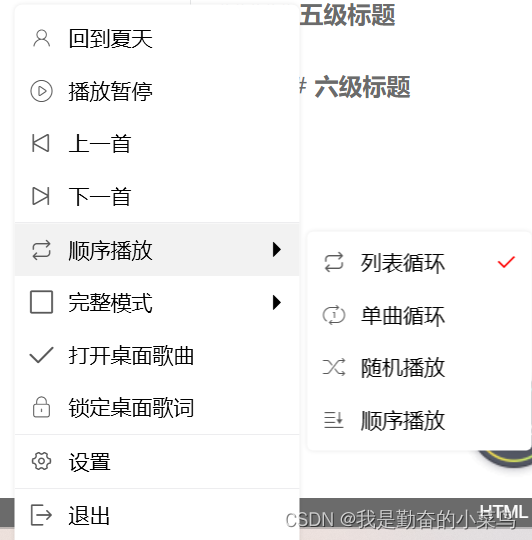
定义ContextMenu样式
-
定义字典文件
<ResourceDictionary xmlns="http://schemas.microsoft.com/winfx/2006/xaml/presentation" xmlns:x="http://schemas.microsoft.com/winfx/2006/xaml"> <!--阿里矢量库的图标--> <FontFamily x:Key="Iconfont"> /Assets/Fonts/#iconfont </FontFamily> <!-- Separator --> <Style x:Key="SeparatorStyle" TargetType="{x:Type Separator}"> <Setter Property="Template"> <Setter.Value> <ControlTemplate TargetType="{x:Type Separator}"> <Border Height="0.7" Background="#ededef" /> </ControlTemplate> </Setter.Value> </Setter> </Style> <!-- Outer menu items --> <Style TargetType="{x:Type MenuItem}"> <Style.Triggers> <Trigger Property="IsHighlighted" Value="False"> <Setter Property="Height" Value="35" /> </Trigger> <Trigger Property="IsHighlighted" Value="True"> <Setter Property="Height" Value="35" /> </Trigger> <Trigger Property="IsEnabled" Value="False"> <Setter Property="Foreground" Value="#98989c" /> </Trigger> <Trigger Property="IsEnabled" Value="True"> <Setter Property="Foreground" Value="#010101" /> </Trigger> </Style.Triggers> </Style> <!-- Outer menu --> <Style TargetType="{x:Type ContextMenu}"> <Setter Property="Template"> <Setter.Value> <ControlTemplate TargetType="{x:Type ContextMenu}"> <!-- Here is where you change the border thickness to zero on the menu --> <Border Padding="5" Width="{TemplateBinding Width}"> <Border.Effect> <DropShadowEffect Color="#1e1e1e00" ShadowDepth="0" BlurRadius="5" Opacity="0.1" Direction="0"/> </Border.Effect> <Border x:Name="Border" CornerRadius="5" Padding="0 5"> <StackPanel ClipToBounds="True" IsItemsHost="True" KeyboardNavigation.DirectionalNavigation="Cycle" Orientation="Vertical" /> </Border> </Border> <ControlTemplate.Triggers> <Trigger Property="IsMouseOver" Value="true"> <Setter TargetName="Border" Property="Background" Value="#ffffff" /> </Trigger> </ControlTemplate.Triggers> </ControlTemplate> </Setter.Value> </Setter> </Style> <!-- SubmenuItem --> <ControlTemplate x:Key="{x:Static MenuItem.SubmenuItemTemplateKey}" TargetType="{x:Type MenuItem}"> <Border Name="Border" Background="Transparent" ClipToBounds="True"> <Grid> <StackPanel Orientation="Horizontal" > <TextBlock Text="{TemplateBinding Icon}" FontSize="16" Margin="10 0 10 0" Foreground="#595959" FontFamily="{DynamicResource Iconfont}" VerticalAlignment="Center"/> <TextBlock Text="{TemplateBinding Header}" FontSize="14" VerticalAlignment="Center" TextTrimming="CharacterEllipsis" MaxWidth="150" ToolTip="{TemplateBinding Header}"/> </StackPanel> <TextBlock x:Name="Checkabled" Text="" FontSize="14" VerticalAlignment="Center" FontFamily="{DynamicResource Iconfont}" Visibility="Collapsed" Foreground="red" HorizontalAlignment="Right" Margin="0 0 10 0"/> </Grid> </Border> <ControlTemplate.Triggers> <Trigger Property="IsHighlighted" Value="true"> <Setter TargetName="Border" Property="Background" Value="#f2f2f2" /> </Trigger> <Trigger Property="IsEnabled" Value="false"> <Setter Property="Foreground" Value="#0f3c5a" /> </Trigger> <Trigger Property="IsCheckable" Value="true"> <Setter Property="Visibility" TargetName="Checkabled" Value="Visible" /> </Trigger> </ControlTemplate.Triggers> </ControlTemplate> <!-- SubmenuHeader --> <ControlTemplate x:Key="{x:Static MenuItem.SubmenuHeaderTemplateKey}" TargetType="{x:Type MenuItem}"> <Border Name="Border"> <Grid Background="Transparent"> <StackPanel Orientation="Horizontal"> <TextBlock Text="{TemplateBinding Icon}" FontSize="16" Margin="10 0 10 0" Foreground="#595959" FontFamily="{DynamicResource Iconfont}" VerticalAlignment="Center"/> <TextBlock Text="{TemplateBinding Header}" FontSize="14" VerticalAlignment="Center"/> </StackPanel> <TextBlock Text="" FontSize="10" VerticalAlignment="Center" HorizontalAlignment="Right" Margin="0 0 10 0" FontFamily="{DynamicResource Iconfont}"/> <Popup Name="Popup" AllowsTransparency="True" Focusable="False" Width="{TemplateBinding Width}" HorizontalOffset="-5" IsOpen="{TemplateBinding IsSubmenuOpen}" Placement="Right" PopupAnimation="Fade"> <StackPanel Orientation="Horizontal"> <Border Width="5" Height="35" Background="White" Opacity="0.01"/> <Border Padding="5"> <Border.Effect> <DropShadowEffect Color="#1e1e1e00" ShadowDepth="0" BlurRadius="5" Opacity="0.1" Direction="0"/> </Border.Effect> <Border Width="{TemplateBinding Width}" Name="SubmenuBorder" Background="White"> <StackPanel IsItemsHost="True" KeyboardNavigation.DirectionalNavigation="Cycle" /> </Border> </Border> </StackPanel> </Popup> </Grid> </Border> <ControlTemplate.Triggers> <Trigger Property="IsHighlighted" Value="true"> <Setter TargetName="Border" Property="Background" Value="#f2f2f2" /> </Trigger> <Trigger SourceName="Popup" Property="Popup.AllowsTransparency" Value="True"> <Setter TargetName="SubmenuBorder" Property="CornerRadius" Value="4" /> <Setter TargetName="SubmenuBorder" Property="Padding" Value="0,3,0,3" /> </Trigger> <Trigger Property="IsEnabled" Value="false"> <Setter Property="Foreground" Value="#0f3c5a" /> </Trigger> </ControlTemplate.Triggers> </ControlTemplate> </ResourceDictionary> -
使用
<MenuItem Header="完整模式" Icon="">
<MenuItem Header="完整模式" Width="150" Icon=""/>
<MenuItem Header="mini模式" Width="150" Icon=""/>
<MenuItem Header="最小化" Width="150" Icon=""/>
</MenuItem>
<MenuItem Header="打开桌面歌曲" Icon=""/>
<MenuItem Header="锁定桌面歌词" Icon=""/>
-
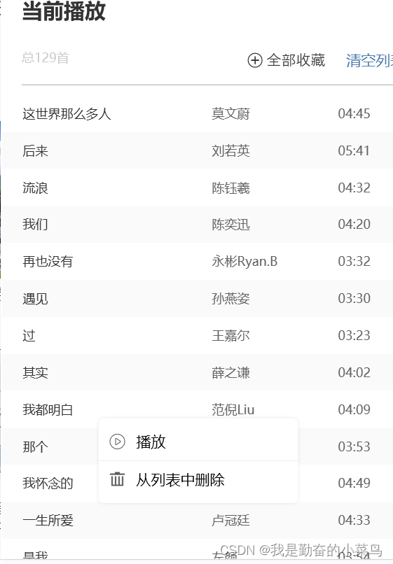
例子来源


 1165
1165


 被折叠的 条评论
为什么被折叠?
被折叠的 条评论
为什么被折叠?
 到【灌水乐园】发言


