


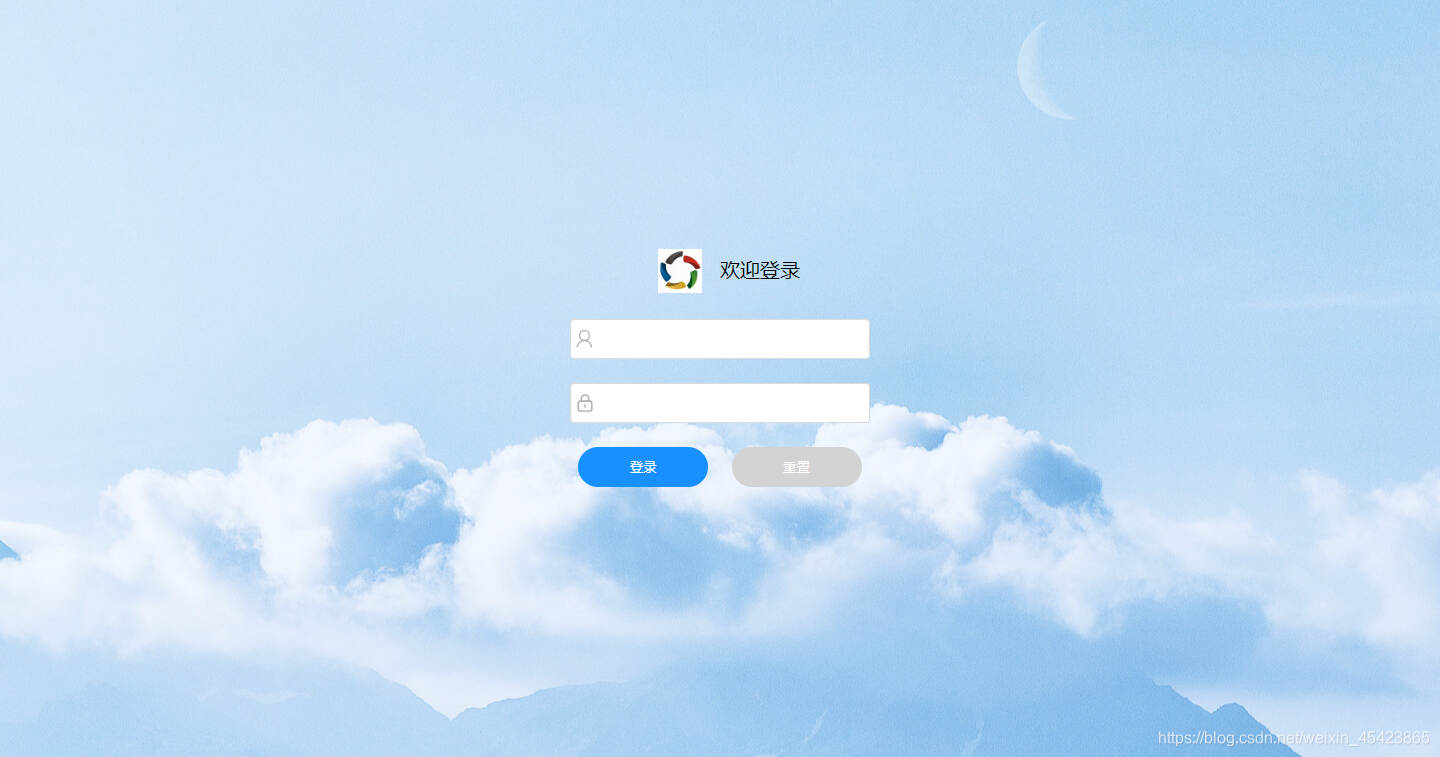
实现效果如图:
<!DOCTYPE html>
<html>
	<head>
		<meta charset="utf-8" />
		<title></title>
		<style type="text/css">
			*, html, body{
				width:100%;
				height:100%;
				margin:0 auto;
				box-sizing: border-box;
			}
			.box{
				width:100%;
				height:100%;
				background: url(img/background.jpg) no-repeat 100%;//背景图片
				display: flex;//垂直居中
				justify-content: center;
				align-items: center;
			}
			.center{
				text-align: center;
				width:300px;
				height:300px;
			}
			.center input:nth-of-type(1){
				width:300px;
				height:40px;
				line-height: 40px;
				border:1px solid #d9d9d9;
				border-radius: 4px;
				padding-left:30px;//图标位置
				background:#FFFFFF url(img/user.png) 4px no-repeat;//input前面的图标
				background-size: 20px;//图标大小
			}
			.center input:nth-of-type(2){
				margin-top:24px;
				width:300px;
				height:40px;
				line-height: 40px;
				border:1px solid #d9d9d9;
				border-radius: 4px;
				padding-left:30px;
				background:#FFFFFF url(img/psd.png) 4px no-repeat;
				background-size: 20px;
			}
			.btn{
				margin-top:24px;
				display: flex;
				justify-content: space-around;
			}
			.btn button:nth-of-type(1){
				width:130px;
				height:40px;
				line-height: 40px;
				background: #1890FF;
				color:white;
				border-radius: 20px;
				border:none;
			}
			.btn button:nth-of-type(2){
				margin-left: 15px;
				width:130px;
				height:40px;
				line-height: 40px;
				background: lightgrey;
				color:white;
				border-radius: 20px;
				border:none;
			}
			.top{
				display: flex;
				justify-content: space-around;
				align-items: center;
				height:80px;
				line-height: 80px;
				padding:0 70px;
				font-size: 20px;
				margin-bottom: 10px;
			}
			.top img{
				vertical-align: middle;
				width:44px;
				height:44px;
				text-align: center;
			}
		</style>
	</head>
	<body>
		<div class="box">
			<div class="center">
				<div class="top">
					<div><img src="img/logo.jpg"/></div>
					<span>欢迎登录</span>
				</div>
				<input type="text" /><br />
				<input type="text" /><br />
				<div class="btn">
					<button>登录</button>
					<button>重置</button>
				</div>
			</div>

		</div>
	</body>
</html>


 扫一扫
扫一扫


 被折叠的 条评论
为什么被折叠?
被折叠的 条评论
为什么被折叠?
 到【灌水乐园】发言


