


(1)使用标签上传文件图片设置type='file’时,去除input自带的原有的样式
 input[type="file"] {
        display: none;
      }
(2)设置文字超出一行隐藏或者超出多行隐藏显示省略号
white-space:nowrap; /* 强制文本一行显示 */
text-overflow:ellipsis; /*添加省略号*/
word-wrap:break-word;/*英文长单词换行,默认长单词是不换行的*/
/* 超出一行隐藏代码 */
.text {
       overflow:hidden;/*超出部分隐藏*/
       white-space:nowrap;
       text-overflow:ellipsis;
}
/*超出两行隐藏并显示省略号*/
.text {
        overflow:hidden;
        text-overflow:ellipsis;
        display:-webkit-box;  //将对象作为弹性伸缩盒子模型显示
        -webkit-box-orient:vertical; //从上到下垂直排列子元素(设置伸缩盒子的子元素排列方式)
        -webkit-line-clamp:2; //表示显示的行数
}
/* 设置超出多少字隐藏*/
.text {
     width: 7em; //width要设置比你原理隐藏的字多一位,因为省略号也占一个字符
     overflow: hidden;
     text-overflow:ellipsis;
     white-space:nowrap;
}
(3)设置h5页面滚动效果
/* 给父元素设置 */
.div {
       height:100vh; //这里高度设置百分比不起作用,设置px或者vh可以滑动
       overflow:auto;
}
(4)设置弹框的css样式
/*代码*/
<div v-show="peopleListShow">
      /*遮罩层*/
    <div class="wind-alert-bg"></div>
      <div class="dialog">
      /*内容写在这里面*/
    </div>
  </div>
 .wind-alert-bg {
    top: 0;
    left: 0;
    width: 100%;
    height: 100%;
    opacity: 0.3;
    display: block;
    position: fixed;
    z-index: 9;
    background-color: #000000;
  }
    .dialog {
    top: 50%;
    width: 80%;
    padding: 20px 0 0 0;
    left: 10%;
    opacity: 1;
    position: fixed;
    z-index: 99;
    box-sizing: content-box;
    background-color: #fff;
    border-radius: 10px;
    transform: translate(0,-50%);
    -webkit-transform: translate(0,-50%);
    }
(5)输入框textarea的样式设置:
textarea {
border:none; /*去除边框*/
resize:none; /*禁止缩放*/
}
/*获取焦点时显示去掉显示的蓝色背景*/
input:focus,textarea:focus{
    border:1px solid #f99;
    background-color:#fff;
}
textarea设置高度自适应,随着内容的输入适应
textarea {
  field-sizing: content;
}
textarea的相关的各种需求:
规定输入的字数,并实时监听输入的并显示输入的字数,代码如下,主要用到@input函数:
 <textarea
        maxlength="200"
        @input="descInput"
        v-model="text"
        placeholder="请输入"
        rows="5"
      ></textarea>
      <p class="count_num">{{ num }}/200</p>

//   输入字符
    descInput() {
      const txtVal = this.text.length;
      this.num = txtVal;
    },
(6)动态绑定类
/*绑定类*/
<div :class="{ 'active': isActive}"></div>
<div :class="[{ active: isActive }, errorClass]"></div>
//绑定多个类
<div :class="{'active':isActive,'activeTwo':isActiveTwo}"></div>
//结合三元表达式绑定类
<div :class=" isActive ? 'active' : '' "></div>
<div :class="[isActive ? activeClass : '', errorClass]"></div>
//多个三元表达式绑定类
<div :class="[ isActive ? 'active' : '', filter == 0 ? 'two' : '']"></div>
(7)动态的绑定样式
<div :style="{color: activeColor,font-weight:fontWeight+'px'}"></div>
//js部分
data(){
return {
 activeColor:'#fff',
 fontWeight:500
}
}
//结合三元表达式使用
<div :style="{ color: isActive==true ? '#fff' : 'red' }"></div>
(8)给一段不固定长度的文字设置边框,让边框随文字大小变化
例如:


这时宽度不能写死
.text_style {
 padding: 10px 20px;
 width:auto;
 display:inline-block !important;//主要是设置display:inline-block
}
(9)利用伪元素给switch开关添加文字
在这里我主要用的是cube-ui的组件<cube-switch v-model="value"></cube-switch>,所以我就以这个为例子说明,其他的组件要添加文字,只需要复制下面的伪元素样式就可以了。
/deep/ .cube-switch .cube-switch-input:checked+.cube-switch-ui {
     &::before {
        content: '公开';
        // left: 10px;
        font-size: 14px;
        transform: scale(0.85);
        line-height: 20px;
        background-color: #126DF7;
        color: #ffffff;
        left: 1px;
      }
}
/deep/ .cube-switch .cube-switch-ui {
    background-color: #999999;
    &::before {
      content: '屏蔽';
      color: #fff;
      line-height: 20px;
       font-size: 14px;
      transform: scale(0.85);
      position: absolute;
      left: 24px;
      background-color: #999999;
      width: 30px;
    }
}
实现的效果图如下所示:


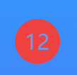
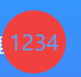
10、给一个不固定位数的数字设置一个圆,圆的大小不能固定要随着数字位数的变化而变化。
//一位数
<div  class="circle-container"><span>1</span></div>
//两位数
<div  class="circle-container"><span>12</span></div>
//三位数
<div  class="circle-container"><span>123</span></div>
//四位数
<div  class="circle-container"><span>1234</span></div>
.circle-container {
    display: inline-block;
    border-radius: 50%;
	font-size: 15px;
    min-width: 25px; /*如果min-height太小(一般>=25即可) 会被字体的大小撑开导致形成的圆不圆*/
    min-height: 25px;
    padding:5px;
	background: #f04141;
	color: #649df1;
    text-align: center;
    box-sizing: content-box;
    line-height: 1;
    white-space: nowrap;

    &:before {
        content: '';
        display: inline-block;
        vertical-align: middle;
        padding-top: 100%;
        height: 0;
    }
    & > span{
        display: inline-block;
        vertical-align: middle;
    }
}
效果图如何所示:


11、设置底部按钮固定,内容滚动(position:fixed;这种方法就很常见就不说了,现在记录一个比较好用的)
.parent {
    display: flex;
    flex-direction: column;
    height: 100vh;
    .list {
        min-height:110vh;
        overflow:auto;
        flex:1;
    }
    .btn {
         //正常设置按钮的样式就可以了,按钮会固定在底部的。
     }
}
12、修改input、textarea中placeholder文字的样式
      //textarea
    textarea::-webkit-input-placeholder {
        color: #666666;
      }

      textarea::-moz-placeholder {
       color: #666666;
      }

      textarea:-ms-input-placeholder {
       color: #666666;
      }

      textarea:-moz-placeholder {
       color: #666666;
      }
        //input
      input::-webkit-input-placeholder {
        color: #666666;
      }

      input::-moz-placeholder {
       color: #666666;
      }

      input:-ms-input-placeholder {
       color: #666666;
      }

      input:-moz-placeholder {
       color: #666666;
      }
13、滚动条样式修改
::-webkit-scrollbar {
  /*滚动条整体样式*/
  width: 4px; /*高宽分别对应横竖滚动条的尺寸*/
  height: 1px;
}
::-webkit-scrollbar-thumb {
  /*滚动条里面小方块*/
  border-radius: 10px;
  box-shadow: inset 0 0 5px rgba(0, 0, 0, 0.1);
  background: #78b4b4;
}
::-webkit-scrollbar-track {
  /*滚动条里面轨道*/
  box-shadow: inset 0 0 5px rgba(0, 0, 0, 0.2);
  border-radius: 10px;
  background: #ededed;
}
14、引入字体
在assets文件夹中新加一个font文件,将字体引入,并新建一个index.css文件,例如:
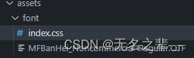
/* index.css文件中内容 */
@font-face {
    font-family: 'MFBanHei'; //字体名称
    src: url('./MFBanHei_Noncommercial-Regular.OTF'); //字体文件
}
全局引入main.js 或者单独使用在相关的页面中写入:
// 导入css字体样式
import '@/assets/font/index.css'
使用:
font-family: MFBanHei;
15、设置标题前面的竖线
效果图: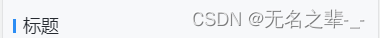
.title {
          position: relative;
	          &::before {
	            content: '';
	            width: 3px;
	            height: 14px;
	            background: #2c8df4;
	            display: block;
	            position: absolute;
	            left: 0px;
	            top: 50%;
	            transform: translateY(-50%);
	          }
        }
16、底部导航栏适配ios
首先要设置viewport-fit=cover,要不然下面的属性不会生效
.tab {
	  padding-bottom: 0;
	  padding-bottom: constant(safe-area-inset-bottom);
	  padding-bottom: env(safe-area-inset-bottom);
}
17、css的组合,全局作用域和局部作用域
具体介绍:地址
在 CSS Modules 中,一个选择器可以继承另一个选择器的规则,这称为"组合"
.className {
  background-color: blue;
}

.title {
  composes: className;
  color: red;
}
全局和局部作用域
<style scoped>
/* 局部作用域  */
:local(.title) {
  color: red;
}
/* 全局作用域 */
:global(.title) {
  color: green;
}
</style>
18、网站置灰效果filter(其它属性用法地址)
filter 属性定义了元素(通常是)的可视效果(例如:模糊与饱和度)

 /* 可以写在body中 */
 body {
   -webkit-filter: grayscale(100%); /* Chrome, Safari, Opera */
    filter: grayscale(100%);
 }
19、字母大小写转换
.text {text-transform: uppercase}     /* 将所有字母变成大写字母 */
.text {text-transform: lowercase}    /* 将所有字母变成小写字母 */
.text {text-transform: capitalize}  /* 首字母大写 */
.text {font-variant: small-caps}   /* 将字体变成小型的大写字母 */
20、文字模糊效果
.text {
  color: transparent;
  text-shadow: 0 0 5px #000; /* 模糊距离越大越模糊 */
}
模糊效果:
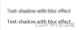
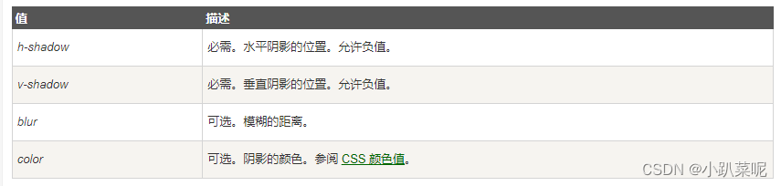
text-shadow值的属性含义:
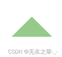
21、css实现直角三角形
<div class="triangle"></div>
.triangle {
    width: 0;
    height: 0;
    border-color: transparent rgba(45, 150,23, 0.5) transparent transparent;//设置其它边颜色透明
    border-style: solid;
    border-width: 100px 100px 0 0;//三角形边的大小
    transform: rotate(-90deg);
 }
效果图:

其它角度的可以调整旋转:
例如
不旋转:

旋转90:

旋转225
22、修改第三方样式
如果发现直接修改uni-ui或其它第三方组件的样式无效,使用了deep也无效有以下两种方法可以尝试:
(1)在选项中加入styleIsolation: 'isolated’来达到解除样式隔离的目的;
options: { styleIsolation: 'shared' },
(2)全局修改,在app.vue中直接修改
23、设置字体颜色渐变
 .text {
    background: linear-gradient(90deg, #68ffff 0%, #ffffff 100%); /* 设置渐变背景色 */
    -webkit-background-clip: text;                    /* 用文本剪辑背景 */
   -webkit-text-fill-color: transparent;              /* 设置字体颜色透明 */
 }
24、tarnsform的scale和translate同时使用
同时使用scale和translate会导致translate失效
可以使用scale和roate实现
img {
      scale:1.5 1.5;
      transform-origin:center center;
      transform:rotate(90deg)

}
25、Scss–控制指令(@if, @for, @each, @while)–使用,可以写在公共的css里面,可以减少很多重复的样式书写
//例如定义主题字体色
@for $val from 12 through 40 {
  .text1-#{$val} {
    font-weight: 500;
    font-size: $val * 1px;
    color: red; //红色
  }

  .text2-#{$val} {
    font-weight: 400;
    font-size: $val * 1px;
    color: green; //绿色
  }

  .text3-#{$val} {
    font-weight: 400;
    font-size: $val * 1px;
    color: blue; //蓝色
  }
}
使用:例如你需要一个20px的红色字体样式
<div class="text1-20">哈哈哈哈哈哈</div>
//还可以这样设置
@each $val in 0, 10, 16, 20, 40 ,60 ,80 {
//里面的类可以根据自己的需求定义
  //margin
  .m-#{$val} {
    margin: $val * 1rpx;
  }
  .mlr-#{$val} {
    margin-left: $val * 1px;
    margin-right: $val * 1rpx;
  }

  //padding
  .p-#{$val} {
    padding: $val * 1rpx;
  }
  .plr-#{$val} {
    padding-left: $val * 1rpx;
    padding-right: $val * 1rpx;
  }
使用:设置margin,padding
<div class="m-20 p-20">哈哈哈哈哈哈哈哈哈哈哈哈</div>
26、v-bind使用: (vue单文件组件的 style标签支持使用 v-bind CSS 函数将 CSS 的值链接到动态的组件状态)官网例子
可以用于需要动态计算的样式,v2和v3都可用
用法:
.text {
  color: v-bind(color);
}
p {
  color: v-bind('theme.color');
}
27、列表左右布局,右边的设置flex:1,右边内容过多时会把左边的给挤没了,右边设置一个宽度就可以了。
例如:
  <div class="item">
	<img :src="picUrl"  class="item_left"/>
	<div class="item_right">
	  <span class="item_text">{{ realName }}</span>
	  <span class="item_tag">{{ communityName }}</span>
	</div>
 </div>
.item {
   display:flex;
   align-items: center;
   &_left {
      width:80px;
      height:80px
      margin-right:10px;
   }
   &_right {
      flex:1;
      width:0;
   }
}
28、field-sizing
field-sizing 可以轻松实现输入框尺寸自动跟随输入内容的效果,又两个可选值,fixed | content;fixed表示默认大小,跟随浏览器的默认尺寸;content大小随着内容自适应
input {
 field-sizing: content;
 width: 200px;
}
29、 gap
用于flex中,用于设置flex元素之间的间距,行间距和列间距;
gap 是 row-gap 和 column-gap 的简写方式;
content {
 display: flex;
 gap: 10px 20px; //列间距、行间距
}
.item {
 flex:1;
}


 1463
1463


 被折叠的 条评论
为什么被折叠?
被折叠的 条评论
为什么被折叠?
 到【灌水乐园】发言


