


设置坐标轴的标签、刻度范围和刻度标签
import numpy as np
import matplotlib.pyplot as plt
plt.rcParams['font.sans-serif'] = ['SimHei']
plt.rcParams['axes.unicode_minus'] = False
x = np.linspace(-np.pi, np.pi, 256, endpoint=True)
y1, y2 = np.sin(x), np.cos(x)
plt.plot(x, y1, x, y2)
# 设置 x 轴和 y 轴的标签
plt.xlabel("x 轴 ")
plt.ylabel("y 轴 ")
plt.xlim(x.min() * 1.5, x.max() * 1.5)
plt.xticks([-np.pi, -np.pi/2, 0, np.pi/2, np.pi], [r'$-\pi$', r'$-\pi/2$',
 r'$0$', r'$\pi/2$', r'$\pi$'])
plt.show()
import matplotlib.pyplot as plt
plt.rcParams['font.sans-serif'] = ['SimHei']
plt.rcParams["axes.unicode_minus"] = False
labels = [" 哪吒之魔童降世 ", " 流浪地球 ", " 复仇者联盟 4: 终局之战 ",
" 疯狂的外星人 ", " 飞驰人生 ", " 烈火英雄 ", " 蜘蛛侠 : 英雄远征 ",
" 速度与激情 : 特别行动 ", " 扫毒 2 : 天地对决 ", " 大黄蜂 "," 惊奇队长 ",
" 比悲伤更悲伤的故事 ", " 哥斯拉 2: 怪兽之王 ", " 阿丽塔 : 战斗天使 ",
" 银河补习班 "]
bar_width = [48.57, 46.18, 42.05, 21.83, 17.03, 16.70, 14.01, 13.84,
12.85, 11.38, 10.25, 9.46, 9.27, 8.88, 8.64]
y_data = range(len(labels))
fig = plt.figure()
ax = fig.add_subplot(111)
ax.barh(y_data, bar_width, height=0.2, color='orange')
# 设置 x 轴和 y 轴的标签
ax.set_xlabel(" 总票房 ( 亿元 )")
ax.set_ylabel(" 电影名称 ")
# 设置 y 轴的刻度线位置、 刻度标签
ax.set_yticks(y_data)
ax.set_yticklabels(labels)
plt.show() 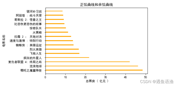
import matplotlib.pyplot as plt
plt.rcParams['font.sans-serif'] = ['SimHei']
plt.rcParams['axes.unicode_minus'] = False
kinds = [' 购物 ', ' 人情往来 ', ' 餐饮美食 ', ' 通信物流 ', ' 生活日用 ',
' 交通出行 ', ' 休闲娱乐 ', ' 其他 ']
money_scale = [800 / 3000, 100 / 3000, 1000 / 3000, 200 / 3000,
300 / 3000, 200 / 3000, 200 / 3000, 200 / 3000]
dev_position = [0.1, 0.1, 0.1, 0.1, 0.1, 0.1, 0.1, 0.1]
plt.pie(money_scale, autopct='%3.1f%%', shadow=True,
explode=dev_position, startangle=90)
# 添加标题
plt.title(' 支付宝月账单报告 ')
# 添加图例
plt.legend(kinds, loc='upper right', bbox_to_anchor=[1.3, 1.1])
plt.show()
import numpy as np
import matplotlib.pyplot as plt
plt.rcParams['font.sans-serif'] = 'SimHei'
plt.rcParams['axes.unicode_minus'] = False
x_speed = np.arange(10, 210, 10)
y_distance = np.array([0.5, 2.0, 4.4, 7.9, 12.3,
17.7, 24.1, 31.5, 39.9, 49.2,
59.5, 70.8, 83.1, 96.4, 110.7,
126.0, 142.2, 159.4, 177.6, 196.8])
plt.scatter(x_speed, y_distance, s=50, alpha=0.9, linewidths=0.3)
# 设置 x 轴的标签、 刻度标签
plt.xlabel(' 速度 (km/h)')
plt.ylabel(' 制动距离 (m)')
plt.xticks(x_speed)
# 显示网格
plt.grid(b=True, linewidth=0.3)
plt.show()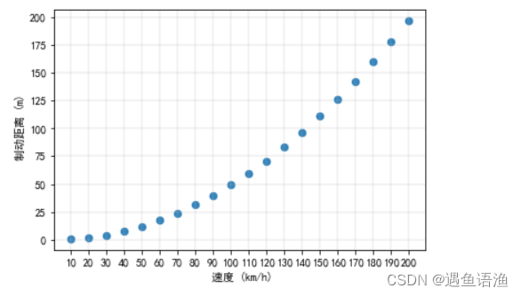
添加参考线和参考区域
import numpy as np
import matplotlib.pyplot as plt
plt.rcParams['font.sans-serif'] = ['SimHei']
#plt.rcParams['axes.unicode_minus']=False
men_means = (90.5, 89.5, 88.7, 88.5, 85.2, 86.6)
women_means = (92.7, 87.0, 90.5, 85.0, 89.5, 89.8)
ind = np.arange(len(men_means)) # 每组柱形的 x 位置
#width =0.2
width=0.2         # 各柱形的宽度
fig = plt.figure()
ax = fig.add_subplot(111)
ax.bar(ind - width / 2, men_means, width, label=' 男生平均成绩 ')
ax.bar(ind + 0.2, women_means, width, label=' 女生平均成绩 ')
ax.set_title(' 高二各班男生、 女生英语平均成绩 ')
ax.set_ylabel(' 分数 ')
ax.set_xticks(ind)
ax.set_xticklabels([' 高二 1 班 ', ' 高二 2 班 ', ' 高二 3 班 ', ' 高二 4 班 ',
 ' 高二 5 班 ', ' 高二 6 班 '])
# 添加参考线
ax.axhline(88.5, ls='--', linewidth=1.0, label=' 全体平均成绩 ')
ax.legend(loc="lower right")
plt.show()
添加注释文本
import matplotlib.pyplot as plt
import numpy as np
plt.rcParams['font.sans-serif'] = ['SimHei']
plt.rcParams['axes.unicode_minus'] = False
x = np.arange(1, 8)
y = np.array([10770, 16780, 24440, 30920, 37670, 48200, 57270])
bar_rects = plt.bar(x, y, tick_label=["FY2013", "FY2014", "FY2015",
 "FY2016", "FY2017", "FY2018", "FY2019"], width=0.5)
# 添加无指向型注释文本
def autolabel(rects):
#""" 在每个矩形条的上方附加一个文本标签 , 以显示其高度 """
        for rect in rects:
            height=rect.get_height()
            #height = rect.get_height()   # 获取每个矩形条的高度
            plt.text(rect.get_x() + rect.get_width() / 2, height + 300,
                s='{}'.format(height),
                ha='center', va='bottom')
autolabel(bar_rects)
plt.ylabel('GMV( 亿元 )')
plt.show()
添加表格
import matplotlib.pyplot as plt
plt.rcParams['font.sans-serif'] = ['SimHei']
plt.rcParams['axes.unicode_minus'] = False
kinds = [' 面粉 ', ' 全麦粉 ', ' 酵母 ', ' 苹果酱 ', ' 鸡蛋 ', ' 黄油 ', ' 盐 ', ' 白糖 ']
weight = [250, 150, 4, 250, 50, 30, 4, 20]
total_weight = 0
for i in weight:
    total_weight += i
batching_scale = [i / total_weight for i in weight]
plt.pie(batching_scale, autopct='%3.1f%%')
plt.legend(kinds, loc='upper right', bbox_to_anchor=[1.1, 1.1])
# 添加表格
plt.table(cellText=[weight], cellLoc='center', rowLabels=[' 重量 (g)'], colLabels=kinds, loc='lower center')
plt.show()


 1488
1488


 被折叠的 条评论
为什么被折叠?
被折叠的 条评论
为什么被折叠?
 到【灌水乐园】发言


