


python作为最常用的语言之一,其绘图功能也是及其强大的,但程序绘图有个通病,细节调整的时候比较麻烦,很多参数不知道如何设置,因此本文概述了python绘图的总体框架及绘图参数的优化调整
1. 建立画布设置子图
matplotlib中的图像都可以分为画布(figure)和子图(Axes)
画布:相当于是一张绘画的白纸,没有画布图像则无法显示,如果是论文写作的话,子图应用相对更多一些,建议使用子图绘图
子图:除去画布之外,一切绘制图形的对象都包含在子图中(如:axis/title/label等)

导入绘图库
"""
Author: Shuaijie
Blog: https://blog.csdn.net/weixin_45452300
公众号:AgbioIT
date: 2022/2/10
desc: The summary of plotting with python
"""
import numpy as np
import pandas as pd
import matplotlib.pyplot as plt
import seaborn as sns
sns.set_style("whitegrid") # 使用seaborn主题
# import matplotlib as mpl
# mpl.rcParams.update(mpl.rcParamsDefault)  # 恢复默认主题
# 创建命令画布,在画布上添加子图
fig = plt.figure(figsize=(10, 5), dpi= 80,facecolor="white")
ax1 = fig.add_subplot(121)  # 表示创建一行两列的两个子图,此为第一个
ax2 = fig.add_subplot(122)

# 也可使用plt直接画子图
fig = plt.figure(figsize=(10, 5), dpi= 80,facecolor="white")
ax1 = plt.subplot(121)  # 表示创建一行两列的两个子图,此为第一个
ax2 = plt.subplot(122)
ax1.set_xticks(range(2, 8))
ax1.set_xticklabels([1,2,3,4,5,6])
ax2.tick_params(axis="both", which="both", labelsize=15,
                bottom=False, top=True, labelbottom=True,
                left=False, right=False, labelleft=True, direction='in')  # 坐标轴刻度及标签参数
ax1.set_title('Bar Chart for Highway Mileage', fontdict={'size':22}, fontproperties='Times New Roman')

# 使用subplots时axes会是一个多维元组的形式存在
fig, axes = plt.subplots(nrows=2, ncols=2, figsize=(12,10), sharex=True, sharey=True)
axes[0][1] # 第一行第二个图
for axis in axes.flatten():  # 循环提取坐标轴
    axis
    axis.tick_params(axis="both", which="both", direction='in')  # 设置坐标轴向内
fig.subplots_adjust(hspace=0.1, wspace=0.08)  # 设置子图之间距离

# 通过添加子图更加个性化的设置子图
fig = plt.figure(figsize=(10, 6), dpi= 80,facecolor="white")
grid = plt.GridSpec(4, 4, hspace=0.5, wspace=0.2)
#在分割完毕的画布上确认子图的位置
ax_main = fig.add_subplot(grid[:-1, :-1])
ax_right = fig.add_subplot(grid[:-1, -1], xticks=[], yticklabels=[])
ax_bottom = fig.add_subplot(grid[-1, 0:-1], xticklabels=[], yticklabels=[])

2. 选择绘图样式
各个绘图的具体参数不再介绍
## 主要的绘图函数
# 散点图,两种数据输入格式
ax3.axhline(1, linestyle='dashed', color='darkorange')   # 默认绘制贯穿坐标轴的横线或竖线(axvline)
plt.scatter(midwest.loc[midwest["category"]==categories[i],"area"]
                ,midwest.loc[midwest["category"]==categories[i],"poptotal"]
                ,s=20
                ,c=np.array(plt.cm.tab10(i/len(categories))).reshape(1,-1)
                ,label=categories[i]
               )
plt.scatter("area","poptotal",
           data = midwest.loc[midwest.category == "HLU",:],
            s=300,
            facecolors="None",
            edgecolors="red",
            label = "Selected")
# 直接利用子图绘制
axes.scatter('displ', 'hwy'
                , s=df.cty*4 #设置尺寸以影响气泡图,这里是城市里程/加仑
                , data=df
                , c=df.manufacturer.astype('category').cat.codes #这是按类别编码的一种写法
                , cmap="tab10" #colormap可以根据自己喜欢的随意修改
                , edgecolors='gray', linewidths=.5, alpha=.9)

# 最佳拟合曲线散点图
gridobj = sns.lmplot(x="displ" #横坐标:发动机排量
                     , y="hwy" #纵坐标:公路里程/加仑
                     , hue="cyl" #分类/子集,汽缸数量
                     , data=df_select #能够输入的数据
                     , height=8 #图像的高度(纵向,也叫做宽度)
                     , aspect=1.6 #图像的纵横比,因此 aspect*height = 每个图像的长度(横向),单位为英寸
                     , palette='tab10' #色板,tab10
                     , legend = False #不显示图例
                     , scatter_kws=dict(s=60, linewidths=.7, edgecolors='black') #其他参数
                     , truncate=False
                     , )

# 抖动散点图
sns.stripplot(x=df.cty, y=df.hwy
              , jitter=0.25 #抖动的幅度
              , size=8
              , linewidth=.5
              , palette='tab10'
              , ax=axes
             )

# 直方图
ax_right.hist(df.hwy, 40, histtype='stepfilled', orientation='horizontal', color='deeppink')

# 热力图
h = sns.heatmap(df.corr() #需要输入的相关性矩阵
            , xticklabels=df.corr().columns #横坐标标签
            , yticklabels=df.corr().columns #纵坐标标签
            , cmap='RdYlGn' #使用的光谱,一般来说都会使用由浅至深,或两头颜色差距较大的光谱
         #   , cmap='winter' #不太适合做热力图的光谱
            , center=0 #填写数据的中值,注意观察此时的颜色条,大于0的是越来越靠近绿色,小于0的越来越靠近红色
         #   , center= -1 #填写数据中的最大值/最小值,则最大值/最小值是最浅或最深的颜色,数据离该极值越远,颜色越浅/颜色越深
            , annot=True # 可以输入相同大小的array显示
            , annot_kws={'size':16}
            , cbar=False
           )
cb = h.figure.colorbar(h.collections[0])  # 显示colorbar,此种方法需要先关闭cbar
cb.ax.tick_params(labelsize=16, grid_color='b', grid_linewidth=5, grid_alpha=0, colors='k',pad=5 )  # 设置colorbar刻度字体大小。

# 成对分析图
sns.pairplot(df #数据,各个特征和标签
             , kind="scatter" #要绘制的图像类型kind:绘制的相关性图像类型,可以选择“scatter”散点图或者“reg”带拟合线的散点图
             , hue="species" #类别所在的列(标签)
             , plot_kws=dict(s=40, edgecolor="white", linewidth=1) #散点图的一些详细设置
            )

# 差值面积图
plt.fill_between(x[1:], y_returns[1:], 0, where=y_returns[1:] <= 0, facecolor='red', interpolate=True, alpha=0.7) #小于0的部分填充为红色

# 密度曲线图
sns.kdeplot(df.loc[df['cyl'] == 8, "cty"], shade=True, color="orange", label="Cyl=8", alpha=.7)      #绘制气缸数为8的密度曲线

# 直方密度图
sns.distplot(df.loc[df['class'] == 'minivan', "cty"], color="g", label="minivan", hist_kws={'alpha':.7}, kde_kws={'linewidth':3})

# 箱型图
sns.boxplot(x='class', y='hwy', data=df, notch=False) #绘制基础箱型图

# 小提琴图
sns.violinplot(x='class', y='hwy', data=df, scale='width', inner='quartile')

# 饼图
wedges, texts, autotexts = ax.pie(x=data,
                                   autopct=lambda x: "{:.2f}% ({:d})".format(x,int(x/100.*np.sum(data))),
                                   colors=plt.cm.Dark2.colors, #图形的颜色
                                   startangle=150, #第一瓣扇叶从什么角度开始
                                   explode=explode #扇叶与扇叶之间的距离
                                  )

# 树形图
squarify.plot(sizes=sizes, label=labels, color=colors, alpha=.8)

# 柱状图
plt.bar(df['manufacturer'], df['counts'], color=c, width=.5)

# 折线图
plt.plot('date', 'value', data=df, color='tab:red')
# plot()函数的第一个参数表示横坐标数据,第二个参数表示纵坐标数据
# 第三个参数表示颜色、线型和标记样式
# 颜色常用的值有(r/g/b/c/m/y/k/w)
# 线型常用的值有(-/--/:/-.)
# 标记样式常用的值有(./,/o/v/^/s/*/D/d/x/</>/h/H/1/2/3/4/_/|)

# 雷达图
plt.polar(angles,                      # 设置角度
          scores,                      # 设置各角度上的数据
          'rv--',                      # 设置颜色、线型和端点符号
          linewidth=2)                 # 设置线宽
3. 细化坐标轴参数
3.1 绘图区域装饰
#预设图像的各种属性
large = 22; med = 16; small = 12
params = {'axes.titlesize': large, #子图上的标题字体大小
          'legend.fontsize': med, #图例的字体大小
          'figure.figsize': (16, 10), #图像的画布大小
          'axes.labelsize': med, #标签的字体大小
          'xtick.labelsize': med, #x轴上的标尺的字体大小
          'ytick.labelsize': med, #y轴上的标尺的字体大小
          'figure.titlesize': large} #整个画布的标题字体大小
plt.rcParams.update(params) #设定各种各样的默认属性,运行plt.rcParams可查看所有参数
plt.style.use('seaborn-whitegrid') #设定整体风格
sns.set_style("white") #设定整体背景风格  (主要是为了去掉图例的框)
# import matplotlib as mpl
# mpl.rcParams.update(mpl.rcParamsDefault)  # 恢复默认主题
3.2 颜色
# 在matplotlib中,有众多光谱供我们选择:https://matplotlib.org/tutorials/colors/colormaps.html
# 我们可以在plt.cm.tab10()中输入任意浮点数,来提取出一种颜色
# 光谱tab10中总共只有十种颜色,如果输入的浮点数比较接近,会返回类似的颜色
# 这种颜色会以元祖的形式返回,表示为四个浮点数组成的RGBA色彩空间或者三个浮点数组成的RGB色彩空间中的随机色彩

color = '#%02x' % int(df[band][j] / 60) + '6666' # 设置颜色随值大小变化(16进制的颜色代码)
colors = [plt.cm.tab10(i/float(len(categories)-1)) for i in range(len(categories))]  # 在光谱中输入浮点数生成色谱
ax.scatter(local_df['lon'][j], local_df['lat'][j],s=local_df[band][j]/8, c=np.array(plt.cm.Reds(local_df[band][j]/local_df[band].max())).reshape(1,-1), marker='.')
# 在绘图中使用浮点颜色条时要转为array并转置
color = [0.5, 0.6, 0.5, 1] # RGB or RGBA设置颜色
all_colors = list(plt.cm.colors.cnames.keys()) # 提取出color spectrum name
# 使用seaborn生成调色板
colors2 = sns.color_palette(['#4595CA', '#E6B729', '#49B574', '#D61818', '#9470B4'])
# data_type: {‘sequential’, ‘diverging’, ‘qualitative’}
sns.palplot(sns.color_palette(['#4595CA', '#E6B729', '#49B574', '#D61818', '#9470B4']))
sns.color_palette("Greens",as_cmap=False)
sns.color_palette("Greens",as_cmap=True)


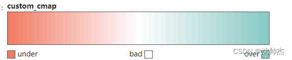
自定义连续的camp
from matplotlib.colors import LinearSegmentedColormap

# Define the colors for the start, midpoint, and end
start_color = '#f17c64'  # A kind of light red
mid_color = '#ffffff'    # White
end_color = '#86cac4'    # A pale teal

# Create the colormap
custom_cmap = LinearSegmentedColormap.from_list('custom_cmap', [start_color, mid_color, end_color], N=256)
custom_cmap
3.3 标注
plt.annotate('Mercedes Models', xy=(0.0, 11.0), xytext=(1.0, 11), xycoords='data',
            fontsize=15, ha='center', va='center',
            bbox=dict(boxstyle='square', fc='firebrick'),
            arrowprops=dict(arrowstyle='-[, widthB=2.0, lengthB=1.5', lw=2.0, color='steelblue'), color='white')
axes.annotate(" RMSE  = %.2f Mg/ha" % tagp_rmse[i], xy=('2019-10-20', 10), family='Helvetica', weight='normal', fontsize=16)
# 关于annotate相关参考资料:https://matplotlib.org/tutorials/text/annotations.html?highlight=boxstyle
plt.text('2019-10-20', 17.8, annote[i], family='Helvetica', weight='normal', fontsize=17)

plt.text(x,y,s
        ,fontdict={'color':'red' if x < 0 else 'green', 'size':14} #此处添加了颜色和尺寸,以字典的形式打包
        ,horizontalalignment='right' if x<0 else 'left' #水平对齐参数,有left,right,center三种选择
        ,verticalalignment='center' )#垂直对齐参数,有bottom,top,center三种选择
ax.text(0.5, 0.5, 'BEFORE'
        , ha='right'
        , va='center'
        , fontdict={'size':18, 'weight':700, 'color': 'k', 'family': 'Arial'}  # 字体字号颜色
        , bbox=dict(boxstyle="round",ec=[0.7766,0.8776,0.9929], fc=[0.8666,0.9176,0.9529]) # 添加框的颜色
        , transform=ax.transAxes  # 以ax轴线比例确定位置(0-1)transform=fig.transFigure以fig为底的比例
        )
给柱形图添加显著性差异
需要注意的是要将ci设置成‘sd’才能确保误差棒使用的是sd以便于在误差线上添加标注
# 绘制NHI柱形图
NHI = pd.read_excel(r'C:\Users\Administrator\产量汇总.xlsx', sheet_name='产量三要素')
b = sns.barplot(x="Year", y="NHI", hue="处理", data=NHI, capsize=0.1, errwidth=1, palette='tab10',
                ec=[0.1]*3,linewidth=0.8, saturation=0.85, ci="sd")
# add text label
# 默认排序与图的排序不一致,需要定义排序规则
from pandas.api.types import CategoricalDtype  # 自定义排序
cat_size_order = CategoricalDtype(['N0', 'N75', 'N150', 'N225', 'N300'], ordered=True)
std = NHI.groupby(by=['处理', 'Year']).std(ddof=1).reset_index()
std['处理'] = std['处理'].astype(cat_size_order)  # 自定义排序
std.sort_values(by=['处理', 'Year'], inplace=True)
# std.to_excel(r'C:\Users\Administrator\Desktop\2.xlsx')
# 四个簇,每个簇五个条
sig = ['b', 'b', 'b', 'b',
      'a', 'ab', 'b',  'a',
      'b', 'a', 'a',  'a',
      'bc', 'a', 'b',  'b',
      'c', 'ab', 'b',  'b']
for v, s, p in zip(std['NHI'], sig, b.patches):
    # get the height of each bar
    height = p.get_height()
    # adding text to each bar
    b.text(x = p.get_x()+(p.get_width()/2), # x-coordinate position of data label, padded to be in the middle of the bar
            y = height + 0.01 + v, # y-coordinate position of data label, padded 100 above bar
            s = s, # data label, formatted to ignore decimals
            ha = 'center', # sets horizontal alignment (ha)
            fontdict={'family' : 'Arial', 'size': 10})
plt.tick_params(axis="both", which="both", labelsize=12, direction='in')
plt.ylim=(0.45, 0.92)
plt.legend(title='', frameon=False, loc='upper left', fontsize = 12)
3.4 轴域参数设置
设置xy范围
plt.gca().set(xlim=(0, 0.12), ylim=(0, 80000)) #控制横纵坐标的范围plt.gca()为获取plt中的子图
ax_main.set(xlim=(0.5, 7.5), ylim=(0, 50), title='边缘直方图 ', xlabel='(L)', ylabel='km')
plt.xlim(0, 5)
plt.ylim(0, 5)
ax.set_xlim(10, 27)
设置title和label和补丁
plt.title('dsafdaf', fontsize=20, fontproperties='stkaiti')
ax.set_title('Bar Chart for Highway Mileage', fontdict={'family' : 'Helvetica',
    'weight' : 'normal',
    'size'   : 16,
    })  # 也可以用fontproperties fontsize等设置字体样式及大小
ax_main.title.set_fontsize(20)

plt.ylabel('Population',fontsize=22, fontproperties='Arial') #坐标轴上的标题和字体大小
plt.xlabel("N rate (kg$⋅$ha$^{-1})$",fontsize=20, fontproperties='Arial')
ax.set_ylabel('里程',fontsize=20, fontproperties='Arial', weight='normal')
# 采用获取坐标轴label的方式更改字体字号
[item.set_fontsize(20) for item in [ax_main.xaxis.label, ax_main.yaxis.label]]
[label.set_fontname('Arial') for label in ([ax_main.xaxis.label, ax_main.yaxis.label]
# 同时修改label及ticklabels
[item.set_fontsize(12) for item in ([axes[1,0].xaxis.label, axes[1,0].yaxis.label] + axes[1,0].get_xticklabels() + axes[1,0].get_yticklabels())]

# transform=fig.transFigure确保矩形显示在图像最上方,如果我们对fig作画,不会被ax挡住
# , zorder=5绘图参数里加上此参数就可以设置图层位置
p1 = patches.Rectangle((.57, -0.005), width=.33, height=.13, alpha=.1, facecolor='green', transform=fig.transFigure)
设置ticks和ticklabels
# 设置ticks,ticks可以是数组,加上小数是平移,对应可以赋予ticklabel
plt.xticks(ticks=bins[:-1]+0.3, labels=np.unique(df[x_var]).tolist(),
			rotation=90, horizontalalignment='left', fontsize=16,
			fontproperties='Arial') #设定X轴刻度标签
plt.yticks(index, cars, fontsize=12) # 第一个参数类似于ax_main.set_xticks()第二个ax_main.set_xticklabels()设置ticks和tickslabel

# 子图设置ticks和tickslabel
ax3.tick_params(axis = 'y', labelsize=16) # 可以只修改坐标轴的格式,
# 设置坐标轴间隔
from matplotlib.ticker import MultipleLocator
axis.xaxis.set_major_locator(MultipleLocator(2)) # 设置坐标轴间隔为2
ax.set_xticks()  # plt.xticks的第一个参数相同,缺点是不输入label不能修改参数
ax.set_xticklabels(df.manufacturer.str.upper(), rotation=60,
				fontdict={'horizontalalignment': 'right', 'size':20,
				'weight':500, 'family': 'Arial'})
# 同时修改label及ticklabels  ax.set_fontname('Arial')改字体
[item.set_fontsize(12) for item in ([axes[1,0].xaxis.label, axes[1,0].yaxis.label] + axes[1,0].get_xticklabels() + axes[1,0].get_yticklabels())]
# 通过tick参数设置刻度线,刻度线标签,刻度线方向,刻度线标签大小等具体效果可参见画布设置
plt.tick_params(axis="both", which="both", labelsize=15,
                bottom=False, top=False, labelbottom=True,
                left=False, right=False, labelleft=True,
                direction='in', length=1, width =1, color='k')  # plt可以改成axes

ax1.xaxis.set_tick_params(width=0.5, labelsize=6, direction='in', labelrotation=90) # 也可以获取单个轴来设置以上参数
axes.get_yaxis().set_visible(False)
axes.yaxis.set_visible(False)  # 与上句同义, 不显示刻度线和标签

ax.plot_date(df_results.index, df_results[var], 'b-')
fig.autofmt_xdate() # 使用plot_date绘图时自适应x轴,去除多余的标签

# 旋转轴刻度上文字方向的几种方法
ax.set_xticklabels(ax.get_xticklabels(), rotation=-90)
ax.set_xticklabels(corr.index, rotation=90)
ax1.xaxis.set_tick_params(labelrotation=90)
# 直接使用set方法一次更改多个内容
ax.set(ylim=(0, 200), xlabel='', ylabel='', xticklabels=['N0', 'N75', 'N150', 'N225', 'N300'])
# 直接更新全局的参数设置
plt.rcParams['axes.labelsize']=13  # xylabel标签的字体大小
plt.rcParams['ytick.labelsize']=12  # x轴上的标尺的字体大小
plt.rcParams['xtick.labelsize']=12
plt.rcParams['font.sans-serif']='Arial'
plt.rcParams['xtick.direction'] = 'in'
plt.rcParams['ytick.direction'] = 'in'
坐标轴框线设置
axes.invert_yaxis() #让y轴反向,为了美观所以让分布形成朝下的分布
plt.gca().spines['right'].set_alpha(.3)  # plt.gca()为获取坐标的子轴
plt.gca().spines['left'].set_alpha(.3)  # 设置框线透明度
plt.gca().spines['bottom'].set_alpha(.3)
plt.gca().spines['top'].set_color('red')
ax1.spines['bottom'].set_linewidth(0.2)# 设置框线宽度
ax1.xaxis.set_tick_params(width=0.5) # 设置刻度线宽度和刻度字体
# 设置框线是否可见
plt.gca().spines['top'].set_visible(True)
# 设置刻度线和标签是否可见
axes.get_yaxis().set_visible(False)
axes.yaxis.set_visible(False)  # 与上句同义, 不显示刻度线和标签
plt.setp(plt.gca().get_xticklabels(), visible=True) # 设置X轴刻度标签
plt.setp(plt.gca().get_yticklines(), visible=True) # 设置y刻度线
# plt.rcParams['xtick.direction'] = 'in' # 将x轴的刻度线方向设置向内, 不推荐使用
plt.gca().xaxis.set_tick_params(direction='in')  # 将x轴的刻度线方向设置向内
plt.axis('off') #不显示坐标轴
plt.tight_layout()  # 调整子图最优显示
图例
import matplotlib.font_manager as fm
myfont = fm.FontProperties(fname=r'C:\Windows\Fonts\STKAITI.ttf') # 使用Windows自带字体
plt.legend( fontsize = 16
			prop=myfont, #图例字体
			title='Legend', #图例标题
			loc='lower left', #图例左下角坐标为(0.43,0.75)也可以自己定loc=(0.02, 0.72),自定义可以定义在axes外定义在画布上
			bbox_to_anchor=(0.43,0.75),
			shadow=True, #显示阴影
			facecolor='yellowgreen', #图例背景色
			edgecolor='red', #图例边框颜色
			ncol=2, #显示为两列
			markerfirst=False, #图例文字在前,符号在后
			markerscale=0.5, #现有的图例气泡的某个比例
			frameon=False, # 去除边框
			handletextpad=0.2 # 文本和标签的距离
			)
prop = {'family' : 'Arial', 'size': 6}
# 自定义添加图例
red_patch = plt.plot([],[], marker="o", ms=10, ls="", mec=None, color='firebrick', label="Median")
patch1 = plt.plot([],[], marker="o", ms=10, ls="", mec=None, color='tab:cyan', label="cyl = 4")
patch2 = plt.plot([],[], marker="o", ms=10, ls="", mec=None, color='tab:green', label="cyl = 5")
patch3 = plt.plot([],[], marker="o", ms=10, ls="", mec=None, color='tab:olive', label="cyl = 6")
patch3 = plt.plot([],[], marker="o", ms=10, ls="", mec=None, color='tab:brown', label="cyl = 8")
ax.legend(fontsize=12,frameon=False)
# 不显示图例或删除图例
ax3.legend([],[], frameon=False)

# 修改图例顺序,绘制图例
handles, labels = axes[0, 0].get_legend_handles_labels()
handles = [handles[1], handles[0], handles[2]]
labels = [labels[1], labels[0], labels[2]]
axes[0, 0].legend(handles, labels, loc=(0.86, -0.17), fontsize=13)

# 自定义colorbar
sm = plt.cm.ScalarMappable(cmap=custom_cmap, norm=plt.Normalize(vmin=correlation_df.min().min(), vmax=correlation_df.max().max()))
cbar_ax = fig.add_axes([0.95, 0.09, 0.023, 0.8])# 可以调colorbar的位置和宽窄
cbar = fig.colorbar(sm, orientation='vertical', fraction=0.05, pad=0.03, cax=cbar_ax)
cbar.ax.tick_params(labelsize=12)  # Set font size to 10
4. 图片保存
plt.savefig('simulation.tif',bbox_inches='tight', dpi=600)  # bbox_inches防止保存丢失信息
matplotlib.rcParams['backend'] = 'SVG'
plt.savefig(r'C:\Users\Desktop\{}light interception.svg'.format(name[i]), format='svg') #  存为矢量图


 2万+
2万+


 被折叠的 条评论
为什么被折叠?
被折叠的 条评论
为什么被折叠?
 到【灌水乐园】发言


