


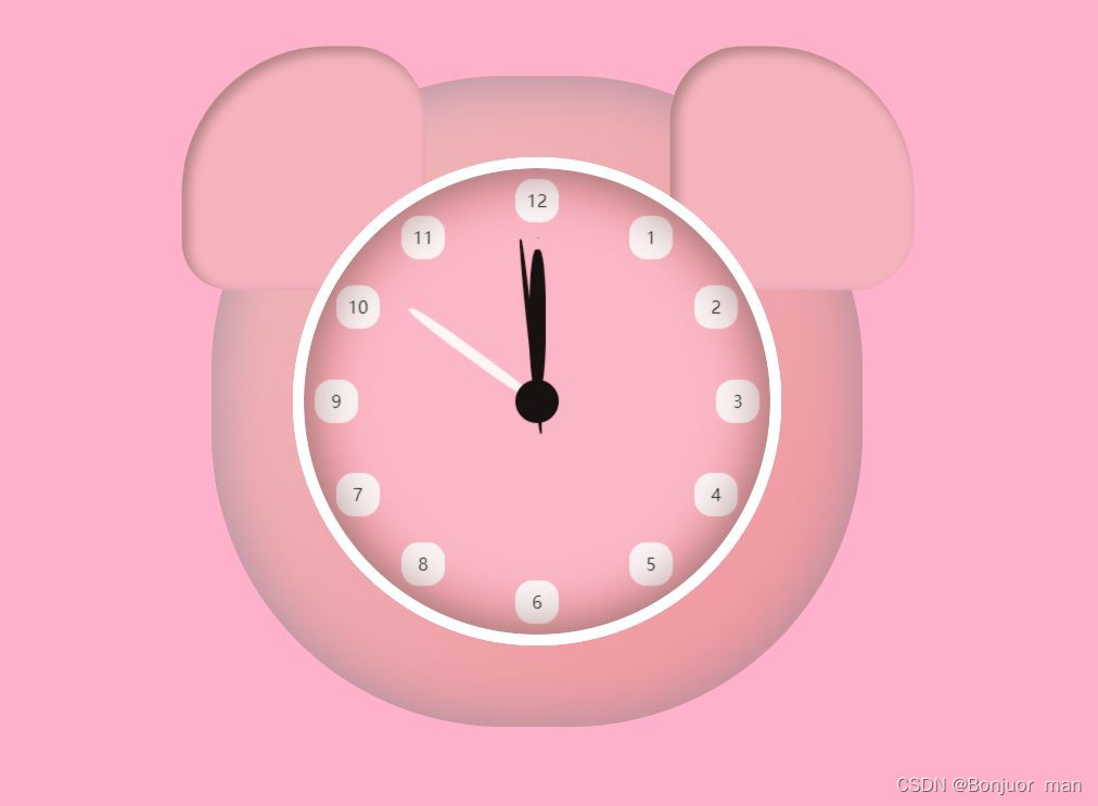
代码效果
HTML 基本框架
<!DOCTYPE html>
<html lang="en">
<head>
    <meta charset="UTF-8">
    <meta http-equiv="X-UA-Compatible" content="IE=edge">
    <meta name="viewport" content="width=device-width, initial-scale=1.0">
    <title>Document</title>
</head>
<html>
<body>
    <div class="phy">
        <div class="body">
            <div class="ear">
                <div></div>
                <div></div>
            </div >

            <div class="num">
                <p>1</p>
                <p>2</p>
                <p>3</p>
                <p>4</p>
                <p>5</p>
                <p>6</p>
                <p>7</p>
                <p>8</p>
                <p>9</p>
                <p>10</p>
                <p>11</p>
                <p>12</p>


                <div class="line">
                    <div class="hour-line" id="hour">
                        <div></div>
                    </div>
                    <div class="minute-line" id="min">
                        <div></div>
                    </div>
                    <div class="second-line" id="second">
                        <div></div>
                    </div>
               </div>

            <div id="circle">
                <ul id="kedu"></ul>
            </div>
               </ul>
               <p class="crilc"></p>
            </div>
            <div class="molid"></div>
        </div>
    </div>


</body>
</html>
CSS 代码
<style>
    *{
        margin: 0;
        padding: 0;
    }
    .phy>div{
        position: absolute;
    }
    body{
        background: rgb(255, 176, 202);
    }
    .ear>div{
        width: 225px;
        height: 225px;
        left: 50%;
        top: 50%;
        transform: translate(-50%,-50%);
        border-radius: 60% 30% 25% 20%;
        box-shadow: 5px 5px 10px 1px #b48484 inset;
        background: rgb(245, 179, 190);

    }
    .ear>div:nth-child(2){
        transform: translate(150%,-150%);
        border-radius: 30% 60% 25% 20%;
        box-shadow: 5px 5px 10px 1px #b48484 inset;
        background:rgb(245, 179, 190);
    }
    .body{
        width: 600px;
        height: 600px;
        left: 50%;
        top: 50%;
        margin-top: -300px;
        margin-left: -300px;
        border-radius: 45%;
        box-shadow: 0px 0px 50px 1px #a58e9c inset;
        background:linear-gradient(to right bottom, #eebbbf, #f1939c);
        z-index: 2000px;
    }
    .body>div{
        width: 430px;
        height: 430px;
        left: 50%;
        top: 50%;
        transform: translate(-50%,-50%);
        border-radius: 100%;
        box-shadow: 0px 0px 50px 1px rgb(160, 120, 120) inset;
        border: 10px solid rgb(255, 255, 255);
        background: pink;
        position: absolute;
    }
    .body>.molid{
        background: rgba(223, 165, 165, 0.1);
        backdrop-filter: saturate(150%) blur(0.5px);
    }
   .body>.num>p{
       width: 40px;
       height: 40px;
       border-radius: 40%;
       text-align: center;
       line-height: 40px;
       background: white;
       position: absolute;
   }
   .body>.num>p:nth-child(1){
       top: 8%;
       left: 100%;
       margin-top: 10px;
       margin-left:-130px;
   }
   .body>.num>p:nth-child(2){
       top: 23%;
       left: 100%;
       margin-top: 10px;
       margin-left: -70px;
   }
   .body>.num>p:nth-child(3){
       top: 50%;
       left: 100%;
       margin-top: -20px;
       margin-left: -50px;
   }
   .body>.num>p:nth-child(4){
       bottom: 23%;
       left: 100%;
       margin-bottom: 10px;
       margin-left:-70px;
   }
   .body>.num>p:nth-child(5){
       bottom: 8%;
       left: 100%;
       margin-bottom: 10px;
       margin-left:-130px;
   }
    .body>.num>p:nth-child(6){
       top: 100%;
       left: 50%;
       margin-top: -50px;
       margin-left: -20px;
   }
   .body>.num>p:nth-child(7){
       bottom: 23%;
       right: 100%;
       margin-bottom: 10px;
       margin-right:-70px;
   }
   .body>.num>p:nth-child(8){
       bottom: 8%;
       right: 100%;
       margin-bottom: 10px;
       margin-right:-130px;
   }
   .body>.num>p:nth-child(9){
       top: 50%;
       left: 0%;
       margin-top: -20px;
       margin-left: 10px;
   }
   .body>.num>p:nth-child(10){
       top: 23%;
       right: 100%;
       margin-top: 10px;
       margin-right: -70px;
   }
   .body>.num>p:nth-child(11){
       top: 8%;
       right: 100%;
       margin-top: 10px;
       margin-right:-130px;
   }

   .body>.num>p:nth-child(12){
       margin-top: 10px;
       left: 50%;
       margin-left: -20px;
   }
   .body>.num>.crilc{
       top: 50%;
       left: 50%;
       margin-top: -20px;
       margin-left: -20px;
       border-radius: 50%;
       background: black;
   }
 .body>.num>.line>div{
       width: 40px;
       height: 300px;
       top: 50%;
       margin-top: -150px;
       left: 50%;
       margin-left: -20px;
       position: absolute;
}

.body>.num>.line>.hour-line>div{
    width: 15px;
    height: 130px;
    left: 50%;
    margin-top: 10px;
    margin-left: -7.5px;
    border-radius: 40%;
    background:black;
    position: absolute;
}
.body>.num>.line>.minute-line>div{
    width: 10px;
    height: 140px;
    margin-top: 5px;
    left: 50%;
    margin-left: -5px;
    border-radius: 40%;
    background:white ;
    position: absolute;
}
.body>.num>.line>.second-line>div{
    width: 5px;
    height: 180px;
    left: 50%;
    margin-left: -2.5px;
    border-radius: 40%;
    background: rgb(0, 0, 0);
    position: absolute;
}


</style>
JS 代码
 <script>
               function time(){
                    let s=document.getElementById("second");//获取到时分秒的三个指针,后面用来动态让它们旋转起来。
                    let m=document.getElementById("min");
                    let h=document.getElementById("hour");

                    //获取时间。
                    let date=new Date();
                    let snum=date.getSeconds();//获取现在是多少秒。
                    let mnum=date.getMinutes();//获取现在是多少分,不能忘记加上 秒数/60。
                    let hnum=date.getHours(); //获取现在是多少时,不能忘记加上 分钟数/60。

                    s.style.transform=`rotate(${snum*6}deg)`;//设置的trasnform就可以让它们旋转起来,秒针时一秒旋转6度。
                    m.style.transform=`rotate(${mnum*6}deg)`//分针也是一分钟旋转6度。
                    h.style.transform=`rotate(${hnum*30}deg)`//这里时小时,一小时旋转30度,所以*30.
                }
                setInterval(time,1000)//用计时器每100ms运行这个time函数。
            </script>


 2476
2476


 被折叠的 条评论
为什么被折叠?
被折叠的 条评论
为什么被折叠?
 到【灌水乐园】发言


