


vue3 + element-plus + ts el-table封装
博客参考https://blog.csdn.net/weixin_45291937/article/details/125523244
1. 文件位置(根据自己的需求)
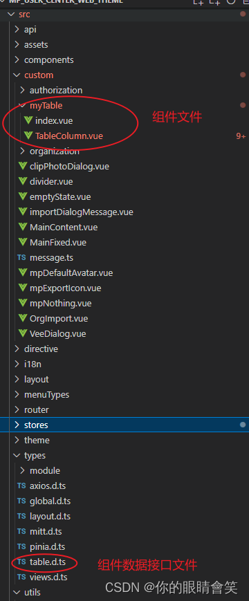
2. 在 custom 文件夹下面 创建 mytable 文件夹
3. 直接上代码
// index.vue

<template>
	<div class="el-table-box">
		<el-table ref="tableRef" check-strictly :class="[_options.showPagination ? 'isActive' : 'active']" :data="tableData" v-loading="fullLoading" v-bind="_options" default-expand-all highlight-current-row @selection-change="handleSelectionChange" @row-click="handleRowClick" @cell-click="handleCellClick" @sort-change="handleSortChange">
			<el-table-column v-if="_options.showCheckout" :index="indexMethod" v-bind="{ type: 'selection', width: '50' }"></el-table-column>
			<template v-for="(col, index) in  columns " :key="index">
				<!---复选框, 序号 (START)-->
				<el-table-column v-if="col.type === 'expand' || col.type === 'customCell'" :index="indexMethod" v-bind="col">
					<!-- 当type等于expand时, 配置通过h函数渲染、tsx语法或者插槽自定义内容 -->
					<template #default="{ row, $index }">
						<!-- render函数 (START) : 使用内置的component组件可以支持h函数渲染和txs语法 -->
						<component v-if="col.render" :is="col.render" :row="row" :index="$index" />
						<!-- 自定义slot (START) -->
						<slot v-else-if="col.slot" name="expand" :row="row" :index="$index"></slot>
					</template>
				</el-table-column>
				<el-table-column v-else-if="col.type === 'index' && (col.hideFlag || col.hideFlag == null)" :index="indexMethod" v-bind="{ type: 'index', width: '50', label: $t(col.label + '') }" width="65">
					<!-- 当type等于expand时, 配置通过h函数渲染、txs语法或者插槽自定义内容 -->
					<template #default="{ row, $index }">
						<!-- render函数 (START) : 使用内置的component组件可以支持h函数渲染和txs语法 -->
						<component v-if="col.render" :is="col.render" :row="row" :index="$index" />
						<!-- 自定义slot (START) -->
						<slot v-else-if="col.slot" name="expand" :row="row" :index="$index"></slot>
					</template>
				</el-table-column>
				<!-- 渲染插槽 START -->
				<TableColumn :col="col" v-else-if="col.hideFlag || col.hideFlag == null" @command="handleAction">
					<template v-for="slot in  Object.keys($slots) " #[slot]="scope: Record<string, any>">
						<slot :name=" slot " v-bind=" scope " />
					</template>
				</TableColumn>
				<!-- 渲染插槽 END -->
			</template>
			<template #empty>
				<div class="mp_tatble_nodata">
					<img class="active-daek" :src=" ImageUrl " alt="">
					<div>{{$t('message.application.btn.currently')}}</div>
				</div>
			</template>
		</el-table>
		<!-- 分页器 -->
		<div v-if=" _options.showPagination " class="mt20">
			<el-pagination v-bind=" _paginationConfig " @size-change=" pageSizeChange " @current-change=" currentPageChange " />
		</div>
	</div>
</template>
<script lang="ts" setup>
	import { ComputedRef, computed, ref, onMounted, defineAsyncComponent, withDefaults } from 'vue';
	import type { TableColumnCtx } from 'element-plus/es/components/table/src/table-column/defaults';
	import { ElTable } from 'element-plus';
	import ImageUrl from '/@/assets/nodata.png'

	const TableColumn = defineAsyncComponent(() => import('./TableColumn.vue'));
	export type SortParams<T> = {
		column: TableColumnCtx<T | any>;
		prop: string;
		order: Table.Order;
	};
	interface TableProps {
		tableData: Array<object>; // table的数据
		columns: Table.Column[]; // 每列的配置项
		options?: Table.Options;
		fullLoading?: boolean;
	}


	const props = withDefaults(defineProps<TableProps>(), {
		fullLoading: false,
	});
	const tableRef = ref<InstanceType<typeof ElTable>>();
	// 设置option默认值,如果传入自定义的配置则合并option配置项
	const _options: ComputedRef<Table.Options> = computed(() => {
		const option = {
			stripe: false,
			tooltipEffect: 'dark',
			showHeader: true,
			showPagination: false,
			rowStyle: () => 'cursor:pointer', // 行样式
		};
		return Object.assign(option, props?.options);
	});

	// 合并分页配置
	const _paginationConfig = computed(() => {
		const config = {
			total: 0,
			currentPage: 1,
			pageSize: 10,
			pageSizes: [10, 20, 50],
			layout: 'total, sizes, prev, pager, next, jumper'
		}
		return Object.assign(config, _options.value.paginationConfig)
	})
	const emit = defineEmits([
		'selection-change', // 当选择项发生变化时会触发该事件
		'row-click', // 当某一行被点击时会触发该事件
		'cell-click', // 当某个单元格被点击时会触发该事件
		'command', // 按钮组事件
		'size-change', // pageSize事件
		'current-change', // currentPage按钮组事件
		'pagination-change', // currentPage或者pageSize改变触发
		'sort-change', // 列排序发生改变触发
		'row-radio', // 单选
	]);
	// 自定义索引
	const indexMethod = (index: number) => {
		const tabIndex = index + (_paginationConfig.value.currentPage - 1) * _paginationConfig.value.pageSize + 1;
		return tabIndex;
	};
	// 切换pageSize
	const pageSizeChange = (pageSize: number) => {
		emit('size-change', pageSize);
		emit('pagination-change', 1, pageSize);
	};
	// 切换currentPage
	const currentPageChange = (currentPage: number) => {
		emit('current-change', currentPage);
		emit('pagination-change', currentPage, _paginationConfig.value.pageSize);
	};
	// 按钮组事件
	const handleAction = (command: Table.Command, row: any, index: number) => {
		emit('command', command, row, index);
	};

	// 多选事件
	const handleSelectionChange = (val: any) => {
		emit('selection-change', val);
	};
	//返回当前选中的行
	const getSelectionRows = () => {
		return tableRef.value?.getSelectionRows();
	};
	// 当某一行被点击时会触发该事件
	const handleRowClick = (row: any, column: any, event: MouseEvent) => {
		emit('row-click', row, column, event);
	};
	// 当某个单元格被点击时会触发该事件
	const handleCellClick = (row: any, column: any, cell: any, event: MouseEvent) => {
		if (column && column.className) {
			if (column.className == 'mp-highlight') {
				emit('cell-click', row, column, cell, event);
			}
		}
		if (_options.value.showRadio) {
			if (tableRef.value && tableRef.value) tableRef.value.setCurrentRow(row)
			emit('row-radio', row, column, cell, event);
		}
	};
	/**
	 *  当表格的排序条件发生变化的时候会触发该事件
	 * 在列中设置 sortable 属性即可实现以该列为基准的排序, 接受一个 Boolean,默认为 false。
	 * 可以通过 Table 的 default-sort 属性设置默认的排序列和排序顺序。
	 * 如果需要后端排序,需将 sortable 设置为 custom,同时在 Table 上监听 sort-change 事件,
	 * 在事件回调中可以获取当前排序的字段名和排序顺序,从而向接口请求排序后的表格数据。
	 */
	const handleSortChange = ({ column, prop, order }: SortParams<any>) => {
		emit('sort-change', { column, prop, order });
	};
	// 暴露给父组件参数和方法,如果外部需要更多的参数或者方法,都可以从这里暴露出去。
	defineExpose({ element: tableRef, fn: getSelectionRows });
</script>
<style lang="scss" scoped>
:deep(.el-image__inner) {
	transition: all 0.3s;
	cursor: pointer;

	&:hover {
		transform: scale(1.2);
	}
}

.el-table-box {
	height: 100%;

	.isActive {
		height: calc(100% - 45px) !important;
	}

	.active {
		height: 100%;
	}

	.mt20 {
		display: flex;
		justify-content: end;
	}
}

</style>
4. 安装 cnpm i -S dayjs (可以不安装 ,如果不安装就删除下面的标记部分)
 // TableColumn.vue

<script lang="ts" setup>
	import dayjs from 'dayjs'
	defineProps<{ col: Table.Column }>()
	const emit = defineEmits(['command', 'handleClickRow'])
	// 按钮组事件
	const handleAction = (command: Table.Command, { row, $index }: { row: any; $index: number }) => {
	    emit('command', command, row, $index)
	}
</script>
<template>
    <!-- 如果有配置多级表头的数据,则递归该组件 -->
    <template v-if="col.children?.length">
        <el-table-column :label="col.label" :width="col.width" :align="col.align">
            <TableColumn v-for="item in     col.children    " :col="item" :key="item.prop">
                <template v-for="slot in     Object.keys($slots)    " #[slot]="scope: Record<string, any>">
                    <slot :name=" slot " v-bind=" scope " />
                </template>
            </TableColumn>
            <template #header=" { column, $index } ">
                <component v-if=" col.headerRender " :is="col.headerRender" :column=" column " :index=" $index " />
                <slot v-else-if=" col.headerSlot " :name=" col.headerSlot " :column=" column " :index=" $index "></slot>
                <span v-else>{{ $t(column.label) }}</span>
            </template>
        </el-table-column>
    </template>
    <el-table-column v-else-if=" col.highlight " v-bind=" col " class-name='mp-highlight'>
        <template #header=" { column, $index } ">
            <component v-if=" col.headerRender " :is="col.headerRender" :column=" column " :index=" $index " />
            <slot v-else-if=" col.headerSlot " :name=" col.headerSlot " :column=" column " :index=" $index "></slot>
            <span v-else>{{ $t(column.label)}}</span>
        </template>
        <template #default=" { row, $index } ">
            <span>{{ row[col.prop!] }}</span>
        </template>
    </el-table-column>
    <!-- 其他正常列 -->
    <el-table-column v-else v-bind=" col ">
        <!-- 自定义表头 -->
        <template #header=" { column, $index } ">
            <component v-if=" col.headerRender " :is="col.headerRender" :column=" column " :index=" $index " />
            <slot v-else-if=" col.headerSlot " :name=" col.headerSlot " :column=" column " :index=" $index "></slot>
            <span v-else>{{ $t(column.label)}}</span>
        </template>
        <template #default=" { row, $index } ">

            <!-- 如需更改图片size,可自行配置参数 -->
            <el-image v-if=" col.type === 'image' " preview-teleported :hide-on-click-modal=" true " :preview-src-list=" [row[col.prop!]] " :src=" row[col.prop!] " fit="cover" class="w-9 h-9 rounded-lg" />

             <!-- day.js开始  (不安装可删除该部分)  -->
            <!--- 格式化日期 (本项目日期是时间戳,这里日期格式化可根据你的项目来更改) (START)-->
            <template v-else-if=" col.type === 'date' ">
                <!---十位数时间戳-->
                <span v-if=" String(row[col.prop!])?.length <= 10 ">
                    {{ dayjs.unix(row[col.prop!]).format(col.dateFormat ?? 'YYYY-MM-DD') }}
                </span>
                <!---十三位数时间戳-->
                <span v-else>{{ dayjs(row[col.prop!]).format(col.dateFormat ?? 'YYYY-MM-DD') }}</span>
            </template>
            <!-- day.js结束  -->

            <!-- 如果传递按钮数组,就展示按钮组 START-->
            <el-button-group v-else-if=" col.buttons?.length ">
                <el-button v-for="(    btn, index    ) in     col.buttons    " :key=" index " :size=" btn.size " :type=" btn.type " @click="handleAction(btn.command, { row, $index })">{{ btn.name }}</el-button>
            </el-button-group>

            <!-- render函数 (START) 使用内置的component组件可以支持h函数渲染和txs语法-->
            <component v-else-if=" col.render " :is="col.render" :row=" row " :index=" $index " />

            <!-- 自定义slot (START) -->
            <slot v-else-if=" col.slot " :name=" col.slot " :row=" row " :index=" $index "></slot>

            <!-- 默认渲染 (START)  -->

            <span v-else>{{ row[col.prop!] }}</span>

        </template>
    </el-table-column>
</template>
5. table.d.ts (表格全局接口文件)
// table.d.ts
declare namespace Table {
	type VNodeChild = import('vue').VNodeChild
	type Type = 'selection' | 'index' | 'expand' | 'image' | 'date'
    type Size = 'large' | 'default' | 'small'
    type Align = 'center' | 'left' | 'right'
    type Command = string | number
    type DateFormat = 'YYYY-MM-DD' | 'YYYY-MM-DD HH:mm:ss' | 'YYYY-MM-DD HH:mm' | 'YYYY-MM'
    type Order = 'ascending' | 'descending'
    interface ButtonItem {
        name: string,
        command: Command,
        size?: Size
        type?: 'primary' | 'success' | 'warning' | 'danger' | 'info',
    }
    interface Sort {
        prop: string
        order: Order
        init?: any
        silent?: any
    }
    interface Column {
   		// 对应列的类型。 如果设置了selection则显示多选框; 如果设置了 index 则显示该行的索引(从 1 开始计算); 如果设置了 expand 则显示为一个可展开的按钮
        type?: Type | 'customCell',
        label?: string,
        prop?: string,
        slot?: string
        width?: string,
        align?: Align,
        hideFlag?:boolean,
        hide?:boolean,
        fixed?:string|boolean,
        highlight?:boolean,//字段高亮
        dateFormat?: DateFormat // 显示在页面中的日期格式,简单列举了几种格式, 可自行配置
        showOverflowTooltip?: boolean,
        buttons?: ButtonItem[],
        render?: (row?: any, index?: number) => VNodeChild // 渲染函数,渲染这一列的每一行的单元格
        sortable?: boolean | 'custom', // 对应列是否可以排序, 如果设置为 'custom',则代表用户希望远程排序,需要监听 Table 的 sort-change 事件
        headerRender?: ({ column, index }) => VNodeChild, // 渲染函数,渲染列表头
        headerSlot?: string, // 自定义表头插槽名字
        children?: Column[] // 配置多级表头的数据集合, 具体用法可参考多级表头使用示例。
    }
    interface Options {
        height?: string | number,
        // Table 的高度, 默认为自动高度。 如果 height 为 number 类型,单位 px;如果 height 为 string 类型,则这个高度会设置为 Table 的 style.height 的值,Table 的高度会受控于外部样式。
        stripe?: boolean, // 是否为斑马纹 table
        maxHeight?: string | number, // Table 的最大高度。 合法的值为数字或者单位为 px 的高度。
        size?: Size // Table 的尺寸
        showHeader?: boolean // 是否显示表头,
        showRadio?:boolean, //单选
        showCheckout?:boolean, //多选
        defaultExpandAll?:boolean
        tooltipEffect?: 'dark' | 'light' // tooltip effect 属性
        showPagination?: boolean, // 是否展示分页器
        paginationConfig?: Pagination, // 分页器配置项,详情见下方 paginationConfig 属性,
   	 	rowStyle?: ({ row, rowIndex }) => stirng | object // 行的 style 的回调方法,也可以使用一个固定的 Object 为所有行设置一样的 Style。
   	 	headerCellStyle?: import('vue').CSSProperties, // 表头单元格的style样式,是一个object为所有表头单元格设置一样的 Style。注:CSSProperties类型就是一个对象,像正常在style中写css一样 {color: #f00}
 	 	defaultSort?: Sort // 默认的排序列的 prop 和顺序。 它的 prop 属性指定默认的排序的列,order 指定默认排序的顺序。
 	 	"row-key"?: string // 行数据的 Key,用来优化 Table 的渲染。
        treeProps?:{}
    }
    interface Pagination {
        total?: number, // 总条目数
        currentPage: number, // 当前页数,支持 v-model 双向绑定
        pageSize: number, // 每页显示条目个数,支持 v-model 双向绑定
        pageSizes?: number[], // 每页显示个数选择器的选项设置
        layout?: string, // 组件布局,子组件名用逗号分隔
        background?: boolean // 是否为分页按钮添加背景色
    }
    interface pagination_type {
        currentPage: number,
        limit: number,
    }
}
6. 简单使用 具体的使用方法可以在 table.d.ts (表格全局接口文件) 中查看配置
<template>
  <div class="mp-box-container layout-pd user-news-center">
    <Table :columns="tableColumn" v-loading="state.fullLoading" :options="state.options"
        :table-data="state.tableData" @pagination-change="paginationChange"
        @sort-change="handleSortChange">
        <!-- 操作 -->
        <template #action="{ row, index }">
          <div class="user-news-center__btns">
              <el-button type="primary" link @click="editNewsHandler(row)">
                {{ $t('编辑') }}
              </el-button>

              <el-button type="primary" link @click="deleteNewsHander(row)">
                {{ $t('删除') }}
              </el-button>

          </div>
        </template>
      </Table>
  </div>
</template>

<script setup lang="ts">
import { defineAsyncComponent, ref, reactive, onMounted, h, watch } from 'vue' // vue实例
const Table = defineAsyncComponent(() => import('/@/custom/myTable/index.vue')) // 引入组件

// 分页
const paginationConfig = reactive({
  total: 0,
  currentPage: 1,
  pageSize: 10,
})

// 排序
const orderConfig = reactive({
  prop: '',
  order: '',
})

let state = reactive({
  options: {
    showPagination: true,
     paginationConfig,
  },
  tableData: [],
  tableColumn: [],
  fullLoading: false
})

const tableColumn = ref<Table.Column[]>([
	// 公司编码
	{
		prop: 'F_EnCode',
		hideFlag: true,
		label: '公司编码',
		width: '150px',
		showOverflowTooltip: true
	},
	// 公司名称
	{
		prop: 'F_FullName',
		label: '公司名称',
		// highlight: true,  //字段高亮
		hideFlag: true, //显隐
	},
	// 上级公司
	{
		prop: 'F_ParentName',
		label: '上级公司',
		// highlight: true,  //字段高亮
		hideFlag: true, //显隐
	},
	// 备注
	{
		prop: 'F_Description',
		label: '备注',
		// highlight: true,  //字段高亮
		hideFlag: true, //显隐
	},
	// 按钮使用render函数渲染(操作)
	{
		width: '120',
		label: 'message.publicTable.Operation',
		prop: 'action',
		slot: 'action',  // 方法一  插槽
		fixed: "right",
		// 方法二 按钮组
		// buttons:[
		// 	{
		// 		name:"编辑",
		// 		command:"edit",
		// 		type:"danger"
		// 	},
		// 	{
		// 		name:"删除",
		// 		command:"delete",
		// 		type:"danger"
		// 	}
		// ]
		/**
		 *
		 * 方法三 render 函数
		 *
		 */
		// render: (row: User, index: number) =>
		// 	// 渲染单个元素
		// 	h('div', null, [
		// 		h(
		// 			ElButton,
		// 			{
		// 				type: 'primary',
		// 				link: true,
		// 				onClick: () => handleRenderEdit(row, index)
		// 			},
		// { default: () => '编辑' }
		// 		),
		// 		h(
		// 			ElButton,
		// 			{
		// 				type: 'primary',
		// 				link: true,
		// 				onClick: () => handleRenderDelete(row, index)
		// 			},
		// 			{ default: () => '删除' }
		// 		)
		// 	])
	}
])

/**
 * 删除
 */
const deleteNewsHander = (row: any) => {

}

/**
 * 编辑
 */
const editNewsHandler = (row: any) => {

}

/**
 * 分页改变
 */
const paginationChange = (currentPage: number, pageSize: number) => {
  paginationConfig.currentPage = currentPage;
  paginationConfig.pageSize = pageSize;

}

/**
 * 排序
 */
const handleSortChange = ({ prop, order }: any) => {
  orderConfig.order = order === 'ascending' ? 'asc' : 'desc'
  orderConfig.prop = prop

}


</script>
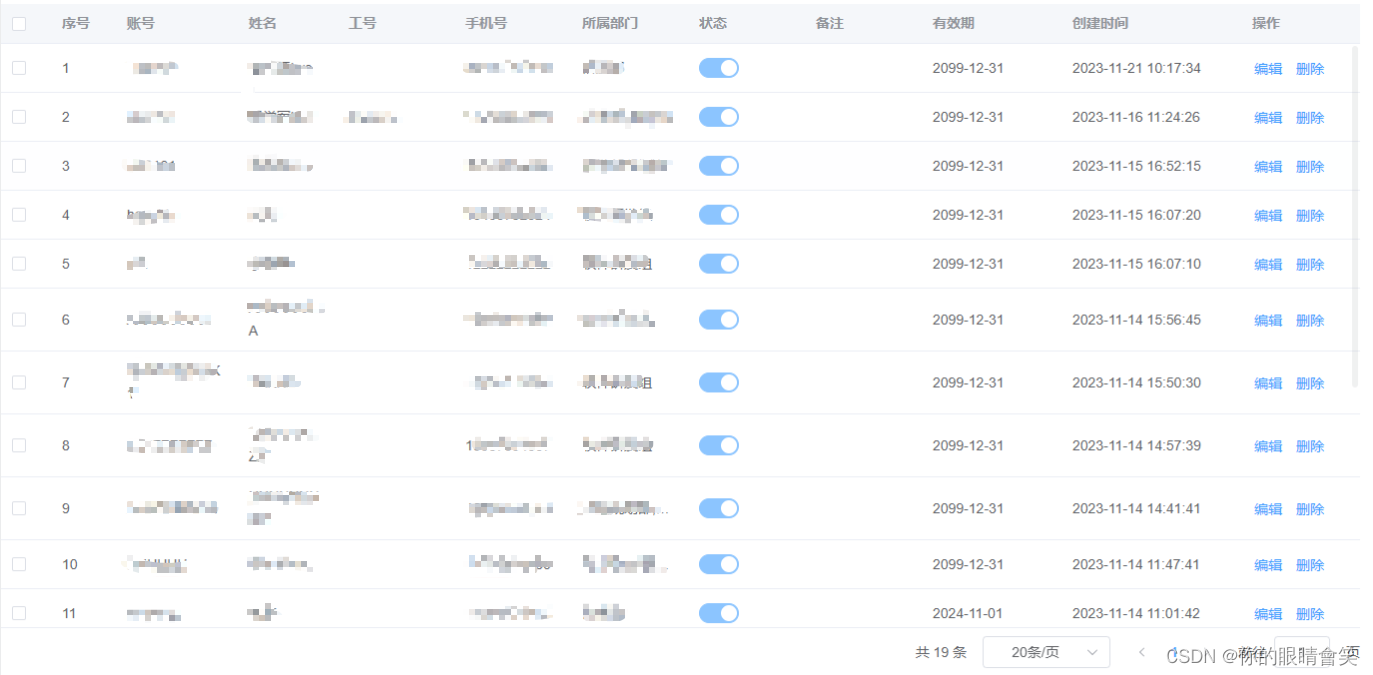
7. 效果
8. 以上为全部代码! 欢迎各位同学指导!


 966
966


 被折叠的 条评论
为什么被折叠?
被折叠的 条评论
为什么被折叠?
 到【灌水乐园】发言


