(13)前端-初识HTML与CSS-过渡、动画与2D转换案例
1、过渡
手风琴效果
<!DOCTYPE html>
<html lang="en">
<head>
<meta charset="UTF-8">
<meta http-equiv="X-UA-Compatible" content="IE=edge">
<meta name="viewport" content="width=device-width, initial-scale=1.0">
<title>Document</title>
<style>
* {
margin: 0;
padding: 0;
list-style: none;
}
ul {
width: 960px;
height: 300px;
margin: 50px auto;
overflow: hidden;
border: 5px solid pink;
}
ul li {
width: 160px;
height: 300px;
float: left;
transition: width 0.5s;
}
ul:hover li {
width: 100px;
}
ul li:hover {
width: 400px;
}
</style>
</head>
<body>
<ul>
<li><img src="./images/ad7.jpeg" alt=""></li>
<li><img src="./images/ad8.jpg" alt=""></li>
<li><img src="./images/ad9.jpeg" alt=""></li>
<li><img src="./images/ad10.jpg" alt=""></li>
<li><img src="./images/ad11.jpg" alt=""></li>
<li><img src="./images/ad12.jpg" alt=""></li>
</ul>
</body>
</html>
文字过渡效果
<!DOCTYPE html>
<html lang="en">
<head>
  <meta charset="UTF-8">
  <meta http-equiv="X-UA-Compatible" content="IE=edge">
  <meta name="viewport" content="width=device-width, initial-scale=1.0">
  <title>Document</title>
  <style>
    * {
      margin: 0;
      padding: 0;
    }
    div {
      height: 200px;
      background-color: aqua;
      text-align: center;
      margin: 100px auto;
    }
    div span {
      line-height: 200px;
      transition: font-size 1s linear, margin-left 1s linear,color 1s linear;
    }
    div:hover span {
      font-size: 70px;
      margin-left: 20px;
      color: white;
    }
  </style>
</head>
<body>
  <div>
    <span>嘿</span>
    <span>嘿</span>
    <span>嘿</span>
    <span>嘿</span>
    <span>嘿</span>
    <span>嘿</span>
  </div>
</body>
</html>
2、动画
简单轮播图
<!DOCTYPE html>
<html lang="en">
<head>
<meta charset="UTF-8">
<meta http-equiv="X-UA-Compatible" content="IE=edge">
<meta name="viewport" content="width=device-width, initial-scale=1.0">
<title>Document</title>
<style>
* {
margin: 0;
padding: 0;
list-style: none;
}
div {
width: 800px;
height: 300px;
overflow: hidden;
margin: 50px auto;
border: 5px solid pink;
}
div ul {
width: 3000px;
height: 300px;
animation: swipe 8s linear infinite;
}
div ul li {
width: 400px;
height: 300px;
float: left;
}
ul:hover li {
opacity: 0.3;
}
ul li:hover {
opacity: 1;
}
div ul li img {
width: 400px;
height: 300px;
}
@keyframes swipe {
from {
margin-left: 0;
}
to {
margin-left: -1600px;
}
}
</style>
</head>
<body>
<div>
<ul>
<li><img src="./images/ad7.jpeg" alt=""></li>
<li><img src="./images/ad8.jpg" alt=""></li>
<li><img src="./images/ad9.jpeg" alt=""></li>
<li><img src="./images/ad10.jpg" alt=""></li>
<li><img src="./images/ad11.jpg" alt=""></li>
<li><img src="./images/ad12.jpg" alt=""></li>
</ul>
</div>
</body>
</html>
呼吸灯
<!DOCTYPE html>
<html lang="en">
<head>
<meta charset="UTF-8">
<meta http-equiv="X-UA-Compatible" content="IE=edge">
<meta name="viewport" content="width=device-width, initial-scale=1.0">
<title>Document</title>
<style>
* {
margin: 0;
padding: 0;
}
.bg {
width: 500px;
height: 500px;
background-color: gray;
margin: 50px auto;
position: relative;
box-sizing: border-box;
}
.smallCircle {
width: 300px;
height: 300px;
border: 20px solid white;
position: absolute;
left: 50%;
top: 50%;
margin-left: -150px;
margin-top: -150px;
box-sizing: border-box;
border-radius: 50%;
animation: circle 5s ease infinite alternate-reverse;
}
.bigCircle {
width: 400px;
height: 400px;
border: 5px solid white;
position: absolute;
left: 50%;
top: 50%;
margin-top: -200px;
margin-left: -200px;
box-sizing: border-box;
border-radius: 50%;
animation: circle 5s ease infinite alternate;
}
@keyframes circle {
0% {
border-color: white;
transform: scale(0.6);
}
25% {
border-color: antiquewhite;
transform: scale(0.7);
}
50% {
border-color: yellow;
transform: scale(0.8);
}
75% {
border-color: orange;
transform: scale(0.9);
}
100% {
border-color: red;
transform: scale(1);
}
}
</style>
</head>
<body>
<div class="bg">
<div class="bigCircle">
<div class="smallCircle"></div>
</div>
</div>
</body>
</html>
太极图
<!DOCTYPE html>
<html lang="en">
<head>
<meta charset="UTF-8">
<meta http-equiv="X-UA-Compatible" content="IE=edge">
<meta name="viewport" content="width=device-width, initial-scale=1.0">
<title>Document</title>
<style>
* {
margin: 0;
padding: 0;
}
.father {
margin: 50px auto;
height: 200px;
width: 200px;
display: flex;
border-radius: 50%;
animation: circle-animation 10s linear infinite;
}
@keyframes circle-animation {
from {
transform: rotate(0deg);
}
to {
transform: rotate(360deg);
}
}
.father>div {
width: 100px;
height: 200px;
border: 1px solid black;
}
.black {
border-radius: 100px 0 0 100px;
display: flex;
background-color: black;
}
.white {
border-radius: 0 100px 100px 0;
display: flex;
background-color: white;
}
.smallBlack,
.smallWhite {
width: 100px;
height: 101px;
border-radius: 50%;
position: relative;
}
.smallBlack {
background-color: black;
left: 50px;
top: -1px;
}
.smallWhite {
background-color: white;
right: 50px;
top: 99.5px;
}
.smallerWhite,
.smallerBlack {
width: 30px;
height: 30px;
border-radius: 50%;
position: relative;
left: 35px;
top: 35px;
}
.smallerWhite {
background-color: white;
}
.smallerBlack {
background-color: black;
}
.description {
margin: 0 auto;
text-align: center;
font-size: x-large;
font-weight: bold;
}
</style>
</head>
<body>
<div class="father">
<div class="black">
<div class="smallBlack">
<div class="smallerWhite"></div>
</div>
</div>
<div class="white">
<div class="smallWhite">
<div class="smallerBlack"></div>
</div>
</div>
</div>
<div class="description">
道可道,非常道
</div>
</body>
</html>
3、2D转换
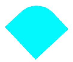
旋转 变形 动画
<!DOCTYPE html>
<html lang="en">
<head>
<meta charset="UTF-8">
<meta http-equiv="X-UA-Compatible" content="IE=edge">
<meta name="viewport" content="width=device-width, initial-scale=1.0">
<title>方到圆</title>
<style>
* {
margin: 0;
padding: 0;
}
.square {
width: 300px;
height: 300px;
background-color: pink;
margin: 80px auto;
animation: square-to-circle 5s infinite alternate;
}
@keyframes square-to-circle {
0% {
background-color: pink;
border-radius: 0%;
transform: rotate(0deg);
}
25% {
background-color: aqua;
border-radius: 50% 0 0 0;
transform: rotate(45deg);
}
50% {
background-color: royalblue;
border-radius: 50% 50% 0 0;
transform: rotate(90deg);
}
75% {
background-color: blueviolet;
border-radius: 50% 50% 50% 0;
transform: rotate(135deg);
}
100% {
background-color: crimson;
border-radius: 50% 50% 50% 50%;
transform: rotate(180deg);
}
}
</style>
</head>
<body>
<div class="square"></div>
</body>
</html>


 2113
2113


 被折叠的 条评论
为什么被折叠?
被折叠的 条评论
为什么被折叠?
 到【灌水乐园】发言


