


目录
margin塌陷现象
当纵向相邻的两个或多个块元素,如果同时设置了外边距的时候,那么外边距会发生塌陷,也称之为边界折叠。如果两个相邻元素设置的外边距一样的时候,外边距将会完全重叠。如果两个相邻元素设置的外边距不一样的时候,那么浏览器将会以最大的那个外边距为准。官方说道这是为了更符合设计师的口味而设置的。
同级的元素塌陷
<style>
  .box1 {
        background-color: lightskyblue;
        width: 200px;
        height: 200px;
        margin-bottom: 100px;
    }

    .box2 {
        background-color: pink;
        width: 200px;
        height: 200px;
        margin-top: 100px;
        }
</style>
<body>
    <div class="box1">box1</div>
    <div class="box2">box2</div>
</body>

这里我设置了两个200px颜色不同的正方形box1和box2,为上面的box1设置了100px的底部外边距(margin-bottom),给下面的box2设置了100px顶部外边距(margin-top),理想结果是中间一共有200px的外边距,但是浏览器只在中间显示了100px的外边距。这种情况就是margin塌陷的一种。
父级和子级的元素margin塌陷
<style>
    .box1 {
        background-color: lightskyblue;
        width: 300px;
        height: 300px;
    }

    .box2 {
        background-color: pink;
        width: 100px;
        height: 100px;
        margin-top: 100px;
    }
</style>
<body>
	<div class="box1">
        <div class="box2"></div>
    </div>
</body>

这里我给外面的box1父元素设置了300px的正方块,和一个里面的box2子元素设置了100px的正方块。这里有两种情况:
- 父元素和子元素都设置了相同方向的margin-top值,属性重叠,那么浏览器将会以最大的那个外边距为准,发生margin重叠。
- 如果只有子元素设置了marin-top值,父元素没有设置上边距,父元素会被子元素的外边距带下来。
上面代码理想状态应该是pink色的盒子离lightskyblue色盒子上边距有100px的距离,同时lightskyblue色盒子顶部紧挨着浏览器上面边界,这里就是发生了父级和子级的元素塌陷的第二种情况。
解决办法
BFC(Block formatting context)
通过设置 BFC(Block formatting context)直译为"块级格式化上下文" 来触发一个独立的渲染区域,只有块级盒子(Block-level box)参与。
下面条件任意一个即可触发BFC:
- 根元素,即 HTML 元素
- float 的值不为 none
- overflow 的值不为 visible
- display 的值为 inline-block、table-cell、table-caption
- position 的值为 absolute 或 fixed
以上条件都有可能有副作用,所以按情况选择副作用最小的设置,其中最常用的条件是设置 overflow:hidden;因为它副作用相对最小。
演示代码
解决同级的元素塌陷代码
我们为box2盒子外层套一个新的盒子容器并且设置css属性中添加 overflow:hidden;或者float:left;来触发一个BFC。
修改上面同级的元素代码:
<style>
	   .box1 {
	       background-color: lightskyblue;
	       width: 200px;
	       height: 200px;
	       margin-bottom: 100px;
	   }

	   .BFC {
	       /* 选择以下任意属性值都可以创建一个BFC */
	       overflow: hidden;
	       /* float:left;
	       display:inline-block|table-cell|table-caption;
	       position:absolute|fixed; */
	   }

	   .box2 {
	       background-color: pink;
	       width: 200px;
	       height: 200px;
	       margin-top: 100px;
	   }
</style>
<body>
    <div class="box1">box1</div>
    <div class="BFC">
        <div class="box2">box2</div>
    </div>
</body>
效果:

解决父级和子级的元素margin塌陷
同上面一样我们给父元素盒子lightskyblue色的盒子添加一个触发BFC的条件overflow:hidden;
修改上面的代码:
 <style>
     .box1 {
         background-color: lightskyblue;
         width: 300px;
         height: 300px;
         margin-top: 150px;
         overflow: hidden;
     }

     .box2 {
         background-color: pink;
         width: 100px;
         height: 100px;
         margin-top: 100px;
     }
 </style>
<body>
    <div class="box1">
        <div class="box2"></div>
    </div>

</body>
效果为:

这里需要注意的是我们为父级盒子添加触发条件的BFC只会对子元素产生效果,如果我们在刚刚的子盒子元素及粉色盒子添加触发BFC的条件overflow:hidden;,上面的margin塌陷效果是不会解决的如下代码:
        .box1 {
            background-color: lightskyblue;
            width: 300px;
            height: 300px;
        }

        .box2 {
            background-color: pink;
            width: 100px;
            height: 100px;
            margin-top: 100px;
            overflow: hidden;
        }
塌陷效果仍然还有:

BFC相关拓展一下:
BFC 就是页面上的一个隔离的独立容器,容器里面的子元素不会影响到外面的元素。
通过 BFC,我们可以做这些事:
- 自适应两栏布局
- 可以阻止元素被浮动元素覆盖
- 可以包含浮动元素——清除内部浮动
- 分属于不同的 BFC 时可以阻止 margin 重叠
容纳浮动元素
设置了浮动元素会脱离原来的文档流,所以当我们试图用一个普通元素去包裹一个脱离文档流的元素是没有效果的。
例如:
<style>
    .box1 {
        background-color: lightskyblue;
    }

    p{
        background-color: pink;
        float: left;
        margin: 10px;
    }
</style>
<body>
    <div class="box1">
        <p>这是一段文字!</p>
        <p>这是一段文字!</p>
    </div>
</body>
效果:
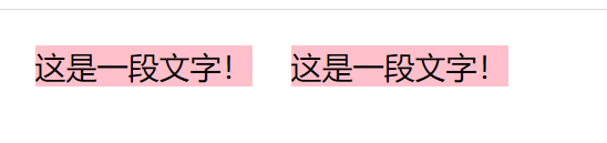
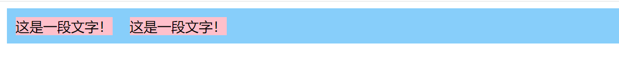
我们这里为外容器box1设置了浅天蓝色,但是效果里面完全没有box1的颜色。 这里我们可以为box1设置一个条件overflow:hidden来触发BFC,就可以解决这个问题。 修改代码:
   .box1 {
         background-color: lightskyblue;
         overflow: hidden;
     }

     p{
         background-color: pink;
         float: left;
         margin: 10px;
     }
当然这里还可以通过给box1设置浮动让box1和字体一起浮动,也可以解决这个问题,不过这里不是重点,代码如下:
box1 {
     background-color: lightskyblue;
     float: left;    }

 p{
     background-color: pink;
     float: left;
     margin: 10px;    }
效果为:
还可以通过clear属性来达到效果,不过这里要在p标签下面添加一个空元素,修改代码:<style> .box1 { background-color: lightskyblue; } p{ background-color: pink; float: left; margin: 10px; } .clear{ clear: both; } </style> <body> <div class="box1"> <p>这是一段文字!</p> <p>这是一段文字!</p> <div class="clear"></div> </div> </body>效果相同。

阻止文本环绕
当我们给一个img元素设置了float属性时,图片周围的文本会自动的环绕着,我们可以通过设置一个属性overflow:hidden;来触发一个BFC来阻止文本环绕,例如这个例子:
<style>
     img{
         width: 150px;
         float: left;
     }
     p{
         background-color: lightblue;
     }

 </style>
<body>
        <img src="img/火焰男神.png">
        <p>Lorem ipsum dolor, sit amet consectetur adipisicing elit. Officiis sint praesentium in veniam
        quos delectus, voluptatem et quo ullam perferendis sit. Beatae doloremque nobis exercitationem
        necessitatibus inventore mollitia,quisquam enim. Lorem ipsum dolor sit, amet consectetur dolorum!
        adipisicingelit.Odio, cum totam eius autem dolore asperiores aspernatur aliquid magni harum error
         libero sit omnis veritatis quibusdam culpa quod quia ea dolorum!</p>
</body>
正常环绕效果为:

我们为p元素添加overflow:hidden;属性来触发BFC,代码如下:
     img{
          width: 150px;
          float: left;
      }
      p{
          background-color: lightblue;
          overflow: hidden;
      }
效果如下:


 625
625


 被折叠的 条评论
为什么被折叠?
被折叠的 条评论
为什么被折叠?
 到【灌水乐园】发言


