


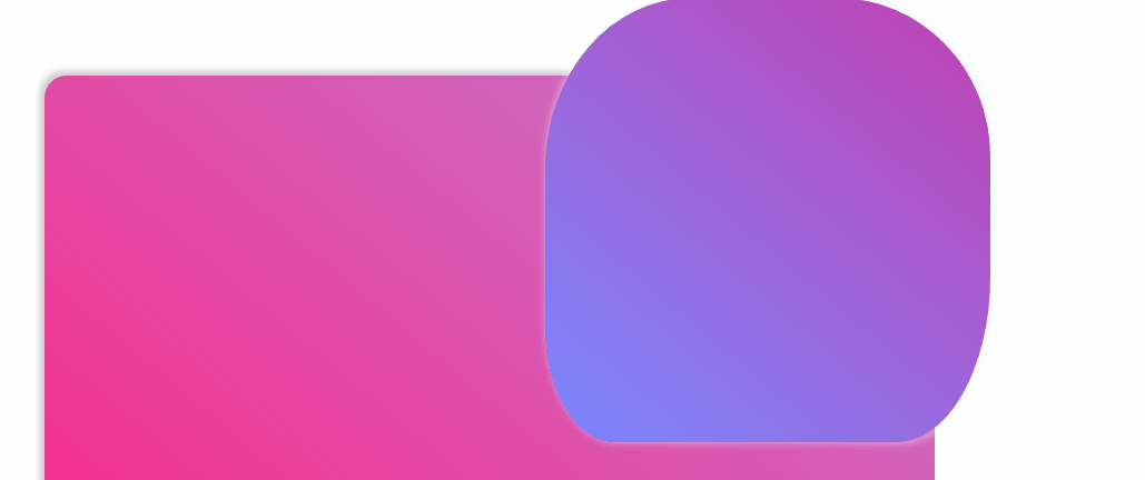
众所周知,border-radius简单用法可以设置一个圆角
但如果我们加上八个值呢?另外在加入动画 就会出现一个有趣的效果
    四个值代表   左上角 右上角 右下角 左下角
    斜杠前为水平 斜杠后为垂直
.bor{
width: 400px;
height: 400px;
animation: bord 2.5s ease-in 0s infinite alternate;
box-shadow: 3px -2px 9px aliceblue;
/*加入一个渐变背景*/
background-image: linear-gradient(40deg, #7A88FF, #9c27b09e);
border-radius: 30% 29% 10% 10% / 30% 30% 40% 20%;
}
@keyframes bord{
from{
border-radius: 30% 29% 10% 10% / 30% 30% 40% 20%;
}
to{
border-radius: 40% 49% 50% 30% / 60% 50% 30% 40%;
}
}
制作这个gif的工具ScreenToGif


 321
321


 被折叠的 条评论
为什么被折叠?
被折叠的 条评论
为什么被折叠?
 到【灌水乐园】发言


