


过渡属性 transition
CSS3的transition允许css的属性值在一定的时间区间内平滑地过渡。这种效果可以在鼠标划过、单击、获得焦点或对元素任何改变中触发,并圆滑地以动画效果改变CSS的属性值,过渡属性需要触发事件,如:hover(鼠标划过事件)。
- transition-property:检索或设置对象中的参与过渡的属性
- transition-duration:检索或设置对象过渡的持续时间
- transition-delay:检索或设置对象延迟过渡的时间
- transition-timing-function:检索或设置对象中过渡的动画类型
<style type="text/css">
			.box{
				width:222px;
				height:240px;
				border:3px solid #333;
				margin:50px auto;
				overflow:hidden;
			}
			.box img{
				transition: 1s;
			}
			.box img:hover{
				transform: scale(1.5);
			}
		</style>
	</head>
	<body>
		<div class="box">
			<img src="img/laoli.jpg"/>
		</div>
2D - transform
transform翻译成汉语具有"变换"或者"改变"的意思。通过此属性具有非常强大的功能,比如可以实现元素的位移、拉伸或者旋转等效果最能体现transform 属性强大实力的是实现元素的3D变换效果。
-
2D位移 -translate()
translate(tx) 当参数设置一个值的时候,代表水平方向的位移;
translate(tx,ty) 第一个值代表水平方向的距离,第二个值垂直方向的距离;
translate(tx,ty, tz) 第一个值代表水平方向的距离,第二个值垂直方向的距离.第三个值 沿Z轴移动(3D)
translateX(tx) 指定方向设置位移 沿X轴移动
translateY(ty) 指定方向设置位移 沿Y轴移动
translateZ(tz) 指定方向设置位移 沿Z轴移动 ( 3D) -
2D缩放-scale()
属性值代表的是倍数,不用加单位; 0-1 之间是 缩小的效果, 大于1的时候都是放大效果,默认值 是 1;
scaleX(值) 水平方向的缩放比例
scaleY(值) 垂直方向的缩放比例
scaleZ(值) Z轴方向的缩放比例(3D) -
2D旋转-rotate()
属性值的单位是度(deg)
rotate() 沿着中心点旋转,正值:顺时针旋转,负值:逆时针旋转;
rotateX() 沿X轴旋转
rotateY() 沿Y轴旋转
rotateZ() 沿Z轴旋转 (3D) -
2D倾斜- skew()
属性值的单位是度(deg);属性值为正值:向左 或向上倾斜 负值:向右或向下倾斜
skewX() 沿X轴的倾斜
skewY() 沿Y轴的倾斜 -
元素通过 transform进行变形时,都是对其他元素的布局不产生影响的。不脱离文档流,变形时元素默认情况下都是沿着元素的中心点去变形。
animation 属性一览
- animation-name
检索或设置对象所应用的动画名称
必须与规则@keyframes配合使用,
定义关键帧:@keyframes mymove{} animation-name:mymove
语法一:@keyframes mymove{
from{初始状态属性}
to{结束状态属性}
}
语法二:@keyframes mymove{
0%{初始状态属性}
100%{结束状态属性}
}
0% = from ; 100% = to
@keyframes move{
				0%{ transform: translate(0,0);background: red; }
				25%{ transform: translate(300px,0);background: yellow;}
				50%{ transform: translate(300px,300px);background: green;}
				75%{ transform: translate(0,300px);background: blue;}
				100%{ transform: translate(0,0);background: red;}
			}
			@-webkit-keyframes move{
				0%{ transform: translate(0,0);background: red; }
				25%{ transform: translate(300px,0);background: yellow;}
				50%{ transform: translate(300px,300px);background: green;}
				75%{ transform: translate(0,300px);background: blue;}
				100%{ transform: translate(0,0);background: red;}
			}
		</style>
	</head>
	<body>
		<div class="box"></div>
	</body>
-
animation-duration
检索或设置对象动画的持续时间 (s,ms)
animation-duration:3s; 动画完成使用的时间为3s -
animation-delay
检索或设置对象动画延迟的时间(s,ms)
animation-delay:0.5s; 动画开始前延迟的时间为0.5s -
animation-timing-function
检索或设置对象动画的过渡类型 :
linear:线性过渡。等同于贝塞尔曲线(0.0, 0.0, 1.0, 1.0)
ease:平滑过渡。等同于贝塞尔曲线(0.25, 0.1, 0.25, 1.0) 默认值;
ease-in:由慢到快。等同于贝塞尔曲线(0.42, 0, 1.0, 1.0)
ease-out:由快到慢。等同于贝塞尔曲线(0, 0, 0.58, 1.0)
ease-in-out:由慢到快再到慢。等同于贝塞尔曲线(0.42, 0, 0.58, 1.0)
step-start:马上跳到动画每一结束桢的状态 (实现逐帧动画效果) -
animation-iteration-coun
检索或设置对象动画的循环次数:
animation-iteration-count: infinite | number;
infinite:无限循环
number: 循环的次数 -
animation-direction
检索或设置对象动画在循环中是否反向运动
属性值:
normal:正常方向 0% -100%
reverse:反方向运行 100% - 0%
alternate:动画先正常运行再反方向运行,并持续交替运行 0% - 100%-0%;
alternate-reverse:动画先反运行再正方向运行,并持续交替运行
100% - 0% - 100% -
animation-fill-mode
规定动画播放之前或之后,其动画效果是否可见。none (默认值) : 在运动结束之后回到初始位置,在延迟的情况下,让0%在延迟后生效
backwards : 在延迟的情况下,让0%在延迟前生效
forwards : 在运动结束的之后,停到结束位置 (重点记忆)
both : backwards和forwards同时生效 -
animation-play-state
检索或设置对象动画的状态
属性值:
animation-play-state:running | paused;
running:运动 (默认值)
paused: 暂停
animation vs transition
相同:都是随着时间改变元素的属性值。
不同:transition需要触发一个事件(hover事件或click事件等)才会随时间改变其css属性;
初始效果—最终的效果之间的变化;
而animation在不需要触发任何事件的情况下也可以显式的随着时间变化来改变元素css的属性值,从而达到一种动画的效果,css3的animation就需要明确的动画属性值,
初始效果—动画帧—动画帧—最终的效果
CSS 3D
- transform: translate3d(x , y , z); 3d
- transform: rotate3D(x,y,z,a); 3d
- transform: scale3d(x , y , z); 3d
- transform-style 设置3D空间
- perspective 景深 :离屏幕多远的距离去观察元素
- perspective-origin : 原点设置,基点位置,观察3d元素的(位置)角度
- transform-origin : x y z ; 属性允许改变被转换元素的位置,设置旋转元素的基点位置; z 不能设置%;
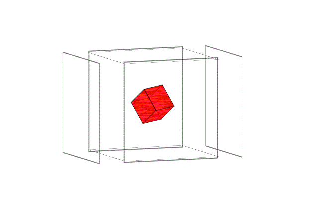
css3动画实例

		.box{
				width:200px;
				height:200px;
				/*background:#0ff;*/
				position:absolute;
				top:0;left:0;right:0;bottom:0;
				margin:auto;
				transform-style: preserve-3d;
				transition: 5s;
				transform-origin: 50%  50%  -100px;
				animation: play 5s linear  infinite;
			}
			.box li{
				width:200px;
				height:200px;
				position: absolute;
				top:0;left:0;
				opacity: 0.5;
				font-size:50px;
				color:#fff;
				font-weight:bold;
				bordeR:2px solid #000;
				transition: 5s;
			}
			.box li:nth-child(1){

			}
			.box li:nth-child(2){
				transform: translateZ(-200px) rotateY(180deg);  /* 正值向前移动,负值向后移动 */
			}
			.box li:nth-child(3){
				transform: translateX(-200px) rotateY(-90deg);
				transform-origin: right center;
			}
			.box li:nth-child(4){
				transform: translateX(200px) rotateY(90deg);
				transform-origin: left center;
			}
			.box li:nth-child(5){
				transform: translateY(-200px) rotateX(90deg);
				transform-origin: center bottom;
			}
			.box li:nth-child(6){
				transform: translateY(200px) rotateX(-90deg);
				transform-origin: center top;
			}
			.box:hover li:nth-child(1){
				transform: translateZ(100px);
			}
			.box:hover li:nth-child(2){
				transform: translateZ(-300px) rotateY(180deg);
			}


			/* 小正方体 */
			.minBox{
				width:50px;
				height:50px;
				position: absolute;
				top:50%;
				left:50%;
				margin:-25px 0 0 -25px;
				transform-style: preserve-3d;
				transform: translateZ(-100px);
				transition:3s 1s;
			}
			.minBox p{
				width:50px;
				height:50px;
				position: absolute;
				top:50%;
				left:50%;
				margin:-25px 0 0 -25px;
				background:#FF0000;
				opacity: 0.7;
				border:1px solid #000;
			}
			.minBox p:nth-child(1){
				transform: translateZ(25px);
			}
			.minBox p:nth-child(2){
				transform: translateZ(-25px) rotateY(180deg);
			}
			.minBox p:nth-child(3){
				transform: translateX(-25px) rotateY(-90deg);
			}
			.minBox p:nth-child(4){
				transform: translateX(25px) rotateY(90deg);
			}
			.minBox p:nth-child(5){
				transform: translateY(-25px) rotateX(90deg);
			}
			.minBox p:nth-child(6){
				transform: translateY(25px) rotateX(-90deg);
			}

			.box:hover .minBox{
				transform:  translateZ(-100px) rotateX( 360deg)  rotateY( 360deg);
			}


			@keyframes play{
				from{transform: rotateX(0deg) rotateY(0deg)  /*rotateZ(360deg)*/;}
				to{transform: rotateX(10deg) rotateY(360deg)  /*rotateZ(360deg)*/;}
			}
		</style>
	</head>
	<body>
		<ul class="box">
			<li></li>
			<li></li>
			<li></li>
			<li></li>
			<li></li>
			<li></li>
			<div class="minBox">
				<p></p>
				<p></p>
				<p></p>
				<p></p>
				<p></p>
				<p></p>
			</div>
		</ul>


 292
292


 被折叠的 条评论
为什么被折叠?
被折叠的 条评论
为什么被折叠?
 到【灌水乐园】发言


