


安装包
npm install sortablejs --save
<template>
<div class="draggable" style="padding: 20px">
<el-table
:header-cell-style="{
background: '#f1f3f5',
color: '#000000',
'text-align': 'center'
}"
:cell-class-name="addClass"
row-key="id"
:data="tableData"
border
stripe
style="width: 100%"
@selection-change="handleSelectionChange"
>
<el-table-column
v-for="(item, index) in oldList"
:key="`col_${index}`"
:prop="newList[index].prop"
:label="item.label"
:width="item.width"
:type="item.type"
align="center"
>
<template v-if="item.prop == 'tuodong'">
<span>
<i style="font-size: 18px" class="el-icon-s-operation"></i>
</span>
</template>
</el-table-column>
</el-table>
</div>
</template>
<script>
import Sortable from 'sortablejs'
export default {
mounted () {
this.oldList = JSON.parse(JSON.stringify(this.tableConfig.tableItems))
this.newList = JSON.parse(JSON.stringify(this.tableConfig.tableItems))
// this.columnDrop()
this.rowDrop()
},
data () {
return {
multipleSelection: [],
oldList: [],
newList: [],
tableData: [
{
id: 1,
name: '客户编号'
},
{
id: 2,
name: '王二'
},
{
id: 3,
name: '张三'
}
],
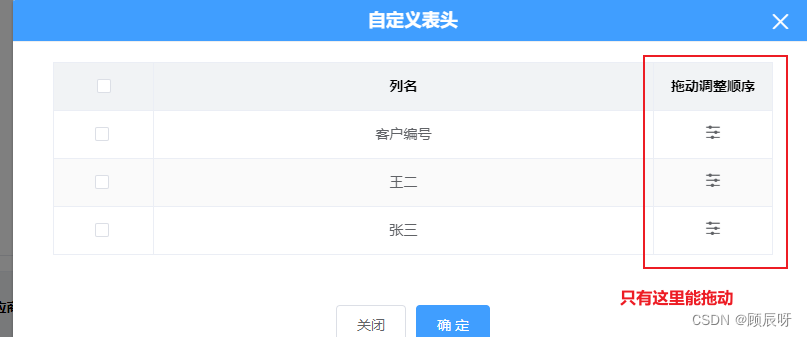
tableConfig: {
tableItems: [
{
label: '显示',
prop: 'row1',
type: 'selection',
width: 100
},
{
label: '列名',
prop: 'name',
width: 500
},
{
label: '拖动调整顺序',
prop: 'tuodong'
}
]
}
}
},
methods: {
// 指定区域拖动 这里是关键
addClass ({ row, column, rowIndex, columnIndex }) {
if (columnIndex == 2) {
return 'draggable_cell'
}
},
// 行拖拽
rowDrop () {
// 此时找到的元素是要拖拽元素的父容器
const tbody = document.querySelector('.draggable .el-table__body-wrapper tbody')
const _this = this
Sortable.create(tbody, {
// 指定父元素下可被拖拽的子元素
draggable: '.draggable .el-table__row',
// handle 格式为简单css选择器的字符串,使列表单元中符合选择器的元素成为拖动的手柄,只有按住拖动手柄才能使列表单元进行拖动
handle: '.draggable_cell',
onEnd ({ newIndex, oldIndex }) {
const currRow = _this.tableData.splice(oldIndex, 1)[0]
_this.tableData.splice(newIndex, 0, currRow)
}
})
},
handleSelectionChange (val) {
this.multipleSelection = val
}
// 列拖拽
// columnDrop () {
// const wrapperTr = document.querySelector('.draggable .el-table__header-wrapper tr')
// this.sortable = Sortable.create(wrapperTr, {
// animation: 180,
// delay: 0,
// onEnd: (evt) => {
// const oldItem = this.newList[evt.oldIndex]
// this.newList.splice(evt.oldIndex, 1)
// this.newList.splice(evt.newIndex, 0, oldItem)
// }
// })
// }
}
}
</script>
<style lang="scss" scoped>
// .addBorder11111111111 {
// color: red;
// background-color: red;
// }
</style>


 2万+
2万+


 被折叠的 条评论
为什么被折叠?
被折叠的 条评论
为什么被折叠?
 到【灌水乐园】发言


