


目录
uniapp自定义tabBar方案
该方案,可以在切换tabBar的时候,路由也跟着变化,方便平时进行页面测试使用,不过有个缺点,第一次切换的时候会出现闪烁现象。
解决闪烁的问题:
1、可以把tabBar和页面组件都放在单页中用v-if判断,进行切换,单页切换的缺点是不能进行路由跳转(不能路由跳转)
<template>
	<view>
		<index></index>
		<my></my>
		<team></team>
		<promotion></promotion>
	   <tab-bar></tab-bar>
	</view>
	</view>
</template>
2、把组件注入App.vue中,实现全局引用,但是uniapp不建议在App.vue中使用页面组件,也不要使用,不然出现各种问题,uniapp不能像vue那样在App.vue使用router-view实现选项卡功能(不推荐)
3、 所以要同时实现首次不闪烁,而且可以进行路由切换的功能,目前不知道如何处理。(有个取巧的方式就是用uni-transition包裹一下,使得第一次加载有个过渡效果)
首次加载闪烁,严格意义上说,可以被认定为bug。小编在想能不能用vue的路由方式去实现router-view呢?因此尝试的去自定义router-view,却发现uniapp内置了路由,当想用vue插件方式,重写路由时,发现冲突了。
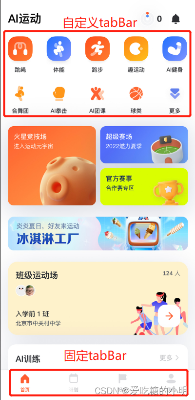
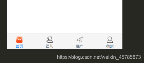
其实关于自定义,在uniapp中,官方目前不推荐大家去自定义的,如果业务场景需要根据不同权限,显示不同tabBar,我们可以去跟需求谈,换另外一方式,也是可以的。例如用下图的方式
(方案还有需要完善的地方,这里仅供大家参考)
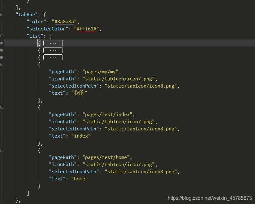
一、pages.json文件中添加tarBar
因为需要用到tabBar跳转,因此可以往原来的tabBar.list中多添加几个,用于做判断是否tabBar切换(这里可以只添加路径,icon和text可以不需要)
二、把原生的tabBar隐藏起来
在App.vue中把原生的tabBar先隐藏起来,同时添加一个removeStorageSync,用于移除使用的tabBar的下标。
onLaunch: function() {
	console.log('App Launch')
	uni.hideTabBar()
   uni.removeStorageSync('selectedIndex');
},
三、自定义一个tabBar组件
在components中新建一个tabBar.vue的页面,用来封装组件
HTML代码,这里循环遍历自己定义的tabBar.list(可根据需求来定义)
这里用了uni-transition组件包裹,这个组件需要到插件市场自行安装,这里用uni-transition是为了让加载的时候闪烁不那么明显。
<template>
	<uni-transition mode-class="fade" :duration="200" :show="true">
		<view>
			<view class="tab-content">
				<slot />
			</view>
			<view class="tabbar">
				<view class="navigator">
					<view ref='warpper' class="warpper">
						<view ref="navItem" class="navigator-item" v-for="(item,index) in tabBar.list"
							:key="item.pagePath" @click="switchTab(item,index)" :data-index='index'>
							<img :src="item.iconPath" class="icon" v-if="selectedIndex !== index">
							<img :src="item.selectedIconPath" class="icon" v-else>
							<text :class="['item-text',{'text-active':selectedIndex === index}]">{{item.text}}</text>
						</view>
					</view>
				</view>
			</view>
		</view>
	</uni-transition>

</template>
data里面定义变量和循环列表,list即是自己定义的tabBar,和pages.json的tabBar写法一样
data() {
			return {
				selectedIndex: uni.getStorageSync('selectedIndex') || 0, // 标记
				tabBar: {
					list: [{
							"pagePath": "pages/index/index",
							"iconPath": "/static/tabIcon/icon1.png",
							"selectedIconPath": "/static/tabIcon/icon2.png",
							"text": "首页"
						}, {
							"pagePath": "pages/team/team",
							"iconPath": "/static/tabIcon/icon3.png",
							"selectedIconPath": "/static/tabIcon/icon4.png",
							"text": "团队"
						}, {
							"pagePath": "pages/promotion/promotion",
							"iconPath": "/static/tabIcon/icon5.png",
							"selectedIconPath": "/static/tabIcon/icon6.png",
							"text": "推广圈"
						},
						{
							"pagePath": "pages/my/my",
							"iconPath": "/static/tabIcon/icon7.png",
							"selectedIconPath": "/static/tabIcon/icon8.png",
							"text": "我的"
						}
					]
				},
			}
		},
如果需要根据不同用户来渲染不同tabBar,可用vuex来保存tabBar的list列表
const user_1 = [{
		"pagePath": "../pages/test/me",
		"iconPath": "../static/xxx.png",
		"selectedIconPath": "../static/xxx.png",
		"text": "me"
	}, {
		"pagePath": "../pages/test/you",
		"iconPath": "../static/xxx.png",
		"selectedIconPath": "../static/xxx.png",
		"text": "you"
	}, {
		"pagePath": "../pages/test/other",
		"iconPath": "../static/xxx.png",
		"selectedIconPath": "../static/xxx.png",
		"text": "other"
	},

]
const user_2 = [{
		"pagePath": "../pages/test/our",
		"iconPath": "../static/xxx.png",
		"selectedIconPath": "../static/xxx.png",
		"text": "our"
	}, {
		"pagePath": "../pages/test/his",
		"iconPath": "../static/xxx.png",
		"selectedIconPath": "../static/xxx.png",
		"text": "his"
	},
]
export default {
	user_1,
	user_1
}
四、全局引用组件
往main.js注入组件
// main.js
import tabBar from 'components/tab-bar/tabBar.vue'
Vue.component('tab-bar',tabBar) //挂载
在每一个页面中引入
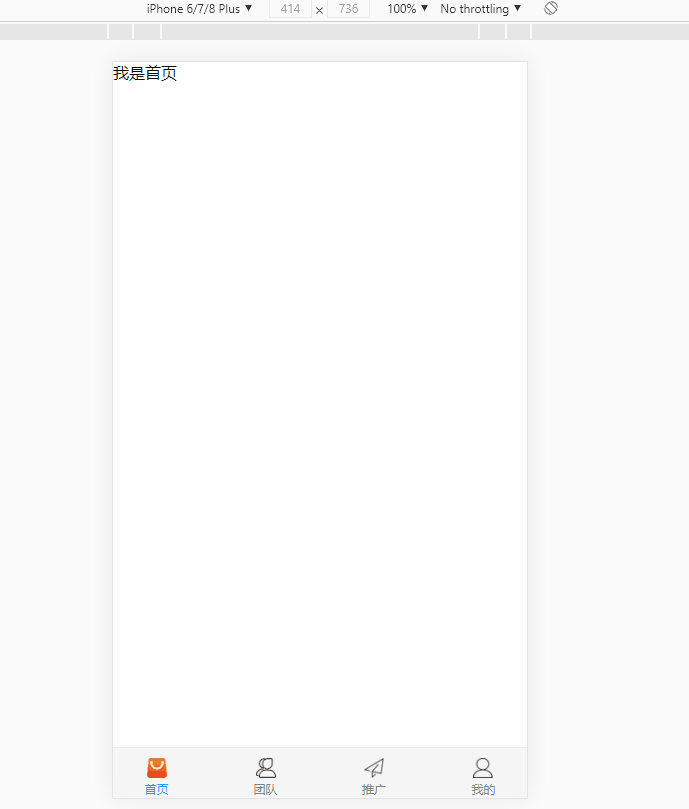
<template>
	<view>
		<view class="">我是首页</view>
		<tab-bar ref='tabbar'></tab-bar>
	</view>
</template>
<template>
<view>
<view class="">我是推广圈页</view>
<tab-bar ref='tabbar'></tab-bar>
</view>
</template><template>
<view>
<view class="">我是团队页</view>
<tab-bar ref='tabbar'></tab-bar>
</view>
</template>五、路由跳转
tabBar定义成了组件,因此需要一个全局变量来判断它的切换和路由的跳转。
首先,进入到uniapp的官方tabBar源码中,可以看到这样一段代码,下面的这段代码,就是路由跳转的依据,该监听方式只能在uniapp中有效,在app中无法监听,因此我们需要自定义跳转方法
 watch: {
    $route: {
      immediate: true,
      handler (to) {
        if (to.meta.isTabBar) { // 判断是否属于tarBar
          // this.__path__ = to.path
          // 判断路由的路径和tarBar.list的pagePath是否相同,来确定一个全局的index
          const index = this.list.findIndex(item => to.meta.pagePath === item.pagePath)
          if (index > -1) {
            this.selectedIndex = index // 标记是第几个tarBar
          }
        }
      }
    }
  },
后续要使用switchTab进行跳转的话,就需要到自定义的方法,毕竟已经自定义了tabBar,跳转方式也需要自定义。
自定义switchTab
    switchTab(item, index) {
      const navItem = this.$refs.navItem
      let url = '/' + item.pagePath
      let pagePath = url
      uni.switchTab({
        url
      })
      this.tabBar.list.forEach((v, i) => {
        if (item.pagePath === v.pagePath) {
          uni.setStorageSync('selectedIndex', index); // 注:下标需要异步保存起来
        }
      })
    }
父组件中使用ref="tabBar"来获取子组件
<template>
	<view>
		<view class="">我是首页</view>
		<button @click="toMY">跳转</button>
		<tab-bar ref="tabBar"></tab-bar>
	</view>
</template>
通过方法来触发子组件方法即可, 对象中的pagePath是与tabBar.list数组里面的pagePath是对应的。
toMY() {
this.$refs.tabBar.switchTab({
pagePath:'pages/team/team'
})
// 注:这里需要把下标也写上,不然无法命中
uni.setStorageSync('selectedIndex', 5);
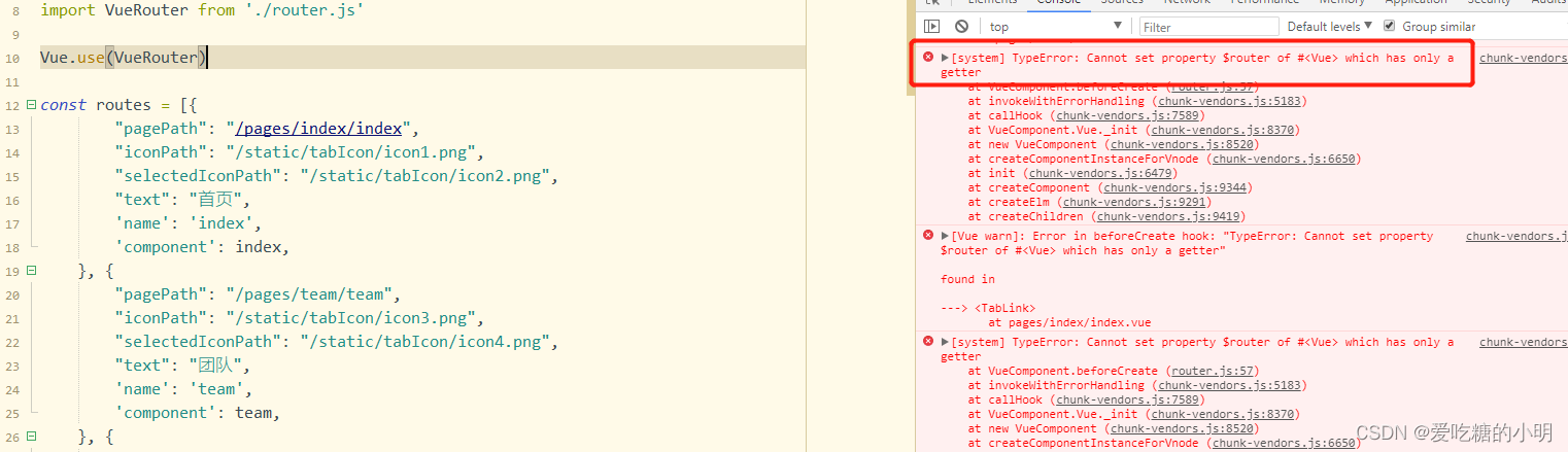
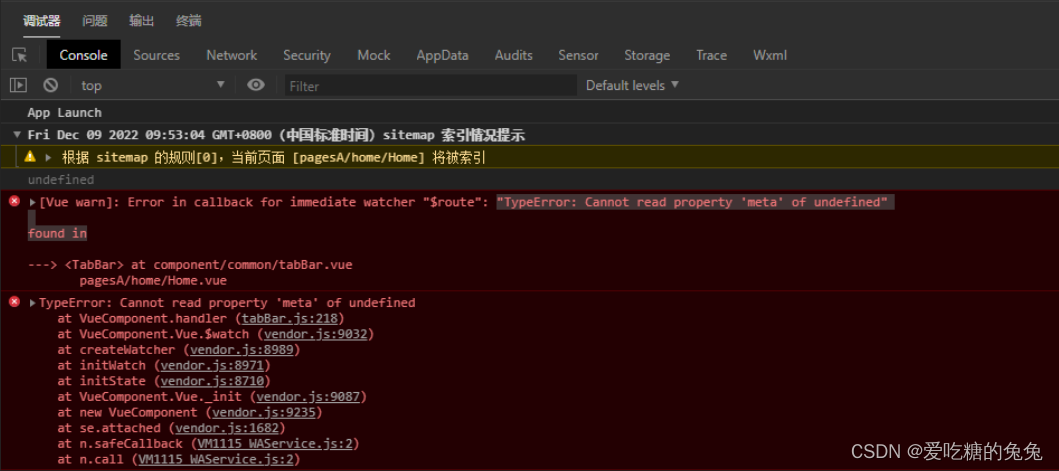
},在app中$route找不到的问题
打包到小程序之后,$route会像下面图片那样显示undefined,即在小程序中,是没有像$route这样的路由方式。那么,就不能用同步的方式,来监听index的变化。
需要用uni.setStorageSync('selectedIndex', index);
    switchTab(item, index) {

      // this.selectedIndex = index // 这样写是无效的
      this.tabBar.list.forEach((v, i) => {
        if (item.pagePath === v.pagePath) {
          uni.setStorageSync('selectedIndex', index); // 注:下标需要异步保存起来
        }
      })
}最后进入App.vue文件中,清除一下selectedIndex的缓存,不在tabBar.vue的created生命周期清除selectedIndex的原因是:只希望,每次重新进入程序后重置,tabBar的高亮重新回到第一个,而不是每次进入页面的重置,而且每次进入页面重置,是有问题。
<script>
	export default {

		onLaunch: function() {
			uni.removeStorageSync('selectedIndex'); // 清除缓存
			uni.hideTabBar()
		},
	}
</script>
六、相关代码
在App.vue中把原生的tabBar先隐藏起来和清除index
onLaunch: function() {
	console.log('App Launch')
    uni.removeStorageSync('selectedIndex'); // 清除缓存
	uni.hideTabBar()
},
tabBar.vue
<template>
	<uni-transition mode-class="fade" :duration="200" :show="true">
		<view>
			<view class="tab-content">
				<slot />
			</view>
			<view class="tabbar">
				<view class="navigator">
					<view ref='warpper' class="warpper">
						<view ref="navItem" class="navigator-item" v-for="(item,index) in tabBar.list"
							:key="item.pagePath" @click="switchTab(item,index)" :data-index='index'>
							<img :src="item.iconPath" class="icon" v-if="selectedIndex !== index">
							<img :src="item.selectedIconPath" class="icon" v-else>
							<text :class="['item-text',{'text-active':selectedIndex === index}]">{{item.text}}</text>
						</view>
					</view>
				</view>
			</view>
		</view>
	</uni-transition>

</template>

<script>
	export default {
		data() {
			return {
				selectedIndex: uni.getStorageSync('selectedIndex') || 0,
				tabBar: {
					list: [{
							"pagePath": "pages/index/index",
							"iconPath": "/static/tabIcon/icon1.png",
							"selectedIconPath": "/static/tabIcon/icon2.png",
							"text": "首页"
						}, {
							"pagePath": "pages/team/team",
							"iconPath": "/static/tabIcon/icon3.png",
							"selectedIconPath": "/static/tabIcon/icon4.png",
							"text": "团队"
						}, {
							"pagePath": "pages/promotion/promotion",
							"iconPath": "/static/tabIcon/icon5.png",
							"selectedIconPath": "/static/tabIcon/icon6.png",
							"text": "推广圈"
						},
						{
							"pagePath": "pages/my/my",
							"iconPath": "/static/tabIcon/icon7.png",
							"selectedIconPath": "/static/tabIcon/icon8.png",
							"text": "我的"
						}
					]
				},
			}
		},
		methods: {
			switchTab(item, index) {
				let url = '/' + item.pagePath
				let pagePath = url
				uni.switchTab({url})
				this.tabBar.list.forEach((v, i) => {
					if (item.pagePath === v.pagePath) {
						uni.setStorageSync('selectedIndex', index);
					}
				})
			}
		},
	}
</script>

<style>
	.tabbar {
		position: fixed;
		bottom: 0;
		left: 0;
		width: 100%;
		height: 100rpx;
		z-index: 999;
		background: #F5F5F5;
		border-top: 2rpx solid #eee;
	}

	.navigator {
		width: 85%;
		margin: 0 auto;
		padding: 20rpx;
		overflow: hidden;
	}

	.warpper {
		display: flex;
		justify-content: space-between;
		width: auto;
		transition-timing-function: ease-out;
	}

	.navigator-item {
		display: flex;
		align-items: center;
		flex-direction: column;
		width: 50rpx;
		height: 100%;
	}

	.item-text {
		margin-top: 6rpx;
		color: #777E86;
		font-size: 24rpx;
	}

	.text-active {
		color: #2E92FD !important;
	}

	.icon {
		width: 20px;
		height: 20px;
	}
</style>
main.js注入组件
// main.js
import tabBar from 'components/tab-bar/tabBar.vue'
Vue.component('tab-bar',tabBar) //挂载
在每一个页面中引入
page/index.vue 首页
<template>
	<view>
		<view class="">我是首页</view>
		<button @click="toMY">跳转</button>
		<tab-bar ref="tabBar"></tab-bar>
	</view>
</template>

<script>
	export default {
		data() {
			return {}
		},
		methods: {
			toMY() {
				this.$refs.tabBar.switchTab({
					pagePath: 'pages/days/days'
				})
			  uni.setStorageSync('selectedIndex', 5);
			}
		}

	}
</script>
<template>
<view>
<view class="">我是推广圈页</view>
<tab-bar></tab-bar>
</view>
</template>
<template>
	<view>
		<view class="">我是团队页</view>
		<tab-bar></tab-bar>
	</view>
</template>
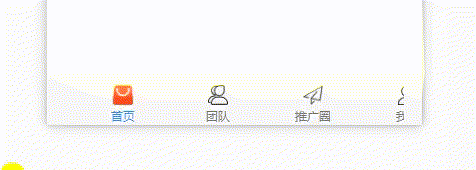
七、可拖拽式
当tabBar的数量比较多,希望可以进行拖拽,然后点击的某项时,希望他出现在视口中,那么我们可以改造一下代码。
首先调整一下css
.navigator {
		width: 85%;
		margin: 0 auto;
		padding: 20rpx;
		overflow: hidden; /* 超出部分隐藏 */
	}

	.warpper {
		display: flex;
		justify-content: flex-start;
		width: auto; /* 自适应 */
        overflow-x: scroll;
	}

	.navigator-item {
		display: flex;
		align-items: center;
		flex-direction: column;
		min-width: 190rpx; /* 设置每个的宽度 */
		height: 100%;
		flex-shrink: 0 /*  flex布局,关键 */
	}
可以看到,已实现拖拽功能,接下来就要实现点击的时候,点击项出现在视口中。
首先在computed中定义一个偏移(translateX)和一个样式(style),注:这个偏移需要在父组件中传值进去,因此需要一个offset
    props: {
      offset: {
        type: Number,
      default: 0
      }
    },
    computed: {
      style() {
        let style = {}
        style.transform = `translateX(${this.translateX}rpx)`
        return style
      },
      translateX: {
        get(){
          return this.offset
        },
        set(val){
          this.$emit('changeOffset',val)
          return val
        }
      }
    },
页面中绑定style
<view ref='warpper' class="warpper" :style="style">父组件传入值,而且是每个应用了tabBar的页面都需要写上,所以在这里使用到了mixins
<template>
	<view>
		<view class="">我是团队页</view>
		<tab-bar :offset='offset' @changeOffset='changeOffset'></tab-bar>
	</view>
</template>

<script>
	import tabbarMixins from '@/mixins/tabbarMixins.js'
	export default {
		mixins:[tabbarMixins],
		data() {
			return {}
		},
		methods: {

		}
	}
</script>
<template>
<view>
<view class="">我是other</view>
<tab-bar :offset='offset' @changeOffset='changeOffset'></tab-bar>
</view>
</template>
<script>
import tabbarMixins from '@/mixins/tabbarMixins.js'
export default {
mixins:[tabbarMixins],
data() {
return {
}
},
methods: {
}
}
</script>tabbarMixins中写公共方法
export default {
	data() {
		return {
			offset:0
		}
	},
	onShow() {
		const index = uni.getStorageSync('selectedIndex')
		this.offset = -95 * index // -95是一个项的宽度,这里可暂时写死
	},
	methods:{
		// 用于实时监控偏移值
		changeOffset(val){
			this.offset = val
		}
	}
} 
当左右拖拽时添加一些渡效果,在warpper中绑定touch方法
    <view ref='warpper' class="warpper" @touchstart="touchstart" @touchmove="touchmove"
  @touchend="touchend" :style="style">
添加位置信息
    data() {
      return {
        time: 0,
        startPosition: 0,
        offsetPosition: 0,
        clientX: 0,
        transitionDuration: 0,
      }
    },
    computed: {
      style() {
        let style = {}
        style.transform = `translateX(${this.translateX}rpx)`
        style.transitionDuration = this.transitionDuration + 'ms'
        return style
      }
编写touch方法
    touchstart(e) {
      this.time = new Date() // 保存一下开始拖拽时的时间
      const warpper = this.$refs.warpper.$el.getBoundingClientRect()
      const offsetLeft = e.target.offsetLeft
      this.clientX = e.changedTouches[0].clientX
      this.startPosition = this.clientX - this.translateX // 保存当前偏移了多少位置
    },
    touchmove(e) {
      const clientX = e.changedTouches[0].clientX
      this.transitionDuration = 0
      this.translateX = clientX - this.startPosition // 实时改变位置
    },
    touchend(e) {
      const currentTime = new Date()
      const clientX = e.changedTouches[0].clientX
      const width = this.$refs.navItem[0].$el.offsetWidth
      const length = this.tabBar.list.length
      const maxOffset = width * length / 2 - width / 2 // 最大偏移量
      const lestOffset = width * (length - 1)
      const changeTime = currentTime - this.time
      const distance = Math.abs(clientX) - Math.abs(this.clientX)

      // 当按下的时间超过200ms,同时位置发生偏移大于20时,可判定为正在拖拽
      if (changeTime > 200 && Math.abs(distance) > 20) {
        this.translateX += 20 // 停止拖拽时,添加一点点阈值
        if (this.translateX < 0 && Math.abs(this.translateX) > lestOffset) {
          this.translateX = -maxOffset * 2 // 已经到最后的时候,放开手指,反弹
        }
        if (this.translateX > 0) {
          this.translateX = 0
        }
        this.transitionDuration = 300
        setTimeout(() => {
          this.transitionDuration = 0 // 用于实现,过渡效果
        }, 300)

      }
    },
以上就是实现可拖拽的实现方式,当然有一个缺点就是,点击的时候无法实现过渡效果,具体原因还未知
相关代码
<template>
	<uni-transition mode-class="fade" :duration="200" :show="true">
		<view>
			<view class="tab-content">
				<slot />
			</view>
			<view class="tabbar">
				<view class="navigator">
					<view ref='warpper' class="warpper" @touchstart="touchstart" @touchmove="touchmove"
						@touchend="touchend" :style="style">
						<view ref="navItem" class="navigator-item" v-for="(item,index) in tabBar.list"
							:key="item.pagePath" @click="switchTab(item,index)" :data-index='index'>
							<img :src="item.iconPath" class="icon" v-if="selectedIndex !== index">
							<img :src="item.selectedIconPath" class="icon" v-else>
							<text :class="['item-text',{'text-active':selectedIndex === index}]">{{item.text}}</text>
						</view>
					</view>
				</view>
			</view>
		</view>
	</uni-transition>

</template>

<script>
	export default {
		props: {
			offset: {
				type: Number,
				default: 0
			}
		},
		data() {
			return {
				time: 0,
				startPosition: 0,
				clientX: 0,
				transitionDuration: 0,
				selectedIndex: uni.getStorageSync('selectedIndex') || 0,
				tabBar: {
					list: [{
							"pagePath": "pages/index/index",
							"iconPath": "/static/tabIcon/icon1.png",
							"selectedIconPath": "/static/tabIcon/icon2.png",
							"text": "首页"
						}, {
							"pagePath": "pages/team/team",
							"iconPath": "/static/tabIcon/icon3.png",
							"selectedIconPath": "/static/tabIcon/icon4.png",
							"text": "团队"
						}, {
							"pagePath": "pages/promotion/promotion",
							"iconPath": "/static/tabIcon/icon5.png",
							"selectedIconPath": "/static/tabIcon/icon6.png",
							"text": "推广圈"
						},
						{
							"pagePath": "pages/my/my",
							"iconPath": "/static/tabIcon/icon7.png",
							"selectedIconPath": "/static/tabIcon/icon8.png",
							"text": "我的"
						},
						{
							"pagePath": "pages/other/other",
							"iconPath": "/static/tabIcon/icon1.png",
							"selectedIconPath": "/static/tabIcon/icon2.png",
							"text": "其他"
						},
						{
							"pagePath": "pages/days/days",
							"iconPath": "/static/tabIcon/icon3.png",
							"selectedIconPath": "/static/tabIcon/icon4.png",
							"text": "日历"
						}
					]
				},
			}
		},
		computed: {
			style() {
				let style = {}
				style.transform = `translateX(${this.translateX}rpx)`
				style.transitionDuration = this.transitionDuration + 'ms'
				return style
			},
			translateX: {
				get(){
					return this.offset
				},
				set(val){
					this.$emit('changeOffset',val)
					return val
				}
			}
		},
		methods: {
			touchstart(e) {
				this.time = new Date()
				const warpper = this.$refs.warpper.$el.getBoundingClientRect()
				const offsetLeft = e.target.offsetLeft
				this.clientX = e.changedTouches[0].clientX
				this.startPosition = this.clientX - this.translateX
			},
			touchmove(e) {
				const clientX = e.changedTouches[0].clientX
				this.transitionDuration = 0
				this.translateX = clientX - this.startPosition
			},
			touchend(e) {
				const currentTime = new Date()
				const clientX = e.changedTouches[0].clientX
				const width = this.$refs.navItem[0].$el.offsetWidth
				const length = this.tabBar.list.length
				const maxOffset = width * length / 2 - width / 2
				const lestOffset = width * (length - 1)
				const changeTime = currentTime - this.time
				const distance = Math.abs(clientX) - Math.abs(this.clientX)
				if (changeTime > 200 && Math.abs(distance) > 20) {
					this.translateX += 20
					if (this.translateX < 0 && Math.abs(this.translateX) > lestOffset) {
						this.translateX = -maxOffset * 2
					}
					if (this.translateX > 0) {
						this.translateX = 0
					}
					this.transitionDuration = 300
					setTimeout(() => {
						this.transitionDuration = 0
					}, 300)

				}
			},
			/*
			// 调整前
			methods: {
				switchTab(index, item) {
					let url = '/' + item.pagePath
					let pagePath = url
					const detail = {
						index,
						pagePath
					}
					if (this.$route.path !== url) {
						// this.__path__ = this.$route.path
						uni.switchTab({
							from: 'tabBar',
							url,
							detail
						})
					} else {
						// UniServiceJSBridge.emit('onTabItemTap', detail)
					}
					this.selectedIndex = index
					// this.$emit('switchTab', detail)
				}
			}, */
			// 调整后,1、调换入参顺序,方便传值,2、循环判断一下index,
			switchTab(item, index) {
				const navItem = this.$refs.navItem
				let url = '/' + item.pagePath
				let pagePath = url
				uni.switchTab({
					url
				})
				this.tabBar.list.forEach((v, i) => {
					if (item.pagePath === v.pagePath) {
						uni.setStorageSync('selectedIndex', index);
					}
				})
			}
		},
	}
</script>

<style>
	.tabbar {
		position: fixed;
		bottom: 0;
		left: 0;
		width: 100%;
		height: 100rpx;
		z-index: 999;
		background: #F5F5F5;
		border-top: 2rpx solid #eee;
	}

	.navigator {
		width: 85%;
		margin: 0 auto;
		padding: 20rpx;
		overflow: hidden;
	}

	.warpper {
		display: flex;
		justify-content: flex-start;
		width: auto;
		transition-timing-function: ease-out;
		transition-duration: 300ms;
	}

	.navigator-item {
		display: flex;
		align-items: center;
		flex-direction: column;
		min-width: 190rpx;
		height: 100%;
		flex-shrink: 0
	}

	.item-text {
		margin-top: 6rpx;
		color: #777E86;
		font-size: 24rpx;
	}

	.text-active {
		color: #2E92FD !important;
	}

	.icon {
		width: 20px;
		height: 20px;
	}
</style>


 2942
2942


 被折叠的 条评论
为什么被折叠?
被折叠的 条评论
为什么被折叠?
 到【灌水乐园】发言


