


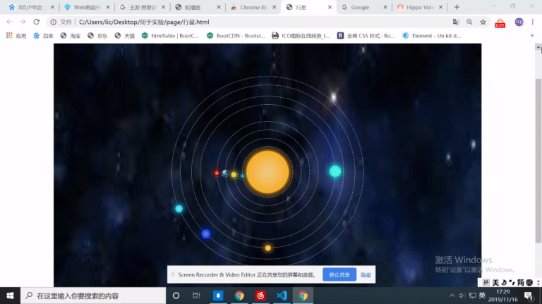
效果图:
程序:
<!DOCTYPE html>
<html lang="en">
<head>
    <meta charset="UTF-8">
    <meta name="viewport" content="width=device-width, initial-scale=1.0">
    <meta http-equiv="X-UA-Compatible" content="ie=edge">
    <title>行星</title>
</head>
<style>
    *{
        padding: 0;
        margin: 0;
        box-sizing: border-box;
    }
    html,body{
        width: 100%;
        height: 100%;
    }
    @keyframes rorate{
        from{
            transform: rotate(0deg);
        }
        to{
            transform: rotate(-360deg);
        }
    }
    .solarsys{
        width: 80%;
        height: 140%;
        background-image: url("../assetes/pic/星空.jpg");
        background-size: 100% 140%;
        margin: 0 auto;
        position: relative;
    }
    .solarsys div{
        border-radius: 50%;
        position: absolute;
    }
    .sun{
        height: 150px;
        width: 150px;
        background-image: radial-gradient(circle,rgb(240, 203, 136),orange);
        box-shadow: 0 0 20px 3px orange;
        top: calc(50% - 75px);
        left: calc(50% - 75px);
    }
    .mercuryOrbit{
        height: 180px;
        width: 180px;
        border: 1px dashed white;
        top: calc(50% - 90px);
        left: calc(50% - 90px);
    }
    .mercury{
        height: 10px;
        width: 10px;
        background-image: radial-gradient(circle,rgb(136, 181, 240),rgb(0, 140, 255));
        box-shadow: 0 0 20px 3px rgb(2, 194, 253);
        top: calc(50% - 5px);
        left: calc(50% - 95px);
        /* 旋转圆心 */
        transform-origin: 95px 5px;
        animation: rorate 2s linear infinite;
    }
    .venusOrbit{
        height: 240px;
        width:240px;
        border: 1px dashed white;
        top: calc(50% - 120px);
        left: calc(50% - 120px);
    }
    .venus{
        height: 18px;
        width: 18px;
        background-image: radial-gradient(circle,rgb(233, 240, 136),rgb(255, 238, 0));
        box-shadow: 0 0 20px 3px rgb(255, 238, 0);
        top: calc(50% - 9px);
        left: calc(50% - 129px);
        /* 旋转圆心 */
        transform-origin: 129px 9px;
        animation: rorate 4s linear infinite;
    }
    .earthOrbit{
        height: 300px;
        width:300px;
        border: 1px dashed white;
        top: calc(50% - 150px);
        left: calc(50% - 150px);
    }
    .earth{
        height: 26px;
        width: 26px;
        /* background-image: radial-gradient(circle,rgb(224, 224, 216),rgb(0, 140, 255));
        box-shadow: 0 0 20px 3px rgb(0, 217, 255); */
        background-image: url("../assetes/pic/地球.jpg");
        background-size: 100%;
        top: calc(50% - 13px);
        left: calc(50% - 163px);
        /* 旋转圆心 */
        transform-origin: 163px 13px;
        animation: rorate 8s linear infinite;
    }
    .marsOrbit{
        height: 360px;
        width:360px;
        border: 1px dashed white;
        top: calc(50% - 180px);
        left: calc(50% - 180px);
    }
    .mars{
        height: 14px;
        width: 14px;
        background-image: radial-gradient(circle,rgb(247, 149, 92),rgb(255, 8, 0));
        box-shadow: 0 0 20px 3px rgb(255, 8, 0);
        top: calc(50% - 7px);
        left: calc(50% - 187px);
        /* 旋转圆心 */
        transform-origin: 187px 7px;
        animation: rorate 16s linear infinite;
    }
    .jupiterOrbit{
        height: 480px;
        width:480px;
        border: 1px dashed white;
        top: calc(50% - 240px);
        left: calc(50% - 240px);
    }
    .jupiter{
        height: 40px;
        width: 40px;
        background-image: radial-gradient(circle,rgb(119, 241, 231),rgb(0, 255, 213));
        box-shadow: 0 0 20px 3px rgb(0, 255, 213);
        top: calc(50% - 20px);
        left: calc(50% - 260px);
        /* 旋转圆心 */
        transform-origin: 260px 20px;
        animation: rorate 32s linear infinite;
    }
    .saturnOrbit{
        height: 540px;
        width:540px;
        border: 1px dashed white;
        top: calc(50% - 270px);
        left: calc(50% - 270px);
    }
    .saturn{
        height: 20px;
        width: 20px;
        background-image: radial-gradient(circle,rgb(241, 202, 119),rgb(255, 187, 0));
        box-shadow: 0 0 20px 3px rgb(255, 187, 0);
        top: calc(50% - 10px);
        left: calc(50% - 280px);
        /* 旋转圆心 */
        transform-origin: 280px 10px;
        animation: rorate 64s linear infinite;
    }
    .uranusOrbit{
        height: 620px;
        width:620px;
        border: 1px dashed white;
        top: calc(50% - 310px);
        left: calc(50% - 310px);
    }
    .uranus{
        height: 30px;
        width: 30px;
        background-image: radial-gradient(circle,rgb(119, 137, 241),rgb(0, 38, 255));
        box-shadow: 0 0 20px 3px rgb(0, 38, 255);
        top: calc(50% - 15px);
        left: calc(50% - 325px);
        /* 旋转圆心 */
        transform-origin: 325px 15px;
        animation: rorate 128s linear infinite;
    }
    .neptuneOrbit{
        height: 680px;
        width:680px;
        border: 1px dashed white;
        top: calc(50% - 340px);
        left: calc(50% - 340px);
    }
    .neptune{
        height: 26px;
        width: 26px;
        background-image: radial-gradient(circle,rgb(119, 241, 231),rgb(0, 195, 255));
        box-shadow: 0 0 20px 3px rgb(0, 195, 255);
        top: calc(50% - 13px);
        left: calc(50% - 353px);
        /* 旋转圆心 */
        transform-origin: 353px 13px;
        animation: rorate 256s linear infinite;
    }
</style>
<body>
    <div class="solarsys">
            <!--太阳-->
            <div class='sun'></div>
            <!--水星轨道-->
            <div class='mercuryOrbit'></div>
            <!--水星-->
            <div class='mercury'></div>
            <!--金星轨道-->
            <div class='venusOrbit'></div>

            <!--金星-->
            <div class='venus'></div>

            <!--地球轨道-->
            <div class='earthOrbit'></div>

            <!--地球-->
            <div class='earth'></div>

            <!--火星轨道-->
            <div class='marsOrbit'></div>

            <!--火星-->
            <div class='mars'></div>

            <!--木星轨道-->
            <div class='jupiterOrbit'></div>

            <!--木星-->
            <div class='jupiter'></div>

            <!--土星轨道-->
            <div class='saturnOrbit'></div>

            <!--土星-->
            <div class='saturn'></div>

            <!--天王星轨道-->
            <div class='uranusOrbit'></div>

            <!--天王星-->
            <div class='uranus'></div>

            <!--海王星轨道-->
            <div class='neptuneOrbit'></div>

            <!--海王星-->
            <div class='neptune'></div>
        </div>

</body>
</html>
<!--
    transform-orign:x y;
    绕圆圈旋转:x 表示 轨道半径+球体半径
               y 表示 球体半径
    transform-orign:x-axis y-axis z-axis;
    绕轴旋转: left right center -x轴参数
              top buttom center -y轴参数
              length            -z轴参数
 -->


 196
196


 被折叠的 条评论
为什么被折叠?
被折叠的 条评论
为什么被折叠?
 到【灌水乐园】发言


