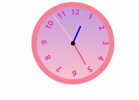
  <div class="clock">
        <div class="circle"></div>
        <div class="hour"></div>
        <div class="minutes"></div>
        <div class="seconds"></div>


        <!-- 添加数字1-12 -->
        <div class="nums"> </div>

    </div>
* {
margin: 0;
padding: 0;
}
.clock {
position: relative;
width: 200px;
height: 200px;
border: solid 14px rgb(247, 129, 149);
border-radius: 50%;
margin: 100px auto;
background: linear-gradient( rgb(190, 155, 223),pink);
}
.circle{
position: absolute;
left: 50%;
top: 50%;
transform: translate(-50%,-50%);
width: 12px;
height: 12px;
background-color: black;
border-radius: 50%;
z-index: 5;
}
.hour {
position: absolute;
left: 49.5%;
top: 48px;
width: 4px;
height: 50px;
background-color: blue;
animation: run 21600s steps(60) infinite;
transform-origin: bottom;
z-index: 3;
}
.minutes {
position: absolute;
left: 49.5%;
top: 28px;
width: 3px;
height: 70px;
background-color: rgb(240, 83, 83);
animation: run 3600s steps(60) infinite;
transform-origin: bottom;
z-index: 2;
}
.seconds {
position: absolute;
left: 50%;
top: 2px;
width: 2px;
height: 96px;
background-color: pink;
animation: run 60s steps(60) infinite;
transform-origin: bottom;
}
.ps {
width: 100%;
height: 100%;
}
.number {
position: absolute;
left: 50%;
width: 10px;
height: 98px;
transform-origin: bottom;
color: rgb(230, 53, 156);
font-weight: bold;
font-size: 20px;
}
.number:last-child {
left: 47%;
}
@keyframes run {
0% {
transform: rotate(0);
}
100% {
transform: rotate(360deg)
}
}
<script>
var nums = document.querySelector('.nums')
var dd = 30;
for (var i = 1; i < 13; i++) {
var number = document.createElement('div');
number.className = 'number';
number.innerText = i;
nums.appendChild(number);
number.style.transform = "rotate(" + dd + "deg)";
if (dd < 360) {
dd += 30;
}
}
</script>


 1179
1179


 被折叠的 条评论
为什么被折叠?
被折叠的 条评论
为什么被折叠?
 到【灌水乐园】发言


