


前言: 基于项目内的一个需求,需要在首页展示一些素材列表,列表内是每一个素材卡片,素材列表在一行显示,且一行最多显示5个卡片,当卡片多与五个时候会出现左右箭头,点击箭头可将卡片列表左右移动,类似于轮播图,区别就是轮播图每次只能看到一张,而这个例子一次最多能看到5张
element UI 组件库内没有相关了组件,只有Carousel 走马灯,但是不符合要求,开始想过用数组,但是这样无法实现过度效果,网上也没搜到相关的例子,那就自己动手吧,写了一个demo,只是一个记录,优化地方很多,开始吧
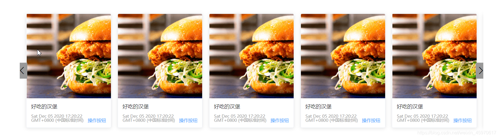
先上效果:
实现:
- 创建项目demo 引入Element UI组件库
// 命令 创建项目,用到了router  scss,等
 vue create demo

// 引入组件 main.js内
import ElementUI from 'element-ui';
import 'element-ui/lib/theme-chalk/index.css';
Vue.use(ElementUI);

 // 引入自己的css样式文件
 import './assets/css/index.css'
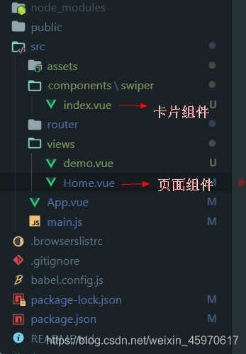
- 创建页面,我的思路是,将每一项的卡片封装成为组件,然后在展示页面内引入组件,用请求回来的数据进行循环,得到列表,因此需要在src/components下建立一个卡片组件,在views下建立一个页面,然后将卡片组件引入到页面组件内.
文件目录如下
3. 开始写页面
card组件(即swiper/index.vue)
我这里只是简单的写了一下,思路,因此里面的数据都是直接写死的,真是开发中里面的数据都是要通过父组件传进来的,比如卡片的内容,然后每张卡片的点击事件可以传出去给父组件处理,当然,这里没写…
这儿 :style="{minWidth:width}"是为了动态的自适应屏幕,不管屏幕怎么变化,可视区内都只有5张卡片可见
<template>
 <div class="card-item" :style="{minWidth:width}">
  <el-card :body-style="{ padding: '0px' }">
      <img src="https://shadow.elemecdn.com/app/element/hamburger.9cf7b091-55e9-11e9-a976-7f4d0b07eef6.png" class="image">
      <div style="padding: 14px;">
        <span>好吃的汉堡</span>
        <div class="bottom clearfix">
          <time class="time">{{ currentDate }}</time>
          <el-button type="text" class="button">操作按钮</el-button>
        </div>
      </div>
    </el-card>
 </div>
</template>

<script>
 export default {
   props:{
       width:{
           type:String,
           default:"20%"
       }
   },
   data () {
     return {
          currentDate: new Date()
     }
   },
 }
</script>

<style lang='scss' scoped>
.card-item {
    padding:10px;
    box-sizing: border-box;
}
  .time {
    font-size: 13px;
    color: #999;
  }

  .bottom {
    margin-top: 13px;
    line-height: 12px;
  }

  .button {
    padding: 0;
    float: right;
  }

  .image {
    width: 100%;
    display: block;
  }

  .clearfix:before,
  .clearfix:after {
      display: table;
      content: "";
  }

  .clearfix:after {
      clear: both
  }
</style>
- 然后home.vue里面
这个页面也只是简单的写了一下,主要是为了实现效果,还有很多可优化的地方,比如,可将左右箭头隐藏,待hove时候显示,当卡片数量小于5时候hover也不显示,等等,
<template>
  <div class="home">
   <el-row :gutter="20" type="flex" justify="center">
      <el-col :span="20">
        <div id="father" class="grid-content bg-purple">
          <div id="swiper-box" class="swiper-box" :style="{transform:'translateX('+currentOffset+'px)'}">
           <swiper-item  :width="width" v-for="i in 10"></swiper-item>
          </div>
          <i class="el-icon-arrow-left" @click="left"></i>
          <i class="el-icon-arrow-right" @click="right"></i>
        </div>
      </el-col>

    </el-row>

  </div>
</template>

<script>
// @ is an alias to /src
import swiperItem from '@/components/swiper'

export default {
  name: 'Home',
  data() {
    return {
      currentOffset:0,
      width:"",
      fatherWith:0,
      box:'' // dom
    }
  },
  components: {
    swiperItem
  },
  mounted () {
    this.setCardWidth()
    this.box = document.querySelector('#swiper-box')
    window.addEventListener('resize',()=>{
      this.currentOffset = 0
      this.setCardWidth()
    })
  },
  methods:{
    setCardWidth() {
      const father = document.querySelector('#father');
      this.fatherWith = father.clientWidth
      console.log("fatherWidth",this.fatherWith);
      this.width = ((this.fatherWith-20) / 5)+'px'
    },

    right() {
      console.log(this.currentOffset);
      if(this.currentOffset <= (-(this.fatherWith-20) / 5)*(10-5)) return
      this.currentOffset-=((this.fatherWith-20) / 5)
    },
    left() {
      console.log(this.currentOffset);
      if(this.currentOffset >= -2) return
      this.currentOffset+=((this.fatherWith-20) / 5)
    }
  }
}
</script>


<style lang="scss" scoped>
.bg-purple {
  overflow: hidden;
  position:relative;
  padding-left: 10px;
}
.home {
  margin-top: 50px;
  .swiper-box {
    display: flex;
    width: auto;
    transition: all .2s;
  }
}

[class ^="el-icon-arrow-"] {
  position:absolute;
  top:50%;
  transform: translateY(-50%);
  font-size: 30px;
  padding: 10px 0;
  background-color: #999;
  cursor: pointer;

}
.el-icon-arrow-left, {
  left:-7px;
}
.el-icon-arrow-right, {
  right:-7px;
}
</style>
至此,就简单的实现了,优化改进的地方很多,仅仅是自己平时的一点点记录,转载请注明出处,谢谢


 1221
1221


 被折叠的 条评论
为什么被折叠?
被折叠的 条评论
为什么被折叠?
 到【灌水乐园】发言


