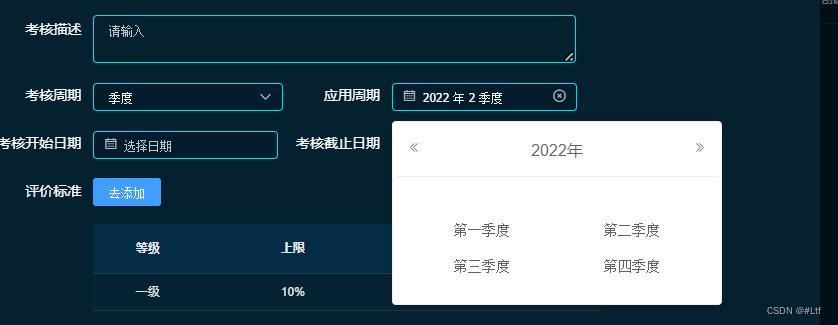
element-ui 封装季度选择框

最终页面效果:

季度选择框

完整代码:

jiduDatePicker.vue组件

<template>
  <!-- 季度选择时间控件 -->
  <div class="wrapper_picker">
    <span>
      <!-- 生成一个点用于控制季度时间弹窗消失 -->
      <span
        style="position:fixed;top:0;bottom:0;left:0;right:0;background:rgba(0,0,0,0);z-index:999;"
        v-show="showSeason"
        @click.stop="showSeason=false"
      ></span>
      <el-input
        placeholder="选择季度"
        v-model="showValue"
        style="width:93%;"
        clearable
        @focus="showSeason=true"
      >
        <i slot="prefix" class="el-input__icon el-icon-date"></i>
      </el-input>
      <el-card
        class="box-card"
        style="width:322px;padding: 0 3px 20px;margin-top:10px;position:fixed;z-index:9999"
        v-show="showSeason"
      >
        <div slot="header" class="firstBtn">
          <button
            type="button"
            aria-label="前一年"
            class="el-picker-panel__icon-btn el-date-picker__prev-btn el-icon-d-arrow-left"
            @click="prev"
          ></button>
          <span role="button" class="el-date-picker__header-label">{{year}}</span>
          <button
            type="button"
            aria-label="后一年"
            @click="next"
            class="el-picker-panel__icon-btn el-date-picker__next-btn el-icon-d-arrow-right"
          ></button>
        </div>
        <div class="text container">
          <!-- 如下,绑定class,disabled为禁止选择的时间的设置 -->
          <el-button
            type="text"
            size="medium"
            style="width:47%;color: #606266;float:left;"
            @click="selectSeason(0)"
          >第一季度</el-button>
          <el-button
            type="text"
            size="medium"
            style="float:right;width:47%;color: #606266;"
            @click="selectSeason(1)"
          >第二季度</el-button>
        </div>
        <div class="item container" style="text-align:center;">
          <el-button
            type="text"
            size="medium"
            style="width:47%;color: #606266;float:left;"
            @click="selectSeason(2)"
          >第三季度</el-button>
          <el-button
            type="text"
            size="medium"
            style="float:right;width:47%;color: #606266;"
            @click="selectSeason(3)"
          >第四季度</el-button>
        </div>
      </el-card>
    </span>
  </div>
</template>
 
<script>
export default {
  name: "jududatepicker",
  props: {
    valueArr: {
      default: () => {
        return ["01-03", "04-06", "07-09", "10-12"];
      },
      type: Array
    },
    getValue: {
      default: val => {
        return val;
      },
      type: Function
    }
  },
  data() {
    return {
      showSeason: false,
      season: "",
      year: new Date().getFullYear(), // input显示时间,会随着用户操作改变
      defaultyear: new Date().getFullYear(), // 当前年份,不变
      month: new Date().getMonth() + 1, // 当前月份,不变
      showValue: "",
      beforeyear: null // 默认显示上一季度所用时间,可能是去年
    };
  },
  created() {
  },
  mounted() {
    // 每次挂在时都对组件进行重置,那么就不需要在上级组件中进行重置
    this.getDefaultTime();
  },
  methods: {
    one() {
      this.showSeason = false;
    },
    prev() {
      this.year = this.year * 1 - 1;
    },
    next() {
      this.year = this.year * 1 + 1;
    },
    selectSeason(i) {
      let that = this;
      // 得到选择后的季度
      that.season = i + 1;
      // let arr = that.valueArr[i].split("-");
      // let seasonValue = that.getValue(that.year + "-" + arr[0] + "-" + "01");
      // 选择季度后关闭弹框
      that.showSeason = false;
      this.showValue = `${this.year}${this.season} 季度`;
      that.$emit("chooseSeason", this.showValue); // 每次选择时间都将当前选择时间发送到父组件
    },
    // 获取默认的上一个季度
    getDefaultTime() {
      var year = this.defaultyear;
      var month = this.month;
      var season = null;
      if (month <= 3) {
        this.season = 1;
        year -= 1;
        season = 4;
        this.beforeyear = year;
      } else if (month > 3 && month <= 6) {
        this.season = 2;
        season = 1;
        this.beforeyear = year;
      } else if (month > 6 && month <= 9) {
        this.season = 3;
        season = 2;
        this.beforeyear = year;
      } else if (month > 9 && month <= 12) {
        this.season = 4;
        season = 3;
        this.beforeyear = year;
      }
      this.showValue = `${year}${season} 季度`;
      this.$emit("chooseSeason", this.showValue);
    }
  }
};
</script>
 
<style lang="scss" scoped>
.wrapper_picker {
  display: inline;
  .firstBtn {
    height: 30px;
    line-height: 34px;
    width: 100%;
    text-align: center;
  }
  .text {
    text-align: center;
    margin: 15px 0 10px;
  }
  .item {
    text-align: center;
  }
}
.colorDis {
  color: #999 !important;
}
</style>
<style lang="scss">
.wrapper_picker {
  .el-card__header {
    padding: 12px;
  }
}
</style>
使用组件:chooseSeason(val)打印的是季度选择框选中的季度
<jidu-date-picker
   ref="jidupicker"
   @chooseSeason='chooseSeason'
 ></jidu-date-picker>
  • 0
    点赞
  • 2
    收藏
    觉得还不错? 一键收藏
  • 0
    评论
### 回答1: Element-UI 是一套基于 Vue.js 2.0 的 UI 组件库,提供了丰富的组件和模板,方便我们快速开发页面。其中,Table 组件是常用的数据展示组件之一,我们可以通过封装一个 TableList 组件来简化 Table 的使用。 以下是一个简单的 TableList 封装示例: ```vue <template> <div> <el-table :data="tableData" :height="height" :max-height="maxHeight" :stripe="stripe" :border="border" :default-sort="defaultSort" :show-header="showHeader" :highlight-current-row="highlightCurrentRow"> <el-table-column v-for="(column, index) in columns" :key="index" :label="column.label" :prop="column.prop" :width="column.width" :min-width="column.minWidth" :fixed="column.fixed" :resizable="column.resizable" :formatter="column.formatter" :show-overflow-tooltip="column.showOverflowTooltip"></el-table-column> </el-table> </div> </template> <script> export default { name: "TableList", props: { tableData: { type: Array, default: () => [] }, columns: { type: Array, default: () => [] }, height: { type: String, default: "" }, maxHeight: { type: String, default: "" }, stripe: { type: Boolean, default: true }, border: { type: Boolean, default: true }, defaultSort: { type: Object, default: () => {} }, showHeader: { type: Boolean, default: true }, highlightCurrentRow: { type: Boolean, default: true } } }; </script> ``` 在这个组件中,我们定义了以下 props: - `tableData`:表格数据,类型为 Array。 - `columns`:表格列的配置项,类型为 Array。每个配置项包含 `label`(列名)、`prop`(对应数据源的字段名)、`width`(列宽度)等属性。 - `height`:表格高度,类型为 String。 - `maxHeight`:表格最大高度,类型为 String。 - `stripe`:是否显示斑马纹,类型为 Boolean。 - `border`:是否显示边,类型为 Boolean。 - `defaultSort`:默认排序规则,类型为 Object,包含 `prop`(排序字段名)和 `order`(排序方式)两个属性。 - `showHeader`:是否显示表头,类型为 Boolean。 - `highlightCurrentRow`:是否高亮当前行,类型为 Boolean。 通过封装这个 TableList 组件,我们可以在项目中更加方便地使用 Element-UI 的 Table 组件,同时也可以减少代码重复。 ### 回答2: element-ui是一款基于Vue.js的UI组件库,而tableList是element-ui中的一个组件封装。 tableList组件的主要作用是用于展示和管理数据表格。它提供了丰富的功能和选项,使得我们可以快速地构建出符合需求的数据表格界面。 首先,我们可以通过tableList组件来定义表格的列,包括列的名称、宽度、对齐方式等。可以根据实际需求设置不同的列,并且还可以对列进行排序、隐藏等操作。 其次,tableList组件还支持分页功能,可以根据数据的大小自动生成相应的分页器,方便用户浏览和查找数据。 另外,tableList还提供了搜索和筛选的功能,用户可以根据表格中的内容进行搜索和筛选操作,以方便快速找到想要的数据。 此外,tableList还支持多选、单选等操作,用户可以通过复选或者单选按钮来选择需要的数据进行操作。 总的来说,tableList是element-ui中的一个封装组件,它简化了数据表格的开发和管理,提供了丰富的功能和选项,使得我们能够更加灵活和高效地展示和管理数据表格。 ### 回答3: element-ui封装中的tableList是对element-ui中的Table组件进行封装后的一个自定义组件。该组件可以方便地在项目中使用Table,减少重复代码的编写。 tableList的特点是具有高度的可定制性和扩展性。通过传入不同的参数和配置,可以实现不同的表格功能和样式。例如,可以通过指定columns来定义表格的列数和展示内容;通过指定data来传入数据源;通过设置pagination来实现分页等功能。 在tableList组件中,我们还可以通过插槽(slot)的方式来自定义表格的一些样式和功能。比如,可以使用slot="header"来自定义表头,使用slot-scope在插槽内部可以访问到每一行的数据。 除了基本的表格功能外,tableList还可以在数据源发生变化时进行自动刷新,通过设置@refresh事件来实现数据的实时更新。 总之,element-ui封装的tableList组件可以帮助我们快速搭建出功能齐全、扩展性强的表格展示页面。它简化了我们对Table组件的使用,提高了开发效率,同时保留了element-ui原本的特性和优势。

“相关推荐”对你有帮助么?

  • 非常没帮助
  • 没帮助
  • 一般
  • 有帮助
  • 非常有帮助
提交
评论
添加红包

请填写红包祝福语或标题

红包个数最小为10个

红包金额最低5元

当前余额3.43前往充值 >
需支付:10.00
成就一亿技术人!
领取后你会自动成为博主和红包主的粉丝 规则
hope_wisdom
发出的红包
实付
使用余额支付
点击重新获取
扫码支付
钱包余额 0

抵扣说明:

1.余额是钱包充值的虚拟货币,按照1:1的比例进行支付金额的抵扣。
2.余额无法直接购买下载,可以购买VIP、付费专栏及课程。

余额充值