


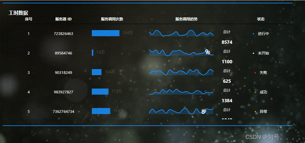
正常显示的时候是这样的
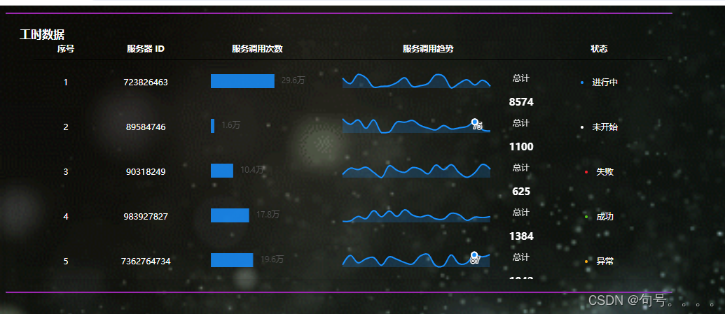
当鼠标进行悬停的时候会有水波纹出现
 .el-card {
          border: none; /* 移除默认边框 */
          border-top: 2px solid #1890ff; /* 上边框 */
          border-bottom: 2px solid #1890ff; /* 下边框 */
          position: relative; /* 为伪元素定位做准备 */
        }
        /* 鼠标悬停时,将边框颜色变为透明或与背景相同 */
        .el-card:hover {
          border-color: transparent; /* 或使用与背景相同的颜色 */
        }
              /* 上边框水纹效果 */
        .el-card:hover::before {
          border: none; /* 移除默认边框 */
          content: "";
          position: absolute;
          top: 0;
          left: 0;
          right: 0;
          height: 2px;
          background-repeat: repeat-x;
          background-size: 200% 100%;
          animation-duration: 2s, 2s, 2s, 2s, 2s, 2s, 2s;
          animation-timing-function: linear;
          animation-iteration-count: infinite;
          background-image:
            linear-gradient(to right, transparent 0%, #9c27b0 15%, #9c27b0 85%, transparent 100%), /* 紫色 */
            linear-gradient(to right, transparent 0%, #2196f3 15%, #2196f3 85%, transparent 100%), /* 蓝色 */
            linear-gradient(to right, transparent 0%, #e91e63 15%, #e91e63 85%, transparent 100%), /* 粉色 */
            linear-gradient(to right, transparent 0%, #ffeb3b 15%, #ffeb3b 85%, transparent 100%), /* 黄色 */
            linear-gradient(to right, transparent 0%, #4caf50 15%, #4caf50 85%, transparent 100%), /* 绿色 */
            linear-gradient(to right, transparent 0%, #f44336 15%, #f44336 85%, transparent 100%), /* 红色 */
            linear-gradient(to right, transparent 0%, #00bcd4 15%, #00bcd4 85%, transparent 100%); /* 蓝绿色 */
          background-position-x:
            -50%,
            calc(-50% + 25px),
            calc(-50% + 50px),
            calc(-50% + 75px),
            calc(-50% + 100px),
            calc(-50% + 125px),
            calc(-50% + 150px);
          animation-name:
            waveTop1,
            waveTop2,
            waveTop3,
            waveTop4,
            waveTop5,
            waveTop6,
            waveTop7;
        }

        /* 底边框水纹效果 */
        .el-card:hover::after {
          content: "";
          position: absolute;
          bottom: 0; /* 改为底部定位 */
          left: 0;
          right: 0;
          height: 2px;
          background-repeat: repeat-x;
          background-size: 200% 100%;
          animation-duration: 2s, 2s, 2s, 2s, 2s, 2s, 2s;
          animation-timing-function: linear;
          animation-iteration-count: infinite;
          background-image:
            linear-gradient(to right, transparent 0%, #9c27b0 15%, #9c27b0 85%, transparent 100%), /* 紫色 */
            linear-gradient(to right, transparent 0%, #2196f3 15%, #2196f3 85%, transparent 100%), /* 蓝色 */
            linear-gradient(to right, transparent 0%, #e91e63 15%, #e91e63 85%, transparent 100%), /* 粉色 */
            linear-gradient(to right, transparent 0%, #ffeb3b 15%, #ffeb3b 85%, transparent 100%), /* 黄色 */
            linear-gradient(to right, transparent 0%, #4caf50 15%, #4caf50 85%, transparent 100%), /* 绿色 */
            linear-gradient(to right, transparent 0%, #f44336 15%, #f44336 85%, transparent 100%), /* 红色 */
            linear-gradient(to right, transparent 0%, #00bcd4 15%, #00bcd4 85%, transparent 100%); /* 蓝绿色 */
          background-position-x:
            -50%,
            calc(-50% + 25px),
            calc(-50% + 50px),
            calc(-50% + 75px),
            calc(-50% + 100px),
            calc(-50% + 125px),
            calc(-50% + 150px);
          animation-name:
            waveBottom1,
            waveBottom2,
            waveBottom3,
            waveBottom4,
            waveBottom5,
            waveBottom6,
            waveBottom7;
        }

      /* 定义动画 */
      @keyframes waveTop1 {
        from { background-position-x: -50%; }
        to { background-position-x: 150%; }
      }
      /* ... 省略其他顶部动画定义 ... */
      @keyframes waveTop7 {
        from { background-position-x: calc(-50% + 150px); }
        to { background-position-x: calc(150% + 150px); }
      }

      @keyframes waveBottom1 {
        from { background-position-x: -50%; }
        to { background-position-x: 150%; }
      }
      /* ... 省略其他底部动画定义 ... */
      @keyframes waveBottom7 {
        from { background-position-x: calc(-50% + 150px); }
        to { background-position-x: calc(150% + 150px); }
      }
还有更花的
        .el-card {
          border: none; /* 移除默认边框 */
          border-top: 2px solid #1890ff; /* 上边框 */
          border-bottom: 2px solid #1890ff; /* 下边框 */
          position: relative; /* 为伪元素定位做准备 */
          transition: border-color 1s; /* 添加过渡效果 */
        }
        /* 鼠标悬停时,将边框颜色变为透明或与背景相同 */
        .el-card:hover {
          border-color: transparent; /* 或使用与背景相同的颜色 */
        }
/* 上边框水波纹效果 */
.el-card:hover::before {
  content: "";
  position: absolute;
  top: 0;
  left: 0;
  right: 0;
  height: 2px;
  background-size: 200% 100%;
  animation: waveGradientTop 10s linear infinite;
}

/* 底边框水波纹效果 */
.el-card:hover::after {
  content: "";
  position: absolute;
  bottom: 0;
  left: 0;
  right: 0;
  height: 2px;
  background-size: 200% 100%;
  animation: waveGradientBottom 10s linear infinite;
}

/* 渐变色水波纹动画 */
@keyframes waveGradientTop {
  0%, 100% {
    background-image: linear-gradient(to right, #9c27b0, #2196f3, #a61c96, #7d720c, #066f0a, #830f06, #00bcd4, #9c27b0);
    background-position-x: 0%;
  }
  50% {
    background-position-x: 100%;
  }
}

@keyframes waveGradientBottom {
  0%, 100% {
    background-image: linear-gradient(to right, #9c27b0, #2196f3, #a61c96, #7d720c, #066f0a, #830f06, #00bcd4, #9c27b0);
    background-position-x: 0%;
  }
  50% {
    background-position-x: 100%;
  }
}


 1609
1609

 被折叠的 条评论
为什么被折叠?
被折叠的 条评论
为什么被折叠?
 到【灌水乐园】发言


