


position
元素的位置也由顶部,底部,左侧和右侧属性控制。

relative 相对定位
relative - 相对于其正常位置定位。不影响其他元素布局,不使元素脱离文档流,因此,样式 “left:-20px” 从元素的原始左侧位置减去 20 像素。样式 “left:20px” 向元素的原始左侧位置增加 20 像素。left,top,right,bottom是相对于元素自身进行偏移
<!DOCTYPE html>
<html lang="en">
<head>
    <meta charset="UTF-8">
    <meta http-equiv="X-UA-Compatible" content="IE=edge">
    <meta name="viewport" content="width=device-width, initial-scale=1.0">
    <title>Document</title>
    <style>
     /*    #box1{width: 100px;height: 100px;background: red;}
        #box2{width: 100px;height: 100px;background:blue;margin-left: 100px;margin-top: 100px;}
        #box3{width: 100px;height: 100px;background: yellow;margin-top: -100px;} */
        #box1{width: 100px;height: 100px;background: red;}
        #box2{width: 100px;height: 100px;background:blue;position: relative;/* 相对定位 */left: 100px;top: 100px;}
        #box3{width: 100px;height: 100px;background: yellow;}
    </style>
</head>
<body>
    <div id="box1"></div>
    <div id="box2"></div>
    <div id="box3"></div>
</body>
</html>

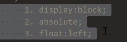
absolute绝对定位
**absolute生成绝对定位的元素,相对于 static 定位以外的第一个父元素进行定位,意思是如果没有定位祖先元素相当于整个文档发生偏移。1 使元素完全脱离文档流。2 使内联元素支持宽高(让内联span元素具备块特性).3 使块元素(div)默认宽根据内容决定
<!DOCTYPE html>
<html lang="en">
<head>
    <meta charset="UTF-8">
    <meta http-equiv="X-UA-Compatible" content="IE=edge">
    <meta name="viewport" content="width=device-width, initial-scale=1.0">
    <title>Document</title>
    <style>
        #box1{width: 100px;height: 100px;background-color: red;position: absolute;}
        #box2{width: 200px;height: 200px;background-color: blue;}
    </style>
</head>
<body>
    <div id="box1"></div>
    <div id="box2"></div>
</body>
</html>

<!DOCTYPE html>
<html lang="en">
<head>
    <meta charset="UTF-8">
    <meta http-equiv="X-UA-Compatible" content="IE=edge">
    <meta name="viewport" content="width=device-width, initial-scale=1.0">
    <title>Document</title>
    <style>
        #box1{width: 300px;height: 300px;border: 1px black solid;margin: 200px;}
        #box2{width: 100px;height: 100px;background-color: blue;position: absolute;right: 0;top: 0;}
    </style>
</head>
<body>
    <div id="box1">
          <div id="box2"></div>
    </div>
</body>
</html>

<!DOCTYPE html>
<html lang="en">
<head>
    <meta charset="UTF-8">
    <meta http-equiv="X-UA-Compatible" content="IE=edge">
    <meta name="viewport" content="width=device-width, initial-scale=1.0">
    <title>Document</title>
    <style>
        #box1{width: 300px;height: 300px;border: 1px black solid;margin: 200px;position: relative;}
        #box2{width: 100px;height: 100px;background-color: blue;position: absolute;right: 0;top: 0;}
    </style>
</head>
<body>
    <div id="box1">
          <div id="box2"></div>
    </div>
</body>
</html>

fixed固定定位
fixed固定定位1 使元素完全脱离文档流。2 使内联元素支持宽高(让内联span元素具备块特性).3 使块元素(div)默认宽根据内容决定4相对于整个浏览器窗口进行偏移,不受浏览器滚动条的影响
<!DOCTYPE html>
<html lang="en">
<head>
    <meta charset="UTF-8">
    <meta http-equiv="X-UA-Compatible" content="IE=edge">
    <meta name="viewport" content="width=device-width, initial-scale=1.0">
    <title>Document</title>
    <style>
        body{height: 2000px;}
        div{position: fixed;right: 0;}
    </style>
</head>
<body>
    <div>这是一个块</div>
</body>
</html>

sticky黏性定位
sticky黏性定位
<!DOCTYPE html>
<html lang="en">
<head>
    <meta charset="UTF-8">
    <meta http-equiv="X-UA-Compatible" content="IE=edge">
    <meta name="viewport" content="width=device-width, initial-scale=1.0">
    <title>Document</title>
    <style>
        body{height: 2000px;}
        div{background-color: blue;position: sticky;top: 0;}
    </style>
</head>
<body>
   <p>aaaaaa</p>
   <p>aaaaaa</p>
   <p>aaaaaa</p>
   <div>这是一个人</div>
   <p>aaaaaa</p>
   <p>aaaaaa</p>
   <p>aaaaaa</p>
</body>
</html>

<!DOCTYPE html>
<html lang="en">
<head>
    <meta charset="UTF-8">
    <meta http-equiv="X-UA-Compatible" content="IE=edge">
    <meta name="viewport" content="width=device-width, initial-scale=1.0">
    <title>Document</title>
    <style>
        *{
            margin: 0;
            padding: 0;
        }
        .header{
            background-color: yellow;
            width: 100%;
            height: 100px;
        }
        .nav{
            background-color: red;
            width: 500px;
            height: 50px;
            margin: 0 auto;
            position: sticky;
            top: 50px;
        }
        .body{
            height: 1000px;
            background: green;
        }
    </style>
</head>
<body>
    <div class="header"></div>
    <div class="nav"></div>
    <div class="body"></div>
</body>
</html>

定位的下拉菜单
定位的下拉菜单
<!DOCTYPE html>
<html lang="en">
<head>
    <meta charset="UTF-8">
    <meta http-equiv="X-UA-Compatible" content="IE=edge">
    <meta name="viewport" content="width=device-width, initial-scale=1.0">
    <title>Document</title>
    <style>
        *{margin: 0;padding: 0;}
        ul{list-style: none;}
        #menu{width: 100px;height: 30px;margin: 20px auto;border: 1px black solid;position: relative;}
        #menu ul{width: 100px;border: 1px black solid;position: absolute; left: -1px;top: 30px; background: white;
        display: none;}
        #menu:hover ul{display: inline/* block */;}
        #menu ul li:hover{background: red;}
        p{text-align: center;}
    </style>

</head>
<body>
    <div id="menu">卖家中心
        <ul>
            <li>列表项1</li>
            <li>列表项2</li>
            <li>列表项3</li>
            <li>列表项4</li>
        </ul>
    </div>
    <p>晏青篁</p>
</body>
</html>

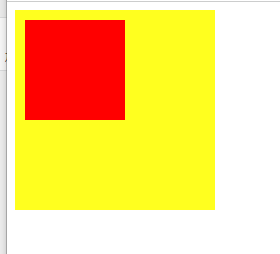
定位实现元素集中
定位实现元素集中
<!DOCTYPE html>
<html lang="en">
<head>
    <meta charset="UTF-8">
    <meta http-equiv="X-UA-Compatible" content="IE=edge">
    <meta name="viewport" content="width=device-width, initial-scale=1.0">
    <title>Document</title>
    <style>
        #box1{width: 300px;height: 300px;border: 1px black solid;position: relative;}
        #box2{width: 100px;height: 100px;background: red;position: absolute;left: 50%;top: 50%;margin: -50px 0 0 -50px;}
    </style>
</head>
<body>
    <div id="box1">
        <div id="box2"></div>
    </div>
</body>
</html>

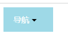
三角形案列
<!DOCTYPE html>
<html lang="en">
<head>
    <meta charset="UTF-8">
    <meta http-equiv="X-UA-Compatible" content="IE=edge">
    <meta name="viewport" content="width=device-width, initial-scale=1.0">
    <title>Document</title>
    <style>
        .box{
            width: 100px;
            height: 50px;
            line-height: 50px;
            text-indent: 20px;
            background-color: lightblue;
            color: white;
        }
        span{
            width: 0;
            height: 0;
            display: inline-block;
            border: 5px solid transparent;
            border-top: 5px solid black;
            position: relative;
            top: 2.5px;
        }
        div:hover  span{
            border: 5px solid transparent;
            border-bottom: 5px solid black;
            top: -2.5px;
        }
    </style>
</head>
<body>
    <div class="box">
        导航
        <span></span>
    </div>
</body>
</html>
定位里层级
z-index值越大,层级越大, 越靠 上显示,可以为负值。
<!DOCTYPE html>
<html lang="en">
<head>
    <meta charset="UTF-8">
    <meta http-equiv="X-UA-Compatible" content="IE=edge">
    <meta name="viewport" content="width=device-width, initial-scale=1.0">
    <title>Document</title>
    <style>
        div{
            width: 200px;
            height: 200px;
        }
        .box1{
            background: yellow;
            position: relative;
            top: 100px;
            left: 100px;
            z-index: 10;
            /* 层级 */
        }
        .box2{
            background-color: red;
            position: relative;
            z-index: 2;
        }
    </style>
</head>
<body>
    <div class="box1"></div>
    <div class="box2"></div>
</body>
</html>

绝对定位的深入探索
父子关系,在父盒子z-index: 0;失效
倘若父盒子不动,子盒子z-index设置为负值,则子盒子效果消失
<!DOCTYPE html>
<html lang="en">
<head>
    <meta charset="UTF-8">
    <meta http-equiv="X-UA-Compatible" content="IE=edge">
    <meta name="viewport" content="width=device-width, initial-scale=1.0">
    <title>Document</title>
    <style>
        .box{
            width: 200px;
            height: 200px;
            background-color: yellow;
            position: relative;
            z-index: 0;
        }
        .child{
            width: 100px;
            height: 100px;
            background-color: red;
            position: absolute;
            top: 10px;
            left: 10px;
            /* z-index: -100; */
        }
    </style>
</head>
<body>
    <div class="box">
        <div class="child"></div>
    </div>
</body>
</html>
兄弟关系z-index有效
<!DOCTYPE html>
<html lang="en">
<head>
    <meta charset="UTF-8">
    <meta http-equiv="X-UA-Compatible" content="IE=edge">
    <meta name="viewport" content="width=device-width, initial-scale=1.0">
    <title>Document</title>
    <style>
        .box1{
            width: 200px;
            height: 200px;
            background-color: yellow;
            position: absolute;
            top: 100px;
            left: 100px;
            z-index: 1;
        }
        .box2{
            width: 200px;
            height: 200px;
            background-color: red;
            position: absolute;
            top: 0px;
            left: 0px;
        }
    </style>
</head>
<body>
    <div class="box1"> </div>
    <div class="box2"></div>
</body>
</html>

如何让一个行内元素转换为块元素
如何让一个行内元素转换为块元素
<!DOCTYPE html>
<html lang="en">
<head>
    <meta charset="UTF-8">
    <meta http-equiv="X-UA-Compatible" content="IE=edge">
    <meta name="viewport" content="width=device-width, initial-scale=1.0">
    <title>Document</title>
    <style>
        span{
            width: 100px;
            height: 100px;
            background-color: yellow;
            position: absolute;
        }
    </style>
</head>
<body>
    <span>
        裂开
    </span>
</body>
</html>

定位控制元素实现水平垂直居中
top: 50%;
left: 50%;是以父元素设置为一半,此时需要在子元素里设置为自身一半。
<!DOCTYPE html>
<html lang="en">
<head>
    <meta charset="UTF-8">
    <meta http-equiv="X-UA-Compatible" content="IE=edge">
    <meta name="viewport" content="width=device-width, initial-scale=1.0">
    <title>Document</title>
    <style>
        *{
            margin: 0;
            padding: 0;
        }
        .box{
            width: 500px;
            height: 500px;
            background-color: yellow;
            margin: 0 auto;
            position: relative;
        }
        .child{
            width: 200px;
            height: 200px;
            background-color: red;
            position: absolute;
            top: 50%;
            left: 50%;
            margin-top: -100px;
            margin-left: -100px;
        }
    </style>
</head>
<body>
    <div class="box">
        <div class="child"></div>
    </div>
</body>
</html>

定位与浮动区别
float:半脱离,文字环绕
absolute:全脱离,不会出现文字环绕效果
<!DOCTYPE html>
<html lang="en">
<head>
    <meta charset="UTF-8">
    <meta http-equiv="X-UA-Compatible" content="IE=edge">
    <meta name="viewport" content="width=device-width, initial-scale=1.0">
    <title>Document</title>
    <style>
        .box1{
            width: 200px;
            height: 200px;
            background-color: red;
            float: left;
        }
        .box2{
            width: 300px;
            height: 300px;
            background-color: yellow;
        }
    </style>
</head>
<body>
    <div class="box1"></div>
    <div class="box2">
        Lorem ipsum dolor sit amet, consectetur adipisicing elit. Perferendis eaque dicta incidunt fugit vitae facilis error commodi perspiciatis soluta aperiam illo consequatur vero nihil ut minus quisquam dolorum, corrupti consectetur.
    </div>
</body>
</html>


 8113
8113


 被折叠的 条评论
为什么被折叠?
被折叠的 条评论
为什么被折叠?
 到【灌水乐园】发言


