


大家好,我是一碗周,一个不想被喝(内卷)的前端。如果写的文章有幸可以得到你的青睐,万分有幸~
写在前面
对 CSS 布局掌握程度决定你在 Web 开发中的开发页面速度。随着 Web 技术的不断革新,实现各种布局的方式已经多得数不胜数了。
最近利用碎片时间,大概用了半个月的时间整理了一个系列,本系列文章总结了 CSS 中的各种布局,以及实现方式及其常用技巧。让你通过该系列文章对 CSS 布局有一个新的认识。
该系列的导航帖点我进入,里面可以快速跳转到你想了解的文章(建议收藏)
实现居中布局的 8 种方式
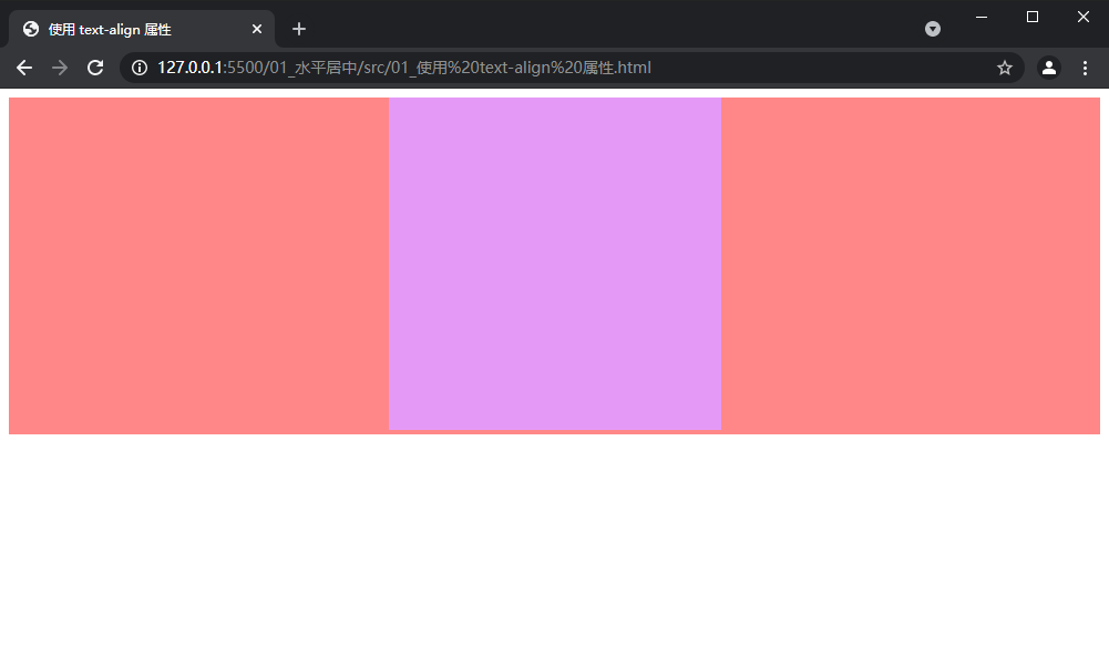
1. 使用 text-align 属性
若元素为行内块级元素,也就是 display: inline-block 的元素,可以通过为其父元素设置 text-align: center 实现水平居中。示例代码如下
HTML 代码
<div class="parent">
  <div class="child"></div>
</div>
CSS 代码
.parent {
  background: #ff8787;
  /* 对于子级为 display: inline-block; 可以通过 text-align: center; 实现水平居中 */
  text-align: center;
}
.child {
  display: inline-block;
  background: #e599f7;
  height: 300px;
  width: 300px;
}
最终效果
2. 定宽块级元素水平居中(方法一)
对于定宽的的块级元素实现水平居中,最简单的一种方式就是 margin: 0 auto;, 但是值得注意的是一定需要设置宽度。
示例代码如下:
.parent {
  background: #ff8787;
}
.child {
  background: #e599f7;
  height: 300px;
  width: 300px;
  /* 对于定宽的子元素,直接 margin:0 auto; 即可实现水平居中 */
  margin: 0 auto;
}
HTML 代码和效果图同上
3. 定宽块级元素水平居中(方法二)
对于开启定位的元素,可以通过 left 属性 和 margin 实现,示例代码如下所示:
关于定位的知识,可以从该专题的导航帖点我去看一下深入理解position
.parent {
  background: #ff8787;
}
.child {
  background: #e599f7;
  height: 300px;
  width: 300px;
  /* 开启定位 */
  position: relative;
  left: 50%;
  /* margin-left 为 负的宽度的一半 */
  margin-left: -150px;
}
HTML 代码和效果图同上
4. 定宽块级元素水平居中(方法三)
当元素开启决定定位或者固定定位时,left 属性和 right 属性一起设置就会拉伸元素的宽度,在配合 width 属性与 margin 属性就可以实现水平居中。示例代码如下所示:
.parent {
  background: #ff8787;
  position: relative;
  height: 300px;
}
.child {
  background: #e599f7;
  height: 300px;
  /* 开启定位 */
  position: absolute;
  /* 水平拉满屏幕 */
  left: 0;
  right: 0;
  /* 拉满屏幕之后设置宽度,最后通过 margin 实现水平居中 */
  width: 300px;
  margin: auto;
}
HTML 代码和效果图同上
5. 定宽块级元素水平居中(方法四)
当元素开启决定定位或者固定定位时,left 属性和 transform 属性即可实现水平居中。示例代码如下:
.parent {
  background: #ff8787;
  position: relative;
  height: 300px;
}
.child {
  background: #e599f7;
  height: 300px;
  width: 300px;
  /* 开启定位 */
  position: absolute;
  /* 该方法类似于 left 于 -margin 的用法,但是该方法不需要手动计算宽度。 */
  left: 50%;
  transform: translateX(-50%);
}
HTML 代码和效果图同上
6. 设置宽度为 fit-content
若子元素包含 float: left; 属性, 为了让子元素水平居中, 则可让父元素宽度设置为 fit-content ,并且配合 margin。示例代码如下:
.parent {
  background: #ff8787;
  height: 300px;
  /* 兼容多浏览器 */
  width: -moz-fit-content;
  width: -webkit-fit-content;
  width: fit-content;
  margin: 0 auto;
}
.child {
  background: #e599f7;
  height: 300px;
  width: 300px;
  /* 子元素开启浮动 */
  float: left;
}
如果 HTML 结构不变的话会有如下问题:
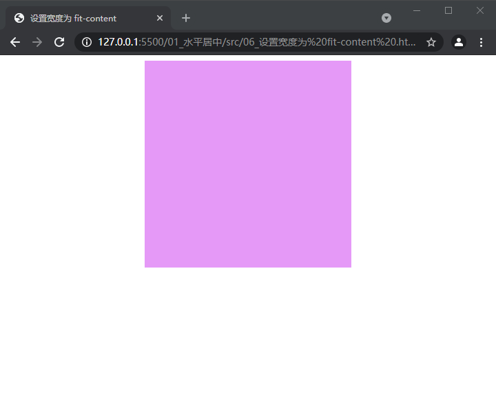
父级的实际宽度与子容器相同了,这里需要修改一下 HTML 结构,修改如下:
.parent {
  background: #ff8787;
  height: 300px;
}
/* 辅助居中的容器 */
.center {
  /* 兼容多浏览器 */
  width: -moz-fit-content;
  width: -webkit-fit-content;
  width: fit-content;
  margin: 0 auto;
}
.child {
  background: #e599f7;
  height: 300px;
  width: 300px;
  /* 子元素开启浮动 */
  float: left;
}
最终实现了一开始想要的效果,但是使用这种方法,代码量多而且需要修改 HTML 结构,在实际开发中作用不大
7. Flex 布局
为父元素开启 Flex 布局,通过 justify-content: center 即可实现居中布局。示例代码如下:
关于 Flex 布局的详细用法请参考 点我进入
.parent {
  background: #ff8787;
  height: 300px;
  /* 开启 Flex 布局 */
  display: flex;
  /* 通过 justify-content 属性实现居中 */
  justify-content: center;
}
.child {
  background: #e599f7;
  height: 300px;
  width: 300px;
  /* 或者 子元素 margin: auto*/
  margin: auto;
}
两种方法选择其一就好
HTML 代码和效果图同上
8. Grid 布局
开启 Grid 布局也也可以实现居中效果,不过仅仅实现一个居中就有点大材小用了。示例代码如下:
关于 Grid 布局的详细用法请参考 点我进入
.parent {
  background: #ff8787;
  height: 300px;
  /* 开启 Grid 布局 */
  display: grid;
  /* 方法一 */
  justify-items: center;
  /* 方法二 */
  justify-content: center;
}
.child {
  background: #e599f7;
  height: 300px;
  width: 300px;
  /* 方法三 子元素 margin: auto*/
  margin: auto;
}
HTML 代码和效果图同上
总结


 406
406


 被折叠的 条评论
为什么被折叠?
被折叠的 条评论
为什么被折叠?
 到【灌水乐园】发言


