


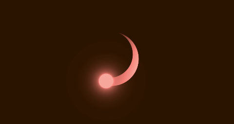
效果如下:
完整代码如下 :
<!DOCTYPE html>
<html lang="en">
<head>
    <meta charset="UTF-8">
    <meta http-equiv="X-UA-Compatible" content="IE=edge">
    <meta name="viewport" content="width=device-width, initial-scale=1.0">
    <title>css实现旋转的小流星</title>
    <style>
        *{
            margin: 0;
            padding: 0;
            box-sizing: border-box;
        }
        section{
            display: flex;
            justify-content: center;
            align-items: center;
            min-height: 100vh;
            background: #001d30;
            animation: changeBg 5s linear infinite;
        }
        @keyframes changeBg{
            to{
                filter: hue-rotate(360deg);
            }
        }
        .loader{
            position: relative;
            width: 150px;
            height: 150px;
            background: linear-gradient(to top,#001d30 40%,#51eeee);
            border-radius:50%;
            animation: rotate 2s linear infinite;
        }
        @keyframes rotate{
            to{
                transform: rotate(360deg);
            }
        }
        .loader::before{
            content: '';
            position: absolute;
            background: #001d30;
            inset: 20px 20px 0 0;
            border-radius: 50%;
        }
        .loader::after{
            content: '';
            position: absolute;
            top: 50px;
            right: -8px;
            width: 40px;
            height: 40px;
            background: #51eeee;
            border-radius: 50%;
            box-shadow: 0 0 5px #51eeee,0 0 25px #51eeee,
            0 0 50px #51eeee,0 0 75px #51eeee;
        }
    </style>
</head>
<body>
    <section>
        <div class="loader"></div>
    </section>
</body>
</html>
其他小案例:
点击主页看更多css小动画,js小案例…


 3万+
3万+


 被折叠的 条评论
为什么被折叠?
被折叠的 条评论
为什么被折叠?
 到【灌水乐园】发言


