


px、em和rem的使用和区别
一、px
px像素(Pixel)是相对长度单位。相对于显示器屏幕分辨率而言的。
<!DOCTYPE html>
<html lang="en">
<head>
<meta charset="UTF-8">
<meta http-equiv="X-UA-Compatible" content="IE=edge">
<meta name="viewport" content="width=device-width, initial-scale=1.0">
<title>px、em和rem的使用</title>
<style>
.div1 {
width: 150px;
height: 150px;
background-color: antiquewhite;
}
</style>
</head>
<body>
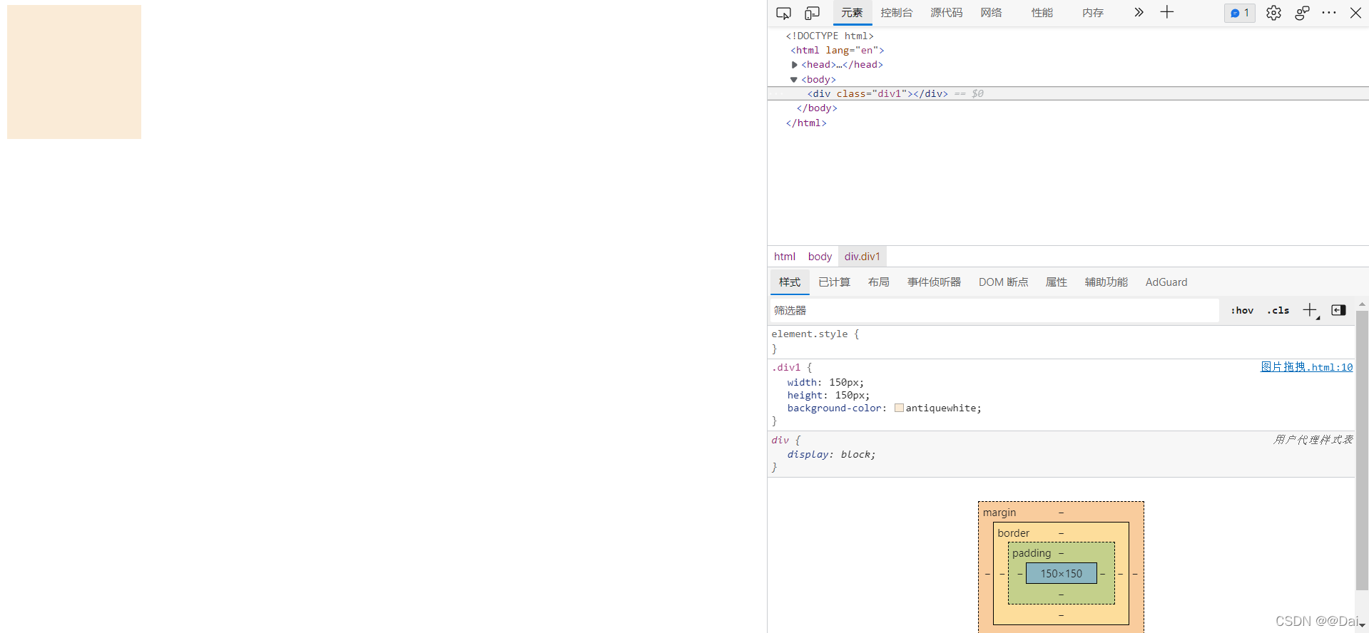
<div class="div1"></div>
</body>
</html>
电脑分辨率时的效果,width和height都为150px。
![[外链图片转存失败,源站可能有防盗链机制,建议将图片保存下来直接上传(img-sEu3ZrAP-1640275410040)(C:\Users\25218\AppData\Roaming\Typora\typora-user-images\image-20211223222620294.png)]](https://i-blog.csdnimg.cn/blog_migrate/363fc071067a93baa92be28f64d4da0c.png)
手机分辨率时的效果,width和height都为150px。
二、em
em是相对长度单位。相对于当前对象内文本的字体尺寸。如当前对行内文本的字体尺寸未被人为设置,则相对于浏览器的默认字体尺寸。子元素会继承父级元素的字体大小。
例:如果当前元素没有定义font-size,那该元素会继承父元素的font-size,如果父元素的font-size为16px,那么当前元素的font-zise也就为16px。em是相对于自身的font-size,如果当前元素的font-size为16px,width为10em,那么也就是width为160px。
<!DOCTYPE html>
<html lang="en">
<head>
<meta charset="UTF-8">
<meta http-equiv="X-UA-Compatible" content="IE=edge">
<meta name="viewport" content="width=device-width, initial-scale=1.0">
<title>px、em和rem的使用</title>
<style>
/* 不同浏览器默认的font-size不同 */
html {
font-size: 16px;
}
.div1 {
/* 15em => 15*16px=240px */
width: 15em;
height: 15em;
background-color: antiquewhite;
}
.div2 {
/* 10em => 10*24px=240px */
font-size: 24px;
width: 10em;
height: 10em;
background-color: rgb(197, 115, 8);
}
</style>
</head>
<body>
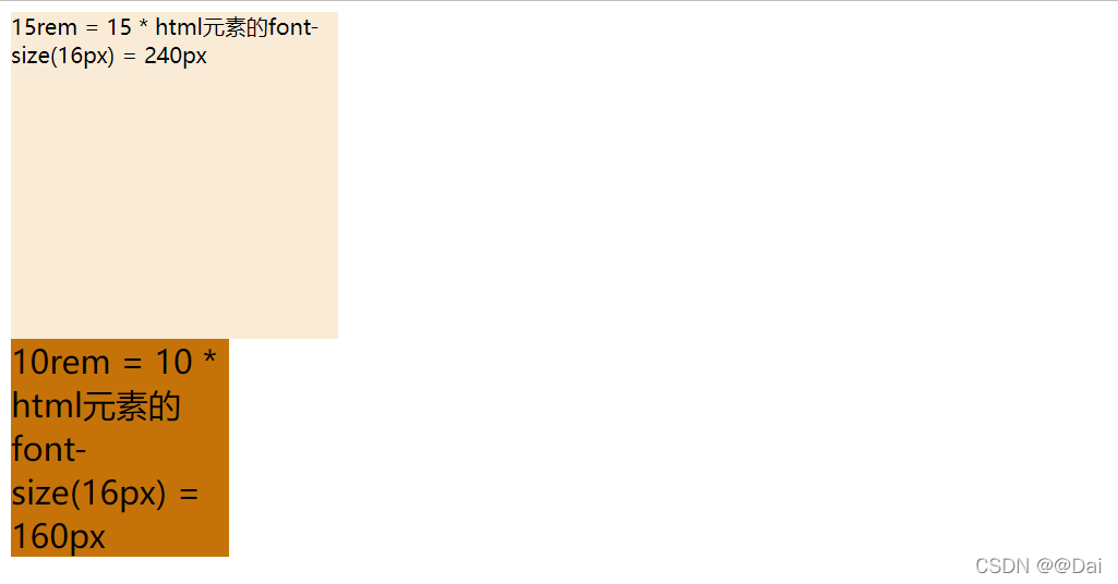
<div class="div1">15em = 15 * 自身元素的font-size(16px) = 240px</div>
<div class="div2">10em = 10 * 自身元素的font-size(24px) = 240px</div>
</body>
</html>
两个盒子的大小相同,虽然一个是15em,另一个是10em,但是由于自身元素的font-size不同,所以出现了相同的计算结果。
![[外链图片转存失败,源站可能有防盗链机制,建议将图片保存下来直接上传(img-xpeHbaE8-1640275410042)(C:\Users\25218\AppData\Roaming\Typora\typora-user-images\image-20211223235624682.png)]](https://i-blog.csdnimg.cn/blog_migrate/e3526fc14f499254a083676cfb5c604d.png)
三、rem
rem是CSS3新增的一个相对单位(root em,根em),它是相对于根(浏览器)字体的。注意:不同浏览器默认的font-size值不同。
例:如果浏览器字体为12px,那么10rem=120px。
<!DOCTYPE html>
<html lang="en">

<head>
    <meta charset="UTF-8">
    <meta http-equiv="X-UA-Compatible" content="IE=edge">
    <meta name="viewport" content="width=device-width, initial-scale=1.0">
    <title>px、em和rem的使用</title>
    <style>
        /* 不同浏览器默认的font-size不同 */
        html {
            font-size: 16px;
        }

        .div1 {
            /* 15rem => 15*16px=240px */
            width: 15rem;
            height: 15rem;
            background-color: antiquewhite;
        }

        .div2 {
            /* 10rem => 10*16px=160px */
            font-size: 24px;
            width: 10rem;
            height: 10rem;
            background-color: rgb(197, 115, 8);
        }
    </style>
</head>

<body>
    <div class="div1">15rem = 15 * 自身元素的font-size(16px) = 240px</div>
    <div class="div2">10rem = 10 * 自身元素的font-size(16px) = 160px</div>
</body>

</html>
两个盒子的大小不相同,虽然一个是15rem,另一个是10rem,但是由于rem的参照是根元素(也就是浏览器)的font-size,所以出现了不相同的计算结果。
四、px 与 rem 的选择?
1、对于只需要适配少部分手机设备,且分辨率对页面影响不大的,使用px即可 。
2、对于需要适配各种移动设备,使用rem,例如只需要适配iPhone和iPad等分辨率差别比较挺大的设备。
以上就是px、em和rem的使用和区别。
我是前端Dai,一个会将自己平时项目中常见的问题以及笔试面试的知识在CSDN与大家分享的coder,希望大家一起进步,加油。


 扫一扫
扫一扫


 1430
1430

 被折叠的 条评论
为什么被折叠?
被折叠的 条评论
为什么被折叠?
 到【灌水乐园】发言


