


做项目有些效果,平时没什么存在感,很容易忘记,但一遇到又必须要用。这这里写下一些简单的小技巧
一、水平分割线
间隔线平时遇到的不多,但运用的好也能有不错的样式效果。html本身就有一个元素<hr>可以实现在元素产生一条下滑间隔线。但不美观、不便于控制、又留一个元素在页面显得不专业,所以在这用写出其他方法。
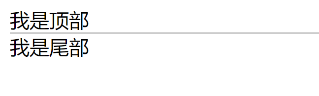
1、html自带的<hr>标签,HTML 页面中创建一条水平线
<body>
    <div>我是顶部</div>
    <hr>
    <div>我是尾部</div>
</body>
产生的效果如下:

2、利用元素属性border来实现
    <div>我是顶部</div>
    <div style="border-bottom:1px solid #CCC"></div>
    <div>我是尾部</div>
效果如下:
3、线性渐变
在很多网站中能看到这么一种水平线。这种水平线中间粗大,两端却不过分的占用空间。如果用<hr>来编写 视觉感官是不是很糙? 这时候就可以用线性渐变来做
 如果用
如果用<hr>来编→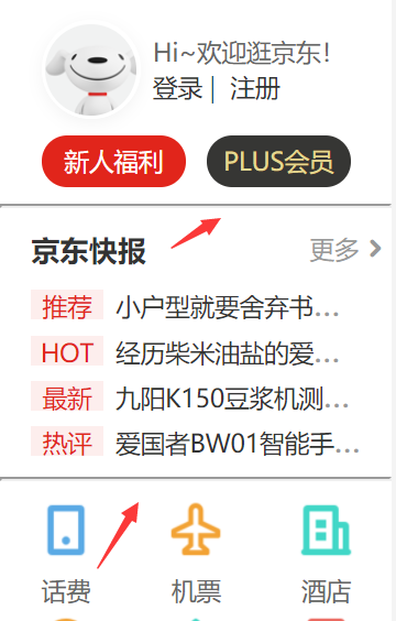
    <style>
        #test{
            width: 200px;
            height: 1px;
            background: linear-gradient(to left, #fff 5%, gainsboro 50%, #fff 85%);
            background: -webkit-linear-gradient(left, #fff 5%, gainsboro 50%, #fff 85%);
            /* webkit是为了兼容苹果浏览器,建议把其他浏览器兼容也写了 */
        }
    </style>
<body>
    <div>我是顶部</div>
    <br>
    <!-- <br>是更好的下水平线。不是必须的。 -->
        <div id="test"></div>
    <br>
    <div>我是尾部</div>
</body>
效果如下:

使用线性渐变还可以按需求改变颜色、大小等等,比如我喜欢红色蓝色。

4、after伪元素和线性渐变
上面这种方法,虽然能出效果,但是在html上还是存在占用资源,而且影响页面结构。运用上伪类标签,就能解决这种问题。根据需求可以利用定位来改变布局,代码是死的,人是活的,渐变还有很多用法。
   <style>
       #test::after{
           display: inline-block;
           width: 200px;
           height: 1px;
           background: linear-gradient(to left, #fff 5%, gainsboro 50%, #fff 85%);
           z-index: 1;
           content: "";
       }
   </style>

<body>
    <div>我是顶部</div>
        <div id="test"></div>
    <div>我是尾部</div>
</body>
效果依旧!

这种写法在element中和上面的不一样
运用伪类标签

单纯的用线性渐变,id为test的标签就变成了下划线了。本身不方便书写内容

5、字体在分割线居中
<!DOCTYPE html>
<html lang="en">

<head>
    <meta charset="UTF-8">
    <meta name="viewport" content="width=device-width, initial-scale=1.0">
    <title>Document</title>
    <style>
        .hot {
            width: 100%;
            height: 20px;
            background-color: white;
            text-align: center;
            color: #000;
            font-size: 12px;
            line-height: 20px;
            position: relative;
        }

        .hot:after {
            content: "";
            width: 100%;
            height: 1px;
            background-color: red;
            position: absolute;
            bottom: 50%;
            z-index: 1;
            left: 0;
        }

        .hot span {
            color: blue;
            z-index: 2;
            position: relative;
            background-color: white;
            padding: 0 10px;

        }


        .hot:after {
            content: "";
            width: 100%;
            height: 1px;

            /*这个就是设置渐变的啦!*/

            background-image: -webkit-linear-gradient(top, hsla(0, 0%, 100%, .1), hsla(0, 0%, 0%, .1));
            background-image: -moz-linear-gradient(top, hsla(0, 0%, 100%, .1), hsla(0, 0%, 0%, .1));
            background-image: -ms-linear-gradient(top, hsla(0, 0%, 100%, .1), hsla(0, 0%, 0%, .1));
            background-image: -o-linear-gradient(top, hsla(0, 0%, 100%, .1), hsla(0, 0%, 0%, .1));
            background-image: linear-gradient(top, hsla(0, 0%, 100%, .1), hsla(0, 0%, 0%, .1));
            position: absolute;
            bottom: 50%;
            z-index: 1;
            left: 0;
        }
    </style>


</head>

<body>
    <div class="hot">
        <span>精品特惠</span>
    </div>
</body>

</html>
效果如下:


 1627
1627


 被折叠的 条评论
为什么被折叠?
被折叠的 条评论
为什么被折叠?
 到【灌水乐园】发言


