


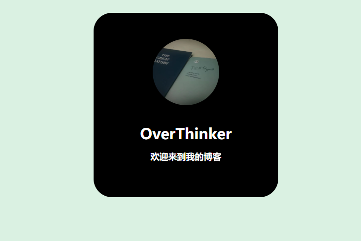
使用纯CSS创建简洁名片卡片的学习实践
在这篇技术博客中,我将分享我的前端学习过程,如何使用纯HTML和CSS创建一个简洁美观的名片式卡片,就像我博客首页展示的那样。这种卡片设计非常适合作为个人简介、产品展示或团队成员介绍。
源码展示
<!DOCTYPE html>
<html lang="zh-CN">
<head>
    <meta charset="UTF-8">
    <meta name="viewport" content="width=device-width, initial-scale=1.0">
    <title>纯CSS名片卡片</title>
    <style>
        /* 全局重置与基础设置 */
        * {
            margin: 0;
            padding: 0;
            box-sizing: border-box;
        }

        body {
            background-color: #daf1e2;
            display: flex;
            justify-content: center;
            align-items: center;
            min-height: 100vh;
            font-family: 'Microsoft YaHei', sans-serif;
        }

        /* 卡片容器样式 */
        .card {
            margin: 30px auto;
            width: 250px;
            height: 250px;
            background-color: #000;
            text-align: center;
            border-radius: 25px;
            padding-top: 35px;
            box-shadow: 0 4px 8px rgba(0, 0, 0, 0.2);
            transition: all 0.3s ease;
        }

        /* 头像图片样式 */
        .logo {
            margin-bottom: 20px;
            width: 90px;
            height: 90px;
            border-radius: 50%;
            object-fit: cover;
            border: 3px solid #daf1e2;
        }

        /* 文字样式 */
        .writer {
            font: normal 700 20px 'Microsoft YaHei', sans-serif;
            color: #fff;
            text-align: center;
            margin-bottom: 10px;
        }

        .introduce {
            font: normal 700 12px 'Microsoft YaHei', sans-serif;
            color: #fff;
            text-align: center;
        }

        /* 悬停效果 */
        .card:hover {
            transform: translateY(-5px);
            box-shadow: 0 10px 20px rgba(0, 0, 0, 0.3);
        }

        /* 响应式设计 */
        @media (max-width: 600px) {
            .card {
                width: 200px;
                height: 200px;
                padding-top: 25px;
            }

            .logo {
                width: 70px;
                height: 70px;
                margin-bottom: 15px;
            }

            .writer {
                font-size: 18px;
            }

            .introduce {
                font-size: 10px;
            }
        }
    </style>
</head>
<body>
    <div class="card">
        <!-- 替换为你的图片路径 -->
        <img src="https://via.placeholder.com/150" alt="头像" class="logo">
        <p class="writer">OverThinker</p>
        <p class="introduce">欢迎来到我的博客</p>
    </div>
</body>
</html>
记得替换为自己的图片路径!!!
HTML结构分析
首先,让我们看看基础的HTML结构:
<div class="card">
    <img src="../image/了不起的盖茨比.jpg" alt="" class="logo">
    <p class="writer">OverThinker</p>
    <p class="introduce">欢迎来到我的博客</p>
</div>
这个结构非常简单明了:
- 一个
div容器作为卡片主体 - 一个圆形头像图片
- 两个段落文本分别显示名称和简短介绍
CSS样式详解
1. 全局重置与基础设置
* {
    margin: 0;
    padding: 0;
    box-sizing: border-box;
}
body {
    background-color: #daf1e2;
}
*选择器重置了所有元素的外边距和内边距,确保在不同浏览器中表现一致box-sizing: border-box让元素的宽度和高度包含边框和内边距,更符合直觉- 设置了柔和的浅绿色背景(
#daf1e2)作为整个页面的底色
2. 卡片容器样式
div.card {
    margin: 30px auto;
    width: 250px;
    height: 250px;
    background-color: #000;
    text-align: center;
    border-radius: 25px;
    padding-top: 35px;
}
margin: 30px auto:上下边距30px,左右自动居中- 固定宽高250px的正方形
- 黑色背景(
#000) - 内容居中对齐
border-radius: 25px创建圆角效果padding-top: 35px顶部内边距,使内容下移
3. 头像图片样式
img.logo {
    margin-bottom: 20px;
    width: 90px;
    height: 90px;
    border-radius: 50%;
}
- 固定宽高90px的正方形
border-radius: 50%将其变为圆形- 底部外边距20px,与下方文字保持距离
4. 文字样式
p.writer {
    font: normal 700 20px 微软雅黑;
    color: #fff;
    text-align: center;
    margin-bottom: 10px;
}

p.introduce {
    font: normal 700 12px 微软雅黑;
    color: #fff;
    text-align: center;
}
- 使用了
font简写属性设置字体样式 - 白色文字(
#fff)在黑色背景上形成高对比度 - 名称使用20px较大字号,简介使用12px较小字号
- 都设置为居中对齐
设计要点总结
- 视觉层次:通过字体大小差异创建清晰的视觉层次
- 对比度:黑白高对比度确保可读性
- 圆角设计:卡片和头像都使用圆角,营造友好现代感
- 间距控制:精心调整的内外边距使布局平衡
- 居中布局:所有内容居中对齐,形成视觉焦点
响应式考虑
当前设计是固定尺寸的,要使其响应式,可以:
@media (max-width: 600px) {
    div.card {
        width: 200px;
        height: 200px;
    }
    img.logo {
        width: 70px;
        height: 70px;
    }
}
扩展建议
- 添加悬停效果增强交互性:
div.card:hover {
    transform: translateY(-5px);
    box-shadow: 0 10px 20px rgba(0,0,0,0.2);
    transition: all 0.3s ease;
}
- 使用CSS变量方便主题切换:
:root {
    --card-bg: #000;
    --text-color: #fff;
}
这种简洁的卡片设计虽然简单,但包含了CSS布局的核心概念,非常适合初学者练习,也可以作为更复杂组件的基础。


 扫一扫
扫一扫


 1294
1294

 被折叠的 条评论
为什么被折叠?
被折叠的 条评论
为什么被折叠?
 到【灌水乐园】发言


