


全局弹窗组件实现
使用函数式组件实现。框架采用Vue、bootstrap。
当我们写好一个组件时,这个组件功能大体上可能都是差不多的,但是要在很多地方调用,通常的组件要在template中引入才行。
在饿了么UI组件中,有的对话框组件只是调用函数即可完成,通常来说组件调用不应该很麻烦,在原生的JS中调用警告提示只需要alert即可。
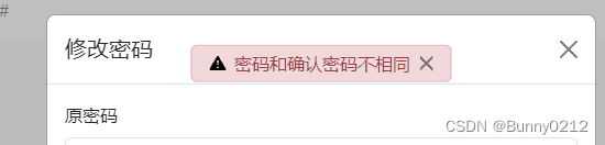
效果展示

实现方式
按照bootstrap的要求大体布置如下,在div标签中判断当前需要什么样的组件类型。之后只需要传递:消息、消息类型、关闭按钮逻辑。
<svg style="display: none" xmlns="http://www.w3.org/2000/svg">
  <symbol id="check-circle-fill" viewBox="0 0 16 16">
   <path d="M16 8A8 8 0 1 1 0 8a8 8 0 0 1 16 0zm-3.97-3.03a.75.75 0 0 0-1.08.022L7.477 9.417 5.384 7.323a.75.75 0 0 0-1.06 1.06L6.97 11.03a.75.75 0 0 0 1.079-.02l3.992-4.99a.75.75 0 0 0-.01-1.05z" />
  </symbol>
  <symbol id="info-fill" viewBox="0 0 16 16">
   <path
    d="M8 16A8 8 0 1 0 8 0a8 8 0 0 0 0 16zm.93-9.412-1 4.705c-.07.34.029.533.304.533.194 0 .487-.07.686-.246l-.088.416c-.287.346-.92.598-1.465.598-.703 0-1.002-.422-.808-1.319l.738-3.468c.064-.293.006-.399-.287-.47l-.451-.081.082-.381 2.29-.287zM8 5.5a1 1 0 1 1 0-2 1 1 0 0 1 0 2z"
   />
  </symbol>
  <symbol id="exclamation-triangle-fill" viewBox="0 0 16 16">
   <path
    d="M8.982 1.566a1.13 1.13 0 0 0-1.96 0L.165 13.233c-.457.778.091 1.767.98 1.767h13.713c.889 0 1.438-.99.98-1.767L8.982 1.566zM8 5c.535 0 .954.462.9.995l-.35 3.507a.552.552 0 0 1-1.1 0L7.1 5.995A.905.905 0 0 1 8 5zm.002 6a1 1 0 1 1 0 2 1 1 0 0 1 0-2z"
   />
  </symbol>
</svg>

<div :class="`alert alert-${type} d-flex align-items-center animate__animated animate__fadeIn`" role="alert">
  <svg v-show="type === 'info'" aria-label="Info:" class="alter-svg bi bi-exclamation-triangle-fill flex-shrink-0 me-2" role="img">
   <use xlink:href="#info-fill" />
  </svg>
  <svg v-show="type === 'success'" aria-label="Success:" class="alter-svg bi bi-exclamation-triangle-fill flex-shrink-0 me-2" role="img">
   <use xlink:href="#check-circle-fill" />
  </svg>
  <svg v-show="type === 'warning'" aria-label="Warning:" class="alter-svg bi bi-exclamation-triangle-fill flex-shrink-0 me-2" role="img">
   <use xlink:href="#exclamation-triangle-fill" />
  </svg>
  <svg v-show="type === 'danger'" aria-label="Danger:" class="alter-svg bi flex-shrink-0 me-2" role="img">
   <use xlink:href="#exclamation-triangle-fill" />
  </svg>

  <div>{{ message }}</div>
  <button aria-label="Close" class="btn-close" data-bs-dismiss="alert" style="margin: 0 0 0 8px; width: 4px; height: 15px" type="button" @click="close"></button>
</div>
<style lang="scss" scoped>
.alert {
	position: fixed;
	top: 10%;
	left: 50%;
	transform: translate(-50%, -10%);
	height: 30px;
	z-index: 99999;

	.alter-svg {
		width: 15px;
		height: 30px;
	}
}
</style>
props内容
<script lang="ts" setup>
defineProps(['message', 'type', 'close']);
</script>
封装成函数使用
import { App, createApp } from 'vue';
import Alerts from '@/components/Message/index.vue';

/**
 * 函数式消息组件
 * @param message
 * @param type
 */
const handleMessage = (message: string, type: string) => {
  // 创建标签并将标签放到body上
  const mountNode: any = document.createElement('div');
  document.body.appendChild(mountNode);

  // 配置内容是组件中的props
  const app: App<Element> = createApp(Alerts, {
   message,
   type,
   close: () => {
    app.unmount();
    document.body.removeChild(mountNode);
   },
  });

  // 挂载组件
  app.mount(mountNode);

  // 定时关闭
  setTimeout(() => {
   app.unmount();
   document.body.removeChild(mountNode);
  }, 2000);
};

export const Message = {
  success: (message: string) => handleMessage(message, 'success'),
  error: (message: string) => handleMessage(message, 'danger'),
  primary: (message: string) => handleMessage(message, 'info'),
  warning: (message: string) => handleMessage(message, 'warning'),
};
createApp(组件名称,props函数),props中内容在{}中完成。创建组件之后记得销毁。


 1934
1934

 被折叠的 条评论
为什么被折叠?
被折叠的 条评论
为什么被折叠?
 到【灌水乐园】发言


