


一、CSS如何生效
1.外部样式表
引入外部样式表是我们使用样式的主流方式,因为众多的样式规则单独放在一个文件中,与 HTML
内容分开,结构清晰。同时其它页面也可使用,达到复用的目的。
首先是创建所需的html文件和css文件,这里我分别创建了文件夹和对应的文件
<!DOCTYPE html>
<html>
<head>
<meta charset="utf-8">
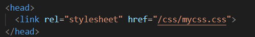
<!-- 注意下面这个语句,将导入外部的 mycss.css 样式表文件 -->
<link rel="stylesheet" type="text/css" href="mycss.css">
<title>页面标题</title>
</head>
<body>
<h1>我是有样式的</h1>
<hr>
<p class="haha">还是有点丑:)</p>
</body>
</html>
body {
  background-color: linen;
  text-align: center;
}
h1 {
  color: red;
}
.haha {
  margin-top: 100px;
  color: chocolate;
  font-size: 50px;
}
使用方式依托于href超链接引用css样式文件
2.内部样式表
或者是将样式表放入html文件中,注意在head元素中引入了style标签,放入了样式。

3.内联样式
直接把样式规则直接写到要应用的元素中
<h3 style="color:green;">I am a heading</h3>
二、盒子模型
盒子模型指的是一个 HTML 元素可以看作一个盒子。从内到外,这个盒子是由内容 content, 内边距 padding, 边框 border, 外边距 margin构成的
- Content 盒子的内容,如文本、图片等
- Padding 填充,也叫内边距,即内容和边框之间的区域
- Border 边框,默认不显示
- Margin 外边距,边框以外与其它元素的区域
<html>
  <head>
    <link rel="stylesheet" href="./mycss.css">
  </head>
  <body>
    <div class="box1">我是内容一,外面红色的是我的边框。注意边框的内外都有25px的距离。</div>
    <div class="box2">我是内容二,外面蓝色的是我的边框。注意与上面元素的外边距,发生了叠加,不是50px而是25px。</div>
  </body>
</html>
.box1 {
  height: 200px;
  width: 200px;
  background-color:#615200;
  color: aliceblue;
  border: 10px solid red;
  padding: 25px;
  margin: 25px;
}
.box2 {
  height: 300px;
  width: 300px;
  background-color:#004d61;
  color: aliceblue;
  border: 10px solid blue;
  padding: 25px;
  margin: 25px;
}

三.定位
position属性用于对元素进行定位。该属性有以下一些值:
static 静态
relative 相对
fixed 固定
absolute 绝对
static
设置为静态定位position: static;,这是元素的默认定位方式,也即你设置与否,元素都将按正常的页面布局进行。
即:按照元素在 HTML出现的先后顺序从上到下,从左到右进行元素的安排。
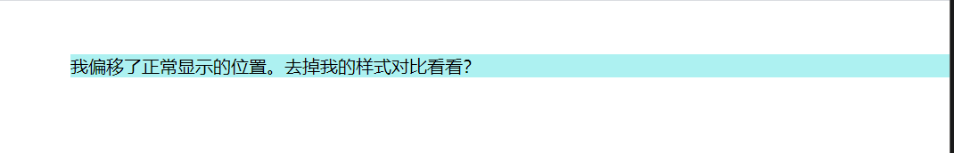
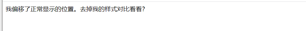
relative
设置为相对定位position: relative;,这将把元素相对于他的静态(正常)位置进行偏移
试试如下的代码:
<!-- HTML -->
<div class="example-relative">我偏移了正常显示的位置。去掉我的样式对比看看?</div>
<!-- CSS -->
.example-relative {
  position: relative;
  left: 60px;
  top: 40px;
  background-color: rgb(173, 241, 241);
}
fixed
设置为固定定位position: fixed;,这将使得元素固定不动(即使你上下左右拖动浏览器的滚动条)。
此时元素固定的位置仍由top, bottom, left, right属性确定,但相对的是视口(viewport,就是浏览器的屏幕可见区域)
如下的代码将会在浏览器右下角固定放置一个按钮元素:
<!-- HTML -->
<div class="broad">占位区域。请将浏览器窗口改变大小,看看右下角的按钮发生了什么?</div>
<div class="example-fixed">这个按钮是固定的</div>
<!-- CSS -->
.example-fixed {
  position: fixed;
  bottom: 40px;
  right: 10px;
  padding: 6px 24px;
  border-radius: 4px;
  color: #fff;
  background-color: #9d0f0f;
  cursor: pointer;
  box-shadow: 0 3px 3px 0 rgba(0,0,0,0.3), 0 1px 5px 0 rgba(0,0,0,0.12), 0 3px 1px -2px rgba(0,0,0,0.2);
}
.broad {
  height: 5000px;
  width: 5000px;
  padding: 20px;
  background-color: darkkhaki;
}

更改为absolute则会固定在该位置

缩放移动窗口,按钮始终保持在右下角
absolute
设置为绝对定位position: absolute;,将使元素相对于其最近设置了定位属性(非static)的父元素进行偏移。
如果该元素的所有父元素都没有设置定位属性,那么就相对于这个父元素。

四.不透明度
我们可以用opacity对任何元素(不过常用于图片)设置不透明度。
值在[0.0~1.0]之间,值越低,透明度越高
上图不透明度依次为0.2/0.5/1

五.组合选择器
1.后代选择器
以空格作为分隔,如:.haha p 代表在div元素内有.haha这种类的所有元素。
代码如下:
<html>
<head>
  <style>
    .haha p {
      background-color: yellow;
    }
  </style>
</head>
<body>
  <div class="haha">
    <p>Paragraph 1 in the div .haha.</p>
    <p>Paragraph 2 in the div .haha>.</p>
    <span>
        <p>Paragraph 3 in the div .haha.</p>
    </span>
  </div>
  <p>Paragraph 4. Not in a div .haha.</p>
  <p>Paragraph 5. Not in a div .haha.</p>
</body>
</html>
显示效果

在css样式的定义中,定义了haha这一类,而在主体body中,我们可以观察到段1~段3都在haha类中,注意到段3有span的标签,查阅资料后得到如下信息

2.子选择器
也称为直接后代选择器,以>作为分隔,如:.haha > p 代表在有.haha类的元素内的直接p元素。
参见如下代码:
<html>
<head>
  <style>
    .haha > p {
      background-color: yellow;
    }
  </style>
</head>
<body>
  <div class="haha">
    <p>Paragraph 1 in the div .haha.</p>
    <p>Paragraph 2 in the div .haha.</p>
    <span>
        <p>Paragraph 3 in the div .haha - it is descendant but not immediate child.</p>
    </span> <!-- not Child but Descendant -->
  </div>
  <p>Paragraph 4. Not in a div .haha.</p>
  <p>Paragraph 5. Not in a div .haha.</p>
</body>
</html>
与后代选择器不同的是,虽然段落3在.haha类中,但它的直接父元素是span,不是.haha的直接后代,所以不能选择。只有段落1、2有黄色背景
六.过渡
SS3 过渡是元素从一种样式逐渐改变为另一种的效果。
要实现这一点,必须规定两项内容:
- 指定要添加效果的CSS属性
- 指定效果的持续时间。
<!DOCTYPE html>
<html>
<head>
<meta charset="utf-8">
<title>菜鸟教程(runoob.com)</title>
<style>
div
{
	width:100px;
	height:100px;
	background:red;
	transition:width 2s;
	-webkit-transition:width 2s; /* Safari */
}

div:hover
{
	width:300px;
}
</style>
</head>
<body>

<p><b>注意:</b>该实例无法在 Internet Explorer 9 及更早 IE 版本上工作。</p>

<div></div>

<p>鼠标移动到 div 元素上,查看过渡效果。</p>

</body>
</html>


当鼠标放置在div元素上时,元素将会向右侧延长
七.图片的修饰
<!DOCTYPE html>
<html>
<head>
<meta charset="utf-8">
<title>菜鸟教程(runoob.com)</title>
<style>
img {
    border-radius: 8px;
}
</style>
</head>
<body>

<h2>圆角图片</h2>
<p>使用 border-radius 属性来创建圆角图片:</p>

<img src="paris.jpg" alt="Paris" width="400" height="300">

</body>
</html>

运行效果如上,会达到观感更舒适的效果
img {
    max-width: 100%;
    height: auto;
}
图片的样式对高度进行了auto的设置,从而达到了响应式图片的效果,再改变浏览器窗口大小会改变图片的长宽


div.polaroid {
    width: 80%;
    background-color: white;
    box-shadow: 0 4px 8px 0 rgba(0, 0, 0, 0.2), 0 6px 20px 0 rgba(0, 0, 0, 0.19);
}

img {width: 100%}

div.container {
    text-align: center;
    padding: 10px 20px;
}
卡片式图片的观感也十分好,更加的简约大方

八.按钮的修饰
<!DOCTYPE html>
<html>
<head>
<meta charset="utf-8">
<title>菜鸟教程(runoob.com)</title>
<style>
.button {
    background-color: #4CAF50; /* Green */
    border: none;
    color: white;
    padding: 15px 32px;
    text-align: center;
    text-decoration: none;
    display: inline-block;
    font-size: 16px;
    margin: 4px 2px;
    cursor: pointer;
}

.button2 {background-color: #008CBA;} /* Blue */
.button3 {background-color: #f44336;} /* Red */
.button4 {background-color: #e7e7e7; color: black;} /* Gray */
.button5 {background-color: #555555;} /* Black */
</style>
</head>
<body>

<h2>按钮颜色</h2>
<p>我们可以使用 background-color 属性来设置按钮颜色:</p>

<button class="button">Green</button>
<button class="button button2">Blue</button>
<button class="button button3">Red</button>
<button class="button button4">Gray</button>
<button class="button button5">Black</button>

</body>
</html>

按钮类的基本参数一致,这里改变的是颜色,多样的颜色对网页的修饰更得体
font-size则是对按钮大小的改变
border-radius则是设置按钮的圆角属性

鼠标悬停我认为是一个非常有互动感的属性
主要依托于button中transition-duration 属性来设置 “hover” 效果的速度,hover中可设置响应的颜色

按钮动画也是一个十分简约的效果
<!DOCTYPE html>
<html>
<head>
<meta charset="utf-8">
<title>菜鸟教程(runoob.com)</title>
<style>
.button {
  display: inline-block;
  border-radius: 4px;
  background-color: #f4511e;
  border: none;
  color: #FFFFFF;
  text-align: center;
  font-size: 28px;
  padding: 20px;
  width: 200px;
  transition: all 0.5s;
  cursor: pointer;
  margin: 5px;
}

.button span {
  cursor: pointer;
  display: inline-block;
  position: relative;
  transition: 0.5s;
}

.button span:after {
  content: '»';
  position: absolute;
  opacity: 0;
  top: 0;
  right: -20px;
  transition: 0.5s;
}

.button:hover span {
  padding-right: 25px;
}

.button:hover span:after {
  opacity: 1;
  right: 0;
}
</style>
</head>
<body>

<h2>按钮动画</h2>

<button class="button" style="vertical-align:middle"><span>Hover </span></button>

</body>
</html>


 3018
3018


 被折叠的 条评论
为什么被折叠?
被折叠的 条评论
为什么被折叠?
 到【灌水乐园】发言


