


钟表(CSS练习6)
效果截图
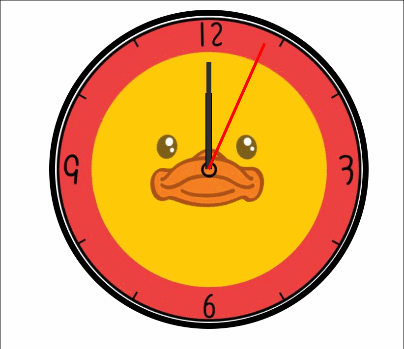
使用了动画效果及transform,animation属性
代码部分
<!DOCTYPE html>
<html lang="ch">
<head>
    <meta charset="UTF-8">
    <meta http-equiv="X-UA-Compatible" content="IE=edge">
    <meta name="viewport" content="width=device-width, initial-scale=1.0">
    <title>Document</title>
    <style>
        @keyframes run{
            from{
                transform: rotateZ(0);
            }
            to{
                transform: rotateZ(360deg);
            }
        }
        .clock{
            width: 500px;
            height: 500px;
            margin: 100px auto;
            border-radius: 50%;
            border: 10px solid #000;
            position: relative;
            background-image: url(./img/08/clock.jpg);
            background-size: cover;
        }
        .clock>div{
            position: absolute;
            top: 0;
            bottom: 0;
            left: 0;
            right: 0;
            margin: auto;
        }
        .hour-wrapper{
            width: 50%;
            height: 50%;
            animation: run 7200s linear infinite;
        }
        .hour{
            width: 10px;
            height: 50%;
            background-color: #000;
            margin: 0 auto;
        }
        .min-wrapper{
            width: 70%;
            height: 70%;
            animation: run 600s steps(60) infinite;
        }
        .min{
            width: 8px;
            height: 50%;
            background-color: rgb(48, 46, 46);
            margin: 0 auto;
        }
        .sec-wrapper{
            width: 90%;
            height: 90%;
            animation: run 10s steps(60) infinite;
        }
        .sec{
            width: 5px;
            height: 50%;
            background-color: red;
            margin: 0 auto;
        }
    </style>
</head>
<body>
    <div class="clock">
        <div class="hour-wrapper">
            <div class="hour"></div>
        </div>
        <div class="min-wrapper">
            <div class="min"></div>
        </div>
        <div class="sec-wrapper">
            <div class="sec"></div>
        </div>
    </div>
</body>
</html>


 513
513


 被折叠的 条评论
为什么被折叠?
被折叠的 条评论
为什么被折叠?
 到【灌水乐园】发言


