


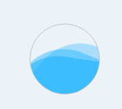
1.水波纹动画
2.实现代码
<template>
  <div>
    <div class="water-wave">
      <div class="water-wave1"></div>
      <div class="water-wave2"></div>
      <div class="water-wave3"></div>
    </div>
  </div>
</template>
<style lang='scss' scoped>
.water-wave {
  margin: 0 auto;
  overflow: hidden;
  position: relative;
  width: 100px;
  height: 100px;
  border-radius: 50%;
  border: 1px solid silver;
  text-align: center;
  line-height: 50px;
  animation: water-waves linear infinite;
  .water-wave1 {
    position: absolute;
    top: 40%;
    left: -25%;
    background: #0eaffe;
    opacity: 0.3;
    width: 200%;
    height: 200%;
    border-radius: 35%;
    animation: inherit;
    animation-duration: 6s;
  }
  .water-wave2 {
    position: absolute;
    top: 45%;
    left: -35%;
    background: #0eaffe;
    opacity: 0.4;
    width: 200%;
    height: 200%;
    border-radius: 35%;
    animation: inherit;
    animation-duration: 7s;
  }
  .water-wave3 {
    position: absolute;
    top: 50%;
    left: -35%;
    background: #0eaffe;
    opacity: 0.5;
    width: 200%;
    height: 200%;
    border-radius: 35%;
    animation: inherit;
    animation-duration: 8s;
  }
}
@keyframes water-waves {
  0% {
    transform: rotate(0deg);
  }
  100% {
    transform: rotate(360deg);
  }
}
</style>


 扫一扫
扫一扫


 374
374

 被折叠的 条评论
为什么被折叠?
被折叠的 条评论
为什么被折叠?
 到【灌水乐园】发言


