


Matplotlib 是 Python 中类似 MATLAB 的绘图工具,笔者在校学习时经常使用Matlab,所以将其视为数据可视化的入门导航,但其风格往往较规整,调整起来语法也较复杂。Plotnine则弥补了Python数据化的不足,类似R语言,可以说是ggplot2在Python上的移植版,笔者在做美赛时因其细腻的绘图风格有了初步接触,调整语法较简单,但美中不足并不支持中文,相关资料也较少。现在趁夏季学期的空档,介绍一下它们的基本用法。
构架
对于Matplotlib而言,其做的是一种串行式的加法,具有层层堆叠的特点。最底层为Canvas(画板) ,在之上构建Figure(画布) ,再在画布之上构建Axes(绘图区) ,而坐标轴(axis) 、图例(legend) 等辅助显示层以及图像层都建立在Axes之上,面向绘图对象。
这很像我们用画板作画的过程,我们先找到一块画板,然后铺上一张画布,再在画布上选定了作画的区域,在这个区域里我们画上了蓝天和白云,并在蓝天和白云旁边可以继续写字一样。
对于Plotnine而言,其做的是一种并行式的加法,具有次次递进的特点。这套图形语法把绘图过程分为了数据(data)、映射(mapping)、几何对象(geom)、统计变换(stats)、标度(scale)、坐标系(coord)、分面(facet)几个部分,各个部分是相互独立的。不同于Matplotlib,当前后之间存在较强关联时,修改往往变得繁琐,而Plotnine只需修改对应部分的设置即可。
这很像对雕像进行修饰的过程,加一个花环,戴一顶帽子,但摘下雕像上的花环和帽子也是同样的简单,特别是样式主题(theme)的选取,使得样式调整变得更加方便。
绘图函数
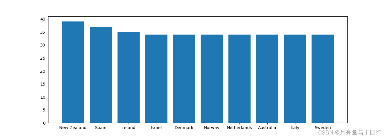
对于Matplotlib来说,绘图函数叫matplotlib.pyplot,一般记为plt;对于Plotnine而言,是ggplot。 用好这两个基本函数,然后查找我们所需绘制的图表类型,就能完成基本的绘图任务。用例子来看,比如我们现在有这么一组数据,要去绘制柱状图:
median_age_dict = {
    'coutry': ['New Zealand', 'Spain', 'Ireland', 'Israel', 'Denmark', 'Norway', 'Netherlands', 'Australia', 'Italy', 'Sweden'],
    'age': [39.0, 37.0, 35.0, 34.0, 34.0, 34.0, 34.0, 34.0, 34.0, 34.0]
    }
plt
import matplotlib.pyplot as plt
import pandas as pd

median_age_dict = {
    'country': ['New Zealand', 'Spain', 'Ireland', 'Israel', 'Denmark', 'Norway', 'Netherlands', 'Australia', 'Italy',
           'Sweden'],
    'age': [39.0, 37.0, 35.0, 34.0, 34.0, 34.0, 34.0, 34.0, 34.0, 34.0]
}
median_age = pd.DataFrame(median_age_dict)

# 创建窗体
plt.figure('matplotlib')
# 绘图
plt.bar(median_age['country'],median_age['age'])
# 展示
plt.show()
ggplot
from plotnine import *
import pandas as pd

median_age_dict = {
    'country': ['New Zealand', 'Spain', 'Ireland', 'Israel', 'Denmark', 'Norway', 'Netherlands', 'Australia', 'Italy',
           'Sweden'],
    'age': [39.0, 37.0, 35.0, 34.0, 34.0, 34.0, 34.0, 34.0, 34.0, 34.0]
}
median_age = pd.DataFrame(median_age_dict)

# 绘图,美中不足,不支持中文
sep = (ggplot(median_age,aes('country','age',fill='country'))+
              # 二维条形图
              geom_col()
              )
# 展示
print(sep)
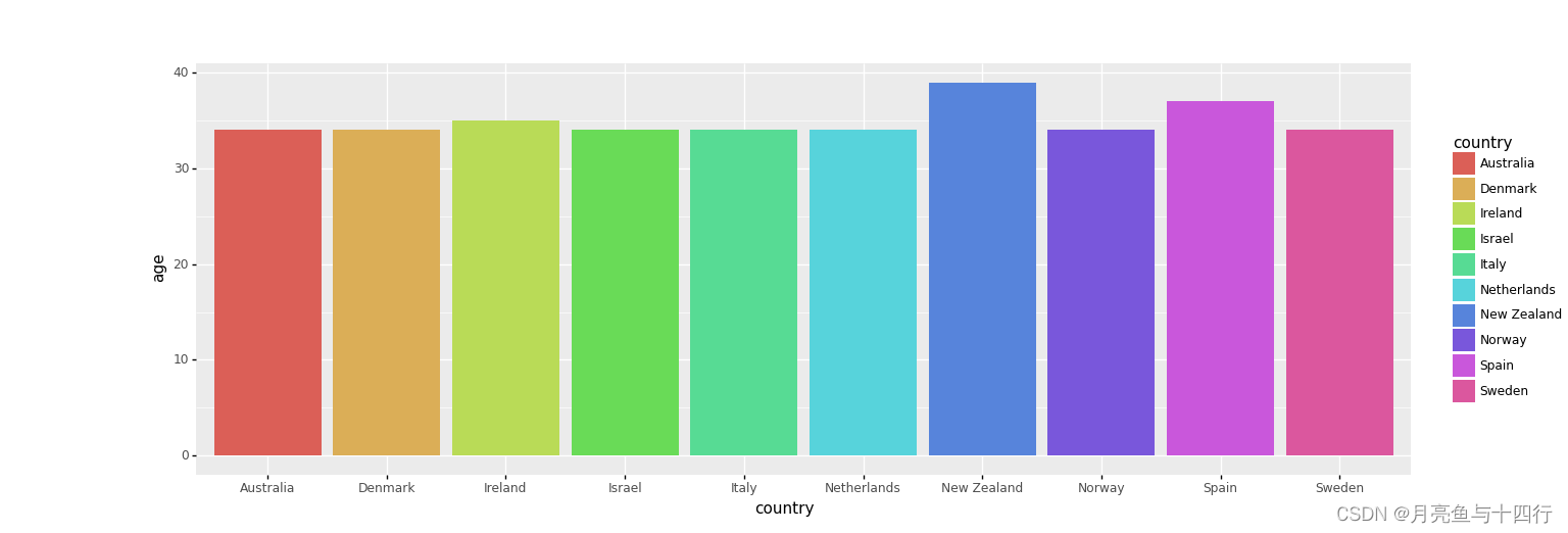
看得出来,ggplot的绘图风格更为亮丽,直接展示时绘图显示要素也更为丰富,而plt则较为规整,属于加啥才能显示啥的状态,图例和坐标轴名称都没有主动显示。
风格多样化的常识
掌握柱状图、曲线图和散点图的绘制,懂得图例和坐标轴的调整,能够调整线型和点型,并能完成图片的指定形式保存,基本就能满足日常学习中的绘图需要。 日后有空可再分别具体说明。
对于Matplotlib的学习, matplotlib官网上资料足够充分,民间也有很多详细的资料,如Matplotlib教程,其语法与Matlab近似,因此也可与Matlab中函数的用法类比迁移。
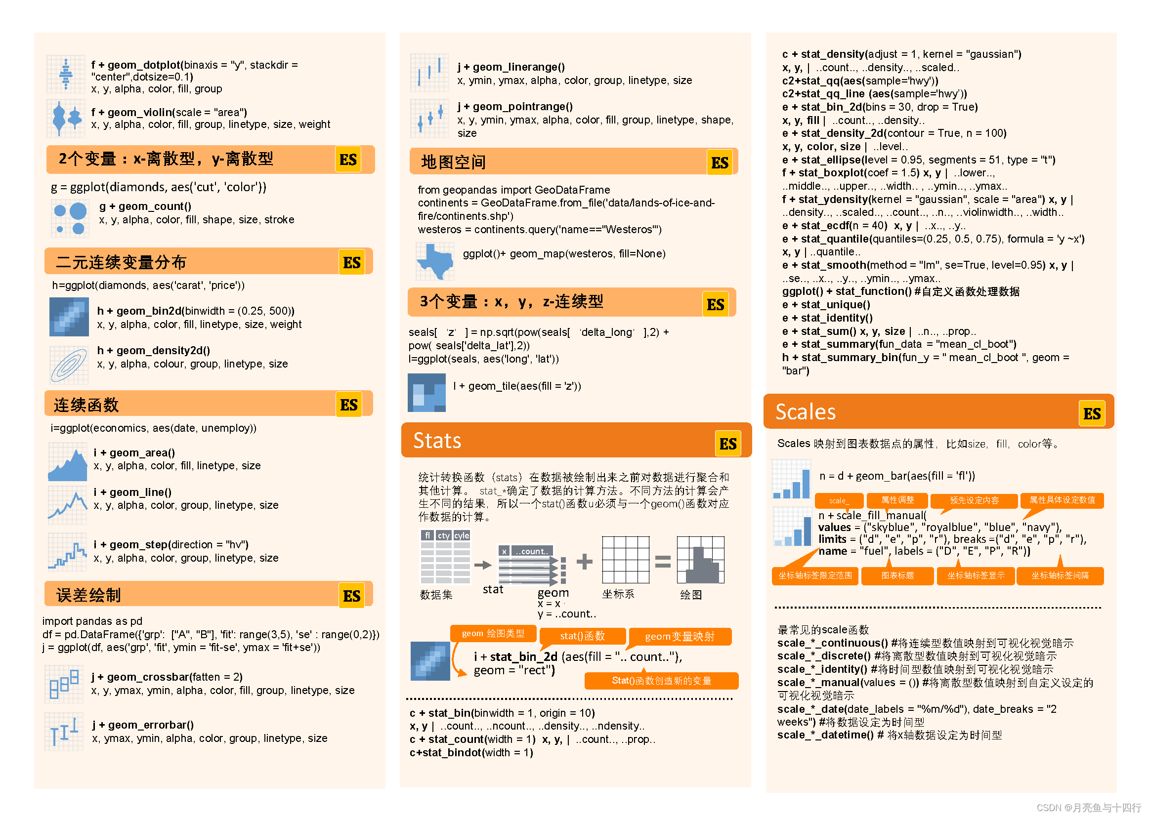
对于Plotnine的学习,《python数据可视化之美》提供了很好的一张导例图,特展示如下。同样可以参照R语言的ggplot2的语法进行学习,民间这方面的资料也很多,如 ggplot2高效实用指南。
Plotnine学习手册


Matplotlib模拟动态森林失火
最后展示一下自己做过的两个更为复杂的实例,第一个是模拟森林动态失火的实例,采用Matplotlib画了方格演化的动态显示。
#Here we have a 2-D battle field
#One side is green, the other is blue
import matplotlib.animation as animation  # 保存动图
import matplotlib.pyplot as plt
import numpy as np
from matplotlib.ticker import MultipleLocator
import random

#define class cell
class Cell:

    def __init__(self,HP,GEN,site):
        self.HP = HP
        #self.POS = POS
        self.GEN = GEN
        self.site = site

#The LOS caused by the enemies
    def Attack(self):
        LOS =  random.uniform(2, 4)
        return LOS

#The CURE provided by the teammates
    def Heal(self):
        CURE = random.uniform(1,3)
        return CURE

#Judge if the cell is dead
    def Sign(self):
        if self.HP <= 0:
            return True
        else:
            return False

#create the cell list
def create_cells(Num,HP):
    # the list of sites
    sites = []
    for j in range(int(np.sqrt(Num))):
        for k in range(int(np.sqrt(Num))):
            sites.append([j, k])
    random.shuffle(sites)

    # The amounts of green cells
    Green = random.randint(int(np.fix(np.sqrt(Num))), Num)
    cells = []
    for i in range(0, Green):
        cells.append(Cell(HP[0], 'green', sites[i]))
    for i in range(Green, Num):
        cells.append(Cell(HP[1], 'blue', sites[i]))
    return cells

#the battle between two cells
def battle(Cell_1,Cell_2):
    if Cell_1.GEN == Cell_2.GEN:
        Cell_1.HP += Cell_2.Heal()
        Cell_2.HP += Cell_1.Heal()
    else:
        Cell_1.HP -= Cell_2.Attack()
        Cell_2.HP -= Cell_1.Attack()
    return [Cell_1.HP,Cell_2.HP]

#the war between the cells
def war(cells):
    # for i in range(len(cells)):
    #     HP = battle(cells[i-1], cells[i])
    #     cells[i-1].HP = HP[0]
    #     cells[i].HP = HP[1]
    Num = len(cells)
    Grid = int(np.sqrt(Num))
    for cell_1 in cells:
        for cell_2 in cells:
            if cell_1.site[1] == cell_2.site[1]:
                if cell_1.site[0] == 0:
                    if cell_2.site[0] == 1 or cell_2.site[0] == Grid:
                        HP = battle(cell_1, cell_2)
                        cell_1.HP = HP[0]
                        cell_2.HP = HP[1]
                elif cell_1.site[0] == Grid:
                    if cell_2.site[0] == 0 or cell_2.site[0] == Grid - 1:
                        HP = battle(cell_1, cell_2)
                        cell_1.HP = HP[0]
                        cell_2.HP = HP[1]
                else:
                    if cell_2.site[0] == cell_1.site[1] - 1 or cell_2.site[0] == cell_1.site[1] + 1:
                        HP = battle(cell_1, cell_2)
                        cell_1.HP = HP[0]
                        cell_2.HP = HP[1]
            elif cell_1.site[0] == cell_2.site[0]:
                if cell_1.site[1] == 0:
                    if cell_2.site[1] == 1 or cell_2.site[1] == Grid:
                        HP = battle(cell_1, cell_2)
                        cell_1.HP = HP[0]
                        cell_2.HP = HP[1]
                elif cell_1.site[1] == Grid:
                    if cell_2.site[1] == 0 or cell_2.site[1] == Grid - 1:
                        HP = battle(cell_1, cell_2)
                        cell_1.HP = HP[0]
                        cell_2.HP = HP[1]
                else:
                    if cell_2.site[1] == cell_1.site[1] - 1 or cell_2.site[1] == cell_1.site[1] + 1:
                        HP = battle(cell_1, cell_2)
                        cell_1.HP = HP[0]
                        cell_2.HP = HP[1]

    return cells

# visual the war
def visual(cells,ims):
    ax = plt.subplot(111)
    plt.ion()
    reddead = 0
    greenlive = 0
    bluelive = 0

    # get the color
    for cell in cells:
        x = np.linspace(cell.site[0], cell.site[0] + 1)
        if cell.Sign():
            ax.fill_between(x, cell.site[1], cell.site[1] + 1, facecolor='red')
            reddead += 1
        else:
            if cell.GEN == 'green':
                ax.fill_between(x, cell.site[1], cell.site[1] + 1, facecolor='green')
                greenlive += 1
            elif cell.GEN == 'blue':
                ax.fill_between(x, cell.site[1], cell.site[1] + 1, facecolor='blue')
                bluelive += 1

    # set the scale
    plt.xlim(0, np.sqrt(len(cells)))
    plt.ylim(0, np.sqrt(len(cells)))
    ax.xaxis.set_major_locator(MultipleLocator(1))
    ax.yaxis.set_major_locator(MultipleLocator(1))
    ax.xaxis.grid(True, which='major')  # major,color='black'
    ax.yaxis.grid(True, which='major')  # major,color='black'
    plt.pause(0.8)
    ims.append(ax.findobj())

    # print([reddead, greenlive, bluelive])
    return [reddead, greenlive, bluelive]

def simulata(cells):
     fig = plt.figure()
     ims = []
     initial = visual(cells,ims)
     state = [initial]
     i = 0
     while state[i][0] < initial[1] and state[i][0] < initial[2]:
         cells = war(cells)
         state.append(visual(cells, ims))
         i +=1
     ani = animation.ArtistAnimation(fig, ims, interval=500, repeat_delay=1000)
     ani.save("test.gif", writer='pillow')

     return state


# Here we have a try, assume that we have Num cells
Num = 256
cells = create_cells(Num,[10,10])
state = simulata(cells)
print('Below is the result of simulation:\n',state)
greenlive_ratio = state[-1][1]/state[0][1]
bluelive_ratio = state[-1][2]/state[0][2]
print('\ngreenlive ratio is ',state[-1][1],'/',state[0][1], greenlive_ratio,
      '\nbluelive ratio is',state[-1][2],'/',state[0][2],bluelive_ratio)
效果显示是一个动图,并由matplotlib.animation实现动图的保存。

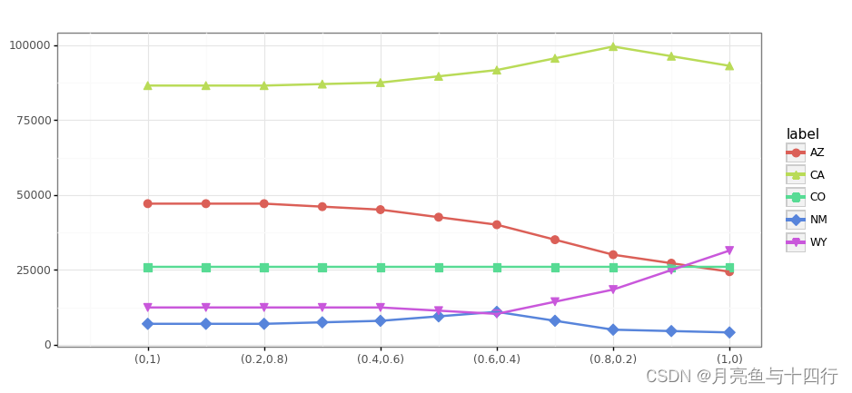
Plotnine点线图
另一个是用Plotnine画的一组数据的点线图,此时能看到整个风格是比较紧凑雅观的。
import numpy as np
from plotnine import *
import pandas as pd

def pit():
	# 数据
    df = {'x': [], 'y': [], 'label': []}

    y1 = [25978.40, 25978.40, 25978.40, 25978.40, 25978.40, 25978.40,
          25978.40, 25978.40, 25978.40, 25978.40, 25978.40]

    y2 = [12511.43, 12511.43, 12511.43, 12511.43, 12511.43, 11440.20,

          10368.96, 14418.96, 18468.96, 24969.96, 31470.96]

    y3 = [47111.58, 47111.58, 47111.58, 46111.58, 45111.58, 42602.52,

          40093.45, 35093.45, 30093.45, 27264.94, 24436.42]

    y4 = [7055.95, 7055.95, 7055.95, 7555.95, 8055.95, 9550.86,
          11045.76, 8074.72, 5103.67, 4645.83, 4187.98]

    y5 = [86468.18, 86468.18, 86468.18, 86968.18, 87468.18, 89553.58,

          91638.97, 95560.02, 99481.06, 96266.42, 93051.78]

    Num = 11
    for i in range(Num):
        df['x'].append(i + 1)
        df['y'].append(y1[i])
        df['label'].append('CO')

    for i in range(Num):
        df['x'].append(i + 1)
        df['y'].append(y2[i])
        df['label'].append('WY')

    for i in range(Num):
        df['x'].append(i + 1)
        df['y'].append(y3[i])
        df['label'].append('AZ')

    for i in range(Num):
        df['x'].append(i + 1)
        df['y'].append(y4[i])
        df['label'].append('NM')

    for i in range(Num):
        df['x'].append(i + 1)
        df['y'].append(y5[i])
        df['label'].append('CA')

    cases = ['(0,1)', '(0.2,0.8)', '(0.4,0.6)', '(0.6,0.4)', '(0.8,0.2)', '(1,0)']

    df = pd.DataFrame(df)

    COLOR = ('#F91400', '#FF328E')
    SHAPE = ('o', 's')

    # 绘图
    first_plot = (ggplot(df, aes('x', 'y', shape='label', fill='label', color='label')) +
    			 # 点线图结合
                  geom_point(size=3) +
                  geom_line(size=1) +
                  labs(x=' ', y="", title=' ') +
                  # 坐标轴调整
                  scale_x_continuous(limits=(0, 11), breaks=np.linspace(1, 11, 6), labels=cases) +
                  # 风格调整,这是很方便灵活的一步
                  theme_bw(
                  )
                  )

    first_plot.save('alplan.png', width=10, height=4.5)
    print(first_plot)

pit()


 5991
5991


 被折叠的 条评论
为什么被折叠?
被折叠的 条评论
为什么被折叠?
 到【灌水乐园】发言


