


介绍
-
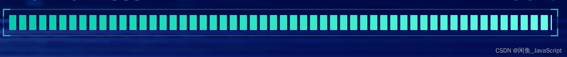
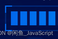
效果图展示:(
颜色自定义哦~js控制)


-
实现逻辑介绍:
(1)主要实现方案就是使用css渐变背景实现的。(linear-gradient)
(2)因为需要js控制颜色,所有边框渐变分了2个盒子,一个盒子控制左、右边框线的实现,一个盒子控制上下边框线的实现。就如解释说的一样,上图的边框为拼接出来的。
(3)内部进度条实现原理是使用背景渐变然后使用background-size设置大小控制无限渲染。(background-size这个可以控制每一个的大小,也可以使用linear-gradient去控制每一个的大小) -
组件功能介绍
(1)进度条功能,可设置百分比(0~100)进行百分比分割展示。
(2)可自定义颜色(边框色、四个角的颜色、进度条背景色)
实现
- react实现:
(1) Line/index.tsx
(2)index.lessimport styles from './index.less'; const linerGradient = ({ direction, width, color }: any) => { const _width = width || '10px'; return `linear-gradient(${direction}, ${color} ${_width},transparent ${_width}, transparent calc(100% - ${_width}), ${color} calc(100% - ${_width}), ${color}) 4` } const ContentFill = (props: any) => { const { begin, end, percentage } = props; return <div className={styles['contentFill-bg']} style={{ background: `linear-gradient(90deg, ${begin},${end})`, width: `${percentage}%` }}> <div className={styles['contentFill']} style={{ background: `linear-gradient(90deg, transparent 36%, #071353 0%, #071353 50%, transparent 0%, transparent 86%, #071353 0%, #071353 100% )`, backgroundSize: '16px 16px' }}></div> </div> } const Line = (props: any) => { const { color: { begin, end, border }, percentage } = props; return <div className={styles['lh-line']} style={{borderColor: border}}> <div className={[styles['top'], styles['content']].join(' ')} style={{ borderImage: linerGradient({ direction: 'to right', color: begin, width: '10px' }) }}> </div> <div className={[styles['left'], styles['content']].join(' ')} style={{ borderImage: linerGradient({ direction: 'to bottom', color: begin, width: '8px' }) }}></div> <ContentFill begin={begin} end={end} percentage={percentage}></ContentFill> </div> } export default Line;.contentFill-bg { .contentFill { height: 12px; width: 100%; } } .lh-line { border: 1px solid #071358; position: relative; padding: 4px; &>.content { border: 1px solid; width: calc(100% + 2px); height: calc(100% + 2px); position: absolute; top: -1px; left: -1px; right: 0; bottom: 0; } .top { border-left: none; border-right: none; } .left { border-top: none; border-bottom: none; } } - vue 实现待定(实现逻辑差不多,本文react示例并不涉及react的api那些,如果实现起来有问题可以询问我)
使用
- react使用
const page = () => {
	return <>
		<Line color={{
	      begin: '#0167EB',
	      end: '#00BFFA',
	      border: 'rgb(1, 103, 235, .3)'
	    }} percentage={100}></Line>
	    <Line color={{
	      begin: '#00CCAA',
	      end: '#65FFE5',
	      border: 'rgb(0, 204, 170, .3)'
	    }} percentage={50}></Line>
	</>
}


 205
205


 被折叠的 条评论
为什么被折叠?
被折叠的 条评论
为什么被折叠?
 到【灌水乐园】发言


