


CSS动画效果个人练习第四天
Html源代码
<!doctype html>
<html lang="en">
<head>
<meta charset="utf-8">
	<meta name="viewport" content="width=device-width,initial-scale=1.0">
<title>comic1</title>
<link href="style.css" rel="stylesheet" type="text/css">
</head>

<body>
	<div class="font-box">
	    <span>C</span>
		<span>S</span>
		<span>S</span>
		<span>,</span>
		<span>从</span>
		<span>入</span>
		<span>门</span>
		<span>到</span>
		<span>放</span>
		<span>弃</span>
	</div>
</body>
</html>
CSS源代码
*{
	padding: 0;
	margin: 0;
}
html{
	height: 100%;
}
body{
	background-color:black;
}
.font-box{
	text-align: center;
	padding: 200px 0;
}
.font-box span{
	color: #fff;
	font-family:"Gill Sans", "Gill Sans MT", "Myriad Pro", "DejaVu Sans Condensed", Helvetica, Arial, "sans-serif";
	font-size: 100px;
	font-weight: bold;
	text-shadow: -0.05em 0 cyan,0.05em 0 red;
	position: relative;
	display: inline-block;
}
@keyframes text-jump {
  0% {
    top: 0px;
  }
  50% {
    top: -150px;
  }
  80% {
    top: 50px;
  }
  100% {
    top: 0px;
  }
}

@keyframes text-rotate{
	0% {
		transform: rotate(0deg);
	}
	100% {
		transform: rotate(360deg);
	}
}
.font-box span:nth-child(1){
	animation: text-jump 0.8s ease-in-out 0s ,text-rotate 0.8s ease 0s;
}
.font-box span:nth-child(2){
	animation: text-jump 0.8s ease-in-out 0.2s ,text-rotate 0.8s ease 0.2s;
}
.font-box span:nth-child(3){
	animation: text-jump 0.8s ease-in-out 0.4s ,text-rotate 0.8s ease 0.4s;
}
.font-box span:nth-child(4){
	animation: text-jump 0.8s ease-in-out 0.6s ,text-rotate 0.8s ease 0.6s;
}
.font-box span:nth-child(5){
	animation: text-jump 0.8s ease-in-out 0.8s ,text-rotate 0.8s ease 0.8s;
}
.font-box span:nth-child(6){
	animation: text-jump 0.8s ease-in-out 1.0s ,text-rotate 0.8s ease 1.0s;
}
.font-box span:nth-child(7){
	animation: text-jump 0.8s ease-in-out 1.2s ,text-rotate 0.8s ease 1.2s;
}
.font-box span:nth-child(8){
	animation: text-jump 0.8s ease-in-out 1.4s ,text-rotate 0.8s ease 1.4s;
}
.font-box span:nth-child(9){
	animation: text-jump 0.8s ease-in-out 1.6s ,text-rotate 0.8s ease 1.6s;
}
.font-box span:nth-child(10){
	animation: text-jump 0.8s ease-in-out 1.8s ,text-rotate 0.8s ease 1.8s;
}
效果图片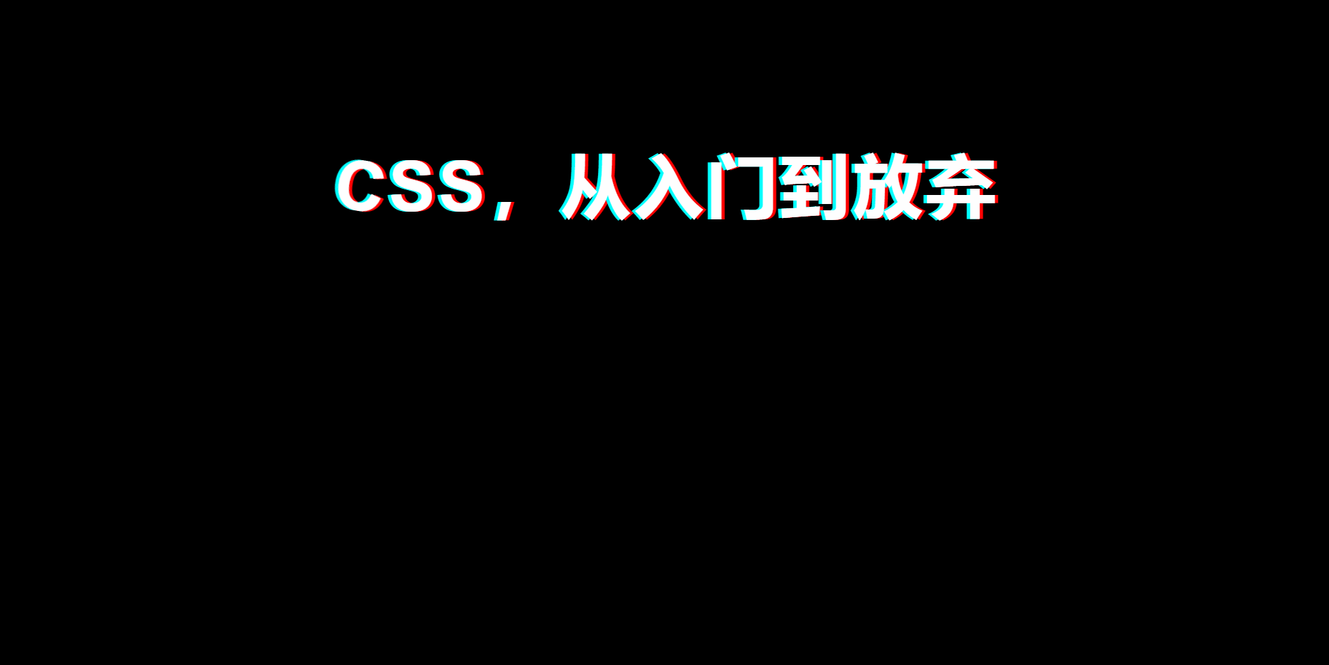


 353
353


 被折叠的 条评论
为什么被折叠?
被折叠的 条评论
为什么被折叠?
 到【灌水乐园】发言


