


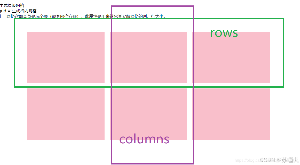
网格布局的定义
1、是父盒子对子盒子进行布局的方法
2、grid-template-columns设置盒子内部,有几列
3、grid-template-rows设置盒子内部,有几行
如图
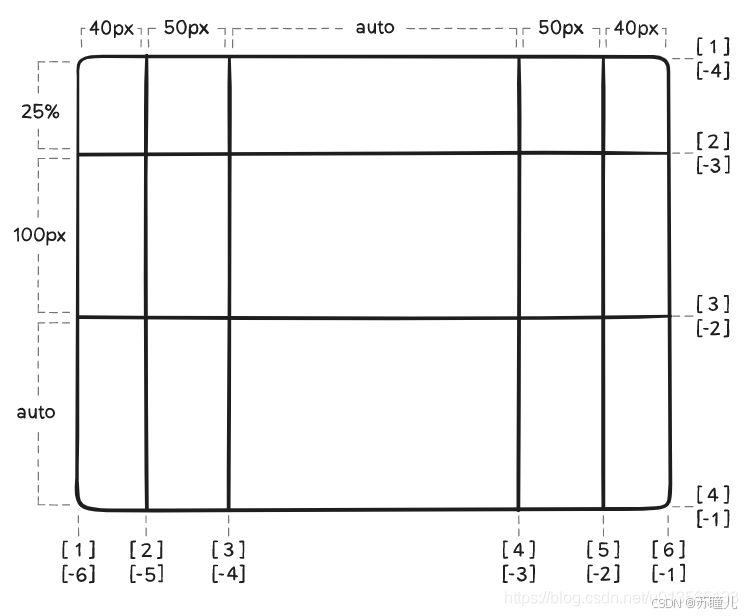
grid-template-columns和grid-template-rows
示例:
.container {
  grid-template-columns: 40px 50px auto 50px 40px;
  grid-template-rows: 25% 100px auto;
}
grid-template-columns:5列,第一列宽度40px、第二列宽度50px、第三列自适应等
grid-template-rows:3排,第一排高度25%、第二排高度100px,第三排高度自适应
如图:
如果有多个一样的格子,可以用repeat()
.box{
//三列,每列宽度为20%
grid-template-columns:repeat(3,20%)
//四排,每排高度为25%
grid-template-rows:repeat(4,25%)
}
//或者
.box{
//4列,宽度平分
grid-template-columns: repeat(4, 1fr);
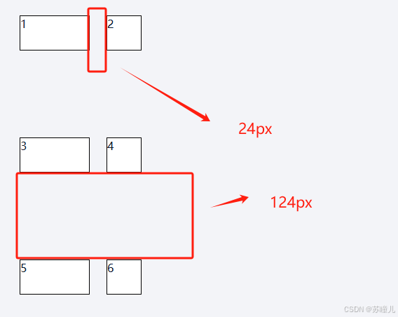
}grid-column-gap和grid-row-gap
示例:
.rowVox2{
  display: grid; //网格布局
  grid-template-columns:100px 50px; //2列,第一列款宽100px,第二列宽度50px
  grid-template-rows:repeat(3,50px); //3排,三排都是50px
  grid-column-gap:24px; //每列间距24px
  grid-row-gap:124px; //每行间距124px
}
grid-column-gap格子每列的间距(左右间距)
grid-row-gap格子每排的间距(上下间距)
如图:


 扫一扫
扫一扫


 被折叠的 条评论
为什么被折叠?
被折叠的 条评论
为什么被折叠?
 到【灌水乐园】发言


