


Flex的灵活用法
Flex布局现在比较常用,就个人经历来说,之前在做小程序的时,接触一个比较的好做法。现在想将它记录下来,避免以后忘记了。需要用的时候直接复制粘贴就行了。
整体打包代码
.flex-row {
	display: flex;
	flex-direction: row;
}
.flex-column {
	display: flex;
	flex-direction: column;
}
.j-c {
	justify-content: center;
}
.j-s-b {
	justify-content: space-between;
}
.j-s-a {
	justify-content: space-around;
}
.a-c {
	align-items: center;
}
分别解释它们作用
第一个flex-row
.flex-row {
  display: flex;
  flex-direction: row;
}
display:flex明确该盒子为弹性盒子
flex-direction明确盒子的弹性的方向为主轴的方向,也就是从左往右的展开
第二个flex-column
.flex-column {
	display: flex;
	flex-direction: column;
}
flex-direction明确盒子的方向为纵轴的方向
第三个j-c
.j-c {
	justify-content: center;
}
justify-content: center明确盒子在弹性的方向居中,注意这里单单指的弹性方向而不一定是主轴。视情况而定。

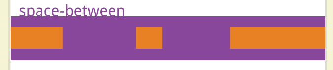
第四个j-s-b
.j-s-b {
	justify-content: space-between;
}
第五个j-s-a
.j-s-a {
	justify-content: space-around;
}

通过小项目的形式具体演示用法
下面的是没有涉及到弹性布局的代码以及运行结果
为什么看起来更具代表性,给三个盒子设置不一样的高度同时让它们之间有一点间距
<!DOCTYPE html>
<html>
	<head>
		<meta charset="utf-8">
		<title>小项目</title>
		<link rel="stylesheet" type="text/css" href="./flex.css"/>
		<style type="text/css">
			.box{
				margin: 20px auto;
				width: 400px;
				height: 600px;
				border: 1px solid blue;
			}
			.son1,.son2,.son3{
				width: 100px;
				background-color: red;
				margin: 2px;
			}
			.son1{
				height: 100px;
			}
			.son2{
				height: 120px;
			}
			.son3{
				height:200px ;
			}
		</style>
	</head>
	<body>
		<div class="box">
			<div class="son1"></div>
			<div class="son2"></div>
			<div class="son3"></div>
		</div>
	</body>
</html>
运行结果如下

接下来引入弹性布局
实现弹性布局中的
目录结构如下

flex.css里面放到是上面提到的打包文件

html的代码如下
<!DOCTYPE html>
<html>
	<head>
		<meta charset="utf-8">
		<title>小项目</title>
		<link rel="stylesheet" type="text/css" href="./flex.css"/>
		<style type="text/css">
			.box{
				margin: 20px auto;
				width: 400px;
				height: 600px;
				border: 1px solid blue;
			}
			.son1,.son2,.son3{
				width: 100px;
				background-color: red;
				margin: 2px;
			}
			.son1{
				height: 100px;
			}
			.son2{
				height: 120px;
			}
			.son3{
				height:200px ;
			}
		</style>
	</head>
	<body>
		<div class="box flex-row">
			<div class="son1"></div>
			<div class="son2"></div>
			<div class="son3"></div>
		</div>
	</body>
</html>
运行结果如下

这个相当于前面没有添加弹性布局的代码唯一如下

这样的话就会方便许多


 2780
2780


 被折叠的 条评论
为什么被折叠?
被折叠的 条评论
为什么被折叠?
 到【灌水乐园】发言


