


1、弹性布局flex
flex布局表示弹性布局,为盒字模型提供最大的灵活性。
 .red_box{
            background-color: red;
            height: 200px;
            width: 600px;
            display: flex;
        }
        .yellow_box1{
            background-color:yellow;
            width: 200px;
            height: 150px;
        }
        .green_box2{
            background-color:green;
            width: 200px;
            height: 150px;
        }
        .blue_box3{
            background-color: blue;
            width: 200px;
            height: 150px;
        }
         <div class="red_box">
        <div class="yellow_box1">1</div>
        <div class="green_box2">2</div>
        <div class="blue_box3">3</div>
    </div>

父元素display:flex后,子元素从左到右依次排列,不换行
即flex默认属性:[row nowrap]
利用flex轻松实现等分
在父元素设置了display:flex后,其子元素设置flex:1,即可实现平分布局,不用依次设置宽,简化代码。
<style>
        .red_box{
            background-color: red;
            height: 200px;
            width: 600px;
            display: flex;
        }
        .yellow_box1{
            background-color:yellow;
           flex: 1;
            height: 150px;
        }
        .green_box2{
            background-color:green;
           flex: 1;
            height: 150px;
        }
        .blue_box3{
            background-color: blue;
           flex: 1;
            height: 150px;
        }
    </style>

	<div class="red_box">
        <div class="yellow_box1">1</div>
        <div class="green_box2">2</div>
        <div class="blue_box3">3</div>
    </div>

设置flex不同值,实现各种分割
通过子元素设置flex不同值,改变元素占比,实现分割
<style>
        .red_box{
            background-color: red;
            height: 200px;
            width: 600px;
            display: flex;
        }
        .yellow_box1{
            background-color:yellow;
           flex: 2;
            height: 150px;
        }
        .green_box2{
            background-color:green;
           flex: 3;
            height: 150px;
        }
        .blue_box3{
            background-color: blue;
           flex: 5;
            height: 150px;
        }
    </style>

Position属性:static、absolute和relative的区别和用法
1、static:静态定位,是元素的默认值,在设置为static的情况下不可以使用top,right等属性实现移动。即static方式不会以任何方式定位,而是根据页面的文档流正常布局。
2、relative:相对定位,根据其元素原本的位置进行定位,通过设置top,right等属性实现移动
原来的样子:
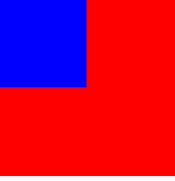 设置relative后
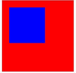
 <style>
        .box1{
            background-color: red;
            width: 200px;
            height: 200px;
        }
        .box2{
            background-color:blue;
            width: 100px;
            height: 100px;
            position: relative;
            top: 20px;
            left: 20px;
        }
    </style>
    <div class="box1">
        <div class="box2"></div>
    </div>
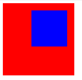
3、absolute:绝对定位。该元素是以最近的一个非static的祖先元素来定位,然而,如果绝对定位的元素没有祖先,它将使用文档主体(body),并随页面滚动一起移动。
<style>
        .box1{
            background-color: red;
            width: 200px;
            height: 200px;
            position: relative;
        }
        .box2{
            background-color:blue;
            width: 100px;
            height: 100px;
           position: absolute;
            top: 20px;
            right: 20px;
        }
    </style>
    <div class="box1">
        <div class="box2"></div>
    </div>
4、position: fixed; 的元素是相对于视口定位的,这意味着即使滚动页面,它也始终位于同一位置。 top、right、bottom 和 left 属性用于定位此元素。
浮动
float 属性:
1、left - 元素浮动到其容器的左侧
2、right - 元素浮动在其容器的右侧
3、none - 元素不会浮动,默认值。
4、inherit - 元素继承其父级的 float 值
position:absolute和float属性的异同:
两者的共同点:都可以让元素脱离文档流(块级元素也可以),并且可以设置其宽高。
两者的不同点:float仍会占位置,position会覆盖文档流中的其他元素。


 175
175


 被折叠的 条评论
为什么被折叠?
被折叠的 条评论
为什么被折叠?
 到【灌水乐园】发言


