


 本文介绍了如何利用CSS计数器、视图进度和滚动驱动动画技术,实现在有限宽度的容器中,标签水平排列并自动显示超出数量。通过实例代码展示了如何控制元素动画、检测元素溢出以及创建提示内容。
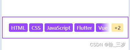
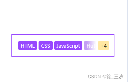
实现效果
css实现:有多个宽度不同的标签水平排列,当外层宽度不足时,会自动提示超出的数量
实现思路
- CSS 如何动态累计数字?
利用 CSS计数器
counter-reset: num var(--num);
counter-increment: num;
::after{
	content: "+"counter(num);
}
- CSS 如何知道哪些元素在容器之外?
CSS滚动驱动动画。这里用到的是视图进度,也就是关注的是元素自身位置,元素进入到容器范围之内就会触发动画,非常类似 JS中的Intersection Observer
tag{
  animation: appear;
  animation-timeline: view(inline);
  animation-range: contain;
}
@keyframes appear{
  to {
    background-color: #9747FF;
  }
}
- CSS 如何区分是否溢出(显示数量)
利用CSS滚动驱动动画,可以检测容器是否可滚动,也就是是否超出。所以我们只需要将遮罩放在滚动驱动动画里就行了,关键实现如下
.con{
  animation: check;
  animation-timeline: scroll(x self);
}
@keyframes check{
  from,to {
    -webkit-mask: linear-gradient(to right, #fff calc(100% - 30px), transparent);
  }
}
完整代码
<div class="wrap">
  <div class="con" style="--num:7">
    <a class="tag">HTML</a>
    <a class="tag">CSS</a>
    <a class="tag">JavaScript</a>
    <a class="tag">Flutter</a>
    <a class="tag">Vue</a>
    <a class="tag">React</a>
    <a class="tag">Svelte</a>
  </div>
</div>
html,body{
  font-family: -apple-system, "BlinkMacSystemFont", sans-serif;
  margin: 0;
  height: 100%;
  display: flex;
  justify-content: center;
  flex-direction: column;
  align-items: center;
  background: #fff;
  gap: 20px;
  accent-color: #9747FF;
}
.wrap{
  width: 300px;
  display: flex;
  align-items: center;
  padding: 15px;
  outline: 2px solid #9747FF;
  gap: 5px;
  overflow: hidden;
}
.con{
  position: relative;
  display: flex;
  gap: 5px;
  padding: 5px;
  overflow: hidden;
  counter-reset: num;
  animation: check;
  animation-timeline: scroll(x self);
  margin-right: -46px;
}
@keyframes check{
  from,to {
    margin-right: 0;
    -webkit-mask: linear-gradient(to right, #fff calc(100% - 30px), transparent);
  }
}
.wrap::after{
  content: "+"counter(num);
  padding: .2em .5em;
  background-color: #FFE8A3;
  color: #191919;
  border-radius: 4px;
}
.tag{
  padding: .2em .5em;
  background-color: #c49ef5;
  color: #fff;
  border-radius: 4px;
  counter-increment: num 1;
  animation: appear;
  animation-timeline: view(inline);
  animation-range: contain;
}
@keyframes appear{
  from,to {
    background-color: #9747FF;
    counter-increment: num 0;
  }
}


 134
134


 被折叠的 条评论
为什么被折叠?
被折叠的 条评论
为什么被折叠?
 到【灌水乐园】发言


