


微信原来的组件样式不满足程序员需求,可以对其样式进行重新修改并封装新组件。
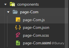
一.创建新组件
<view>
    <checkbox class="checkedstyle" checked="{{ischecked}}" bind:tap="handledata" /><text>{{lable}}</text>
</view>
二.在页面.json中注册使用
{
  "usingComponents": {
    "pageCom":"../../components/page-Com/page-Com"
  }
}
三.修改新组件样式
样式修改需要在微信官方文档内审查元素获取类名
1.在page中修改组件样式 ,修改了整个页面的checked样式,不影响其他页面
 .wx-checkbox-input {
  width: 50rpx !important;
  height: 50rpx !important;
  border-radius: 50% !important;
  border: 1px solid blue !important;
}

 .wx-checkbox-input-checked {
  background-color: blue !important;
}

.wx-checkbox-input.wx-checkbox-input-checked:before {
  font-size: 60rpx !important;
  color: white !important;
}
<pageCom lable="我同意"></pageCom>
<checkbox />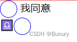
2.在全局中修改组件的样式 在全局页面都修改了组件。
3.只想封装新组件,有不影响原生组件,则需要在JS中开启styleIsolation: 'shared'属性。
在组件JS设置样式开启。
options: {
// 设置其他页面的样式和组件使用者的样式 防止冲突样式 需要添加类名
styleIsolation: 'shared'
},组件内需要添加一个在组件新类名,防止样式冲突
<checkbox class="checkedstyle" checked="{{ischecked}}" bind:tap="handledata" /><text>{{lable}}</text>.checkedstyle .wx-checkbox-input {
width: 50rpx !important;
height: 50rpx !important;
border-radius: 50% !important;
border: 1px solid blue !important;
}
.checkedstyle .wx-checkbox-input-checked {
background-color: blue !important;
}
.checkedstyle .wx-checkbox-input.wx-checkbox-input-checked:before {
font-size: 60rpx !important;
color: white !important;
}页面中调用 ,不影响原生组件
<pageCom lable="我同意"></pageCom>
<checkbox />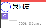


 768
768


 被折叠的 条评论
为什么被折叠?
被折叠的 条评论
为什么被折叠?
 到【灌水乐园】发言


