


所有文章除特别声明外,均采用 CC BY-NC-SA 4.0 许可协议。转载请注明来自 nixgnauhcuy’s blog!
如需转载,请标明出处!
完整代码我已经上传到 Github 上了,可前往 https://github.com/nixgnauhcuy/QCustomPlot_Pyqt_Study 获取。
完整文章路径:
前言
继上文,继续补充官方示例 demo 实现~
实用代码示例
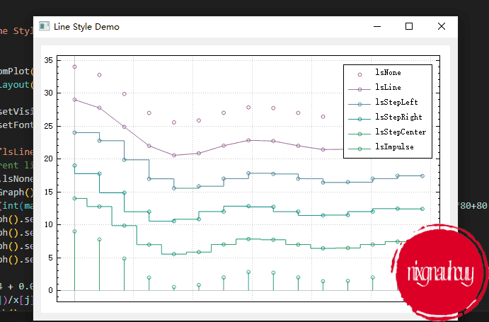
Line Style Demo
A demonstration of several line styles
import sys, math

from PyQt5.QtWidgets import QApplication, QGridLayout, QWidget
from PyQt5.QtGui import QPen, QColor, QFont
from QCustomPlot_PyQt5 import QCustomPlot, QCPGraph, QCPScatterStyle

class MainForm(QWidget):

    def __init__(self) -> None:
        super().__init__()

        self.setWindowTitle("Line Style Demo")
        self.resize(600,400)

        self.customPlot = QCustomPlot(self)
        self.gridLayout = QGridLayout(self).addWidget(self.customPlot)

        self.customPlot.legend.setVisible(True)
        self.customPlot.legend.setFont(QFont("Helvetica", 9))
        pen = QPen()
        lineNames = ["lsNone", "lsLine", "lsStepLeft", "lsStepRight", "lsStepCenter", "lsImpulse"]
        # add graphs with different line styles:
        for i in range(QCPGraph.lsNone, QCPGraph.lsImpulse+1):
            self.customPlot.addGraph()
            pen.setColor(QColor(int(math.sin(i*1+1.2)*80+80), int(math.sin(i*0.3+0)*80+80), int(math.sin(i*0.3+1.5)*80+80)))
            self.customPlot.graph().setPen(pen)
            self.customPlot.graph().setName(lineNames[i-QCPGraph.lsNone])
            self.customPlot.graph().setLineStyle(QCPGraph.LineStyle(i))
            self.customPlot.graph().setScatterStyle(QCPScatterStyle(QCPScatterStyle.ssCircle, 5))
            # generate data:
            x = [j/15.0 * 5*3.14 + 0.01 for j in range(15)]
            y = [7*math.sin(x[j])/x[j] - (i-QCPGraph.lsNone)*5 + (QCPGraph.lsImpulse)*5 + 2 for j in range(15)]
            self.customPlot.graph().setData(x, y)
            self.customPlot.graph().rescaleAxes(True)
        # zoom out a bit:
        self.customPlot.yAxis.scaleRange(1.1, self.customPlot.yAxis.range().center())
        self.customPlot.xAxis.scaleRange(1.1, self.customPlot.xAxis.range().center())
        # set blank axis lines:
        self.customPlot.xAxis.setTicks(False)
        self.customPlot.yAxis.setTicks(True)
        self.customPlot.xAxis.setTickLabels(False)
        self.customPlot.yAxis.setTickLabels(True)
        # make top right axes clones of bottom left axes:
        self.customPlot.axisRect().setupFullAxesBox()

if __name__ == '__main__':
    app = QApplication(sys.argv)
    mainForm = MainForm()
    mainForm.show()
    sys.exit(app.exec())
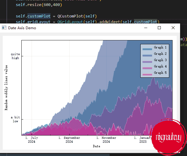
Date Axis Demo
Random walks with fill and smart date ticks on the bottom axis
import sys, math, random

from PyQt5.QtWidgets import QApplication, QGridLayout, QWidget
from PyQt5.QtGui import QPen, QColor, QBrush, QFont
from PyQt5.QtCore import QDateTime, QLocale
from QCustomPlot_PyQt5 import QCustomPlot, QCPGraph, QCPGraphData, QCPAxisTickerText, QCPAxisTickerDateTime

class MainForm(QWidget):

    def __init__(self) -> None:
        super().__init__()

        self.setWindowTitle("Date Axis Demo")
        self.resize(600,400)

        self.customPlot = QCustomPlot(self)
        self.gridLayout = QGridLayout(self).addWidget(self.customPlot)

        # set locale to english, so we get english month names:
        self.customPlot.setLocale(QLocale(QLocale.English, QLocale.UnitedKingdom))
        # seconds of current time, we'll use it as starting point in time for data:
        self.now = QDateTime.currentDateTime().toTime_t()
        # create multiple graphs:
        for i in range(5):
            self.customPlot.addGraph()
            color = QColor(int(20+200/4.0*i), int(70*(1.6-i/4.0)), 150, 150)
            self.customPlot.graph().setLineStyle(QCPGraph.lsLine)
            self.customPlot.graph().setPen(QPen(color.lighter(200)))
            self.customPlot.graph().setBrush(QBrush(color))

            # generate random walk data:
            timeData = [QCPGraphData() for k in range(250)]
            for j in range(250):
                timeData[j].key = self.now + 24*3600*j
                if j == 0:
                    timeData[j].value = (j/50.0+1)*(random.random()/5.0-0.5)
                else:
                    timeData[j].value = math.fabs(timeData[j-1].value)*(1+0.02/4.0*(4-i)) + (j/50.0+1)*(random.random()-0.5)
            self.customPlot.graph().data().set(timeData)

        # configure bottom axis to show date instead of number:
        dateTicker = QCPAxisTickerDateTime()
        dateTicker.setDateTimeFormat("d. MMMM\nyyyy")
        self.customPlot.xAxis.setTicker(dateTicker)

        # configure left axis text labels:
        textTicker = QCPAxisTickerText()
        textTicker.addTick(10, "a bit\nlow")
        textTicker.addTick(50, "quite\nhigh")
        self.customPlot.yAxis.setTicker(textTicker)

        # set a more compact font size for bottom and left axis tick labels:
        self.customPlot.xAxis.setTickLabelFont(QFont(QFont().family(), 8))
        self.customPlot.yAxis.setTickLabelFont(QFont(QFont().family(), 8))

        # set axis labels:
        self.customPlot.xAxis.setLabel("Date")
        self.customPlot.yAxis.setLabel("Random wobbly lines value")

        # make top and right axes visible but without ticks and labels:
        self.customPlot.xAxis2.setVisible(True)
        self.customPlot.yAxis2.setVisible(True)
        self.customPlot.xAxis2.setTicks(False)
        self.customPlot.yAxis2.setTicks(False)
        self.customPlot.xAxis2.setTickLabels(False)
        self.customPlot.yAxis2.setTickLabels(False)

        # set axis ranges to show all data:
        self.customPlot.xAxis.setRange(self.now, self.now+24*3600*249)
        self.customPlot.yAxis.setRange(0, 60)

        # show legend with slightly transparent background brush:
        self.customPlot.legend.setVisible(True)
        self.customPlot.legend.setBrush(QColor(255, 255, 255, 150))

if __name__ == '__main__':
    app = QApplication(sys.argv)
    mainForm = MainForm()
    mainForm.show()
    sys.exit(app.exec())
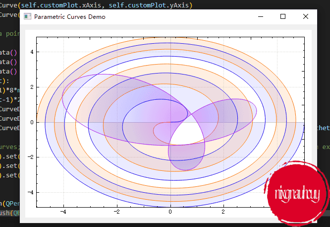
Parametric Curves Demo
Parametric curves with translucent gradient filling
import sys, math

from PyQt5.QtWidgets import QApplication, QGridLayout, QWidget
from PyQt5.QtGui import QPen, QColor, QBrush, QRadialGradient
from PyQt5.QtCore import QPointF
from QCustomPlot_PyQt5 import QCustomPlot, QCP, QCPCurve, QCPCurveData

class MainForm(QWidget):

    def __init__(self) -> None:
        super().__init__()

        self.setWindowTitle("Parametric Curves Demo")
        self.resize(600,400)

        self.customPlot = QCustomPlot(self)
        self.gridLayout = QGridLayout(self).addWidget(self.customPlot)

        # create empty curve objects:
        self.fermatSpiral1 = QCPCurve(self.customPlot.xAxis, self.customPlot.yAxis)
        self.fermatSpiral2 = QCPCurve(self.customPlot.xAxis, self.customPlot.yAxis)
        self.deltoidRadial = QCPCurve(self.customPlot.xAxis, self.customPlot.yAxis)

        # generate the curve data points:
        pointCount = 500
        dataSpiral1 = [QCPCurveData() for i in range(pointCount)]
        dataSpiral2 = [QCPCurveData() for i in range(pointCount)]
        dataDeltoid = [QCPCurveData() for i in range(pointCount)]
        for i in range(pointCount):
            phi = i/(pointCount-1)*8*math.pi
            theta = i/(pointCount-1)*2*math.pi
            dataSpiral1[i] = QCPCurveData(i, math.sqrt(phi)*math.cos(phi), math.sqrt(phi)*math.sin(phi))
            dataSpiral2[i] = QCPCurveData(i, -dataSpiral1[i].key, -dataSpiral1[i].value)
            dataDeltoid[i] = QCPCurveData(i, 2*math.cos(2*theta)+math.cos(1*theta)+2*math.sin(theta), 2*math.sin(2*theta)-math.sin(1*theta))

        # pass the data to the curves; we know t (i in loop above) is ascending, so set alreadySorted=True (saves an extra internal sort):
        self.fermatSpiral1.data().set(dataSpiral1, True)
        self.fermatSpiral2.data().set(dataSpiral2, True)
        self.deltoidRadial.data().set(dataDeltoid, True)

        # color the curves:
        self.fermatSpiral1.setPen(QPen(QColor(0, 0, 255)))
        self.fermatSpiral1.setBrush(QBrush(QColor(0, 0, 255, 20)))
        self.fermatSpiral2.setPen(QPen(QColor(255, 120, 0)))
        self.fermatSpiral2.setBrush(QBrush(QColor(255, 120, 0, 30)))
        radialGrad = QRadialGradient(QPointF(310, 180), 200)
        radialGrad.setColorAt(0, QColor(170, 20, 240, 100))
        radialGrad.setColorAt(0.5, QColor(20, 10, 255, 40))
        radialGrad.setColorAt(1,QColor(120, 20, 240, 10))
        self.deltoidRadial.setPen(QPen(QColor(170, 20, 240)))
        self.deltoidRadial.setBrush(QBrush(radialGrad))

        # set some basic customPlot config:
        self.customPlot.setInteractions(QCP.iRangeDrag | QCP.iRangeZoom | QCP.iSelectPlottables)
        self.customPlot.axisRect().setupFullAxesBox()
        self.customPlot.rescaleAxes()

if __name__ == '__main__':
    app = QApplication(sys.argv)
    mainForm = MainForm()
    mainForm.show()
    sys.exit(app.exec())
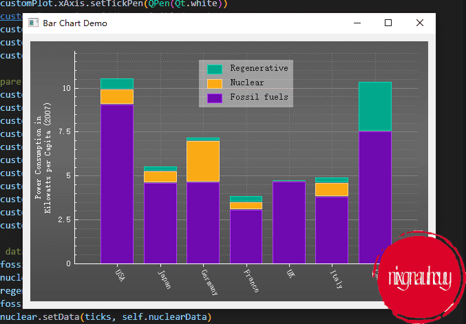
Bar Chart Demo
Three stacked bar charts with manual x axis tick labels
import sys

from PyQt5.QtWidgets import QApplication, QGridLayout, QWidget
from PyQt5.QtGui import QPen, QColor, QBrush, QFont, QLinearGradient
from PyQt5.QtCore import Qt
from QCustomPlot_PyQt5 import QCustomPlot, QCPBars, QCP, QCPAxisTickerText

class MainForm(QWidget):

    def __init__(self) -> None:
        super().__init__()

        self.setWindowTitle("Bar Chart Demo")
        self.resize(600,400)

        self.customPlot = QCustomPlot(self)
        self.gridLayout = QGridLayout(self).addWidget(self.customPlot)

        # set dark background gradient:
        gradient = QLinearGradient(0, 0, 0, 400)
        gradient.setColorAt(0, QColor(90, 90, 90))
        gradient.setColorAt(0.38, QColor(105, 105, 105))
        gradient.setColorAt(1, QColor(70, 70, 70))
        self.customPlot.setBackground(QBrush(gradient))

        # create empty bar chart objects:
        self.regen = QCPBars(self.customPlot.xAxis, self.customPlot.yAxis)
        self.nuclear = QCPBars(self.customPlot.xAxis, self.customPlot.yAxis)
        self.fossil = QCPBars(self.customPlot.xAxis, self.customPlot.yAxis)
        self.regen.setAntialiased(False) # gives more crisp, pixel aligned bar borders
        self.nuclear.setAntialiased(False)
        self.fossil.setAntialiased(False)
        self.regen.setStackingGap(1)
        self.nuclear.setStackingGap(1)
        self.fossil.setStackingGap(1)
        # set names and colors:
        self.fossil.setName("Fossil fuels")
        self.fossil.setPen(QPen(QColor(111, 9, 176).lighter(170)))
        self.fossil.setBrush(QColor(111, 9, 176))
        self.nuclear.setName("Nuclear")
        self.nuclear.setPen(QPen(QColor(250, 170, 20).lighter(150)))
        self.nuclear.setBrush(QColor(250, 170, 20))
        self.regen.setName("Regenerative")
        self.regen.setPen(QPen(QColor(0, 168, 140).lighter(130)))
        self.regen.setBrush(QColor(0, 168, 140))
        # stack bars on top of each other:
        self.nuclear.moveAbove(self.fossil)
        self.regen.moveAbove(self.nuclear)

        # prepare x axis with country labels:
        ticks = [1, 2, 3, 4, 5, 6, 7]
        labels = ["USA", "Japan", "Germany", "France", "UK", "Italy", "Canada"]
        textTicker = QCPAxisTickerText()
        textTicker.addTicks(ticks, labels)
        self.customPlot.xAxis.setTicker(textTicker)
        self.customPlot.xAxis.setTickLabelRotation(60)
        self.customPlot.xAxis.setSubTicks(False)
        self.customPlot.xAxis.setTickLength(0, 4)
        self.customPlot.xAxis.setRange(0, 8)
        self.customPlot.xAxis.setBasePen(QPen(Qt.white))
        self.customPlot.xAxis.setTickPen(QPen(Qt.white))
        self.customPlot.xAxis.grid().setVisible(True)
        self.customPlot.xAxis.grid().setPen(QPen(QColor(130, 130, 130), 0, Qt.DotLine))
        self.customPlot.xAxis.setTickLabelColor(Qt.white)
        self.customPlot.xAxis.setLabelColor(Qt.white)

        # prepare y axis:
        self.customPlot.yAxis.setRange(0, 12.1)
        self.customPlot.yAxis.setPadding(5) # a bit more space to the left border
        self.customPlot.yAxis.setLabel("Power Consumption in\nKilowatts per Capita (2007)")
        self.customPlot.yAxis.setBasePen(QPen(Qt.white))
        self.customPlot.yAxis.setTickPen(QPen(Qt.white))
        self.customPlot.yAxis.setSubTickPen(QPen(Qt.white))
        self.customPlot.yAxis.grid().setSubGridVisible(True)
        self.customPlot.yAxis.setTickLabelColor(Qt.white)
        self.customPlot.yAxis.setLabelColor(Qt.white)
        self.customPlot.yAxis.grid().setPen(QPen(QColor(130, 130, 130), 0, Qt.SolidLine))
        self.customPlot.yAxis.grid().setSubGridPen(QPen(QColor(130, 130, 130), 0, Qt.DotLine))

        # Add data:
        self.fossilData  = [0.86*10.5, 0.83*5.5, 0.84*5.5, 0.52*5.8, 0.89*5.2, 0.90*4.2, 0.67*11.2]
        self.nuclearData = [0.08*10.5, 0.12*5.5, 0.40*5.8, 0.09*5.2, 0.00*4.2, 0.07*11.2]
        self.regenData   = [0.06*10.5, 0.05*5.5, 0.04*5.5, 0.06*5.8, 0.02*5.2, 0.07*4.2, 0.25*11.2]
        self.fossil.setData(ticks, self.fossilData)
        self.nuclear.setData(ticks, self.nuclearData)
        self.regen.setData(ticks, self.regenData)

        # setup legend:
        self.customPlot.legend.setVisible(True)
        self.customPlot.axisRect().insetLayout().setInsetAlignment(0, Qt.AlignTop|Qt.AlignHCenter)
        self.customPlot.legend.setBrush(QColor(255, 255, 255, 100))
        self.customPlot.legend.setBorderPen(QPen(Qt.PenStyle.NoPen))
        legendFont = QFont()
        legendFont.setPointSize(10)
        self.customPlot.legend.setFont(legendFont)
        self.customPlot.setInteractions(QCP.Interactions(QCP.iRangeDrag | QCP.iRangeZoom))

if __name__ == '__main__':
    app = QApplication(sys.argv)
    mainForm = MainForm()
    mainForm.show()
    sys.exit(app.exec())
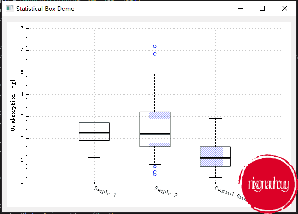
Statistical Box Demo
Statistical 5-parameter-box-plot with outliers
import sys

from PyQt5.QtWidgets import QApplication, QGridLayout, QWidget
from PyQt5.QtGui import QColor, QBrush
from PyQt5.QtCore import Qt
from QCustomPlot_PyQt5 import QCustomPlot, QCPStatisticalBox, QCP, QCPAxisTickerText

class MainForm(QWidget):

    def __init__(self) -> None:
        super().__init__()

        self.setWindowTitle("Statistical Box Demo")
        self.resize(600,400)

        self.customPlot = QCustomPlot(self)
        self.gridLayout = QGridLayout(self).addWidget(self.customPlot)

        statistical = QCPStatisticalBox(self.customPlot.xAxis, self.customPlot.yAxis)
        boxBrush = QBrush(QColor(60, 60, 255, 100))
        boxBrush.setStyle(Qt.Dense6Pattern)  # make it look oldschool
        statistical.setBrush(boxBrush)

        # specify data:
        statistical.addData(1, 1.1, 1.9, 2.25, 2.7, 4.2)
        statistical.addData(2, 0.8, 1.6, 2.2, 3.2, 4.9, [0.7, 0.34, 0.45, 6.2, 5.84])  # provide some outliers as list
        statistical.addData(3, 0.2, 0.7, 1.1, 1.6, 2.9)

        # prepare manual x axis labels:
        self.customPlot.xAxis.setSubTicks(False)
        self.customPlot.xAxis.setTickLength(0, 4)
        self.customPlot.xAxis.setTickLabelRotation(20)
        textTicker = QCPAxisTickerText()
        textTicker.addTick(1, "Sample 1")
        textTicker.addTick(2, "Sample 2")
        textTicker.addTick(3, "Control Group")
        self.customPlot.xAxis.setTicker(textTicker)

        # prepare axes:
        self.customPlot.yAxis.setLabel("O₂ Absorption [mg]")
        self.customPlot.rescaleAxes()
        self.customPlot.xAxis.scaleRange(1.7, self.customPlot.xAxis.range().center())
        self.customPlot.yAxis.setRange(0, 7)
        self.customPlot.setInteractions(QCP.iRangeDrag | QCP.iRangeZoom)

if __name__ == '__main__':
    app = QApplication(sys.argv)
    mainForm = MainForm()
    mainForm.show()
    sys.exit(app.exec())


 2136
2136

 被折叠的 条评论
为什么被折叠?
被折叠的 条评论
为什么被折叠?
 到【灌水乐园】发言


