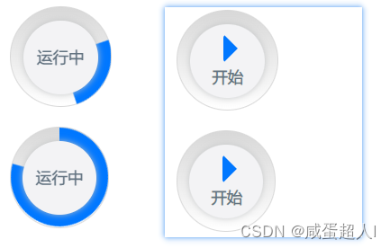
第一种
<template>
<div class="circle_process">
<div class="wrapper right">
<div :class="[isMove?'circle right-circle':'circle']"></div>
</div>
<div class="wrapper left">
<div :class="[isMove? 'circle left-circle':'circle']"></div>
</div>
<div class="round" v-if="isMove">
<p>运行中</p>
</div>
<div class="round" v-else>
<div class="arrow"></div>
<p class="begin-text">开始</p>
</div>
</div>
</template>
<script setup>
import {ref} from 'vue'
const isMove = ref(false)
</script>
<style lang="scss" scoped>
.circle_process {
position: relative;
width: 100px;
height: 102px;
background: linear-gradient(to bottom,
border:1px solid
border-radius: 50%;
margin-bottom: 20px;
.round {
position: absolute;
top: 0;
left: 0;
right: 0;
bottom: 0;
margin: auto;
width: 75px;
height: 75px;
text-align: center;
color:
background:
box-shadow: 0 0 7px 0
border-radius: 50%;
display: flex;
align-items: center;
justify-content: center;
.arrow {
width: 0px;
height: 0px;
border-radius: 4px;
border:15px solid transparent;
border-left-color:
position: absolute;
top: 0;
bottom: 25px;
left: 21px;
right: 0;
margin: auto;
}
.begin-text {
position: absolute;
bottom: 10px;
left: 22px;
}
}
.wrapper {
width: 50%;
height: 100%;
position: absolute;
top: 0;
font-size:0;
overflow: hidden;
}
.right {
right: 0;
}
.left {
left: 0;
}
.circle {
width: 100px;
height: 100px;
border: 15px solid transparent;
border-radius: 50%;
position: absolute;
top: 0;
box-sizing: border-box;
}
.right-circle {
border-top: 15px solid
border-right: 15px solid
right: 0;
animation: circle_right 5s linear infinite;
}
.left-circle {
border-bottom: 15px solid
border-left:15px solid
left: 0;
animation: circle_left 5s linear infinite;
}
}
@keyframes circle_right {
0% {
transform: rotate(-135deg);
}
50%,
100% {
transform: rotate(45deg);
}
}
@keyframes circle_left {
0%,
50% {
transform: rotate(-135deg);
}
100% {
transform: rotate(45deg);
}
}
</style>
第二种方案
<template>
<div class="circle_process">
<div class="wrapper right">
<div :class="[isMove?'circle move-circle':'circle']"></div>
</div>
<div class="round" v-if="isMove">
<p>运行中</p>
</div>
<div class="round" v-else>
<div class="arrow"></div>
<p class="begin-text">开始</p>
</div>
</div>
</template>
<script setup>
import {ref} from 'vue'
const isMove = ref(false)
</script>
<style lang="scss" scoped>
.circle_process {
position: relative;
width: 103px;
height: 102px;
background: linear-gradient(to bottom,
border:1px solid
border-radius: 50%;
margin-bottom: 20px;
.round {
position: absolute;
top: 0;
left: 0;
right: 0;
bottom: 0;
margin: auto;
width: 75px;
height: 75px;
text-align: center;
color:
background:
box-shadow: 0 0 7px 0
border-radius: 50%;
display: flex;
align-items: center;
justify-content: center;
.arrow {
width: 0px;
height: 0px;
border-radius: 4px;
border:15px solid transparent;
border-left-color:
position: absolute;
top: 0;
bottom: 25px;
left: 21px;
right: 0;
margin: auto;
}
.begin-text {
position: absolute;
bottom: 10px;
left: 22px;
}
}
.wrapper {
width: 100%;
height: 100%;
position: absolute;
top: 0;
font-size:0;
overflow: hidden;
}
.circle {
width: 102px;
height: 100px;
border: 15px solid transparent;
border-radius: 50%;
position: absolute;
top: 0;
box-sizing: border-box;
}
.move-circle {
border-top: 15px solid
animation: circle_right 5s linear infinite;
}
}
@keyframes circle_right {
0% { transform: rotate(0deg); }
100% { transform:rotate(360deg); }
}
</style>


 1029
1029


 被折叠的 条评论
为什么被折叠?
被折叠的 条评论
为什么被折叠?
 到【灌水乐园】发言


