


 文章详细介绍了如何使用Pyecharts和Matplotlib库创建各种类型的图表,包括纵向/横向柱状图、折线图、饼状图、环状图、玫瑰图、地图、词云图和矩形树图,并提供了代码示例。
pyecharts/matplotlib总结-持续更新中……
pyecharts各类型图表
- pyecharts文档:https://gallery.pyecharts.org/#/README
- matplotlib文档:https://matplotlib.org/stable/tutorials/index.html
柱状图
纵向柱状图
bar = (
    Bar()
    .add_xaxis(countrysData)
    .add_yaxis('奖牌总数', sumCountsData)
    .reversal_axis()  # 将 x 轴和 y 轴进行反转,变为横向柱状图
    .set_global_opts(
        # xaxis_opts=opts.AxisOpts(type_="value"),
        title_opts=opts.TitleOpts(
            title='国家/地区奖牌总数TOP10',  # 标题
            subtitle='数据来源:cctv.com',
            # 设置标题样式
            title_textstyle_opts=opts.TextStyleOpts(
                font_size=20,
            ),
            pos_left='center',  # title位置
            pos_top='3%',
        ),
        # 图例设置
        legend_opts=opts.LegendOpts(
            is_show=False
        ),
        # 提示款
        tooltip_opts=opts.TooltipOpts(
            trigger='axis',  # 'axis': 坐标轴触发,主要在柱状图,折线图等会使用类目轴的图表中使用
            axis_pointer_type='cross',  # 'cross':十字准星指示器。其实是种简写,表示启用两个正交的轴的 axisPointer。
        ), )
    .set_series_opts(
        label_opts=opts.LabelOpts(is_show=True, position="right"),  # 显示标签
    )
)

grid = Grid(  # 画布配置
    init_opts=opts.InitOpts(
        width="1300px",  # 图的大小
        height='700px'
    ))
grid.add(bar, grid_opts=opts.GridOpts(pos_top="13%")).render(
    "../pic/国家地区奖牌总数TOP10.html")
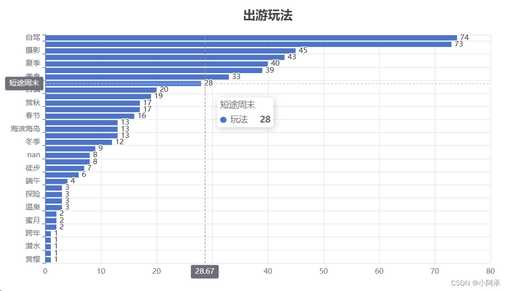
横向柱状图
yData需为升序,反转后横向柱状图呈现降序效果,输入数据均为列表
Bar().add_xaxis(
    xaxis_data=xData
).add_yaxis(
    series_name='玩法',
    y_axis=yData
).reversal_axis(
    # 将 x 轴和 y 轴进行反转,变为横向柱状图
).set_global_opts(
    title_opts=opts.TitleOpts(
        title='出游玩法',  # 标题
        # 设置标题样式
        title_textstyle_opts=opts.TextStyleOpts(
            font_size=20,
        ),
        pos_left='center',  # title位置
        pos_top='3%',
    ),
    # 图例设置
    legend_opts=opts.LegendOpts(
        is_show=False
    ),
    # 提示款
    tooltip_opts=opts.TooltipOpts(
        trigger='axis',  # 'axis': 坐标轴触发,主要在柱状图,折线图等会使用类目轴的图表中使用
        axis_pointer_type='cross',  # 'cross':十字准星指示器。其实是种简写,表示启用两个正交的轴的 axisPointer。
    ),
).set_series_opts(
    label_opts=opts.LabelOpts(is_show=True, position="right"),  # 显示标签
).render("./pic/出游玩法.html")
折线图
可以通过Grid控制图幅大小,输入数据均为列表
# 折线图
line = Line().add_xaxis(
    x_data,  # 添加横轴
).add_yaxis(  # 添加纵轴
    series_name='门店数量', y_axis=com_num, label_opts=opts.LabelOpts(is_show=False), color='#4b0101',
    linestyle_opts=opts.LineStyleOpts(
        width=1.2,
        color='#9400d3',
    ),
).set_global_opts(
    xaxis_opts=opts.AxisOpts(
        type_="category",
    ),
    yaxis_opts=opts.AxisOpts(
        name='门店数量'
    ),
    title_opts=opts.TitleOpts(
        title='全国门店各省份折线图',  # 标题
        pos_left='center',  # title位置
        pos_top='3%',
    ),
    # 图例设置
    legend_opts=opts.LegendOpts(
        pos_top='10%',  # 图例位置
        pos_left='center',
    ),
    # 提示款
    tooltip_opts=opts.TooltipOpts(
        trigger='axis',  # 'axis': 坐标轴触发,主要在柱状图,折线图等会使用类目轴的图表中使用
        axis_pointer_type='cross',  # 'cross':十字准星指示器。其实是种简写,表示启用两个正交的轴的 axisPointer。
    ),
).set_series_opts(
    label_opts=opts.LabelOpts(
        is_show=True,
    ),  # 显示标签
)

grid = Grid(  # 画布配置
    init_opts=opts.InitOpts(
        width="1300px",  # 图的大小
        height='750px'
    ))
grid.add(line, grid_opts=opts.GridOpts(pos_top="13%")).render('../pic/全国门店各省份折线图.html')
饼状图
环状图
Pie().add(
    series_name="", data_pair=data_pie,
    radius=['30%', '60%'], # 内外环比例
).set_global_opts(
    title_opts=opts.TitleOpts(
        title="出游结伴方式",
        subtitle="数据来源:去哪儿官网",
        pos_left='center',
        pos_top='3%',
        # 设置标题样式
        title_textstyle_opts=opts.TextStyleOpts(
            font_size=20,
        ),
    ),
    legend_opts=opts.LegendOpts(pos_bottom='5%', pos_left='center', pos_right='center', border_color=None, border_width=0)
).set_series_opts(
    label_opts=opts.LabelOpts(formatter='{b}:{d}%')  # 设置显示格式为百分比
).render("./pic/出游结伴方式.html")
玫瑰图
pie = Pie().add(
    series_name="", data_pair=data_pie,
    radius=['10%', '60%'],
    rosetype="radius",
).set_global_opts(
    title_opts=opts.TitleOpts(
        title="全国门店各类型占比玫瑰图",
        subtitle="数据来源:盒马生鲜官网",
        pos_left='center',
        pos_top='3%',
        # 设置标题样式
        title_textstyle_opts=opts.TextStyleOpts(
            font_size=20,
        ),
    ),
    legend_opts=opts.LegendOpts(pos_bottom='5%', pos_left='center', pos_right='center')
).set_series_opts(
    label_opts=opts.LabelOpts(formatter='{b}:{d}%')  # 设置显示格式为百分比
)

grid = Grid(  # 画布配置
    init_opts=opts.InitOpts(
        width="1300px",  # 图的大小
        height='750px'
    ))
grid.add(pie, grid_opts=opts.GridOpts(pos_top="13%")).render("../pic/门店各类型占比玫瑰图.html")
地图
输入数据是元组格式
data = [(key, value) for key, value in words.items()]  # 转换成元组方便pyecharts展示

map = (
    Map(init_opts=opts.InitOpts())
        .add('门店数量', data, "上海", )
        .set_series_opts(label_opts=opts.LabelOpts(is_show=True))
        .set_global_opts(
        title_opts=opts.TitleOpts(
            title="上海门店各区数量分布图",
            # 设置标题样式
            title_textstyle_opts=opts.TextStyleOpts(
                font_size=20,
                width=1.5,
            ),
            pos_left='center',  # title位置
        ),
        visualmap_opts=opts.VisualMapOpts(max_=150, min_=0), # 最大最小值
        legend_opts=opts.LegendOpts(
            is_show=False,  # 图例不显示
        ),
    )
)

grid = Grid(  # 画布配置
    init_opts=opts.InitOpts(
        width="1300px",  # 图的大小
        height='750px'
    ))
grid.add(map, grid_opts=opts.GridOpts(pos_top="13%")).render('../pic/上海门店各区数量分布图.html')
词云图
(
    WordCloud().add(
        # 系列名称,用于 tooltip 的显示,legend 的图例筛选。
        series_name="数量",
        # 系列数据项,[(word1, count1), (word2, count2)]
        data_pair=wordsNum.items(),
        shape='triangle',
    )
    # 全局配置项
    .set_global_opts(
        # 标题设置
        title_opts=opts.TitleOpts(
            title='豆瓣电影top250主演词云图',  # 标题
            subtitle='数据来源:豆瓣',
            # 设置标题样式
            title_textstyle_opts=opts.TextStyleOpts(
                font_size=25,
            ),
            pos_left='center',  # title位置
            pos_bottom='cenetr',
            pos_top='20',
        ),
        # 关闭图例
        legend_opts=opts.LegendOpts(is_show=False),
        # 提示框设置
        tooltip_opts=opts.TooltipOpts(is_show=True),
    ).render("./pic/豆瓣电影top250主演词云图.html")
)
矩形树图
输入数据为字典列表形式:[{“value”: value, “name”: name}]
# 将数据转换成字典列表
data_list = [{"value": value, "name": name} for value, name in zip(values, names)]

(
    TreeMap(init_opts=opts.InitOpts(theme=ThemeType.LIGHT))
    .add("浏览量", data_list, label_opts=opts.LabelOpts(is_show=False))
    .set_global_opts(
        title_opts=opts.TitleOpts(
            title="月浏览量TOP10景点",  # 设置标题样式
            title_textstyle_opts=opts.TextStyleOpts(
                font_size=20,
            ),
        ),
        legend_opts=opts.LegendOpts(is_show=False)
    )
    .set_series_opts(label_opts=opts.LabelOpts())
    .set_series_opts(
        label_opts=opts.LabelOpts(formatter='{b}\n{c}')  # 设置显示格式为百分比
    )
).render("./pic/月浏览量TOP10景点.html")
matplotlib各类型图表
柱状图
# 设置图形
plt.figure(figsize=(10, 6), dpi=300)
plt.rcParams['font.sans-serif'] = ['SimHei']  # 指定使用的中文字体
# 创建柱状图
plt.bar(temp_label, temp_data, color='blue', label="天气情况次数统计")
# 添加标题和标签
plt.title('2023年12月6日北京市30日天气情况柱状图', fontsize=20)
plt.xlabel('天气情况')
plt.ylabel('次数')
plt.legend(loc='upper right')
# 保存
plt.savefig("../pic/2023年12月6日北京市30日天气情况柱状图.jpg")
# 显示图形
plt.show()
折线图
plt.rcParams['font.sans-serif'] = ['SimHei']  # 指定使用的中文字体
plt.rcParams['axes.unicode_minus'] = False  # 用于解决负号显示问题
# 设置图形
plt.figure(figsize=(18, 8), dpi=300)
# 画图,zoder是控制画图流程的属性,其值越大则表示画图的时间越晚
plt.plot(date_x, min_y, color='blue', label='最低温度', zorder=5)
plt.plot(date_x, max_y, color='red', label='最高温度', zorder=10)
# x轴标签
plt.xticks(date_x, rotation=0)
# 增加y轴刻度密度
plt.yticks(np.arange(min_data, max_data, 2))
# 添加标题
plt.title('2023年12月6日北京市30日温度变化情况', fontsize=20)
# 添加x轴和y轴标签
plt.xlabel('日期')
plt.ylabel('温度')
# 绘制网格->grid
plt.grid(alpha=0.5)
plt.legend(loc='upper right')
# 保存
plt.savefig("../pic/2023年12月6日北京市30日温度变化情况.jpg")
# 展示
plt.show()
双饼状图
# 设置图形
plt.style.use('fivethirtyeight')
plt.rcParams['font.sans-serif'] = ['SimHei']  # 指定使用的中文字体

fig, ax = plt.subplots(nrows=1, ncols=2, figsize=(20, 12))

# 绘制饼状图
ax[0].pie(wind_trend_data, labels=wind_trend_label, autopct='%1.1f%%', startangle=90)
ax[1].pie(wind_scale_data, labels=wind_scale_label, autopct='%1.1f%%', startangle=90)
# 添加标题
plt.suptitle('2023年12月6日北京市30日风向风级占比情况', fontsize=30)
# 调整布局以防止标题被裁剪
plt.tight_layout()
# 保存
plt.savefig("../pic/2023年12月6日北京市30日风向风级占比情况.jpg")
# 显示图形
plt.show()


 被折叠的 条评论
为什么被折叠?
被折叠的 条评论
为什么被折叠?
 到【灌水乐园】发言


