


 本文介绍了使用Python进行成绩可视化的方法,包括输入学生信息,绘制成绩直方图,以及利用turtle库绘制国旗动画。通过示例展示了如何计算平均分、最高分、最低分并用matplotlib展示成绩分布,同时展示了使用turtle库创建小人和国旗的图形艺术。
1.成绩可视化,输入成绩,绘制直方图
lis_score=[]
n=int(input("输入学生人数:"))
while n<1:
print("学生人数需大于1")
n = int(input("输入学生人数:"))
def check_score(score):
if score >= 0 and score <= 100:
return score
else:
print("分数未符合规范,请在1~100之间,确认后重新录入。!")
score = int(input("输入分数:"))
score = check_score(score)
j = 3
num_list=[]
b=[]
while j > 0 :
num = eval(input("输入学生学号(1,2,3,4...):"))
num_list.append(num)
i = n
a = []
while i > 0:
score = check_score(int(input("输入该学生分数:")))
a.append(score)
i -= 1
ave_score = (sum(a) / n)
lis_score.append([num,round(ave_score,2),max(a),min(a)])
j -= 1
print('最高分{:.2f}分,最低分{:.2f}分,平均分{:.2f}分'.format(max(a),min(a),ave_score))
print("总分{:.2f}分".format(sum(a)))
b.append(a)
print(lis_score)
print(b)
import csv
list=lis_score
f = open('成绩表.csv','w',newline='')
writer = csv.writer(f)
for i in list:
writer.writerow(i)
f.close()
import matplotlib.pyplot as plt
plt.rcParams['font.family'] = ['SimHei']
plt.title("成绩分布柱状图")
for i in range(num):
x=[num_list[i]]
height=[lis_score[i][1]]
plt.bar(x,height)
plt.xlabel("学生学号——平均分")#设置x轴标签
plt.ylabel("成绩分数段")#设置y轴标签
plt.xlim(0,10)#设置x轴区间
plt.xticks(range(1,10))#设置x轴刻度
plt.yticks([0,10,20,30,40,50,60,70,80,90,100]) #设置y轴刻度
plt.grid()
plt.show()
for i in range(num):
x=[num_list[i]]
height=[lis_score[i][2]]
plt.bar(x,height)
plt.xlabel("学生学号——最高分")#设置x轴标签
plt.ylabel("成绩分数段")#设置y轴标签
plt.xlim(0,10)#设置x轴区间
plt.xticks(range(1,10))#设置x轴刻度
plt.yticks([0,10,20,30,40,50,60,70,80,90,100]) #设置y轴刻度
plt.grid()
plt.show()
for i in range(num):
x=[num_list[i]]
height=[lis_score[i][3]]
plt.bar(x,height)
plt.xlabel("学生学号——最低分")#设置x轴标签
plt.ylabel("成绩分数段")#设置y轴标签
plt.xlim(0,10)#设置x轴区间
plt.xticks(range(1,10))#设置x轴刻度
plt.yticks([0,10,20,30,40,50,60,70,80,90,100]) #设置y轴刻度
plt.grid()
plt.show()
for i in range(num):
x=[num_list[i]]
height=[b[i][0]]
plt.bar(x,height)
plt.xlabel("学生学号——高数")#设置x轴标签
plt.ylabel("成绩分数段")#设置y轴标签
plt.xlim(0,10)#设置x轴区间
plt.xticks(range(1,10))#设置x轴刻度
plt.yticks([0,10,20,30,40,50,60,70,80,90,100]) #设置y轴刻度
plt.grid()
plt.show()
for i in range(num):
x=[num_list[i]]
height=[b[i][1]]
plt.bar(x,height)
plt.xlabel("学生学号——物理")#设置x轴标签
plt.ylabel("成绩分数段")#设置y轴标签
plt.xlim(0,10)#设置x轴区间
plt.xticks(range(1,10))#设置x轴刻度
plt.yticks([0,10,20,30,40,50,60,70,80,90,100]) #设置y轴刻度
plt.grid()
plt.show()
for i in range(num):
x=[num_list[i]]
height=[b[i][2]]
plt.bar(x,height)
plt.xlabel("学生学号——英语")#设置x轴标签
plt.ylabel("成绩分数段")#设置y轴标签
plt.xlim(0,10)#设置x轴区间
plt.xticks(range(1,10))#设置x轴刻度
plt.yticks([0,10,20,30,40,50,60,70,80,90,100]) #设置y轴刻度
plt.grid()
plt.show()
----------------------------------------分割线--------------------------------------------------------------------------------
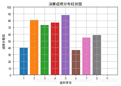
2.输入选手,评委,分数,统计得分,绘制直方图
import matplotlib.pyplot as plt
lis_score=[]
n=int(input("输入评委人数:"))
while n<5:
print("评委人数需大于5")
n = int(input("输入评委人数:"))
player = int(input("参赛人数:"))
while player < 1:
print("参赛人数需大于2")
player = int(input("参赛人数:"))
def check_score(score):
if score >= 0 and score <= 100:
return score
else:
print("分数未符合规范,请在1~100之间,确认后重新录入。!")
score = int(input("输入分数:"))
score = check_score(score)
j = player
num_list=[]
while j > 0 :
num = eval(input("输入选手序号:"))
num_list.append(num)
i = n
a = []
while i > 0:
score = check_score(int(input("输入该选手分数:")))
a.append(score)
i -= 1
final_score = (sum(a) - min(a) - max(a)) / (n-2)
lis_score.append([num,final_score])
j -= 1
print('去掉一个最高分{:.2f}分,去掉一个最低分{:.2f}分'.format(max(a),min(a)))
for i in range(player):
print("选手序号:",num_list[i])
print('选手最后得分是:{:.2f}分'.format(lis_score[i][1]))
plt.rcParams['font.family'] = ['SimHei']
plt.title("决赛成绩分布柱状图")
for i in range(num):
x=[num_list[i]]
height=[lis_score[i][1]]
plt.bar(x,height)
plt.xlabel("选手序号")#设置x轴标签
plt.ylabel("成绩分数段")#设置y轴标签
plt.xlim(0,10)#设置x轴区间
plt.xticks(range(1,10))#设置x轴刻度
plt.yticks([0,10,20,30,40,50,60,70,80,90,100]) #设置y轴刻度
plt.grid()
plt.show()
-----------------------------------------------------分割线-------------------------------------------------------------------
turtle绘图
import turtle as t
t.speed("fast")
#小人
t.pensize(10)
t.pu()
t.rt(180)
t.fd(500)
t.rt(180)
t.pd()
t.circle(50)
t.rt(90)
t.fd(100)
t.rt(55)
t.fd(55)
t.up
t.rt(180)
t.fd(55)
t.rt(35)
t.fd(45)
t.rt(45)
t.fd(50)
t.rt(180)
t.fd(50)
t.lt(45)
t.fd(45)
t.rt(90)
t.fd(50)
t.rt(90)
t.fd(75)
t.lt(45)
t.fd(45)
t.rt(180)
t.fd(45)
t.lt(90)
t.fd(45)
t.lt(45)
t.pu()
t.fd(75)
t.lt(45)
t.fd(24)
t.pd()
#星1
t.pensize(1)
t.color('yellow', 'yellow')
t.begin_fill()
for i in range(5):
t.fd(100)
t.rt(144)
t.end_fill()
t.pu()
t.rt(45)
t.fd(200)
t.pd()
t.pensize(1)
#国旗
t.color('red', 'red')
t.begin_fill()
t.fd(750)
t.lt(90)
t.fd(450)
t.lt(90)
t.fd(750)
t.lt(90)
t.fd(450)
t.end_fill()
t.pu()
t.lt(180)
t.fd(200)
t.rt(90)
t.fd(35)
t.pd()
#星2
t.color('yellow', 'yellow')
t.begin_fill()
for i in range(5):
t.fd(35)
t.rt(144)
t.end_fill()
t.penup()
t.goto(10, 100)
t.pendown()
t.seth(0)
t.left(21)
t.penup()
t.goto(10, 163)
t.pendown()
#星3
t.color('yellow', 'yellow')
t.begin_fill()
for i in range(5):
t.fd(35)
t.rt(144)
t.end_fill()
t.penup()
t.goto(275, 115)
t.pendown()
t.seth(0)
t.right(25)
t.penup()
t.goto(75, 250)
t.pendown()
#星4
t.color('yellow', 'yellow')
t.begin_fill()
for i in range(5):
t.fd(35)
t.rt(144)
t.end_fill()
t.penup()
t.goto(275, 115)
t.pendown()
t.seth(0)
t.right(25)
t.penup()
t.goto(75, 250)
t.pendown()
#星5
t.color('yellow', 'yellow')
t.penup()
t.goto(275, 115)
t.pendown()
t.seth(0)
t.left(21)
t.penup()
t.goto(35, 300)
t.fd(75)
t.pendown()
t.begin_fill()
for i in range(5):
t.fd(35)
t.rt(144)
t.end_fill()
t.penup()
t.goto(-275, 115)
t.pendown()
t.seth(0)
t.right(21)
t.penup()
t.goto(-147, 93)
t.pendown()
#爱心
t.pu()
t.goto(-250,30)
t.pd()
t.setheading(0)
def curvemove():
for i in range(200):
t.right(1)
t.forward(1)
t.color('red','pink')
t.begin_fill()
t.left(140)
t.forward(111.65)
curvemove()
t.left(120)
curvemove()
t.forward(111.65)
t.end_fill()
t.penup()
t.goto(-250,95)
love=("我爱你\n 中国")
t.color('white')
t.write(love, font=('STCaiyun', 25,), align="center")
t.hideturtle()
t.done()
————————————————
版权声明:本文为CSDN博主「weixin_51446993」的原创文章,遵循CC 4.0 BY-SA版权协议,转载请附上原文出处链接及本声明。
原文链接:

https://blog.csdn.net/weixin_51446993/article/details/118467147


 2392
2392

 被折叠的 条评论
为什么被折叠?
被折叠的 条评论
为什么被折叠?
 到【灌水乐园】发言


