常用的居中方法

找干货,看阿淦。大家好,我是阿淦,下面我给大家列举一些常用的居中方法。

1.万能居中方法

<body>
    <div class="fa">
        <div class="son">内容</div>
    </div>
</body>

<style>
        /* 万能居中方法,此种居中方法适用于大部分情况 */
        body{
            padding: 0;
            margin: 0;
        }
        .fa{
            width: 400px;
            height: 300px;
            border: 1px solid #000;
            position: relative;
        }

        /* 给父盒子一个相对定位(relative),给子盒子一个绝对定位(absolute)。再让子盒子从左向右移动50%,从上向下移动50%,
        接着向左移动自身的50%,向上移动自身的50%,就能达到居中效果了。 */
        .son{
            width: 120px;
            height: 100px;
            border: 1px solid #000;
            position: absolute;
            left: 50%;
            top: 50%;
            transform: translate(-50%, -50%);
        }
    </style>

图文详解:  


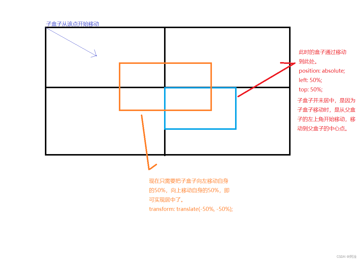
2.calc计算方法的padding方法

<body>
    <div class="fa">
        <div class="son">内容</div>
    </div>
</body>

<style>
        /* calc计算方法,此种居中方法用于固定盒子的居中,给父盒子使用内挤(padding)方法实现居中 */
        body{
            padding: 0;
            margin: 0;
        }

        .fa{
            width: 400px;
            height: 300px;
            border: 1px solid #000;

            padding-top: calc((300px - 100px) / 2);  /* 父盒子的高(height)减去子盒子的高(height) */
            padding-left: calc((400px - 120px) / 2); /* 父盒子的宽(width)减去子盒子的宽(width) */

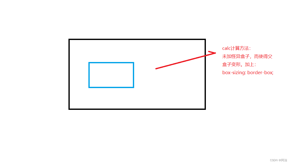
            /* 盒子的大小是由盒子内容(content)、内边距(padding) 、边框(border)构成。由于是通过内挤(padding)方法,calc计算方法出来的的数值,父盒子的大小会发生改变,所以给父盒子添加一个怪异盒子(border-box),这样盒子就能居中了 */
            box-sizing: border-box;
            
        }
        .son{
            width: 120px;
            height: 100px;
            border: 1px solid #000;
        }
    </style>

图文详解: 


 3.calc计算方法的margin方法

<body>
    <div class="fa">
        <div class="son">内容</div>
    </div>
</body>

<style>
        /* calc计算方法,此种居中方法用于固定盒子的居中,给父盒子使用外推(margin)方法实现居中 */
        body {
            padding: 0;
            margin: 0;
        }

        .fa {

            width: 400px;
            height: 300px;
            background-color: #f00;
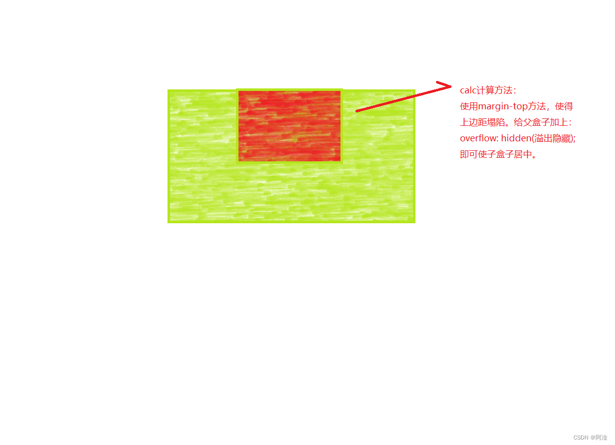
            /* 盒子的大小是由盒子内容(content)、内边距(padding) 、边框(border)构成。由于是通过外推(margin)方法,calc计算方法出来的的数值,使用margin-top方法会使上边距塌陷,给父盒子添加溢出隐藏(overflow: hidden;),这样盒子就能居中了 */
            overflow: hidden;
        }

        .son {
            width: 120px;
            height: 100px;
            background-color: #0f0;
            margin-top: calc((300px - 100px) / 2);
            /* 父盒子的高(height)减去子盒子的高(height) */
            margin-left: calc((400px - 120px) / 2);
            /* 父盒子的宽(width)减去子盒子的宽(width) */
        }
    </style>

图文详解:

4.定位居中方法

<body>
    <div class="fa">
        <div class="son">内容</div>
    </div>
</body>

<style>
        /* 定位居中方法,此种居中方法适用于大部分情况 */
        body{
            padding: 0;
            margin: 0;
        }

        .fa{
            width: 400px;
            height: 300px;
            border: 1px solid #000;
            position: relative;
        }

        /* 此种居中方法要给子盒子定高定宽。给父盒子一个相对定位(relative),给子盒子一个绝对定位(absolute)。给子盒子定高定宽(让其向上、向右、向下、向左移动0即可达到定高定宽效果),并让其水平居中(margin: auto;),就能达到居中效果了。 */
        .son{
            width: 120px;
            height: 100px;
            border: 1px solid #000;
            position: absolute;
            top: 0;
            right: 0;
            bottom: 0;
            left: 0;
            margin: auto;
        }
    </style>

5.弹性盒子(flex)居中方法

<body>
    <div class="fa">
        <div class="son">内容</div>
    </div>
</body>

<style>
        /* 弹性盒子(flex)居中方法,此种居中方法适用于大部分情况 */
        body{
            padding: 0;
            margin: 0;
        }

        /* 让父盒子变成弹性盒子(display: flex;) ,并使其子元素在主轴居中对齐(justify-content: center;),子元素在交叉轴居中对齐(align-items: center;),这样就能达到居中效果了。*/
        .fa{
            width: 400px;
            height: 300px;
            border: 1px solid #000;
            display: flex;
            justify-content: center;
            align-items: center;
        }

        .son{
            width: 120px;
            height: 100px;
            border: 1px solid #000;
        }
    </style>

  • 2
    点赞
  • 3
    收藏
    觉得还不错? 一键收藏
  • 1
    评论
### 回答1: 可以使用如下的CSS代码实现垂直水平居中: ``` .container { display: flex; justify-content: center; align-items: center; } ``` 其中,`.container`是包含需要居中的元素的容器。使用`display: flex`属性可以使容器变为弹性盒子,`justify-content: center`和`align-items: center`可以分别将元素水平和垂直居中。 ### 回答2: 在CSS中,有多种方法可以实现元素的垂直和水平居中。以下是几种常用方法: 1. 使用Flexbox布局:在父元素上应用以下样式可以实现垂直和水平居中: ``` display: flex; justify-content: center; align-items: center; ``` 这样可以使子元素在垂直和水平方向上居中。 2. 使用绝对定位:如果元素的宽高是已知的,可以使用绝对定位来实现居中。父元素需要设置相对定位,并在子元素上应用以下样式: ``` position: absolute; top: 50%; left: 50%; transform: translate(-50%, -50%); ``` 通过将子元素的左上角移动到父元素的中心来实现垂直和水平居中。 3. 使用表格布局:将父元素的display属性设置为table,子元素的display属性设置为table-cell,然后应用以下样式可以实现居中: ``` display: table; margin: 0 auto; ``` 将子元素的左右边距设置为auto可以使其在水平方向上居中。 以上是几种常用CSS垂直和水平居中方法,具体使用哪种方法取决于具体的需求和布局。 ### 回答3: 在CSS中,可以使用以下方法实现元素的垂直水平居中: 1. 使用Flexbox布局:设置父容器的display属性为flex,并且使用align-items和justify-content属性分别设置为center,可以实现元素的垂直水平居中。 ```css .container { display: flex; align-items: center; justify-content: center; } ``` 2. 使用绝对定位和transform属性:将需要居中的元素的position属性设置为absolute,然后使用top、bottom、left和right属性设置为50%,并使用transform属性进行偏移。 ```css .box { position: absolute; top: 50%; left: 50%; transform: translate(-50%, -50%); } ``` 3. 使用表格布局:将需要居中的元素放置在一个display属性设置为table的容器中,然后使用margin属性设置为auto实现水平居中,使用vertical-align属性设置为middle实现垂直居中。 ```css .container { display: table; margin: 0 auto; } .box { display: table-cell; vertical-align: middle; } ``` 4. 使用Grid布局:设置父容器的display属性为grid,然后使用place-items属性设置为center,可以实现元素的垂直水平居中。 ```css .container { display: grid; place-items: center; } ``` 以上是几种常用CSS垂直水平居中方法,可以根据具体的需求选择合适的方法来实现布局。

“相关推荐”对你有帮助么?

  • 非常没帮助
  • 没帮助
  • 一般
  • 有帮助
  • 非常有帮助
提交
评论 1
添加红包

请填写红包祝福语或标题

红包个数最小为10个

红包金额最低5元

当前余额3.43前往充值 >
需支付:10.00
成就一亿技术人!
领取后你会自动成为博主和红包主的粉丝 规则
hope_wisdom
发出的红包
实付
使用余额支付
点击重新获取
扫码支付
钱包余额 0

抵扣说明:

1.余额是钱包充值的虚拟货币,按照1:1的比例进行支付金额的抵扣。
2.余额无法直接购买下载,可以购买VIP、付费专栏及课程。

余额充值