


一、SVG 简介
SVG 是使用 XML 来描述二维图形和绘图程序的语言。
1.1 什么是 SVG ?
- SVG 指可伸缩矢量图形 (Scalable Vector Graphics)
- SVG 用来定义用于网络的基于矢量的图形
- SVG 使用 XML 格式定义图形
- SVG 图像在放大或改变尺寸的情况下其图形质量不会有所损失
- SVG 是万维网联盟的标准
- SVG 与诸如 DOM 和 XSL 之类的 W3C 标准是一个整体
1.2 SVG 的历史和优势
在 2003 年一月,SVG 1.1 被确立为 W3C 标准。
参与定义 SVG 的组织有:Sun公司(已被Oracle公司收购)、Adobe、苹果公司、IBM 以及柯达。
与其他图像格式相比,使用 SVG 的优势在于:
- SVG 可被非常多的工具读取和修改(比如记事本)
- SVG 与 JPEG 和 GIF 图像比起来,尺寸更小,且可压缩性更强。
- SVG 是可伸缩的
- SVG 图像可在任何的分辨率下被高质量地打印
- SVG 可在图像质量不下降的情况下被放大
- SVG 图像中的文本是可选的,同时也是可搜索的(很适合制作地图)
- SVG 可以与 JavaScript 技术一起运行
- SVG 是开放的标准
- SVG 文件是纯粹的 XML
- SVG 的主要竞争者是 Flash。
与 Flash 相比,SVG 最大的优势是与其他标准(比如 XSL 和 DOM)相兼容。而 Flash 则是未开源的私有技术。
1.3 查看 SVG 文件
Internet Explorer9,火狐,谷歌Chrome,Opera和Safari都支持SVG。
IE8和早期版本都需要一个插件 - 如Adobe SVG浏览器,这是免费提供的。
1.4 创建SVG文件
由于SVG是XML文件,SVG图像可以用任何文本编辑器创建,但它往往是与一个绘图程序一起使用,如Inkscape,更方便地创建SVG图像。
1.5 学习之前应具备的基础知识
继续学习之前,你应该对以下内容有基本的了解:
- HTML
- XML 基础
二、SVG 实例
在你的电脑上创建一个 test.svg,用 NodePad++ 或者其他的文本编辑器打开它,并将下面内容复制粘贴到 test.svg 中。
(如果没有可以编辑它的文本编辑器,也可以先将 test.svg 重命名为 test.txt,然后双击 test.txt 用记事本打开它,打开之后同样也是将下面的代码复制粘贴进去,然后保存退出记事本,将 test.txt 重命名回 test.svg 即可)
<svg version="1.1"
  baseProfile="full"
  width="300" height="200"
  xmlns="http://www.w3.org/2000/svg">

  <rect width="100%" height="100%" stroke="red" stroke-width="4" fill="yellow" />

  <circle cx="150" cy="100" r="80" fill="green" />

  <text x="150" y="115" font-size="16" text-anchor="middle" fill="white">RUNOOB SVG TEST</text>

</svg>
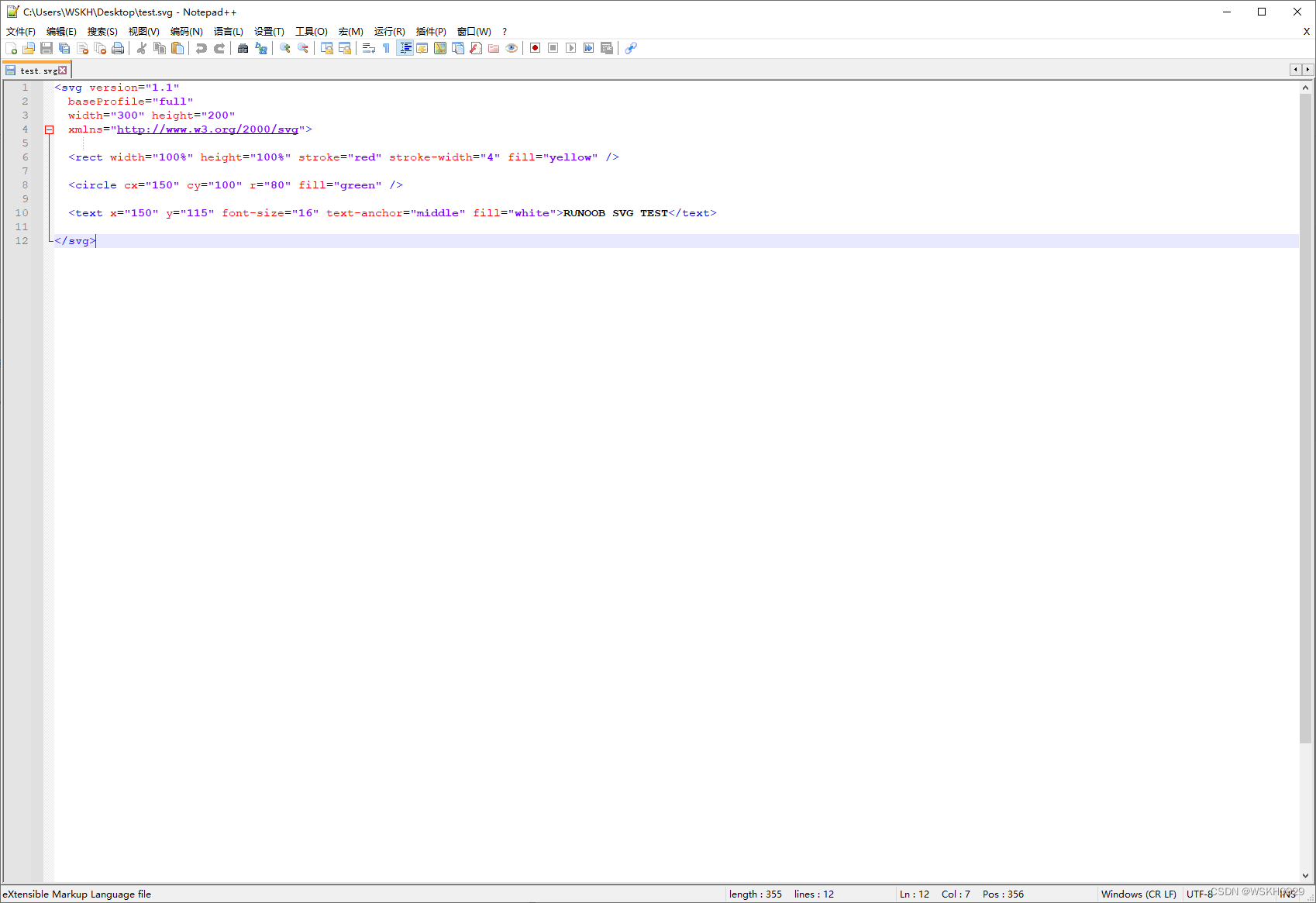
双击 test.svg ,显示结果如下:

SVG 代码解析:
SVG 代码以 <svg> 元素开始,包括开启标签 <svg> 和关闭标签 </svg> 。这是根元素。width 和 height 属性可设置此 SVG 文档的宽度和高度。version 属性可定义所使用的 SVG 版本,xmlns 属性可定义 SVG 命名空间。
SVG 的 <rect> 用来创建一个矩形,通过 fill 把背景颜色设为黄色。
SVG 的 <circle> 用来创建一个圆。cx 和 cy 属性定义圆中心的 x 和 y 坐标。如果忽略这两个属性,那么圆点会被设置为 (0, 0),r 属性定义圆的半径。 一个半径 80px 的绿色圆圈 <circle> 绘制在红色矩形的正中央 (向右偏移 150px,向下偏移115px)。
stroke 和 stroke-width 属性控制如何显示形状的轮廓。我们把圆的轮廓设置为 4px 宽,红色边框。
fill 属性设置形状内的颜色。我们把填充颜色设置为红色。
关闭标签 </svg> 的作用是关闭 SVG 元素和文档本身。
注释:所有的开启标签必须有关闭标签!
三、在 HTML 中嵌入 SVG
SVG 文件可通过以下标签嵌入 HTML 文档:<embed>、<object> 或者 <iframe>。
SVG的代码可以直接嵌入到HTML页面中,或您可以直接链接到SVG文件。
3.1 使用 <embed> 标签
优势:所有主要浏览器都支持,并允许使用脚本
缺点:不推荐在HTML4和XHTML中使用(但在HTML5允许)
语法:
<embed src="circle1.svg" type="image/svg+xml" />
3.2 使用 <object> 标签
优势:所有主要浏览器都支持,并支持HTML4,XHTML和HTML5标准
缺点:不允许使用脚本。
语法:
<object data="circle1.svg" type="image/svg+xml"></object>
3.3 使用 <iframe> 标签
优势:所有主要浏览器都支持,并允许使用脚本
缺点:不推荐在HTML4和XHTML中使用(但在HTML5允许)
语法:
<iframe src="circle1.svg"></iframe>
3.4 直接在HTML嵌入SVG代码
在Firefox、Internet Explorer9、谷歌Chrome和Safari中,你可以直接在HTML嵌入SVG代码。
<svg xmlns="http://www.w3.org/2000/svg" version="1.1">
   <circle cx="100" cy="50" r="40" stroke="black" stroke-width="2" fill="red" />
</svg>
3.5 链接到 SVG 文件
您还可以用 <a> 标签链接到一个 SVG 文件:
<a href="circle1.svg">查看 SVG 文件</a>
四、SVG 画图
4.1 绘制矩形
实例1
<rect> 标签可用来创建矩形,以及矩形的变种:
下面是SVG代码:
<svg xmlns="http://www.w3.org/2000/svg" version="1.1">
  <rect width="300" height="100"
  style="fill:rgb(0,0,255);stroke-width:1;stroke:rgb(0,0,0)"/>
</svg>
代码解析:
- rect 元素的 width 和 height 属性可定义矩形的高度和宽度
- style 属性用来定义 CSS 属性
- CSS 的 fill 属性定义矩形的填充颜色(rgb 值、颜色名或者十六进制值)
- CSS 的 stroke-width 属性定义矩形边框的宽度
- CSS 的 stroke 属性定义矩形边框的颜色
显示效果如下:

实例2
让我们看看另一个例子,它包含一些新的属性:
<svg xmlns="http://www.w3.org/2000/svg" version="1.1">
  <rect x="50" y="20" width="150" height="150"
  style="fill:blue;stroke:pink;stroke-width:5;fill-opacity:0.1;
  stroke-opacity:0.9"/>
</svg>
代码解析:
- x 属性定义矩形的左侧位置(例如,x=“0” 定义矩形到浏览器窗口左侧的距离是 0px)
- y 属性定义矩形的顶端位置(例如,y=“0” 定义矩形到浏览器窗口顶端的距离是 0px)
- CSS 的 fill-opacity 属性定义填充颜色透明度(合法的范围是:0 - 1)
- CSS 的 stroke-opacity 属性定义轮廓颜色的透明度(合法的范围是:0 - 1)
显示效果如下:

实例3
定义整个元素的不透明度:
下面是SVG代码:
<svg xmlns="http://www.w3.org/2000/svg" version="1.1">
  <rect x="50" y="20" width="150" height="150"
  style="fill:blue;stroke:pink;stroke-width:5;opacity:0.5"/>
</svg>
显示效果如下:

实例4
最后一个例子,创建一个圆角矩形:
下面是SVG代码:
<svg xmlns="http://www.w3.org/2000/svg" version="1.1">
  <rect x="50" y="20" rx="20" ry="20" width="150" height="150"
  style="fill:red;stroke:black;stroke-width:5;opacity:0.5"/>
</svg>
显示效果如下:

4.2 绘制圆形
<circle> 标签可用来创建一个圆:
下面是SVG代码:
<svg xmlns="http://www.w3.org/2000/svg" version="1.1">
  <circle cx="100" cy="50" r="40" stroke="black"
  stroke-width="2" fill="red"/>
</svg>
显示效果如下:

4.3 绘制椭圆
实例1
<ellipse> 元素是用来创建一个椭圆:
椭圆与圆很相似。不同之处在于椭圆有不同的x和y半径,而圆的x和y半径是相同的:
下面是SVG代码:
<svg xmlns="http://www.w3.org/2000/svg" version="1.1">
  <ellipse cx="300" cy="80" rx="100" ry="50"
  style="fill:yellow;stroke:purple;stroke-width:2"/>
</svg>
显示效果如下:

代码解析:
- CX属性定义的椭圆中心的x坐标
- CY属性定义的椭圆中心的y坐标
- RX属性定义的水平半径
- RY属性定义的垂直半径
实例2
下面的例子创建了三个累叠而上的椭圆:
下面是SVG代码:
<svg xmlns="http://www.w3.org/2000/svg" version="1.1">
  <ellipse cx="240" cy="100" rx="220" ry="30" style="fill:purple"/>
  <ellipse cx="220" cy="70" rx="190" ry="20" style="fill:lime"/>
  <ellipse cx="210" cy="45" rx="170" ry="15" style="fill:yellow"/>
</svg>
显示效果如下:

实例3
下面的例子组合了两个椭圆(一个黄的和一个白的):
下面是SVG代码:
<svg xmlns="http://www.w3.org/2000/svg" version="1.1">
  <ellipse cx="240" cy="50" rx="220" ry="30" style="fill:yellow"/>
  <ellipse cx="220" cy="50" rx="190" ry="20" style="fill:white"/>
</svg>
显示效果如下:

4.4 绘制直线
<line> 元素是用来创建一个直线:
下面是SVG代码:
<svg xmlns="http://www.w3.org/2000/svg" version="1.1">
  <line x1="0" y1="0" x2="200" y2="200"
  style="stroke:rgb(255,0,0);stroke-width:2"/>
</svg>
显示效果如下:

- x1 属性在 x 轴定义线条的开始
- y1 属性在 y 轴定义线条的开始
- x2 属性在 x 轴定义线条的结束
- y2 属性在 y 轴定义线条的结束
4.5 绘制多边形
实例1
<polygon> 标签用来创建含有不少于三个边的图形。
多边形是由直线组成,其形状是"封闭"的(所有的线条 连接起来)。
Remarkpolygon来自希腊。 “Poly” 意味 “many” , “gon” 意味 “angle”.
下面是SVG代码:
<svg  xmlns="http://www.w3.org/2000/svg" version="1.1">
  <polygon points="200,10 250,190 160,210"
  style="fill:lime;stroke:purple;stroke-width:1"/>
</svg>
显示效果如下:

实例2
下面的示例创建一个四边的多边形:
下面是SVG代码:
<svg  xmlns="http://www.w3.org/2000/svg" version="1.1">
  <polygon points="220,10 300,210 170,250 123,234" style="fill:lime;stroke:purple;stroke-width:1" />
</svg>
显示效果如下:
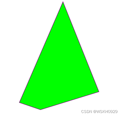
实例3
使用 <polygon> 元素创建一个星型:
<svg height="210" width="500">
  <polygon points="100,10 40,198 190,78 10,78 160,198"
  style="fill:lime;stroke:purple;stroke-width:5;fill-rule:nonzero;" />
</svg>
显示效果如下:

实例4
改变 fill-rule 属性为 “evenodd”:
下面是SVG代码:
<svg height="210" width="500">
  <polygon points="100,10 40,198 190,78 10,78 160,198"
  style="fill:lime;stroke:purple;stroke-width:5;fill-rule:evenodd;" />
</svg>
显示效果如下:

4.6 绘制多段线
实例1
<polyline> 元素是用于创建任何只有直线的形状:
下面是SVG代码:
<svg xmlns="http://www.w3.org/2000/svg" version="1.1">
  <polyline points="20,20 40,25 60,40 80,120 120,140 200,180"
  style="fill:none;stroke:black;stroke-width:3" />
</svg>
显示效果如下:

实例2
只有直线的另一个例子:
下面是SVG代码:
<svg xmlns="http://www.w3.org/2000/svg" version="1.1">
  <polyline points="0,40 40,40 40,80 80,80 80,120 120,120 120,160" style="fill:white;stroke:red;stroke-width:4" />
</svg>
显示效果如下:

4.7 绘制路径
<path> 元素用于定义一个路径。
下面的命令可用于路径数据:
- M = moveto
- L = lineto
- H = horizontal lineto
- V = vertical lineto
- C = curveto
- S = smooth curveto
- Q = quadratic Bézier curve
- T = smooth quadratic Bézier curveto
- A = elliptical Arc
- Z = closepath
注意:以上所有命令均允许小写字母。大写表示绝对定位,小写表示相对定位。
实例1
上面的例子定义了一条路径,它开始于位置150 0,到达位置75 200,然后从那里开始到225 200,最后在150 0关闭路径。
下面是SVG代码:
<svg xmlns="http://www.w3.org/2000/svg" version="1.1">
    <path d="M150 0 L75 200 L225 200 Z" />
</svg>
显示效果如下:

实例2
下面的例子创建了一个二次方贝塞尔曲线,A 和 C 分别是起点和终点,B 是控制点:
下面是SVG代码:
<svg xmlns="http://www.w3.org/2000/svg" version="1.1">
  <path id="lineAB" d="M 100 350 l 150 -300" stroke="red"
  stroke-width="3" fill="none" />
  <path id="lineBC" d="M 250 50 l 150 300" stroke="red"
  stroke-width="3" fill="none" />
  <path d="M 175 200 l 150 0" stroke="green" stroke-width="3"
  fill="none" />
  <path d="M 100 350 q 150 -300 300 0" stroke="blue"
  stroke-width="5" fill="none" />
  <!-- Mark relevant points -->
  <g stroke="black" stroke-width="3" fill="black">
    <circle id="pointA" cx="100" cy="350" r="3" />
    <circle id="pointB" cx="250" cy="50" r="3" />
    <circle id="pointC" cx="400" cy="350" r="3" />
  </g>
  <!-- Label the points -->
  <g font-size="30" font="sans-serif" fill="black" stroke="none"
  text-anchor="middle">
    <text x="100" y="350" dx="-30">A</text>
    <text x="250" y="50" dy="-10">B</text>
    <text x="400" y="350" dx="30">C</text>
  </g>
</svg>
显示效果如下:

4.8 绘制文本
实例1
写一个文本:I love SVG
<svg xmlns="http://www.w3.org/2000/svg" version="1.1">
  <text x="0" y="15" fill="red">I love SVG</text>
</svg>
显示效果如下:

实例2
旋转的文字:
<svg xmlns="http://www.w3.org/2000/svg" version="1.1">
  <text x="0" y="15" fill="red" transform="rotate(30 20,40)">I love SVG</text>
</svg>
显示效果如下:

实例3
路径上的文字:
下面是SVG代码:
<svg xmlns="http://www.w3.org/2000/svg" version="1.1"
xmlns:xlink="http://www.w3.org/1999/xlink">
   <defs>
    <path id="path1" d="M75,20 a1,1 0 0,0 100,0" />
  </defs>
  <text x="10" y="100" style="fill:red;">
    <textPath xlink:href="#path1">I love SVG I love SVG</textPath>
  </text>
</svg>
显示效果如下:

实例4
元素可以安排任何分小组与<tspan> 元素的数量。每个<tspan> 元素可以包含不同的格式和位置。几行文本(与 <tspan> 元素):
下面是SVG代码:
<svg xmlns="http://www.w3.org/2000/svg" version="1.1">
  <text x="10" y="20" style="fill:red;">Several lines:
    <tspan x="10" y="45">First line</tspan>
    <tspan x="10" y="70">Second line</tspan>
  </text>
</svg>
显示效果如下:

实例5
作为链接文本( <a> 元素):
<svg xmlns="http://www.w3.org/2000/svg" version="1.1"
xmlns:xlink="http://www.w3.org/1999/xlink">
  <a xlink:href="http://www.w3schools.com/svg/" target="_blank">
    <text x="0" y="15" fill="red">I love SVG</text>
  </a>
</svg>
4.9 Stroke 属性
SVG提供了一个范围广泛stroke 属性。在本章中,我们将看看下面:
- stroke
- stroke-width
- stroke-linecap
- stroke-dasharray
所有stroke属性,可应用于任何种类的线条,文字和元素就像一个圆的轮廓。
stroke 属性
Stroke属性定义一条线,文本或元素轮廓颜色:
下面是SVG代码:
<svg xmlns="http://www.w3.org/2000/svg" version="1.1">
  <g fill="none">
    <path stroke="red" d="M5 20 l215 0" />
    <path stroke="blue" d="M5 40 l215 0" />
    <path stroke="black" d="M5 60 l215 0" />
  </g>
</svg>
显示效果如下:

stroke-linecap 属性
stroke-width 属性定义了一条线,文本或元素轮廓厚度:
下面是SVG代码:
<svg xmlns="http://www.w3.org/2000/svg" version="1.1">
  <g fill="none" stroke="black">
    <path stroke-width="2" d="M5 20 l215 0" />
    <path stroke-width="4" d="M5 40 l215 0" />
    <path stroke-width="6" d="M5 60 l215 0" />
  </g>
</svg>
显示效果如下:

stroke-linecap 属性
strokelinecap 属性定义不同类型的开放路径的终结:
下面是SVG代码:
<svg xmlns="http://www.w3.org/2000/svg" version="1.1">
  <g fill="none" stroke="black" stroke-width="6">
    <path stroke-linecap="butt" d="M5 20 l215 0" />
    <path stroke-linecap="round" d="M5 40 l215 0" />
    <path stroke-linecap="square" d="M5 60 l215 0" />
  </g>
</svg>
显示效果如下:

stroke-dasharray 属性
strokedasharray属性用于创建虚线:
下面是SVG代码:
<svg xmlns="http://www.w3.org/2000/svg" version="1.1">
  <g fill="none" stroke="black" stroke-width="4">
    <path stroke-dasharray="5,5" d="M5 20 l215 0" />
    <path stroke-dasharray="10,10" d="M5 40 l215 0" />
    <path stroke-dasharray="20,10,5,5,5,10" d="M5 60 l215 0" />
  </g>
</svg>
显示效果如下:

五、SVG 滤镜
SVG滤镜用来增加对SVG图形的特殊效果。
在本教程中,我们将仅展示一个可能采用的特殊效果。基础知识展示后,你已经学会使用特殊效果,你应该能够适用于其他地方。这里的关键是给你一个怎样做SVG的想法,而不是重复整个规范。
SVG可用的滤镜是:
- feBlend - 与图像相结合的滤镜
- feColorMatrix - 用于彩色滤光片转换
- feComponentTransfer
- feComposite
- feConvolveMatrix
- feDiffuseLighting
- feDisplacementMap
- feFlood
- feGaussianBlur
- feImage
- feMerge
- feMorphology
- feOffset - 过滤阴影
- feSpecularLighting
- feTile
- feTurbulence
- feDistantLight - 用于照明过滤
- fePointLight - 用于照明过滤
- feSpotLight - 用于照明过滤
注意: Internet Explorer和Safari不支持SVG滤镜!
5.1 模糊效果
所有互联网的SVG滤镜定义在<defs>元素中。<defs>元素定义短并含有特殊元素(如滤镜)定义。
<filter>标签用来定义SVG滤镜。<filter>标签使用必需的id属性来定义向图形应用哪个滤镜?
实例1
<feGaussianBlur> 元素是用于创建模糊效果:
<svg xmlns="http://www.w3.org/2000/svg" version="1.1">
  <defs>
    <filter id="f1" x="0" y="0">
      <feGaussianBlur in="SourceGraphic" stdDeviation="15" />
    </filter>
  </defs>
  <rect width="90" height="90" stroke="green" stroke-width="3"
  fill="yellow" filter="url(#f1)" />
</svg>
显示效果如下:

代码解析:
- <filter>元素id属性定义一个滤镜的唯一名称
- <feGaussianBlur>元素定义模糊效果
- in="SourceGraphic"这个部分定义了由整个图像创建效果
- stdDeviation属性定义模糊量
- <rect>元素的滤镜属性用来把元素链接到"f1"滤镜
5.2 阴影
实例1
<feOffset>元素是用于创建阴影效果。我们的想法是采取一个SVG图形(图像或元素)并移动它在xy平面上一点儿。
第一个例子偏移一个矩形(带<feOffset>),然后混合偏移图像顶部(含<feBlend>):
<svg xmlns="http://www.w3.org/2000/svg" version="1.1">
  <defs>
    <filter id="f1" x="0" y="0" width="200%" height="200%">
      <feOffset result="offOut" in="SourceGraphic" dx="20" dy="20" />
      <feBlend in="SourceGraphic" in2="offOut" mode="normal" />
    </filter>
  </defs>
  <rect width="90" height="90" stroke="green" stroke-width="3"
  fill="yellow" filter="url(#f1)" />
</svg>
显示效果如下:

代码解析:
- <filter>元素id属性定义一个滤镜的唯一名称
- <rect>元素的滤镜属性用来把元素链接到"f1"滤镜
实例2
现在,偏移图像可以变的模糊(含 <feGaussianBlur>):
<svg xmlns="http://www.w3.org/2000/svg" version="1.1">
  <defs>
    <filter id="f1" x="0" y="0" width="200%" height="200%">
      <feOffset result="offOut" in="SourceGraphic" dx="20" dy="20" />
      <feGaussianBlur result="blurOut" in="offOut" stdDeviation="10" />
      <feBlend in="SourceGraphic" in2="blurOut" mode="normal" />
    </filter>
  </defs>
  <rect width="90" height="90" stroke="green" stroke-width="3"
  fill="yellow" filter="url(#f1)" />
</svg>
显示效果如下:

代码解析:
- <feGaussianBlur>元素的stdDeviation属性定义了模糊量
实例3
现在,制作一个黑色的阴影:
<svg xmlns="http://www.w3.org/2000/svg" version="1.1">
  <defs>
    <filter id="f1" x="0" y="0" width="200%" height="200%">
      <feOffset result="offOut" in="SourceAlpha" dx="20" dy="20" />
      <feGaussianBlur result="blurOut" in="offOut" stdDeviation="10" />
      <feBlend in="SourceGraphic" in2="blurOut" mode="normal" />
    </filter>
  </defs>
  <rect width="90" height="90" stroke="green" stroke-width="3"
  fill="yellow" filter="url(#f1)" />
</svg>
显示效果如下:

代码解析:
- <feOffset>元素的属性改为"SourceAlpha"在Alpha通道使用残影,而不是整个RGBA像素。
实例4
现在为阴影涂上一层颜色:
<svg xmlns="http://www.w3.org/2000/svg" version="1.1">
  <defs>
    <filter id="f1" x="0" y="0" width="200%" height="200%">
      <feOffset result="offOut" in="SourceGraphic" dx="20" dy="20" />
      <feColorMatrix result="matrixOut" in="offOut" type="matrix"
      values="0.2 0 0 0 0 0 0.2 0 0 0 0 0 0.2 0 0 0 0 0 1 0" />
      <feGaussianBlur result="blurOut" in="matrixOut" stdDeviation="10" />
      <feBlend in="SourceGraphic" in2="blurOut" mode="normal" />
    </filter>
  </defs>
  <rect width="90" height="90" stroke="green" stroke-width="3"
  fill="yellow" filter="url(#f1)" />
</svg>
显示效果如下:

代码解析:
- <feColorMatrix>过滤器是用来转换偏移的图像使之更接近黑色的颜色。 '0.2’矩阵的三个值都获取乘以红色,绿色和蓝色通道。降低其值带来的颜色至黑色(黑色为0)
5.3 渐变
渐变是一种从一种颜色到另一种颜色的平滑过渡。另外,可以把多个颜色的过渡应用到同一个元素上。
SVG渐变主要有两种类型:
- Linear
- Radial
5.3.1 线性渐变
<linearGradient>元素用于定义线性渐变。
<linearGradient>标签必须嵌套在<defs>的内部。<defs>标签是definitions的缩写,它可对诸如渐变之类的特殊元素进行定义。
线性渐变可以定义为水平,垂直或角渐变:
- 当y1和y2相等,而x1和x2不同时,可创建水平渐变
- 当x1和x2相等,而y1和y2不同时,可创建垂直渐变
- 当x1和x2不同,且y1和y2不同时,可创建角形渐变
实例1
定义水平线性渐变从黄色到红色的椭圆形:
下面是SVG代码:
<svg xmlns="http://www.w3.org/2000/svg" version="1.1">
  <defs>
    <linearGradient id="grad1" x1="0%" y1="0%" x2="100%" y2="0%">
      <stop offset="0%" style="stop-color:rgb(255,255,0);stop-opacity:1" />
      <stop offset="100%" style="stop-color:rgb(255,0,0);stop-opacity:1" />
    </linearGradient>
  </defs>
  <ellipse cx="200" cy="70" rx="85" ry="55" fill="url(#grad1)" />
</svg>
显示效果如下:

代码解析:
- <linearGradient>标签的id属性可为渐变定义一个唯一的名称
- <linearGradient>标签的X1,X2,Y1,Y2属性定义渐变开始和结束位置
- 渐变的颜色范围可由两种或多种颜色组成。每种颜色通过一个<stop>标签来规定。offset属性用来定义渐变的开始和结束位置。
填充属性把 ellipse 元素链接到此渐变
实例2
定义一个垂直线性渐变从黄色到红色的椭圆形:
下面是SVG代码:
<svg xmlns="http://www.w3.org/2000/svg" version="1.1">
  <defs>
    <linearGradient id="grad1" x1="0%" y1="0%" x2="0%" y2="100%">
      <stop offset="0%" style="stop-color:rgb(255,255,0);stop-opacity:1" />
      <stop offset="100%" style="stop-color:rgb(255,0,0);stop-opacity:1" />
    </linearGradient>
  </defs>
  <ellipse cx="200" cy="70" rx="85" ry="55" fill="url(#grad1)" />
</svg>
显示效果如下:

实例3
定义一个椭圆形,水平线性渐变从黄色到红色并添加一个椭圆内文本:
下面是SVG代码:
<svg xmlns="http://www.w3.org/2000/svg" version="1.1">
  <defs>
    <linearGradient id="grad1" x1="0%" y1="0%" x2="100%" y2="0%">
      <stop offset="0%" style="stop-color:rgb(255,255,0);stop-opacity:1" />
      <stop offset="100%" style="stop-color:rgb(255,0,0);stop-opacity:1" />
    </linearGradient>
  </defs>
  <ellipse cx="200" cy="70" rx="85" ry="55" fill="url(#grad1)" />
  <text fill="#ffffff" font-size="45" font-family="Verdana" x="150" y="86">
  SVG</text>
</svg>
显示效果如下:

代码解析:
- <text> 元素是用来添加一个文本
5.3.2 放射性渐变
<radialGradient>元素用于定义放射性渐变。
<radialGradient>标签必须嵌套在<defs>的内部。<defs>标签是definitions的缩写,它可对诸如渐变之类的特殊元素进行定义。
实例1
定义一个放射性渐变从白色到蓝色椭圆:
下面是SVG代码:
<svg xmlns="http://www.w3.org/2000/svg" version="1.1">
  <defs>
    <radialGradient id="grad1" cx="50%" cy="50%" r="50%" fx="50%" fy="50%">
      <stop offset="0%" style="stop-color:rgb(255,255,255);
      stop-opacity:0" />
      <stop offset="100%" style="stop-color:rgb(0,0,255);stop-opacity:1" />
    </radialGradient>
  </defs>
  <ellipse cx="200" cy="70" rx="85" ry="55" fill="url(#grad1)" />
</svg>
显示效果如下:

代码解析:
- <radialGradient>标签的 id 属性可为渐变定义一个唯一的名称
- CX,CY和r属性定义的最外层圆和Fx和Fy定义的最内层圆
- 渐变颜色范围可以由两个或两个以上的颜色组成。每种颜色用一个<stop>标签指定。offset属性用来定义渐变色开始和结束
- 填充属性把ellipse元素链接到此渐变
实例2
定义放射性渐变从白色到蓝色的另一个椭圆:
下面是SVG代码:
<svg xmlns="http://www.w3.org/2000/svg" version="1.1">
  <defs>
    <radialGradient id="grad1" cx="20%" cy="30%" r="30%" fx="50%" fy="50%">
      <stop offset="0%" style="stop-color:rgb(255,255,255);
      stop-opacity:0" />
      <stop offset="100%" style="stop-color:rgb(0,0,255);stop-opacity:1" />
    </radialGradient>
  </defs>
  <ellipse cx="200" cy="70" rx="85" ry="55" fill="url(#grad1)" />
</svg>
显示效果如下:

六、SVG 其他实例
6.1 重复用 5 秒时间淡出的矩形
<svg xmlns="http://www.w3.org/2000/svg" version="1.1">
  <rect x="20" y="20" width="250" height="250" style="fill:blue">
    <animate attributeType="CSS" attributeName="opacity" from="1" to="0" dur="5s" repeatCount="indefinite" />
  </rect>
</svg>
显示效果如下:

6.2 矩形会变大并改变颜色
<svg xmlns="http://www.w3.org/2000/svg" version="1.1">
  <rect id="rec" x="300" y="100" width="300" height="100" style="fill:lime">
    <animate attributeName="x" attributeType="XML" begin="0s" dur="6s" fill="freeze" from="300" to="0" />
    <animate attributeName="y" attributeType="XML" begin="0s" dur="6s" fill="freeze" from="100" to="0" />
    <animate attributeName="width" attributeType="XML" begin="0s" dur="6s" fill="freeze" from="300" to="800" />
    <animate attributeName="height" attributeType="XML" begin="0s" dur="6s" fill="freeze" from="100" to="300" />
    <animateColor attributeName="fill" attributeType="CSS" from="lime" to="red" begin="2s" dur="4s" fill="freeze" />
  </rect>
</svg>
显示效果如下:


 扫一扫
扫一扫


 1385
1385

 被折叠的 条评论
为什么被折叠?
被折叠的 条评论
为什么被折叠?
 到【灌水乐园】发言


