


 本文介绍了如何使用Python的matplotlib和mplot3d库创建3D热力图。首先导入必要的库,然后生成随机数据集,接着创建一个10x10的图形,并设置为3D投影。通过scatter函数绘制散点图,用不同颜色表示数据点,最后设置坐标轴标签和标题并显示图形。示例包括了基本的3D热力图,带有方差的数据集以及从CSV文件读取数据的3D热力图。
PS:转载之后格式变得很难看,无奈本人水平太差,不知道怎么修改。建议直接看原文,地址如下:
3D Heatmap in Python
Heatmaps are a great way to visualize a dataset, methods for visualizing the data are getting explored constantly and 3D heatmap is one of the ways to plot data. Let’s learn how we can plot 3D data in python. We are going to use matplotlib and mplot3d to plot the 3D Heatmap in Python. We need to install the matplotlib explicitly by running the following command in the console:
pip3 install matplotlib
Creating 3D heatmap
- In this code example, firstly we are using the statement %matplotlib to display all matplotlib plots inline within the jupyter notebook. Then we have imported all the necessary libraries needed for running this code example – the mplot3d library is used to draw 3d plots, pyplot is mainly for plotting the figure and its configuration.
- After this, we have created a random dataset for our 3d heatmap using NumPy randint function to create a random integer array.
- Using plt.figure, we have created a figure of size 10×10 width and height respectively by default the matplotlib will produce 2D plots, so to specify this as a 3d plot we use add_subplot function with projection=’3d’ to create a 3d plot.
- We are mapping an array of integers as an RGBA color for our plot using the set_array() function.
- After that, we are creating a scatter plot with our 3d dataset and by setting marker value as s we are displaying each data point as square-shaped. Their color will depend on the array that we have created earlier called colo.
- At last, we have set the x, y, z labels and title using the set_label function and displayed the plot using show() function.
Code:
Python3
# 3D Heatmap in Python using matplotlib
# to make plot interactive
%
matplotlib
# importing required libraries
from
mpl_toolkits.mplot3d
import
Axes3D
import
matplotlib.pyplot as plt
import
numpy as np
from
pylab
import
# creating a dummy dataset
x
=
np.random.randint(low
=
100
, high
=
500
, size
=
(
1000
,))
y
=
np.random.randint(low
=
300
, high
=
500
, size
=
(
1000
,))
z
=
np.random.randint(low
=
200
, high
=
500
, size
=
(
1000
,))
colo
=
[x
+
y
+
z]
# creating figures
fig
=
plt.figure(figsize
=
(
10
,
10
))
ax
=
fig.add_subplot(
111
, projection
=
‘3d’
)
# setting color bar
color_map
=
cm.ScalarMappable(cmap
=
cm.Greens_r)
color_map.set_array(colo)
# creating the heatmap
img
=
ax.scatter(x, y, z, marker
=
‘s’
,
s
=
200
, color
=
‘green’
)
plt.colorbar(color_map)
# adding title and labels
ax.set_title(
“3D Heatmap”
)
ax.set_xlabel(
‘X-axis’
)
ax.set_ylabel(
‘Y-axis’
)
ax.set_zlabel(
‘Z-axis’
)
# displaying plot
plt.show()
|
Output:

Creating 3D heatmap with variance Dataset
- We have created a random dataset for our 3d heatmap using NumPy randint function to create a random integer array.
- Using plt.figure, we have created a figure of size 10×10 width and height respectively by default the matplotlib will produce 2D plots, so to specify this as a 3d plot we use the Axes3D to create a 3d plot. We are mapping an array of integers as an RGBA color for our plot using the set_array() function.
- After that, we are creating a scatter plot with our 3d dataset and by setting marker value as s we are displaying each data point as square-shaped. Their color will depend on the array that we have created earlier called colo.
- At last, we have set the x, y, z labels and title using the set_label function and displayed the plot using show() function.
Code :
Python3
# 3D Heatmap in Python using matplotlib
# to make plot interactive
%
matplotlib inline
# importing required libraries
from
mpl_toolkits.mplot3d
import
Axes3D
import
matplotlib.pyplot as plt
import
numpy as np
from
pylab
import
# creating a dummy dataset
x
=
np.random.randint(low
=
10
, high
=
1000
, size
=
(
1000
,))
y
=
np.random.randint(low
=
20
, high
=
1000
, size
=
(
1000
,))
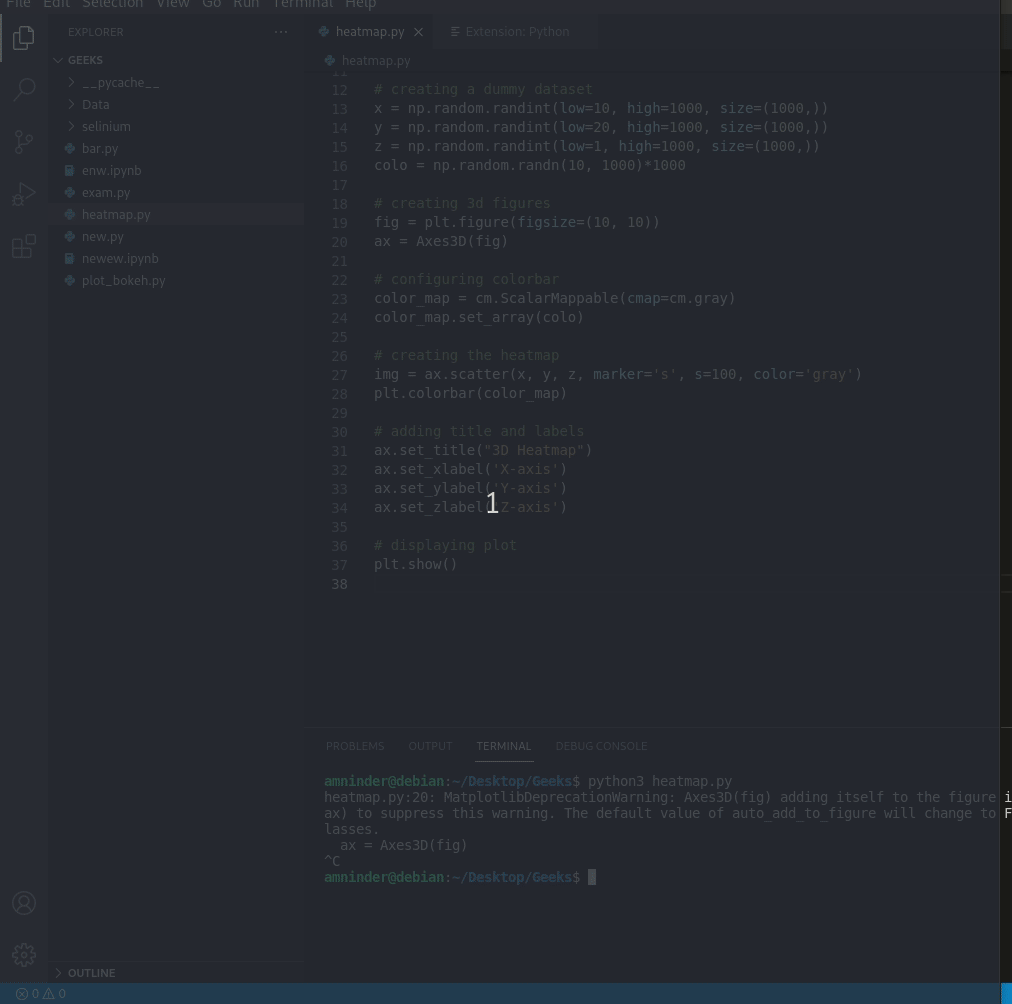
z
=
np.random.randint(low
=
1
, high
=
1000
, size
=
(
1000
,))
colo
=
np.random.randn(
10
,
1000
)
1000
# creating 3d figures
fig
=
plt.figure(figsize
=
(
10
,
10
))
ax
=
Axes3D(fig)
# configuring colorbar
color_map
=
cm.ScalarMappable(cmap
=
cm.gray)
color_map.set_array(colo)
# creating the heatmap
img
=
ax.scatter(x, y, z, marker
=
‘s’
,
s
=
100
, color
=
‘gray’
)
plt.colorbar(color_map)
# adding title and labels
ax.set_title(
“3D Heatmap”
)
ax.set_xlabel(
‘X-axis’
)
ax.set_ylabel(
‘Y-axis’
)
ax.set_zlabel(
‘Z-axis’
)
# displaying plot
plt.show()
|
Output:
Creating 3D heatmap with CSV file
- We are using pandas we have loaded the dataset and we are using 3 columns for plotting and one column for color bar. You can operate the data as your wish.
- Using plt.figure, we have created a figure of size 8×5 width and height respectively by default the matplotlib will produce 2D plots, so to specify this as a 3d plot we use add_subplot function with projection=’3d’ to create a 3d plot. We are mapping an array of integers as an RGBA color for our plot using the set_array() function.
- After that, we are creating a scatter plot with our 3d dataset and by setting marker value as s we are displaying each data point as square-shaped. Their color will depend on the array that we have created earlier called colo.
- At last, we have set the x, y, z labels and title using the set_label function and displayed the plot using show() function.
Download the dataset from here.
Python3
#!/usr/bin/python3
# 3D Heatmap in Python using matplotlib
# to make plot interactive
%
matplotlib inline
# importing required libraries
from
mpl_toolkits.mplot3d
import
Axes3D
import
matplotlib.pyplot as plt
import
numpy as np
import
pandas as pd
from
pylab
import
# reading a dummy dataset
dataset
=
pd.read_csv(
“/data.csv”
)
x
=
dataset[
“Col.1”
].tolist()
y
=
dataset[
“Col.2”
].tolist()
z
=
dataset[
“Col.3”
].tolist()
colo
=
dataset[
“total”
].tolist()
# creating 3d figures
fig
=
plt.figure(figsize
=
(
8
,
5
))
ax
=
fig.add_subplot(
111
, projection
=
‘3d’
)
# configuring colorbar
color_map
=
cm.ScalarMappable(cmap
=
cm.gray)
color_map.set_array(colo)
# creating the heatmap
img
=
ax.scatter(x, y, z, marker
=
‘s’
,
s
=
99
, color
=
‘gray’
)
plt.colorbar(color_map)
# adding title and labels
ax.set_title(
“3D Heatmap”
)
ax.set_xlabel(
‘X’
)
ax.set_ylabel(
‘Y’
)
ax.set_zlabel(‘’)
# displaying plot
plt.show()
|
Output:


 1355
1355

 被折叠的 条评论
为什么被折叠?
被折叠的 条评论
为什么被折叠?
 到【灌水乐园】发言


