


之前面大厂的一面,面试官让我说品字布局.
Flex布局需要注意的是:子元素的float、clear和vertical-align属性将失效
我以为说的是这种(其实不是):
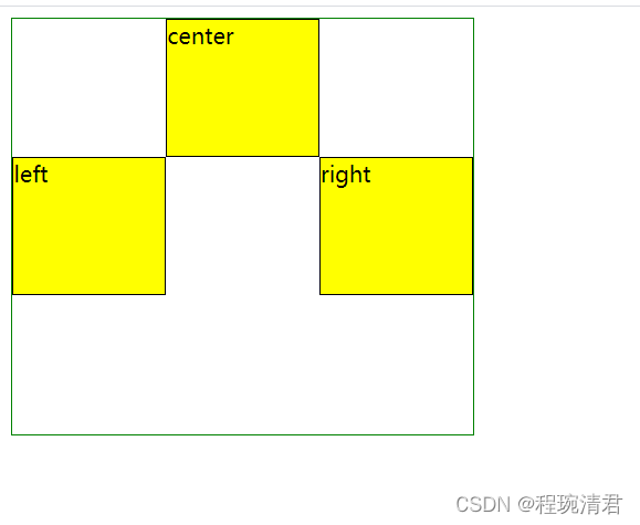
  <style type="text/css">
    .parent{
      display: flex;
      display: -webkit-flex;
      width: 333px;
      height: 300px;
      border: 1px solid green;
    }
    .parent>div{
      flex: 1;
      height: 100px;
      border:1px solid black;
      box-sizing: border-box;
      background-color: yellow;
    }
    .parent>div:first-child,.parent>div:last-child{
      align-self: center;
    }

  </style>
</head>
<body>
  <div class="parent">
  <div>left</div>
  <div>center</div>
  <div>right</div>
</div>
</body>
——————————————————————————————————————
那说说真正的品字布局吧:
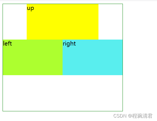
<!DOCTYPE html>
<html lang="en">
<head>
  <meta charset="UTF-8">
  <meta http-equiv="X-UA-Compatible" content="IE=edge">
  <meta name="viewport" content="width=device-width, initial-scale=1.0">
  <title>Document</title>
  <style type="text/css">
    .parent{
      display: flex;
      display: -webkit-flex;
      width: 333px;
      height: 300px;
      border: 1px solid green;
      flex-direction: column;
    }
    .parent>div:first-child{
      width: 200px;
      height: 100px;
      box-sizing: border-box;
      align-self: center;
      background-color: yellow;
    }
    .children{
      display: flex;
    }
    .children>div{
      flex: 1;
      height: 100px;
    }
    .children>div:first-child{
      background-color: greenyellow;
    }
    .children>div:last-child{
      background-color: rgb(89, 238, 238);
    }

  </style>
</head>
<body>
  <div class="parent">
  <div>up</div>
  <div class="children">
    <div>left</div>
    <div>right</div>
  </div>

</div>
</body>

</html>


 扫一扫
扫一扫


 被折叠的 条评论
为什么被折叠?
被折叠的 条评论
为什么被折叠?
 到【灌水乐园】发言


