


画图相关
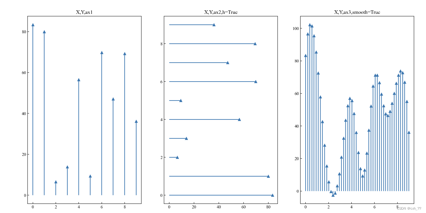
plotstem
Explanations
def plotstem(X,Y,label=None,smooth=False,h=False)
| param | meaning | type |
|---|---|---|
| X | list of X-axis | Array, Dataframe (1- dimension) |
| Y | list of Y-axis | Array, Dataframe ( 1- dimension) |
| label | list of labels | List, Arrary, Dataframe (1- dimension) |
| smooth | Whether smoothing curve | True or False (Default: False) |
| h | Whether horizontal | True of False (Default: False) |
Examples
fig, (ax1, ax2, ax3) = plt.subplots(3, 1, figsize=(5,8),dpi=200)

X = [[1,2,3,4,5,6,7,8,9,10]]
Y = np.random.uniform(0,100,size=(2,10))
plotstem(X,Y,ax1)
plotstem(X,Y,ax2,smooth=True)
plotstem(X,Y,ax3,smooth=True,h=True)
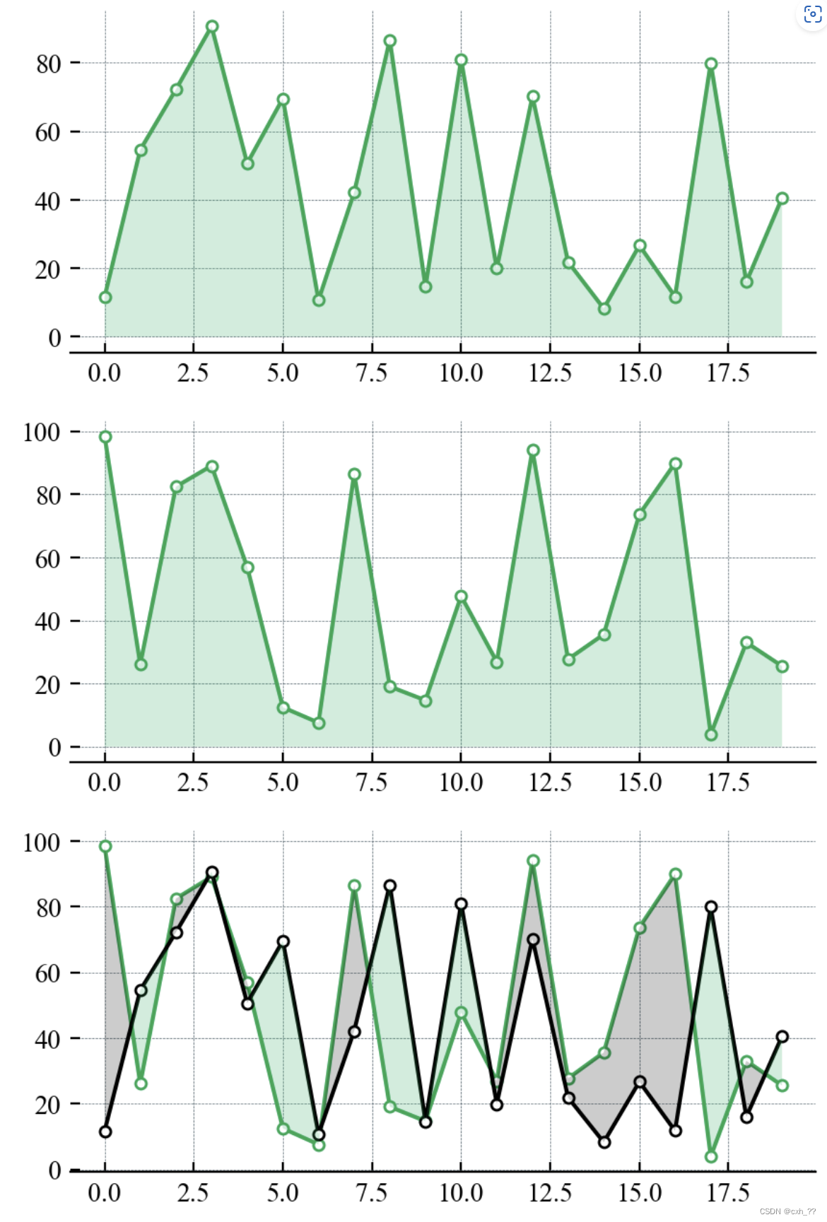
plotfilling
Explanations
def plotfilling(X,Y,ax,color=None)
| param | meaning | type |
|---|---|---|
| X | list of X-axis | Array, Dataframe (1- dimension) |
| Y | list of Y-axis | Array, Dataframe ( at most 2- dimensions) |
| color | list of colors | Array, Dataframe (default) |
Examples
fig, (ax1, ax2, ax3) = plt.subplots(3, 1, figsize=(5,8),dpi=200)
ax1.spines["left"].set_visible(False)
ax1.spines["top"].set_visible(False)
ax1.spines["right"].set_visible(False)
ax.grid(ls = "--", lw = 0.25, color = "#4E616C")
X = [[1,2,3,4,5,6,7,8,9,10]]

Y = np.random.uniform(0,100,size=(2,10))

plotfilling(X,Y,ax1,color=['red','black'])
plotfilling(X,[Y[0]],ax2,color)
plotfilling(X,[Y[1]],ax3,color)
plotlines
Explanations
| param | meaning | type |
|---|---|---|
| X | list of X-axis | Array, Dataframe (1- dimension) |
| Y | list of Y-axis | Array, Dataframe ( n- dimensions) |
| color | list of colors | Array, Dataframe |
| label | list of labels | List, Arrary, Dataframe (1- dimension) |
| linestyle | styles | Referred to linestyle in matplotlib |
| marker | markers | Referred to marker in matplotlib |
| mfc | colors of marker | Referred to mfc in matplotlib |
| ms | size of markers | Referred to ms in matplotlib |
| smooth | Whether smoothing curve | True or False (Default: False) |
Examples
fig, (ax1, ax2, ax3) = plt.subplots(3, 1, figsize=(5,8),dpi=200)
X = [[1,2,3,4,5,6,7,8,9,10],
    [1.5,2.5,3.5,4.5,5.5,6.5,7.5,8.5,9.5,10.5]]
error=np.random.uniform(0,2,size=(2,10))
Y = np.random.uniform(0,100,size=(2,10))
plotlines(X,Y,ax1,color=['black','red'])
plotlines(X,Y,ax2,color=['black','red','pink','gray','yellow'],smooth=True)
plotlines(X,Y,ax3,linestyle='-',
          marker = 'o', mfc = 'white', ms = 4, smooth = False)
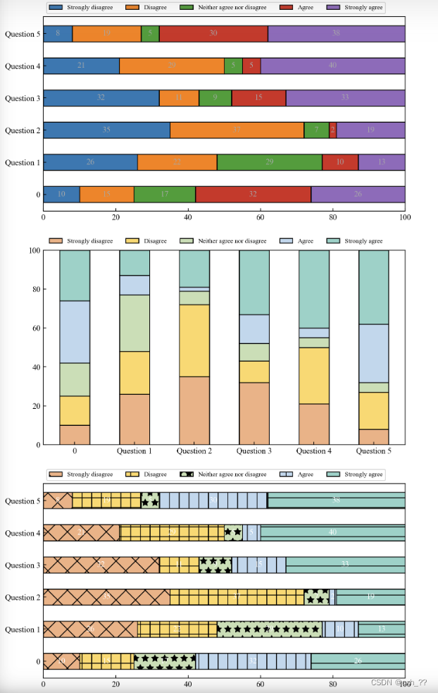
plotstackedbar
Explanations
def plotstackbar(results,ax,category_names,hatch = None,indict_numbers=True,color=None,text_color = 'white', legendsize=8,frameon=True, width = 0.5,h=True,edgecolor='black',error=None):
| param | meaning | type |
|---|---|---|
| results | labels and values of each bar | Dict (Default: None) |
| category_names | labels of bar components | Array, Dataframe (1- dimension) |
| hatch | list of hatches | Arrary, Dataframe (1- dimension) (Default: None) |
| indict_numbers | whehter or not indcict bar numbers | True or False |
| color | colors of each bar components | Arrary, Dataframe (1- dimension)(Default: None) |
| legendsize | size of legend | Default 8 |
| frameon | Whether to show the legend border or not | True or False (Default: True) |
| width | width of each bar | Default: 0.5 |
| h | Whether horizontalor not | Default: True |
| edgecolor | color of edge | Default: ‘black’ |
| error | error list | Default: None |
category_names = ['Strongly disagree', 'Disagree',
                  'Neither agree nor disagree', 'Agree', 'Strongly agree']

results = {
    'Question 1': [10, 15, 17, 32, 26],
    'Question 2': [26, 22, 29, 10, 13],
    'Question 3': [35, 37, 7, 2, 19],
    'Question 4': [32, 11, 9, 15, 33],
    'Question 5': [21, 29, 5, 5, 40],
    'Question 6': [8, 19, 5, 30, 38]
}

fig, (ax1, ax2, ax3) = plt.subplots(3, 1, figsize=(8,15),dpi=200)

hatch=['x','+','*','|','-']

plotstackbar(results, ax=ax1,category_names=category_names,text_color='darkgrey')
plotstackbar(results, ax=ax2,category_names=category_names,color = ['#f4b183','#ffd966','#c5e0b4', '#bdd7ee','#8dd3c7'],
             indict_numbers=False,text_color='darkgrey',frameon=False,h=False)
plotstackbar(results, ax=ax3,category_names=category_names,color = ['#f4b183','#ffd966','#c5e0b4', '#bdd7ee','#8dd3c7'],
             hatch=hatch,h=True)

plt.show()
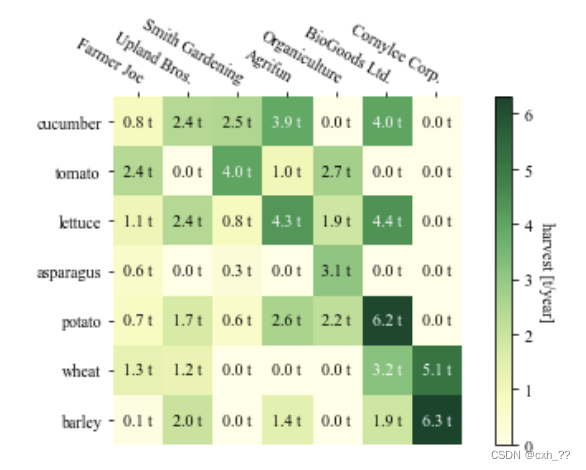
heatmap && annotated_heatmap
Explanations
def heatmap(data, row_labels, col_labels, ax=None,
            cbar_kw=None, cbarlabel="", **kwargs)

def annotate_heatmap(im, data=None, valfmt="{x:.2f}",
                     textcolors=("black", "white"),
                     threshold=None, **textkw)
| param | meaning | type |
|---|---|---|
| data | array | array(N-dimensions) |
| row_labels | labels of rows | array(1-dimension) |
| col_labels | labels of columns | array(N-dimensions) |
| cbar_kw | colorbar | |
| cbarlabel | label for the colorbar |
Examples
fig, ax = plt.subplots()
im, cbar = heatmap(harvest, vegetables, farmers, ax=ax,
cmap=“YlGn”, cbarlabel=“harvest [t/year]”)
texts = annotate_heatmap(im, valfmt=“{x:.1f} t”)
fig.tight_layout()
plt.show()


 7348
7348


 被折叠的 条评论
为什么被折叠?
被折叠的 条评论
为什么被折叠?
 到【灌水乐园】发言


