


一. 什么是弹性盒子布局
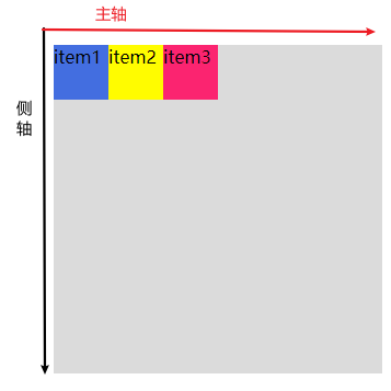
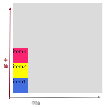
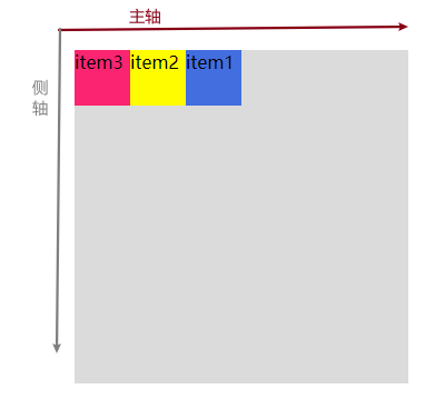
CSS3 弹性盒( Flexible Box 或 flexbox),为了让元素适配不同的屏幕大小或者说页面的大小以及设备类型时确保元素拥有恰当的布局方式。引入弹性盒布局模型的目的是提供一种更加有效的方式来对一个容器中的子元素进行排列、对齐和分配空白空间。 容器通过设置 display:flex 或 inline-flex将其定义为弹性容器,默认弹性容器只有一行。
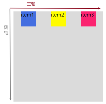
二.基本样式布局
代码段
<!DOCTYPE html>
<html>
<head>
<meta charset="utf-8">
<style type="text/css">
.flex-container {
display: flex;
background-color: gainsboro;
height: 300px;
width: 300px;
/* 默认属性,设置主轴的方向 */
flex-direction: row;
/* 默认属性,设置子元素主轴上的排列样式 */
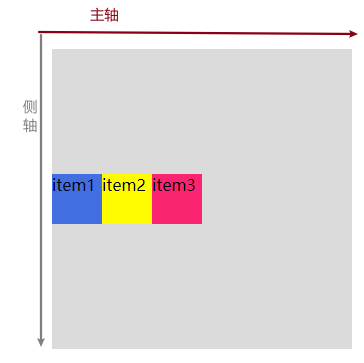
justify-content: flex-start;
/* 默认属性,设置侧轴上的排列样式 */
align-items: flex-start;
/* 默认属性,指定弹性盒子的子元素换行方式 */
flex-wrap: nowrap;
/*align-content: flex-start ;用于修改 flex-wrap 属性的行为,当子元素不局
限于一行排列时,用yu==于控制行之间的对齐方式*/
}
.flex-item {
width: 50px;
height: 50px;
}
.one {
background-color: royalblue;
}
.two {
background-color: yellow;
}
.three {
background-color: #FF266E;
}
</style>
</head>
<body>
<div class="flex-container">
<div class="flex-item one">
item1
</div>
<div class="flex-item two">
item2
</div>
<div class="flex-item three">
item3
</div>
</div>
</body>
</html>
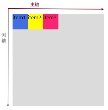
效果图
三.常用属性
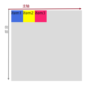
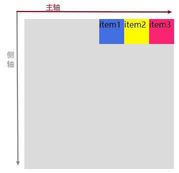
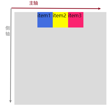
父容器属性:flex-direction
设置父容器的主轴方向。当设置主轴方向的同时也会改变侧轴的方向,主轴和侧轴都是从同一原点发射方向,在确认主轴方向的同时就可以确认侧轴方向
语法:
flex-direction: row | row-reverse | column | column-reverse
父容器属性:justify-content
设置子元素在父容器中主轴方向中的的排列样式
语法:
justify-content: flex-start | flex-end | center | space-between | space-around | space-evenly;
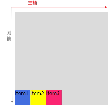
父容器属性:align-items:
设置子元素在父容器中侧轴方向中的的排列样式
语法:
align-items: flex-start | flex-end | center | baseline | stretch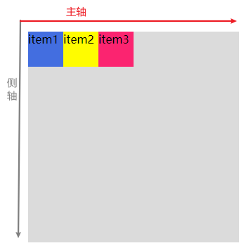
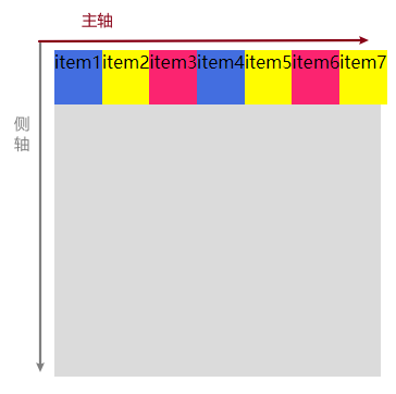
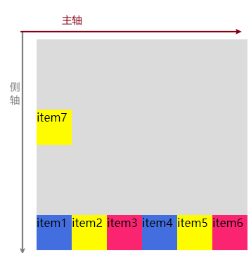
父容器属性:flex-wrap:
设置弹性盒子的子元素换行方式,默认不换行
语法:
flex-wrap: nowrap|wrap|wrap-reverse|initial|inherit;
各个值解析:
- nowrap - 默认, 弹性容器为单行。该情况下弹性子项可能会溢出容器。
- wrap - 弹性容器为多行。该情况下弹性子项溢出的部分会被放置到新行,子项内部会发生断行
- wrap-reverse -反转 wrap 排列
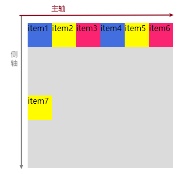
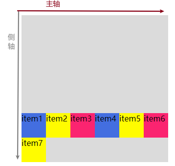
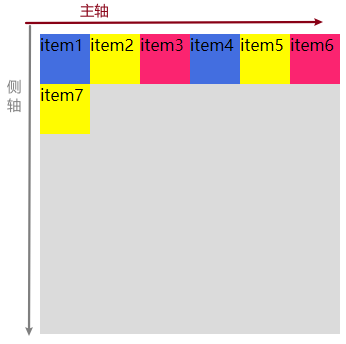
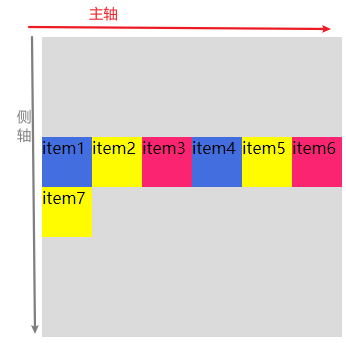
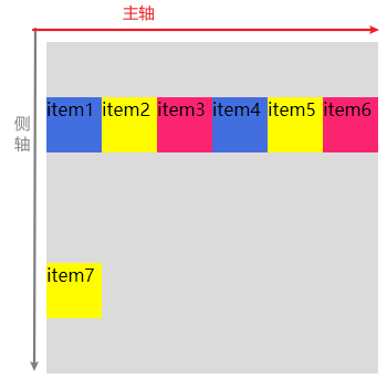
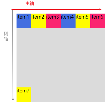
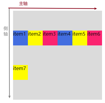
为了掩饰效果,现在我们往父容器内增加至七个子元素
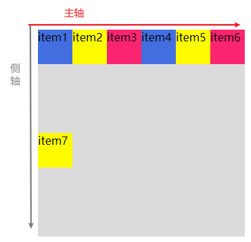
父容器属性:align-content:
align-content 属性用于修改 flex-wrap 属性的行为。类似于 align-items, 但它不是设置弹性子元素的对齐,而是设置各个行在侧轴上的的排列方式。
语法:
align-content: flex-start | flex-end | center | space-between | space-around |space-evenly | stretch各个值解析:
stretch- 默认。各行将会伸展以占用剩余的空间。flex-start- 各行向弹性盒容器的起始位置堆叠。flex-end- 各行向弹性盒容器的结束位置堆叠。center-各行向弹性盒容器的中间位置堆叠。space-between-各行在弹性盒容器中平均分布。space-around- 各行在弹性盒容器中平均分布,两端保留子元素与子元素之间间距大小的一半。
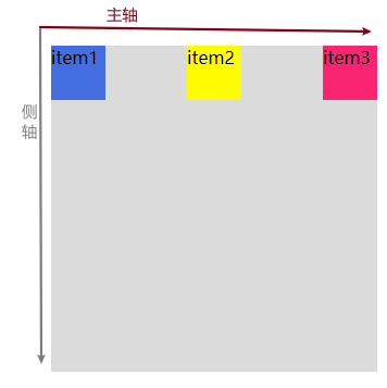
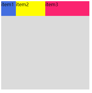
弹性子元素属性:order
根据子元素属性order值的大小一次排序子元素
语法
order:<integer>- <integer>:用整数值来定义排列顺序,数值小的排在前面。可以为负值。
代码段
<!DOCTYPE html>
<html>
	<head>
		<meta charset="utf-8">
		<style type="text/css">
			.flex-container {
				margin: 100px;
				display: flex;
				background-color: gainsboro;
				height: 300px;
				width: 300px;
			}

			.flex-item {
				width: 50px;
				height: 50px;
			}

			.one {
				background-color: royalblue;
				order:3;
			}

			.two {
				background-color: yellow;
				order: 2;
			}

			.three {
				order: 1;
				background-color: #FF266E;
			}
		</style>
	</head>
	<body>
		<div class="flex-container">
			<div class="flex-item one">
				item1
			</div>
			<div class="flex-item two">
				item2
			</div>
			<div class="flex-item three">
				item3
			</div>

		</div>
	</body>
</html>
效果图
弹性子元素属性:align-self
align-self 属性用于设置弹性元素自身在侧轴方向上的对齐方式。
语法
align-self: auto | flex-start | flex-end | center | baseline | stretch
代码段
<!DOCTYPE html>
<html>
<head>
<meta charset="utf-8">
<style>
.flex-container {
    display: flex;
    width: 400px;
    height: 250px;
    background-color: lightgrey;
}

.flex-item {
    background-color: cornflowerblue;
    width: 100;
    height: 100px;
    margin: 10px;
}

.item1 {
    align-self: flex-start;
}
.item2 {
    align-self: flex-end;
}

.item3 {
    align-self: center;
}

.item4 {
    align-self: baseline;
}

.item5 {
    align-self: stretch;
}
</style>
</head>
<body>

<div class="flex-container">
  <div class="flex-item item1">flex-start</div>
  <div class="flex-item item2">flex-end</div>
  <div class="flex-item item3">center</div>
  <div class="flex-item item4">baseline</div>
  <div class="flex-item item5">stretch</div>
</div>

</body>
</html>
效果图

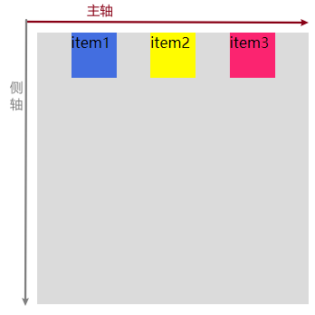
弹性子元素属性:flex
flex 属性用于指定弹性子元素如何分配空间。
语法
flex: auto | initial | none | inherit | [ flex-grow ] || [ flex-shrink ] || [ flex-basis ]
<!DOCTYPE html>
<html>
	<head>
		<meta charset="utf-8">
		<style type="text/css">
			.flex-container {
				display: flex;
				background-color: gainsboro;
				height: 300px;
				width: 300px;
			}

			.flex-item {
				width: 50px;
				height: 50px;
			}

			.one {
				 flex: 1;
				background-color: royalblue;

			}

			.two {
				background-color: yellow;

			 flex: 2;
			}

			.three {
				background-color: #FF266E;
				flex: 3;

			}
		</style>
	</head>
	<body>
		<div class="flex-container">
			<div class="flex-item one">
				item1
			</div>
			<div class="flex-item two">
				item2
			</div>
			<div class="flex-item three">
				item3
			</div>
		</div>
	</body>
</html>
效果图(通过设置flex值的大小来设置弹性盒子的子元素如何分配空间。)
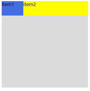
弹性子元素属性:flex-shrink
用于指定弹性子元素是否等比缩放
我们设置父容器的宽度为300px,第一个子元素设置宽度100px,第二个子元素设置300px,让我们看看会是什么样子的效果
<!DOCTYPE html>
<html>
	<head>
		<meta charset="utf-8">
		<style type="text/css">
			.flex-container {
				display: flex;
				background-color: gainsboro;
				height: 300px;
				width: 300px;
			}
			.one {
                width: 100px;
				height: 50px;
				background-color: royalblue;
			}
			.two {
				width: 300px;
				height: 50px;
				background-color: yellow;
			}

			}
		</style>
	</head>
	<body>
		<div class="flex-container">
			<div class="flex-item one">
				item1
			</div>
			<div class="flex-item two">
				item2
			</div>

		</div>
	</body>
</html>
效果图
现在我们为子元素增加 flex-shrink: 0;属性我们会发现效果变了
代码段
.one {
                width: 100px;
				height: 50px;
				background-color: royalblue;
				flex-shrink: 0;
			}
			.two {
				width: 300px;
				height: 50px;
				background-color: yellow;
				flex-shrink: 0;
			}
效果图
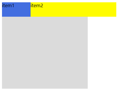
事实证明,子元素设置flex-shrink: 0;则会让子元素展现出原始的大小,当设置为1时则会进行等比缩放
我只是个菜鸡,如有发现不对的地方勿喷,请多多指教。如有侵权请联系本人,必删帖。


 1435
1435


 被折叠的 条评论
为什么被折叠?
被折叠的 条评论
为什么被折叠?
 到【灌水乐园】发言


