


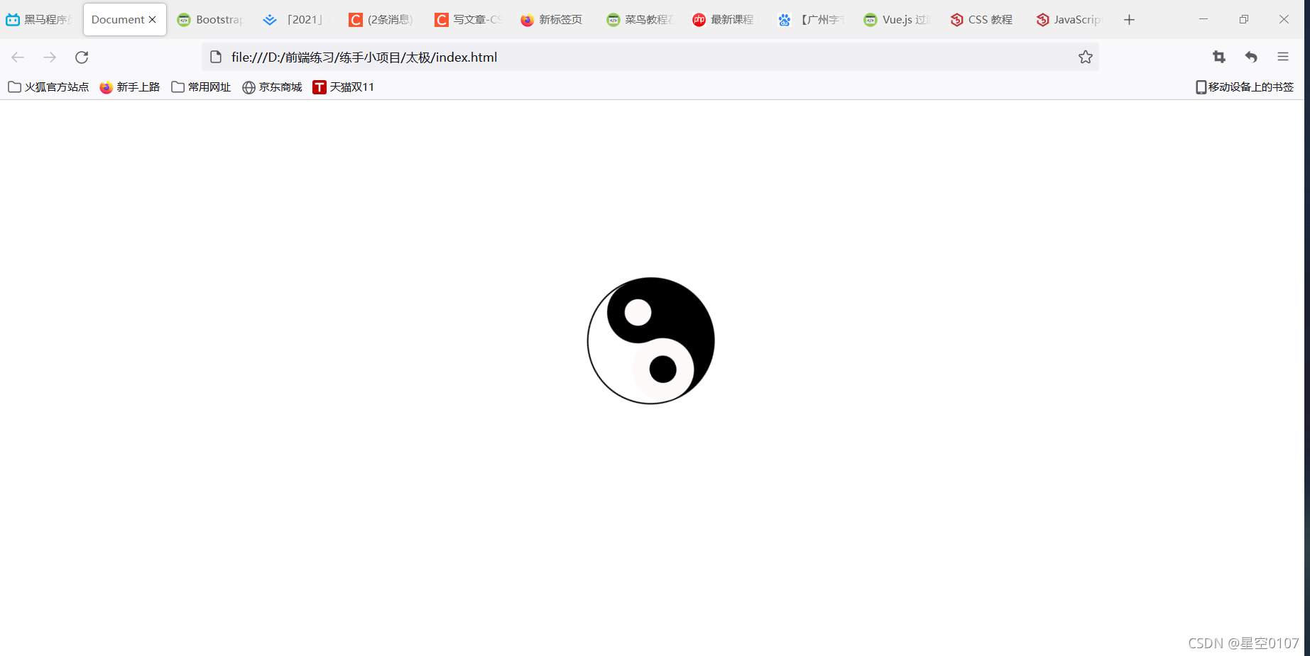
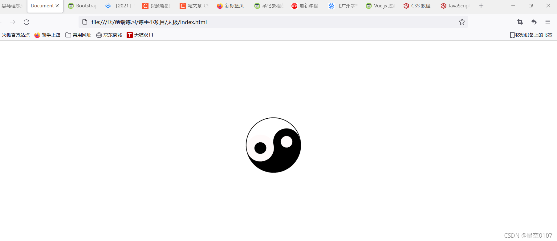
 这篇博客介绍了如何利用CSS的伪元素和关键帧动画来创建一个旋转的太极图。通过设置div的样式和动画属性,使得太极图以5秒为周期匀速旋转360度,形成动态效果。
简单使用CSS实现旋转的太极图,太极图由一个div盒子,添加伪元素before和after完成,然后以五秒旋转360度的速度匀速旋转
CSS代码段
    <style>
        .TaiChi {
            position: relative;
            width: 140px;
            height: 70px;
            border-width: 2px 2px 72px 2px;
            border-style: solid;
            border-radius: 50%;
            margin: 200px auto;
            /* animation: name duration timing-function delay iteration-count direction fill-mode; */
            animation: rotate 5s linear infinite;
        }

        .TaiChi::before {
            content: "";     //注意这里是一定要写的,不然什么都不会显示
            position: absolute;
            top: 50%;
            left: 0;
            width: 30px;
            height: 30px;
            background-color: black;
            border: 20px solid snow;
            border-radius: 50%;
        }

        .TaiChi::after {
            content: "";
            position: absolute;
            top: 50%;
            right: 0;
            width: 30px;
            height: 30px;
            background-color: snow;
            border: 20px solid black;
            border-radius: 50%;
        }

        @keyframes rotate {
            0% {
                transform: rotate(0deg);
            }

            100% {
                transform: rotate(360deg);
            }
        }
    </style>
HTML代码段
<body>
    <div class="TaiChi">
    </div>
</body>


 扫一扫
扫一扫


 445
445

 被折叠的 条评论
为什么被折叠?
被折叠的 条评论
为什么被折叠?
 到【灌水乐园】发言


